Based on the September 8th, 2011 Premium Update. Visit our archives for more gold & silver articles.
In a nutshell, this week we decided to provide you with the analysis of the previous bull market in the precious metals. The goal is to see how the current bull market compares with the previous one. After all, since history rhymes, looking at the analogy should provide us with clues as to what can happen next. In particular, we will be able to estimate if were currently on a verge of the final parabolic upswing and if this bull market is likely to end soon.

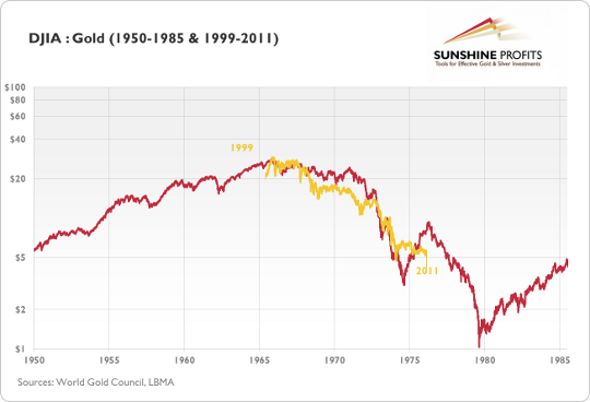
The above chart presents the DJIA:Gold ratio in two time spans: 1950-85 (red line) and 1999-2011 (golden line). The 1999-2011 has been superimposed on the older data. The chart points to the fact that in the period between 1965 and 1975 the ratio had been falling roughly in the same way it did between 1999 and 2011. We live in a globalized world, so looking at golds price relative to stocks might be more appropriate for long-term tendencies than a look at the gold price itself, simply because the major shift in investors sentiment happens when investors prefer gold to the most popular investment class stocks.
The methodology here is, therefore, to compare the decline in the DJIA:Gold ratio around the 70s bull market and compare it to the decline seen in the more recent years. Things to look at include the size of the decline, the time it took before the decline ended and the overall shape of the downswing.
As far as the size of the decline is concerned in both: time and range the slide seems far from being over which means that the bull market in the precious metals is likely to continue. The analysis of shape confirms that both bull markets are indeed similar. However, the most interesting implication is based on the late 1974 rally in the ratio.
As we see that 1974 and 1975 marked a significant trend reversal, we might expect a similar move to happen in the near future. This would imply a significant correction in the precious metals sector and possible rallies in the general stock market before the precious metals sector regains its strength and continues moving up.
Clearly, this is not the time to stop paying attention to warning signs about a possible decline in the precious metals. Lets take a look at the gold chart.

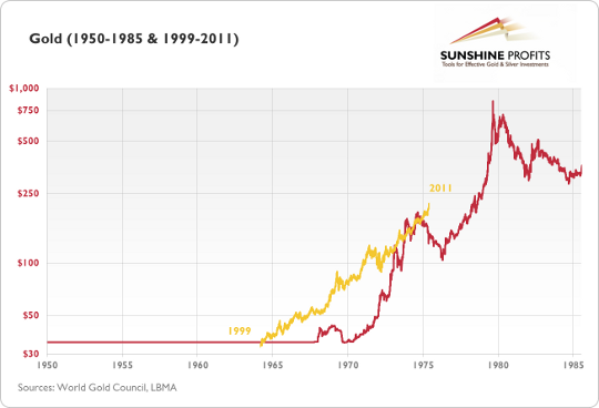
In the chart above, you see the price path of gold in the years 1999-2011 (golden line) superimposed over golds price path between 1950 and 1985 (red line). The vertical axis represents the older data while the values of the recent data have been rescaled to properly reflect the corresponding price changes. After a short comparison you might notice that today gold seems to be in a similar situation to where it was in 1975. This would suggest that we are in for a significant correction in the precious metals sector before the bull market resumes. It would also imply that any correction seen in the following month would not end the current bull.

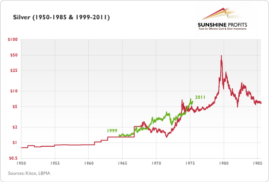
The above chart is similar to the previous one, except for the fact that it presents silver, not gold. Once again, the current bull (green line) has been superimposed over the price path between 1950 and 1985. Even though the price paths here are less similar than in previous cases, they still point to the fact that the silver rally might be followed by a substantial short-term correction or at least by a sideway trend. Just as in the previous cases, this should not be perceived as the end of the current bull.
Summing up, there will be a time gold and silver move straight up without any corrections, but analysis of the previous bull market suggests that this moment is still years from today. Moreover, this is not the time to stop paying attention to signals indicating a significant correction around the corner. Finally, this is not the time to stop trading the precious metals market (in general).
To make sure that you are notified once the new features are implemented, and get immediate access to my free thoughts on the market, including information not available publicly, we urge you to sign up for our free e-mail list. Sign up for our gold & silver mailing list today and you'll also get free, 7-day access to the Premium Sections on my website, including valuable tools and charts dedicated to serious PM Investors and Speculators. It's free and you may unsubscribe at any time.
Thank you for reading. Have a great weekend and profitable week!
P. Radomski
--
Euro has invalidated its breakout this week and at the same time USD moved quickly above its declining resistance line which pushed gold prices lower. At the same time mining stocks moved visibly higher and the HUI Index moved above its previous highs. Is gold going starting another powerful rally like miners would suggest, or will it plunge as rallying dollar would imply?
Additionally, our latest premium analysis includes our thoughts on a sell signal coming from the Yahoo! website, FSG ETF, and the Tobin Tax.
We encourage you to Subscribe to the Premium Service today and read the full version of this week's analysis right away.

