Visit our archives for more gold & silver articles.
Yellow and silver are our favorite colors, but red is what we are seeing on the boards this week after the U.S. central bank dashed hopes for more monetary stimulus and a weakened euro weighed on sentiment. Silver and gold were caught in a broad market sell-off which spread across commodities and equities. Bullion lost more than 3 percent over two days after the U.S. Federal Reserve released minutes from its last policy meeting which showed policy makers were less inclined to launch more monetary stimulus. This was strange since the Fed did not explicitly take QE3 off the table. In fact, according to the minutes, if the recovery stumbles, or if inflation is too low, the Fed is already prepared to launch QE3. Press accounts report that the sentiment dimmed precious metals' appeal as an inflation hedge.
All that red is still a post-breakout consolidation often seen before a rally takes off, only this time, the consolidation is significant (2 months long) enough to make even the staunchest precious metals bull feel nagging doubts. We want to remind you of an investment rule of thumb-- the bigger the consolidation, the bigger the following rally. It’s like a coil, the more you press on it and harder it will spring back, the more you pull back the bow the further the arrow will fly.
Why are we so bullish and are not afraid to tread where others are rushing out?
It’s not based on intuition, or reading the minutes of the last Fed meeting, or scanning the latest jobs reports. We base our calls on the current market sentiment, fundamentals (to some extent) and technical analysis along with related approaches (like fractal and cyclical analysis).
Technical Analysis has its rhythms, forms, textures and harmonies, and when it is done well, it can be like a Bach fugue with intellectual depth, technical command and even profound beauty. It is not an exact science, but it can help us anticipate what is likely to happen to prices over time. Our notes and scales are charts and proprietary tools developed exclusively by us.
Speaking of Technical Analysis - it’s now time we turn to the technical part of the essay. We’ll start with the general stock market and then move to silver (charts courtesy by http://stockcharts.com.)
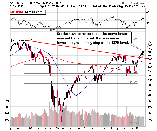
In the long-term S&P 500 Index chart, little has changed in the past week. Quoting from last week’s essay, “It seems that stocks may pause soon, as they’re about to reach their 2008 highs.” Well, we did see a pause this week though the correction may not yet be complete.

In the short-term S&P 500 Index chart, we are now seeing stock prices below the short-term support line although this move has not been confirmed. Prices are just slightly below this line however, and therefore only insignificantly bearish implications are in place.
Let us now take a look at the Sunshine Profits’ Correlation Matrix.
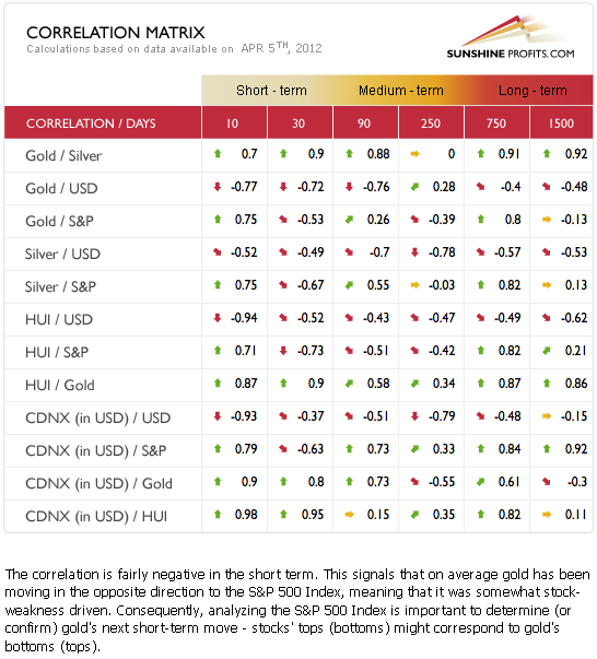
The Correlation Matrix is a tool, which we have developed to analyze the impact of the currency markets and the general stock market upon the precious metals sector. Currently, the coefficients for precious metals and the general stock market are negative in the short-term, 30-day column but this is not the case for the past 10 trading days. There appears to be a quite perplexing influence here. Overall, with negative coefficients in the 30-day column, the suggestion is that declines in the general stock market will not necessarily be bearish for the precious metals sector, including silver.
Speaking of silver, let’s take a look at charts featuring it.
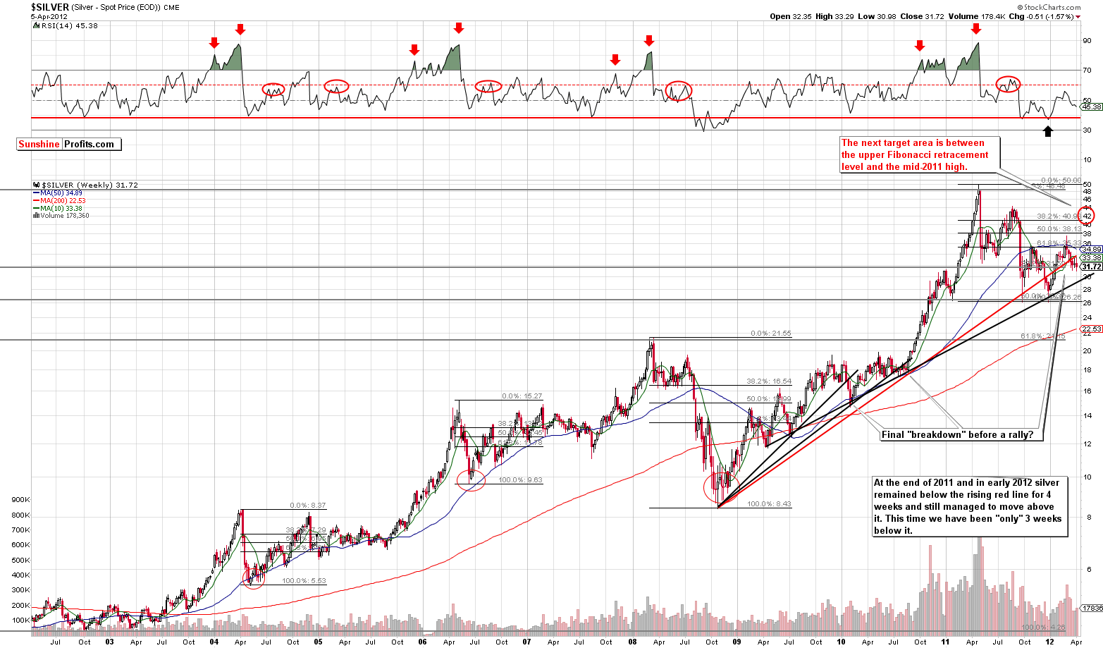
Let’s have a look at the long-term chart (you can click the chart to enlarge it if you’re reading this essay at sunshineprofits.com). Nothing has changed in comparison with last few weeks as silver continued to consolidate below the rising, red resistance-support line. The question now is if the breakdown was confirmed.
It seems that confirmation of the move is not probable. We see a recent example where silver’s price remained below this line for four weeks and moved above it in the fifth. Currently, we have been below this line for three weeks, so the breakdown has not been confirmed and looking at another support line based on previous local lows, there has been no breakdown whatsoever.
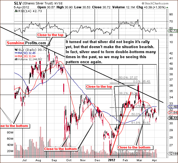
In the short term SLV ETF chart, we have more of the same implications. This week’s price action appears to be part of a double bottom pattern. Such moves have been seen often and are not really cause for concern. The June 2011 bottom and the September 2011 bottom are good examples of a similar pattern. All-in-all, the situation has not turned bearish this week for the white metal.
Summing up, the short-term outlook for the general stock market is a bit unclear but mildly bullish at this time. The link between the precious metals and stocks is also somewhat unclear at this point. All in all, however, the implications seem rather bullish for precious metals, including silver. The situation for gold’s little brother has not changed as much as it might appear as declines have been seen. The white metal has likely been forming a double bottom as has been seen many times in the past.
Taking a look at the situation in the precious metals mining stocks is quite insightful in the context of the future moves on the silver market. This is discussed thoroughly in our Premium Commentary.
To make sure that you are notified once the new features are implemented, and get immediate access to my free thoughts on the market, including information not available publicly, we urge you to sign up for our free e-mail list. Sign up for our gold & silver mailing list today and you'll also get free, 7-day access to the Premium Sections on my website, including valuable tools and charts dedicated to serious PM Investors and Speculators. It's free and you may unsubscribe at any time.
Thank you for reading. Have a great weekend and profitable week!
P. Radomski
--
The situation in the precious metals market is critical, so we've taken extraordinary steps to analyze it even deeper than usually. We introduced 2 additional big, detailed charts featuring GLD and HUI and we believe that especially the latter provides very important insight.
Of course, we covered much more things than "just" gold and gold stocks. Among other things, we comment on the current situation in the USD Index (which once again bottomed at the cyclical turning point), stock market, the financial sector, precious metals correlations, gold:bonds ratio, gold from a non-USD perspective, gold from yen perspective (the same chart that helped us detect top at the end of February), silver formations, XAU Index, GDX:SPY ratio, gold miners bullish percent index, and more.
In today's issue we discuss selling in May and going away, the possibility that the consolidation will continue, investors' sentiment, and probabilities that silver will move to new highs this year and in the following years. Additionally, we feature one tool that doesn't provide us with signals too often, but it has now - prices of junior mining stocks relative to other stocks.
We encourage you to Subscribe to the Premium Service today and read the full version of this week's analysis right away.

