Visit our archives for more gold & silver articles.
Tuesday marked the worst day of the year for U.S. markets. Stocks fell amid anxiety ahead of earnings season and rising bond yields for Spain and Italy, along with sharp losses for those markets.
The Dow Jones Industrial Average closed down 213.66 points, or 1.7%, resulting in a five-session losing streak. That’s the longest such run of losses since August. It was also the biggest one-day point and percentage drop for the index since Nov. 23. But Wednesday, U.S. stocks rose sharply after an extended losing run as Spanish and Italian bond yields fell.
How do these sometime seismic movements in the stock markets affect the precious metals markets? You might be familiar with our correlation analysis as this topic is discussed in our commentaries every once in a while, yet we decided to delve a bit more into that matter.
The relationship between gold and stocks is quite complex. It's positive, negative, and even neutral - all at the same time - depending on the perspective one takes.
If you look at yearly gold and Dow charts separately it seems at first glance that they are aligned. Both moved up since April 2011 and both markets experienced painful corrections.However, taking a closer look (by plotting their prices on the same chart, for example) shows that there were times when gold and Dow moved in opposite directions. For instance, gold rallied strongly from July 2011 to late August 2011 while at the same time stocks declined significantly. A few months later - during the first 3 weeks of October - the Dow soared without analogous action in gold. We've also seen a decline in gold in December 2011 and stocks actually were higher at the end of December 2011 than they were at month's beginning.
Also, in the past few days (second week of April) we saw gold moving higher along with lower stock prices.
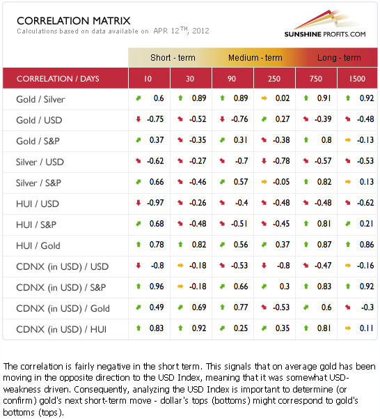
If we take the entire previous year into account (the past 250 trading days), we see a moderately negative correlation between gold and S&P 500 (below -0.3), which means that these two asset classes moved on average in the opposite direction during this time frame.
In short, there are periods when gold moves along with stocks and there are periods when gold and stocks move in the opposite directions. It seems that the period in which gold moves along with stocks has ended. Gold declined along with stocks during the first week of April, however taking the previous 30 trading days into account, these two still moved, on average, in opposite directions. That's why on April 6th, 2012 we wrote thatwith negative coefficients (…) the suggestion is that declines in the general stock market will not necessarily be bearish for the precious metals sector.
Markets are not logical in the short term, but emotional. Fear and greed are the main drivers behind prices of virtually any liquid asset in the short term, including gold and stocks.
In the long run, however, gold moves independently from the stock market, driven by its supply and demand characteristics.
Having said so much about correlations between precious metals and the general stock market, let us begin today’s essay with a quick look at our own tool, useful in spotting the interdependencies between the markets, named Correlation Matrix:

The Correlation Matrix is a tool, which we have developed to analyze the impact of the currency markets and the general stock market upon the precious metals sector. We have described the link between gold and stocks earlier in today’s essay, so here we will focus on the other important factor when it comes to correlations, namely the correlation between the precious metals and the USD Index.
We see moderately significant and negative coefficients for gold and somewhat weaker ones with silver and the mining stocks. The bearish outlook for the USD Index has bullish implications, as usual, for the precious metals.
Please note that the link between silver and the general stock market is moderately negative – similarly to the situation with the link between stocks and gold. Consequently, comments that we made about gold earlier today apply to silver as well
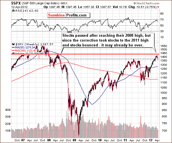
We have already discussed the quite complex correlation structure of gold and the general stock market. Let us now have a look at the S&P charts themselves, to see how the situation looks like on the market (charts courtesy by http://stockcharts.com.)

In the long-term S&P 500 Index chart, we have seen the expected pause following the index reaching the level of its 2008 high on April 2. The S&P has corrected but did not go all the way to the $1,320 level (red line seen on the chart below), more or less reaching the 2011 highs slightly below $1,360 and then bouncing. The breakout above these previous highs has been verified. Based on this chart alone, prices appear ready to move higher - the rally does no longer “demand” a correction as it has already happened.

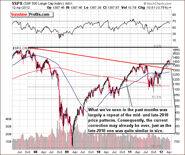
In this slightly different view of the long-term S&P 500 Index chart, we can see a similarity between the trading patterns of mid-2010 and now. Back then, stocks reached a bottom in a similar way and then showed a sustained rally, had a small consolidation around the level of previous highs, and then continued their rally.
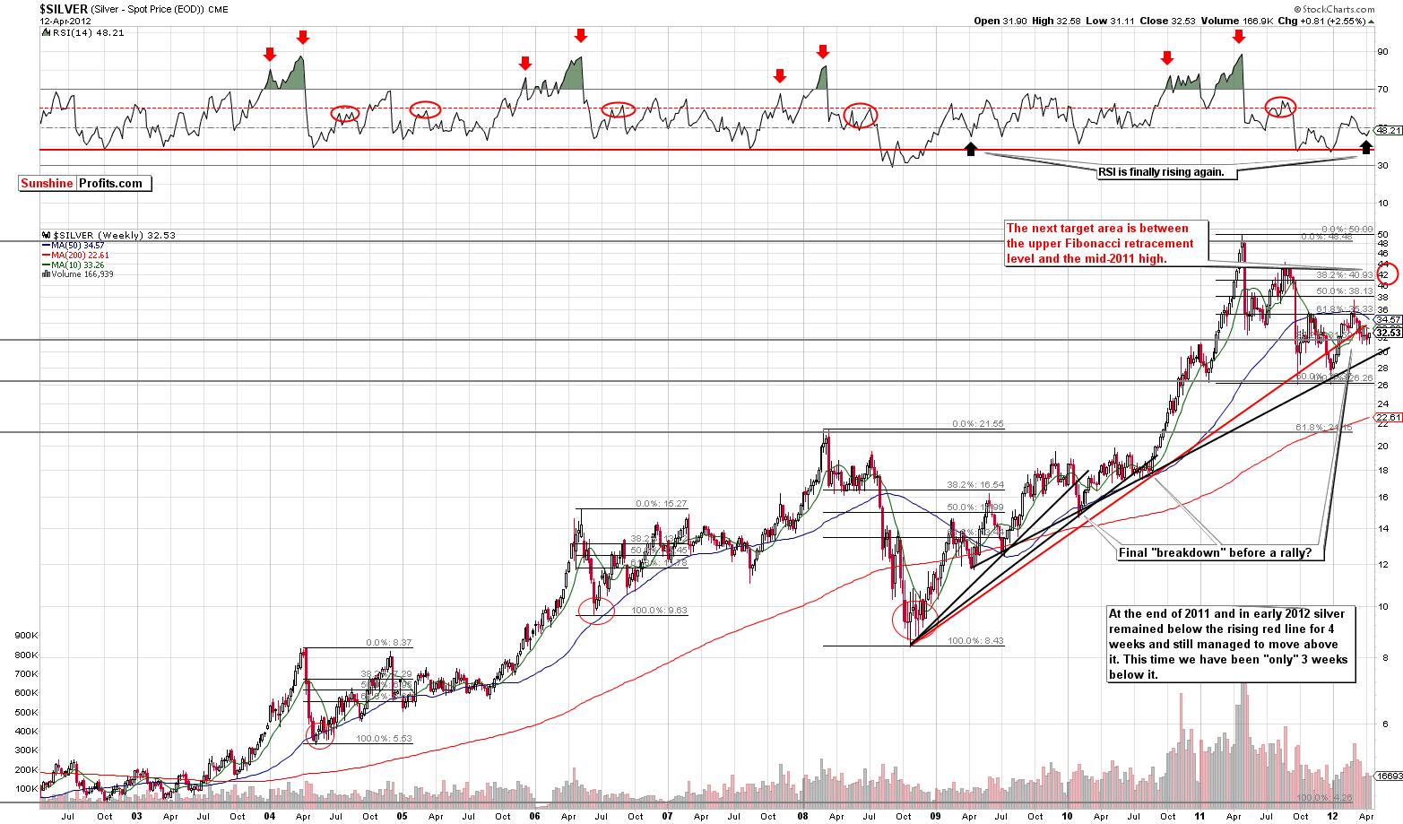
To finish off, let’s move on to the silver market itself.

Looking at this long-term chart (you can click the chart to enlarge it if you’re reading this essay at sunshineprofits.com) we can see that silver is still moving between its important technical support and resistance lines. We continue to view the situation as bullish since the recent breakdown has not yet been truly confirmed. Silver continues to try to move above the resistance line. It stayed below this line for four weeks last December-January before the move back above it. This time it has been three weeks since it crossed to the downside and an attempt to move back above it fairly soon seems to be a good bet right now.
Silver is now in a post-correction period, so it has the strength to move above the previously impenetrable 50-week moving average (blue line on the above chart). The RSI is finally rising and this is a bullish indication. The most similar trading pattern in the recent past was seen in the 2008 bottom and subsequent rally. Back then a major bottom at was followed by a rally to the 50-week moving average price level, after which prices corrected and then the rally continued.
Summing up, the general stock market picture is mixed for the short term and bullish for the medium term. The implications are rather bullish overall for silver but should not be our primary focus at this time. The charts of the white metal itself seem to be better resources today. The situation in silver remains bullish.
To make sure that you are notified once the new features are implemented, and get immediate access to my free thoughts on the market, including information not available publicly, we urge you to sign up for our free e-mail list. Sign up for our gold & silver mailing list today and you'll also get free, 7-day access to the Premium Sections on my website, including valuable tools and charts dedicated to serious PM Investors and Speculators. It's free and you may unsubscribe at any time.
Thank you for reading. Have a great weekend and profitable week!
P. Radomski
--
In today's Premium Update we take a close look the relationship between gold and stock market and we comment on gold's performance relative to the USD Index. Gold rallied this week, but is this rally any different than what we've seen a few times in March and earlier this month - will gold decline also this time? Fortunately, we've seen a few signals that allow us to answer this question. Surprisingly, one of them is related to aluminum.
We received several interesting questions this week, and in today's issue we reply to questions about:
- Volume in gold
- Gold's 70s bull market and its comparison to the current one
- Two kinds of inflation
- Marc Faber's bearish comments on gold
- Additional QE and the way it is... already affecting gold price
We encourage you to Subscribe to the Premium Service today and read the full version of this week's analysis right away.

