Briefly: in our opinion, full (250% of the regular size of the position) speculative short position in gold, silver, and mining stocks are justified from the risk/reward perspective at the moment of publishing this Alert.
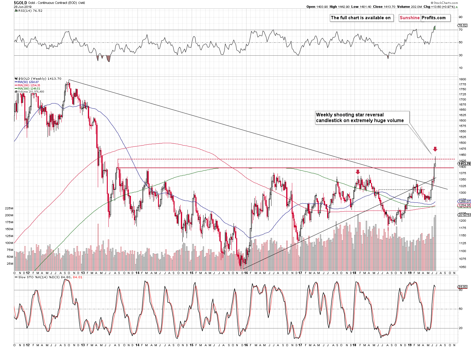
Much to the satisfaction of the cheering gold bulls crowd, the yellow metal had closed last week above the $1,400 barrier. While that appears bullish on its own, gold also formed a major reversal shooting star candlestick on a weekly basis. Which of these signals has proved more important? If you haven't checked today's pre-market price move, it might be a good idea to do so now. Gold is not only below $1,400, but also below $1,390. It's clear that the $1,400 level didn't hold, and that the reversal took precedence. This might be surprising to some, but not to you.
You knew that gold's rally was a geopolitical-news based event, which means that to a big extent it was fake and temporary. You knew that silver and mining stocks were surprisingly weak and we told you about myriads of signs pointing to lower gold prices in the following weeks. We explained the importance of huge volume and the fact that all three key precious metals markets point to a major turnaround based on the triangle-vertex-based reversals. We saw a ridiculously high number of bullish surprises in gold and while it moved relatively high on a short-term basis, the overall trend didn't change. Multiple other signs have kept pointing to lower gold prices and therefore, today's rapid decline in gold price is very normal - it was the preceding rally that was not.
Let's take a look at the weekly price changes.
Gold's Rollercoaster Week
Gold ended the previous week higher, but that's not what's most important. The most important thing is how it performed during the week. It had rallied above the highest of the recent highs and practically immediately reversed. It didn't slide immediately below the week's opening price, but it didn't continue the rally either. The momentum was lost. Before the week was over, gold made another attempt to move higher, and it failed it as well. Ultimately, gold erased most of weekly gains and formed the bearish reversal candlestick.
The volume that accompanied this reversal was extreme, which is the best reversal confirmation we can get.
Also, let's keep in mind that gold closed last week $13.60 higher. At the moment of writing these words it's trading $24.60 lower, which means that the entire last week's gain was erased within several hours of today's overnight trading.
At the moment of writing these words, gold is trading at $1,389.10 and the pre-market low was $1,384.70. What does this mean exactly?
It means two things:
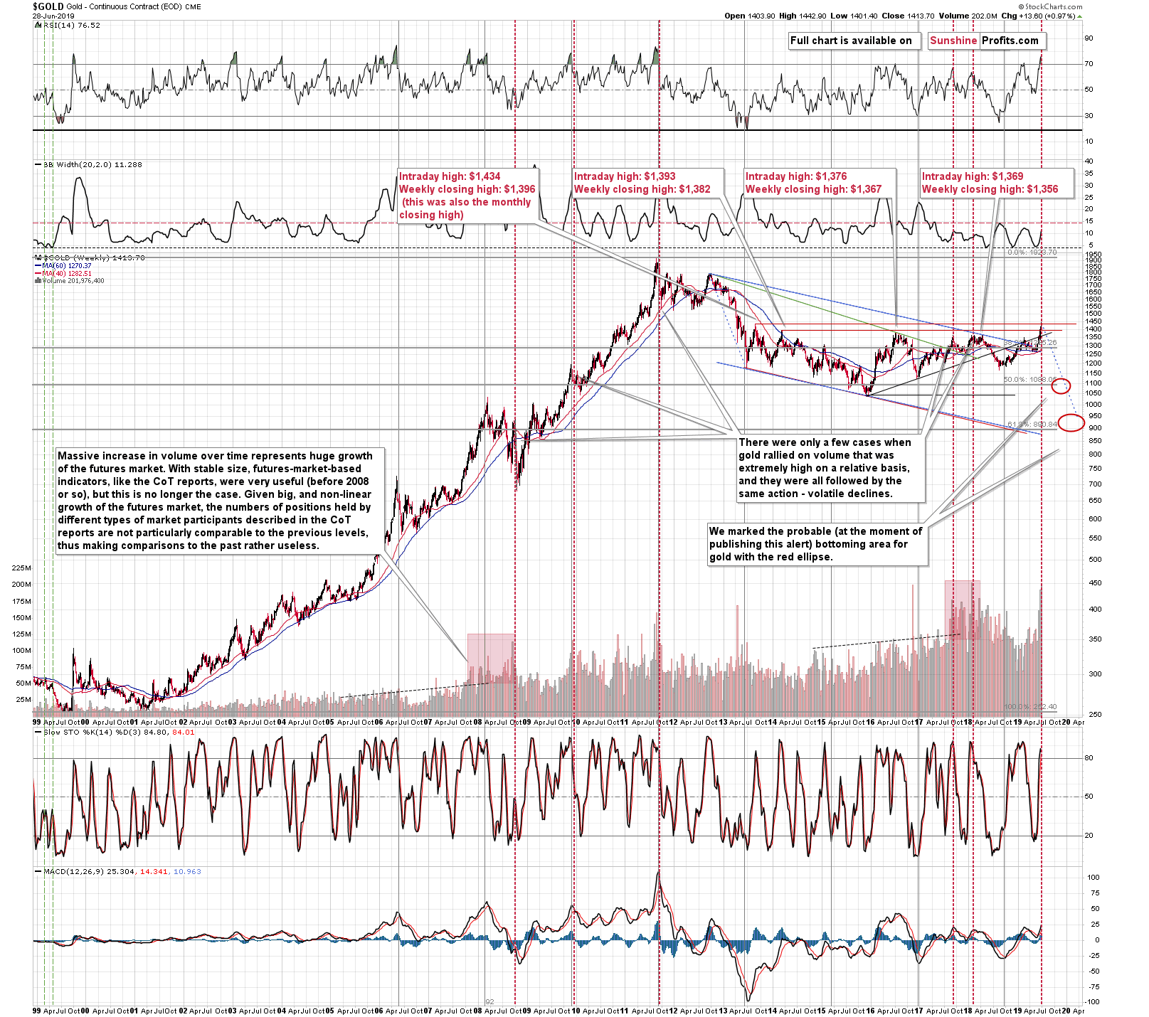
- We are in the middle of a series of major invalidations. It's been only several trading hours of this week, and gold has already moved below the weekly closing high of mid-2013 and below the intraday high of 2014. We are very likely to see more invalidations in the following days or hours.
- Since almost every gold analyst / gold promoter out there claimed that gold "broke out" even though it failed to move above the highest of the resistance levels, and - based on the above false observation - they claimed that the new bull market has already started, it will be very interesting to see how they explain gold's move below - initially - some, and then - finally - all previous highs. At some point they will have to admit that they didn't see the full picture and the highest resistance that their charts allowed them to see were the ones from 2018, which were not as important as the mid-2013 high. As a reminder, when almost everyone claimed that gold is breaking higher, we posted a Gold & Silver Trading Alert that we titled The 2019 Top in Gold Is In.
Once gold closes below $1,356 - the lowest of the previous highs - all recent breakouts will have been invalidated. That's when the decline will likely truly accelerate as people start to panic and run for the hills.
Let's take a look at other parts of the precious metals market.
Enter Silver and Mining Stocks
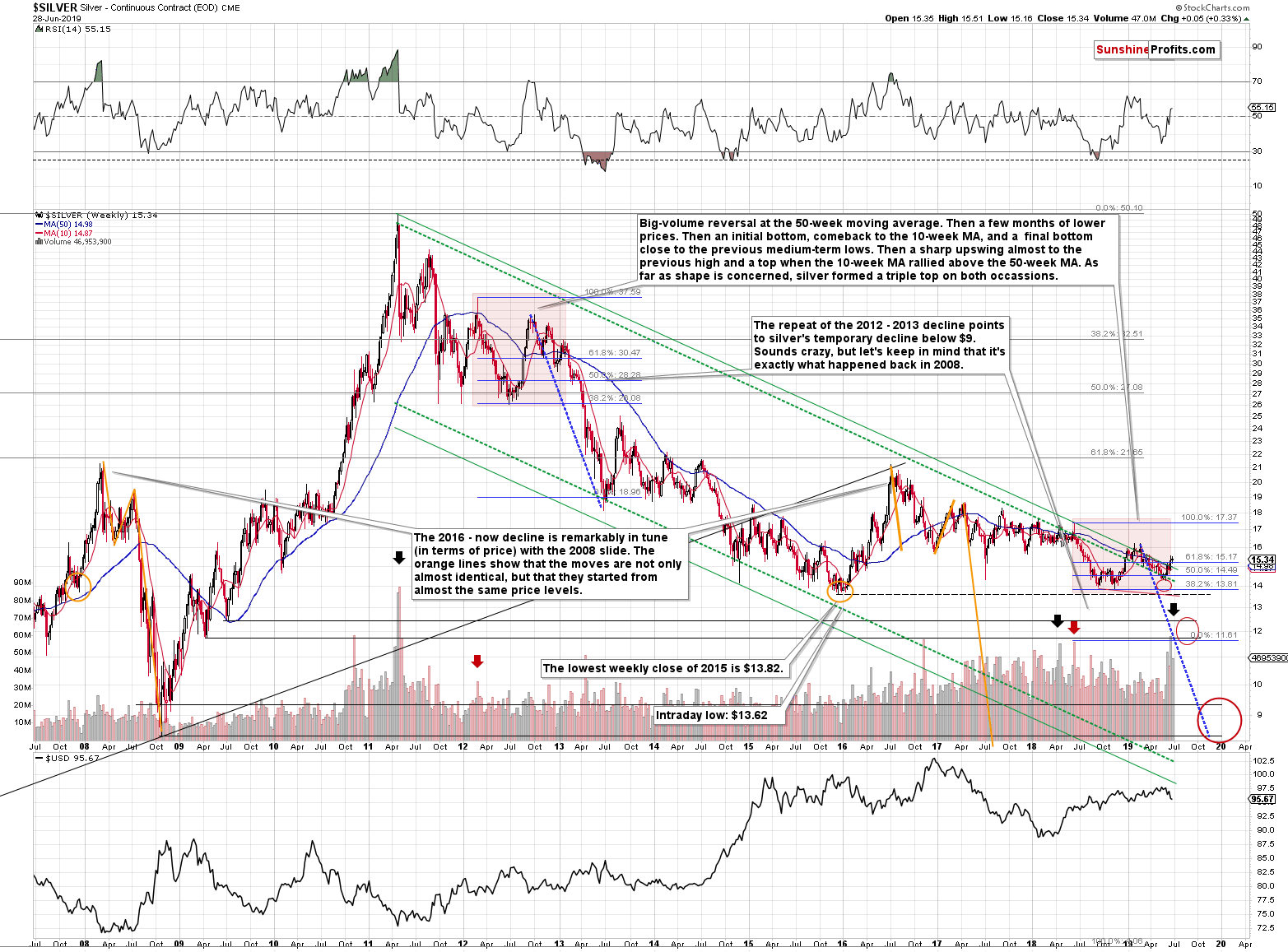
Silver's recent upswing is barely noticeable from the long-term point of view. Yet, we see that the white metal moved a bit above the declining green resistance line. It's not a game-changer as the very same thing happened earlier this year. That was exactly when silver topped, so it's hardly a bullish sign.
What is much more important is a combination of two factors. One is huge volume that we saw recently and that is almost always seen at silver's major tops (marked with arrows). Second is the analogy to the 2008 decline in terms of price. This is something that has been in place for years, so we don't cover it every week, but it's worth to keep in mind at all times.
The yellow lines represent the sizes of price moves in silver in 2008 and between the 2016 top and now. Not only the size of the moves are almost identical, the starting prices of the declines are also practically the same. The analogy is not present in terms of time, but it is very precise in terms of price. And this analogy points to approximately the same price target for silver as does the analogy to the 2012-2013 decline. Silver is very likely heading below $10 and quite likely even below $9.
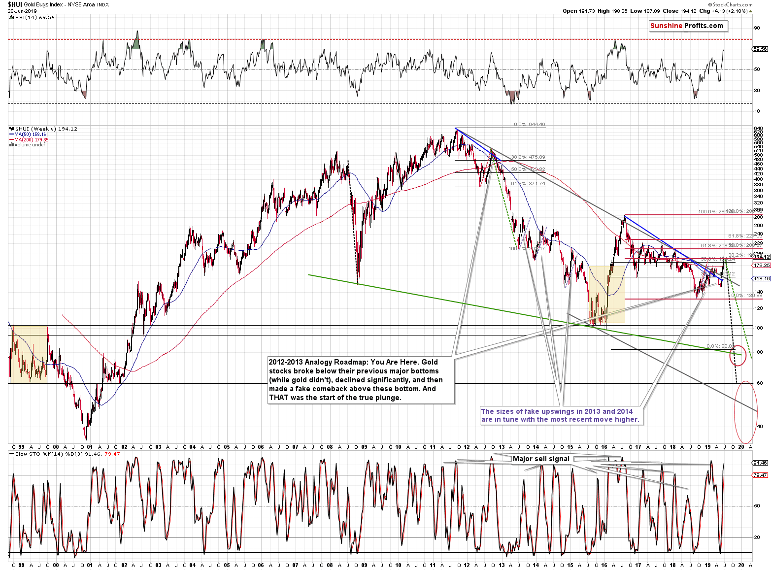
As far as gold stocks are concerned, our previous comments on the above chart remain up-to-date:
But is the move really that significant? The blue (or purple depending on one's screen settings) lines that you can see on the above chart are identical. The mid-2013 rally, the late-2013 - early-2014 rally, the late-2014 - early-2015 rally, and the current upswing are almost identical. Almost, because the current one is just slightly bigger.
In 2016, gold miners soared much higher and much faster based on almost no meaningful fundamental news. This time, we have already seen myriads of bullish news for the precious metals market and miners rallied only a little more than during the above-mentioned corrections. The entire upswing - even though it appears important - looks like yet another corrective upswing, not like the powerful upleg that we saw in 2016.
The current move higher is a bit bigger than the other upswings that we saw in 2013, 2014 and 2015, but do you know what was practically identical?
The May 16, 2012 low was 372.74 and the September 21, 2012 high was 529.80, so the during the 2012 correction, the HUI Index gained about 42%.
The 2018 low was 131.12. Friday's high was 191.09. That's about 45% - the moves are almost identical in terms of size. We marked both moves dashed red lines. The 3% difference is practically invisible on the chart.
We already wrote that the HUI Index is not even close to its 2016 high, but there's more to it than just that. The index just reached the 38.2% Fibonacci retracement levels based on the decline from this high to the 2018 bottom. It didn't even erase half thereof. Are gold stocks leading the way higher here? Absolutely not.
There is also another similarity to the recent upswing - in terms of sharpness. Please take a look at the 1999 rally that preceded the slide to the final low. Gold rallied sharply at that time as well. It was right after the Brown bottom in gold, which adds to the similarity to the current situation. The fundamental news is different, but it's of similar nature. We didn't see one single extremely bullish sign for gold this time, but we saw a series of fundamental news that were almost as chaotic as Gordon Brown's decision. The trade war with China, the supposed tariff on Mexico, much more dovish Fed, public calling for lower US dollar and there was even a quite oddly justified Iran accusation.
Please remember that after the 1999 top, mining stocks declined by about 65%, before declining. Applying this to the current 190 value, provides us with 66.5 as the target... Not too bullish after all.
And what did the USD Index do?
The USD Index: Is Its Bottom In?
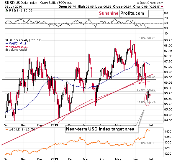
It didn't do much on Friday, but it rallied by 0.42 in today's overnight trading. The bottom seems to be in. In the last 3 months, the Fed became much more dovish and there was a series of geo-political reasons for the USD Index to decline, including Trump's direct calls for lover USD value. And what happened? The USD Index formed a higher low than it did in March. The USD's resilience is a very bullish factor for the following months.
Before summarizing, we would like to remind you about the self-similar analogy in gold that we featured recently.
Do you remember how gold topped in 2011? Do you recall its immediate and sharp decline followed by a correction that hasn't made it to the previous high, and then - after a few months of pausing - making a final attempt to move higher but failing to break above the most recent high? And then, in April 2013, it truly plunged, which was immediately followed by a sharp correction and then the slide continued to new lows?
If you've been interested in the precious metals market at that time, you definitely remember - it was impossible to miss these moves.
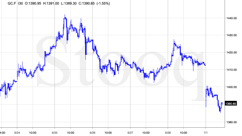
The beautiful thing here is that... The above chart doesn't feature it. These are not weekly or monthly candlesticks. These are 30-minute candlesticks and what you see above is what gold did in the last two days or so. You probably thought that it was gold's performance from 2013, because the price pattern is almost identical. Please take a look below for details.
Entirely different time frames, entirely different candlestick length, and yet, the pattern repeated itself almost to the letter. The fractal near-perfection.
We detected it during yesterday's session, but since it simply confirmed what we wrote in our regular Gold & Silver Trading Alert, we didn't send an intraday follow-up. What does it mean going forward?
The similarity is likely to persist for some time. Unfortunately, we don't know for how long it's going to be the case, but it's definitely likely to remain in place for a day or two. Given the current volatility, a day or two can change quite a lot, so the above is important. What happened after the 2013 slide? Gold entered a few-years-long consolidation. Applying it to this week's terms, it means that we could see some back and forth trading today or tomorrow. This could be accompanied by another move lower in the USD Index, during which it reaches its 61.8% Fibonacci retracement level. Or it could be more or less random, or Twitter-politics based.
What the above doesn't tell us is what happens after the one- or two-day consolidation, and if gold is done declining in case of this immediate-term move. The volatility has been extraordinary recently, which means that gold could slide some more before today's daily bottom is reached. It might be the case that gold slides below $1,400 and then consolidates. This would complete the analogy to the long-term price pattern.
And this is where things are likely to get really interesting. You see, the fractal similarity works both ways. Gold's small (it could be just several hours) consolidation and a daily close below $1,400 could result in a powerful slide in the following hours (possibly tomorrow). Yesterday, we mentioned this week being critical, as it's where we'll get also the monthly and quarterly closing prices, which are paramount. This means that if the bearish picture remains intact, we should see a decline before the end of the week and that's more or less what we're getting right now. Let's move back to the similarity. If gold plunges in the following days and weeks, it will also indicate what gold is about to do from the long-term point of view - in the following months. Please assess gold's performance with regard to the overall volatility - it should provide a taste of what's to come (multiplied many times in terms of price and time).
The final part of the above quote is particularly important. The intraday part of the analogy is already "in the future" compared to the long-term part thereof. And what happened?
Gold first invalidated the strength that turned out to be nothing more than a fake rally, then it consolidated a bit almost to the point that it got boring and then it plunged when nobody (well, almost no one - you knew) was expecting it to. There was an initial dead-cat bounce after which gold continued to decline nonetheless.
The implications for the following weeks and months are very bearish. We will discuss them in detail next week, after seeing how gold performs in the coming five trading days. We will do so by updating our gold price path prediction chart. Waiting this additional week should add clarity and allow us to make more precise forecast. But to make a long story short, our main downside target for gold at $890 remains up-to-date.
Summary
Summing up, last week's close above $1,400 was misleading and all the other signals that we featured along with the reversal nature of last week's candlestick in gold resulted in gold's decline. Given the accompanying volume levels, the triangle-vertex-based reversals, and the multiple other signs, it's very likely that today's decline is not just a breather within a rally, but a very early part of an epic downswing.
As always, we'll keep you - our subscribers - informed.
To summarize:
Trading capital (supplementary part of the portfolio; our opinion): Full short position (250% of the full position) in gold, silver, and mining stocks is justified from the risk/reward perspective with the following stop-loss orders and exit profit-take price levels:
- Gold: profit-take exit price: $1,241; stop-loss: $1,452; initial target price for the DGLD ETN: $51.87; stop-loss for the DGLD ETN $31.67
- Silver: profit-take exit price: $13.81; stop-loss: $16.32; initial target price for the DSLV ETN: $39.38; stop-loss for the DSLV ETN $23.87
- Mining stocks (price levels for the GDX ETF): profit-take exit price: $17.61; stop-loss: $26.47; initial target price for the DUST ETF: $34.28; stop-loss for the DUST ETF $9.87
In case one wants to bet on junior mining stocks' prices (we do not suggest doing so - we think senior mining stocks are more predictable in the case of short-term trades - if one wants to do it anyway, we provide the details), here are the stop-loss details and target prices:
- GDXJ ETF: profit-take exit price: $24.71; stop-loss: $37.17
- JDST ETF: profit-take exit price: $78.21 stop-loss: $22.47
Long-term capital (core part of the portfolio; our opinion): No positions (in other words: cash)
Insurance capital (core part of the portfolio; our opinion): Full position
Whether you already subscribed or not, we encourage you to find out how to make the most of our alerts and read our replies to the most common alert-and-gold-trading-related-questions.
Please note that the in the trading section we describe the situation for the day that the alert is posted. In other words, it we are writing about a speculative position, it means that it is up-to-date on the day it was posted. We are also featuring the initial target prices, so that you can decide whether keeping a position on a given day is something that is in tune with your approach (some moves are too small for medium-term traders and some might appear too big for day-traders).
Plus, you might want to read why our stop-loss orders are usually relatively far from the current price.
Please note that a full position doesn't mean using all of the capital for a given trade. You will find details on our thoughts on gold portfolio structuring in the Key Insights section on our website.
As a reminder - "initial target price" means exactly that - an "initial" one, it's not a price level at which we suggest closing positions. If this becomes the case (like it did in the previous trade) we will refer to these levels as levels of exit orders (exactly as we've done previously). Stop-loss levels, however, are naturally not "initial", but something that, in our opinion, might be entered as an order.
Since it is impossible to synchronize target prices and stop-loss levels for all the ETFs and ETNs with the main markets that we provide these levels for (gold, silver and mining stocks - the GDX ETF), the stop-loss levels and target prices for other ETNs and ETF (among other: UGLD, DGLD, USLV, DSLV, NUGT, DUST, JNUG, JDST) are provided as supplementary, and not as "final". This means that if a stop-loss or a target level is reached for any of the "additional instruments" (DGLD for instance), but not for the "main instrument" (gold in this case), we will view positions in both gold and DGLD as still open and the stop-loss for DGLD would have to be moved lower. On the other hand, if gold moves to a stop-loss level but DGLD doesn't, then we will view both positions (in gold and DGLD) as closed. In other words, since it's not possible to be 100% certain that each related instrument moves to a given level when the underlying instrument does, we can't provide levels that would be binding. The levels that we do provide are our best estimate of the levels that will correspond to the levels in the underlying assets, but it will be the underlying assets that one will need to focus on regarding the signs pointing to closing a given position or keeping it open. We might adjust the levels in the "additional instruments" without adjusting the levels in the "main instruments", which will simply mean that we have improved our estimation of these levels, not that we changed our outlook on the markets. We are already working on a tool that would update these levels on a daily basis for the most popular ETFs, ETNs and individual mining stocks.
Our preferred ways to invest in and to trade gold along with the reasoning can be found in the how to buy gold section. Additionally, our preferred ETFs and ETNs can be found in our Gold & Silver ETF Ranking.
As a reminder, Gold & Silver Trading Alerts are posted before or on each trading day (we usually post them before the opening bell, but we don't promise doing that each day). If there's anything urgent, we will send you an additional small alert before posting the main one.
Thank you.
Sincerely,
Przemyslaw Radomski, CFA
Editor-in-chief, Gold & Silver Fund Manager


