
We have 3 important charts for you and we didn’t want to keep you waiting until Friday. We’ll start with the most critical one – the HUI Index.
Before moving on to gold stocks, we'd like to briefly comment on today's Fed statement. Basically, there's nothing new in it. It seems that markets were expecting to see some kind of bearish news like saying that there will be no QE3 or so. There were no such comments and consequently, the statement was more bullish than expected - thus stocks rallied moderately. The impact on precious metals was insignificant and it seems that other factors - like the technical picture - will determine the next move in the metals market. Having said that, let's take a look at the part of the precious metals sector that is in the most extreme situation - mining stocks.
The chart below (charts courtesy of stockcharts.com) might be a bit perplexing at first, but don’t worry, we’ll feature one thing at a time. Please click on the chart to enlarge it.
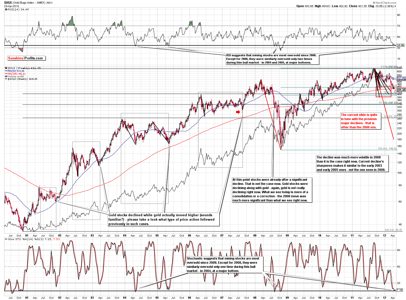
Let’s start with the most straightforward parts – the indicators. At the top of the chart we have RSI and Stochastic is at the bottom. Both are extremely low and these are extreme levels even taking the whole bull market into account. That’s the biggest time frame that we can consider for a medium-term decline, so there will be no more zooming out. The implication is that the sentiment is really hitting rock bottom right now.
Some might say that it’s not a big deal, as sentiment being bad is not a sign of a turnaround and that price can get even lower because it did in 2008. Some e-mails that we receive include information that readers can “easily see this as a start of the 2008-like plunge”. Our initial comment is that at this point indicators suggest at least a short-term move up even if this is a 2008-like decline in progress.
Let’s see how the current decline really compares to the previous ones. If there are characteristics in this decline that make it similar to the 2008 decline and there are no traits that make it look like other significant declines (but not as big as the 2008 one) then we haven’t seen the half of the decline yet. But, if the opposite is the case – if the current decline is similar to the previous declines that were not as big as the 2008 one, but doesn’t really resemble the 2008 one so far, then the odds are that we have a buying opportunity, not anything else.
Having described the methodology, let’s see which of the two outcomes is actually the case. On the above chart we have marked the 2008 decline with a red line and other major declines with black lines. Naturally, the red line is much bigger than the black ones. We duplicated all of these lines and attached their starting points to the 2011 top. Now we can see where gold stocks would move if the current decline was like other declines.
We divided outcomes into two groups – the 2008 and the rest. It appears that declines other than the 2008 one took gold stocks to the price range marked with a red rectangle. Consequently, gold stocks’ decline is quite in tune with the previous declines – except of the 2008 one.
Price is only one dimension in which we can analyze similarities, so if other things make the current decline similar to the 2008 one then we could still be on a verge of a much bigger move lower.
So, let’s dig deeper and take a look at the sharpness of each of the moves. Actually, the current move is not in tune with the 2008 one at all in terms of sharpness. It is actually even a bit less sharp than other major declines, so the analysis of volatility doesn’t suggest a 2008-like plunge.
We also checked if gold (visible on the above chart – black line) and the general stock market are now acting in a way that’s similar to what was seen in the early part of the 2008 plunge. We used indicators (RSI, Stochastic) to estimate at which point we are now if these two declines are similar. In 2008 gold was after a considerable decline at that time (much below its previous bottom) and this is not the case right now. In 2008 gold corrected approximately 25% to “this” point (comparing the size of the decline to the price at the top) and right now gold is about 15% from the top. That’s a bit more than half of the previous, “analogous” decline. The similarity is even less visible in terms of the general stock market. Back in 2008, stocks were already after a significant decline and this is clearly not the case right now.
Consequently, taking into account: indicators (RSI, Stochastic), size of the decline, its volatility, and unique circumstances (situation in gold and main stock indices) into account leads us to believe that the current decline most likely is not a repeat of the 2008 one.
“But gold stocks are shockingly underperforming the metal and I know that this is not a good sign”.
True, gold stocks tend to lag gold prior to important tops and at times they show strength before the whole sector bottoms. However, the first part of this relationship (tops) is more reliable than the second one. The proper question that we need to ask though is if the ends of consolidation patterns were preceded by gold stocks’ outperformance or not. If that was the case before most big rallies, we would have an indication that more downside is yet to come as we have clearly not seen gold stocks’ outperform gold. Conversely, if we’ve seen gold stocks underperform gold before major rallies, then the current situation is not that concerning.
Please take a look at the above chart and focus on the thin, gray rectangles (visible on enlarged chart only). Note where gold stocks (upper part) were at its beginning and where they were at its end. In each case gold stocks declined during these time frames. Now, please compare these moves with the performance of gold. Actually, in each case at the end of the marked time frame, gold was either higher or approximately at the same price level as it was at particular time frame’s beginning.
The most interesting part of the above analysis is the price action that followed each of the marked time frames. All of them were followed by major rallies. This factor alone makes gold stocks underperformance a bullish phenomenon. Again, in some cases (tops) and very-short-term moves seeing gold stocks outperform gold is still a good sign, so all in all, we don’t really see miners’ underperformance as bullish, but we don’t currently see it as bearish neither.
“But gold stocks moved below their support levels! They have to plunge now!”
We didn’t draw this on the chart as it would be too unclear in this case, but the interesting thing is that breakdowns of some sorts were seen before each of the major rallies:
- Rising support line based on late 2000 and early 2001 bottoms was broken in mid-2001. A rally was seen a few months after that,
- Rising support line based on late 2000 and late 2001 bottoms was broken temporarily in early 2001. A rally was seen immediately after that,
- Rising support line based on late 2000 and early 2003 bottoms was broken in early 2004. A rally was seen a year later, however the price didn’t move much lower after it has broken below the support line,
- Rising support line based on late 2000 and early 2005 bottoms was broken in mid-2007. A rally was seen almost immediately. Actually, in 2007 miners moved below the horizontal support line created by previous 2007 bottoms and there was no similar breakdown in gold at that time – more of a consolidation – similarly to what we see right now,
- The breakdown in 2008 was followed by a plunge,
- There were several cases similar to the first 3 points above after the 2008 bottom.
Consequently, since the medium-term breakdowns were seen in 2008 and several times when the final bottom was reached quite soon after the breakdown and not much below the broken support line, the breakout by itself doesn’t really have bearish implications at that time. The post-breakdown decline might already be over or it could be the early part of the 2008-like decline – the breakdown by itself doesn’t suggest that the latter is more probable.
Summing up, the situation in mining stocks is critical, but saying that a 2008-like decline is likely to follow is a huge exaggeration. The decline is in tune with previous major declines and it seems that a powerful rally will soon emerge. Does that have to take place immediately? No. Some major declines (we’re not talking about the 2008 one here) took gold stocks lower the current decline has taken them. Additionally, there are major support lines not too far below Tuesday’s closing price. Combining two previous sentences makes us believe that prices of gold mining companies may move temporarily lower without invalidating the bullish picture. Naturally, this does not have to take place, nor is it overly likely. Please take one more look on the HUI chart above. The rallies that followed miners-underperform-gold periods were both significant and sharp especially at their first part. Consequently, staying long despite a limited downside is still the best position in our view. The odds of being able to get back into miners when they take off will be quite small.
This is particularly up-to-date given the situation in gold. It’s bullish and once gold finally rallies, mining stocks are likely to soar as well. The point is that gold could start to rally any day now. We have a strange situation in gold where the rally could start very soon, but at the same time the consolidation can also continue for another week or two (or more) and it will not invalidate the bullish picture.
Speaking of gold, that’s the second chart that we prepared for today. Again, please click on the chart to enlarge it.
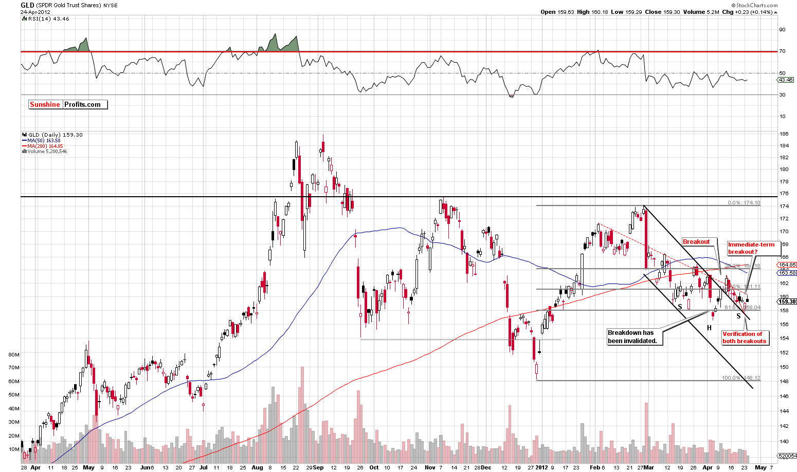
This is a bullish chart. It features a long consolidation, followed by a breakout, which was followed by a consolidation and this consolidation itself now appears to have ended as the prices have… broken out above the declining support line and the following mini-consolidation pattern. It sounds quite complicated, but when you look at the chart, it should become clearer.
Monday’s move lower was actually a verification of two breakouts, so it was not a bearish sign. Actually, based on Monday’s low, a bullish reverse-head-and-shoulders pattern has emerged. What’s even more interesting, is that the whole March-today time frame can be viewed as the right shoulder of a bigger reverse-head-and-shoulders pattern (Sep 2011 bottom being the left shoulder and Dec 2011 bottom being the head). The implications are clearly bullish.
The third and final chart for today is the one featuring the silver:gold ratio.
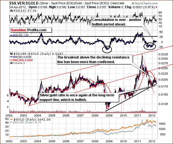
The key point here is that the ratio reached the long-term support line. In the latest Premium Update we wrote that based on this chart, silver is likely to outperform gold in the months ahead, though not necessarily immediately. Right now, thanks to silver’s recent move lower, we have a clearly bullish picture. The white metal is also approaching its short-term cyclical turning point, which given the nature of the current price move – is bullish.
Summing up, the situation remains bullish for the whole precious metals sector although short-term performance might not indicate that and that we may not see much higher prices immediately (though today's intraday price action (V formation) is very bullish). These are trying times, but we believe that being patient and long will provide a significant pay-off.
Our next Premium Update is scheduled for Friday, April 27, 2012.
Thank you for using the Premium Service.
Przemyslaw Radomski

