
The New York Times headline this week caught our attention--"In Striking Shift, Small Investors Flee Stock Market."
Investors, having lost their appetite for risk, withdrew a staggering $33.12 billion from domestic stock market mutual funds in the first seven months of this year, according to a mutual fund industry trade group. Many are flocking to investments they consider safer, like bonds. (We of course, deem gold to be a safer bet, but more on that later.)
Over the years, as Americans have become more responsible for their own retirement, they have poured money into stocks. Half of American's households own shares directly or through mutual funds. That makes the turnabout striking. So does the timing. After past recessions, ordinary investors have typically regained fervor for stocks in hopes of profiting from economic recovery. This time, even as corporate earnings have improved, Americans have become more cautious with their investments. They feel the fierce headwinds blowing against any economic recovery.
The Federal Reserve chairman, Ben S. Bernanke, gave his strongest indication yet on Friday that the central bank was ready to resume huge purchases of longer-term debt, and was determined to prevent the economy from slipping into a cycle of falling prices.
While Bernanke reiterated that deflation was "not a significant risk for the United States at this time," he said the Fed "will strongly resist deviations from price stability in the downward direction." It was his strongest statement to date that the Fed would do its part to avoid a Japanese-style deflationary spiral from taking hold.
Also on Friday, economic statistics released offered the clearest sign yet that the recovery had slowed to a crawl. The government lowered its estimate of economic growth in the second quarter to an annual rate of 1.6 percent, down from an initial estimate of 2.4 percent issued last month. Market's reaction toward these numbers was limited, suggesting that this news was already "in the price". In other words, investors were not surprised.
It is possible that the basic belief, set in stone, that stocks are a profitable investments over time has been eroded. It may take time before we know if this shift in investor psychology is long-term or not. As Reuters report this week, a record number of U.S. workers are tapping into their retirement accounts to make it through the economic downturn. Some are taking loans against their retirement funds while others are taking early hardship withdrawals to prevent foreclosure on a home or to make ends meet.
It didn't help that housing sales in July plunged 25.5 percent below the level of a year ago. The steep decline surprised nearly every analyst and put the volume of single-family home sales at the lowest level since 1995. The financial markets took the news badly on Tuesday with the Dow Jones industrial average closing down 134 points to a six-month low. As investors sought security, gold went up and the yield on the two-year Treasury note fell to a record low.
The surprising thing is that Americans are withdrawing money from stocks even when share prices are rallying. The stock market rose 7 percent last month as corporate profits began rebounding. During this time investors withdrew $14.67 billion from domestic stock market mutual funds in July, according to the investment institute's estimates, the third straight month of withdrawals.
A big beneficiary of these withdrawals has been bond funds. The Investment Company Institute reports that from January 2008 through June 2010, outflows from equity funds totaled $232 billion while bond funds have seen a massive $559 billion of inflows. Investors plowed $185.31 billion into bond mutual funds in the just first seven months of this year.
The amount of money flowing into bond funds is poised to exceed the cash that went into stock funds during the Internet bubble, fueling concern that fixed-income markets are headed for a fall.
Are Treasuries a Bubble?
There are mixed opinions on this subject.
According to Dennis Gartman, editor of the Gartman Letter, there is no bubble in Treasuries. The huge rally in Treasury bonds, which has sent the two-year yield to a record low, "is a tectonic plate shift", he told Bloomberg. The shift is one toward savings and safety in the wake of the financial crisis.
Wharton Finance Professor Jeremy Siegel disagrees. He says a bubble is indeed brewing in the bond market and that investors will pay the price. Those who continue to rush into bonds are making the same kind of mistake investors made back during the technology bubble of the late 1990s, he says. In a recent Wall Street Journal article co-authored with fellow economist Jeremy Schwartz, he wrote:
"Those who are now crowding into bonds and bond funds are courting disaster. The last time interest rates on Treasury bonds were as low as they are today was in 1955. The subsequent 10-year annual return to bonds was 1.9%, or just slightly above inflation, and the 30-year annual return was 4.6% per year, less than the rate of inflation.
Furthermore, the possibility of substantial capital losses on bonds looms large. If over the next year, 10-year interest rates, which are now 2.8%, rise to 3.15%, bondholders will suffer a capital loss equal to the current yield. If rates rise to 4% as they did last spring, the capital loss will be more than three times the current yield. Is there any doubt that interest rates will rise over the next two decades as the baby boomers retire and the enormous government entitlement programs kick into gear?"
Barry Ritholtz wrote in his blog that US Treasuries remind him of the dot com stocks circa 1997-98. Gloom, Boom and Doom editor Marc Faber advises investors to avoid long-term bonds.
Are Bonds Better than Gold? You've Got to be Kidding
Let's do some bond math. Ten year treasury bonds currently yield a measly 2.60%. The average bond fund charges 0.61% in annual fees. That means that right off the top, investors are giving up 25% of the interest. In the best case scenario investors can earn interest in that bond fund of less than 2%. But if you consider the worst case you can have second and even third thoughts about investing in bonds.
If the yield goes up to 4%, which it did several months ago, investors will lose about 10% of their principal. It is possible that the yield will go much higher - over the coming decades that is.
In addition, inflation has averaged about 3% over the past several decades (according to official numbers, which - according to shadowstats.com - are understated). When you compound 3% for ten years while you are only earning 2.6%, you have negative real returns. With the massive printing of money and huge budget deficits, we believe inflation will be much higher in the future. Keep in mind that in the early 1980s we had inflation in the double digits. The ironic thing is that in the 1980s, when interest rates were in the high teens, nobody wanted government bonds. Investors weren't willing to accept 15% interest rates from the government, because the national debt was fast approaching $1 trillion, which was one-third of GDP.
Now we can only look back and laugh. Today, with interest rates of 2.5%, investors are flocking to bond funds. Meanwhile, the national debt will hit $15 trillion and reach 100% of GDP next year.
The pro-bond group points out that unlike other investments; one can hold the bonds till maturity without losing any of your capital. That is certainly true. But it still doesn't make ten-year bonds at a 2.60% yield a good investment now.
If you do allocate a portion of your portfolio to bonds, make sure you do your homework when shopping. Firms that sell bonds mark up the price anywhere from $5 to $10 per $1,000 bond. Since tax-free yields are at their lowest levels in four decades, make sure you're getting the best price.
If bonds aren't such a great idea, what is left? There are those, like Robert Prechter, who believe that safety in a deflation is to have your money in cash. We tend to question the safety of the US dollar and other fiat money with it. It is our bet that when push comes to shove people will turn to the only money they can trust -- gold. We saw some evidence of that this week when gold futures on Wednesday topped $1,240 an ounce, the best levels since early July, as stocks bottomed. Fear fueled safe haven gold buying.
To see what is in store for gold this week, we will turn to the technical portion of the Premium Update and begin with analysis of the Euro Index. We will start with the long-term chart (charts courtesy by http://stockcharts.com.)
Euro and USD Indices
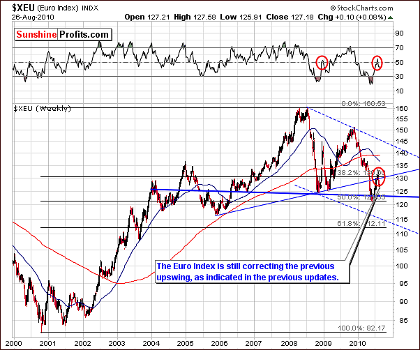
Once again this week, the long-term Euro Index chart reveals very little new information. Things have pretty much remained status quo for the past two weeks as the correction is still underway. The closing level for the Euro Index on Thursday was actually nearly identical to where it stood on July 13, more than seven weeks ago. Furthermore, daily closing levels have been within a narrow trading range with less than a 2% average deviation from the mean daily close during this period.
Last week we stated that "the correction is still in progress and it is not uncommon for periods of this type to continue for several weeks". The subject of whether the bottom is in or not will be addressed in the following paragraphs, in which we analyze the Euro Index short-term chart.
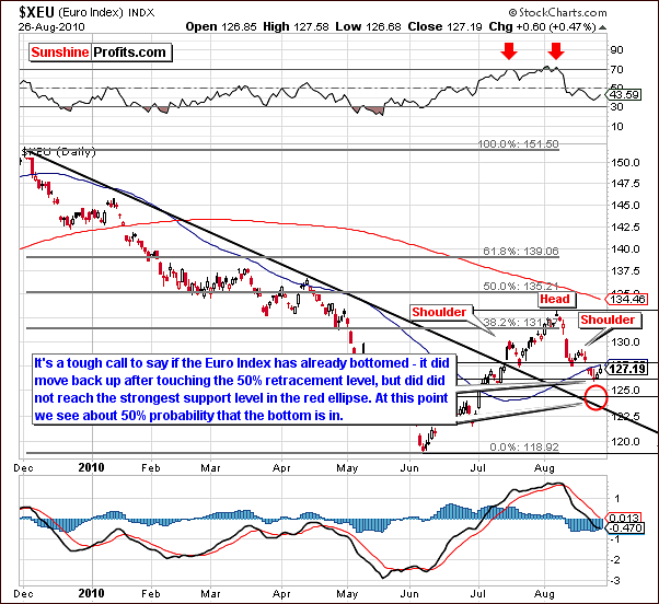
In the short-term Euro Index chart this week, we see further confirmation of the head-and-shoulders pattern. Since our last update, index levels moved down slightly and since Tuesday's intra-day low just under the 126-level have moved back up a bit. The 50% Fibonacci retracement level was reached and seemed to provide at least some support. The completion of this bearish pattern would spell further declines for the euro and have implications upon the dollar and precious metals as well.
It is possible that the bottom has been reached but the supporting factors do not indicate this with any serious strength. Further declines are therefore possible and the likelihood of the bottom being in already is around 50%. It does not appear, however, that betting on lower index values in the near-term would be wise at this point. The coming days will likely clarify this situation significantly.
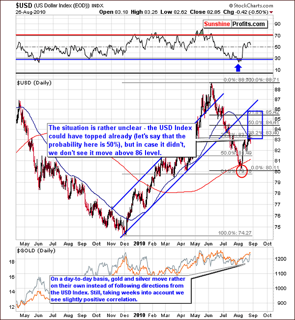
In this week's long-term USD Index chart, we see that the 38.2% Fibonacci retracement level coincides closely with Thursday's closing level of 82.85. This is important because it marks the first probable resistance level for the current rally. Both the 50% and 61.8% retracement levels are set to provide resistance should the 31.8% level be broken.
On both Tuesday and Wednesday this week, the intra-day trading level moved above the 38.2% level of 83.40, but on both days, the USD Index closed slightly below at just over 83. With Thursday's close slightly lower again, the local top being in is a real possibility at this point in time.
Once again, we pause to consider the relationship between the euro and the dollar and how these two currencies inversely react to one another. If the euro has bottomed (as discussed in our opening section), the dollar has likely topped. Should the euro move yet lower in the coming days, the dollar will likely climb a bit higher. It appears to be about a 50 - 50 likelihood as to what will actually be seen in the week ahead.
Another important level of support and/or resistance is the 50-day moving average. We have seen the USD Index pause after approaching this important average (as resistance prior to December 2009, and as support afterwards), which happens to be closely aligned with the 38.2% Fibonacci retracement level at this time. This additional resistance further supports the possibility that the top may be in.
All in all this is bearish news for gold, silver and mining stocks. Although the precious metals have moved independently on a day-to-day basis recently, local tops and bottoms have generally coincided with the USD Index. In June, a local top was seen in the USD Index followed shortly thereafter by tops in the precious metals markets. Once again we are likely seeing possible tops in the precious metals markets, which could coincide with those in the USD Index. Of course, there are many additional factors pointing to a short-term correction in gold, silver, and mining stocks, not just USD/euro analysis.
Note: This week we will not publish the short-term USD Index chart as there was minimal information provided which we had not already seen and discussed in the long-term chart analysis. Summing up, the Euro Index may have reached a local bottom, which will likely also align with a top in the USD Index. Although both may be a few days away, it is likely they will be seen quite soon. The outlook for gold, silver, and mining stocks is therefore bearish for the near-term as lower prices are likely to be seen shortly after the euro and dollar reach their turning points. It is possible that metals will move lower even without influence from currencies, so the odds for the decline in metals are higher than for the abovementioned moves in currencies.
General Stock Market
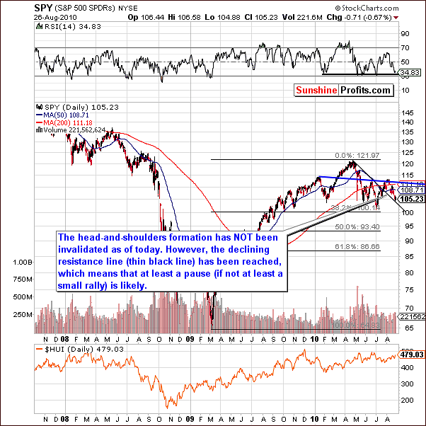
In this week's long-term general stock market chart, we see that prices have continued to decline as indicated in the previous updates. Once again, the head-and-shoulders pattern has not yet been invalidated, but the support line has been reached. This could mean additional sideways movement for stocks in the coming days - or - more likely - at least a small rally.
Also, the RSI is at a level consistent with recent local bottoms. It is likely therefore, that we will see a pause in the decline or even a small rally from here. More details are visible in the short-term chart analysis following.
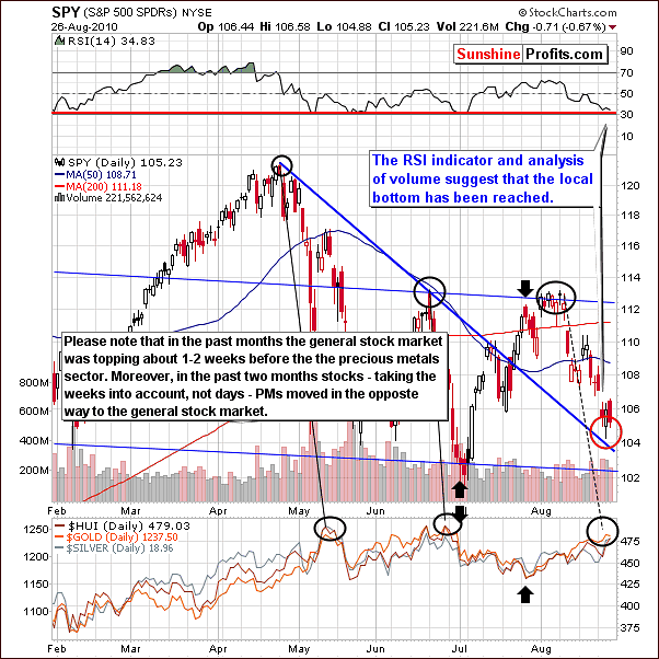
In this week's short-term chart, we see that the RSI has declined to 30. Furthermore, the daily price action and corresponding volumes seem to indicate the next general direction for stocks is up. Thursday's price declines were accompanied by volume levels, which were lower than levels seen with Wednesday's higher prices. As we have discussed many times in the past, in most cases (some markets don't follow this rule - see the silver section for details), higher volume levels generally indicate market strength and increase the likelihood of short-term market moves in the direction as seen on these high volume days.
One phenomenon, which we previously commented upon, is that tops in the general stock market normally precede those seen in precious metals by a few weeks. This is still relevant. This further supports the likelihood that lower prices will be seen in the near-term for precious metals in general.
Additionally, please take a look at the days marked with black arrows on the above chart and note that since the beginning of July gold, silver, and mining stocks moved inversely to the general stock market. The July bottom in stocks more or less corresponded to the beginning of decline in the precious metals sector, and the late-July high (it was not the final one, but very close the final top for this rally). Consequently, if the general stock market is likely to launch a small rally here, this could very well ignite a sell-off in the metals.
Summing up, stocks have recently declined and have reached expected minimum target levels on the downside. RSI, price levels and volume indicate a possible turnaround within a few days and higher prices forthcoming. This is bearish news for gold, silver and mining stocks, which will likely see lower prices very soon.
Correlation Matrix
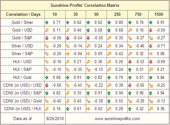
In the Correlation Matrix this week, two coefficients are particularly important this week. First, gold is negatively correlated with the general stock market - Gold / S&P and secondly, gold is positively correlated with the dollar - Gold / USD. Unfortunately, the 30-day and 90-day columns do not reflect the true strength of the correlation here. A 50-day (taking data from the beginning of July to today) column would clearly show a much stronger relationship.
The important factor here is that these two correlation coefficients further confirm that lower prices are quite likely for gold, silver and mining stocks. This is another clue that leads us to delve further into charts and market indicators, which further paint the bearish picture for precious metals in the near-term.
Gold
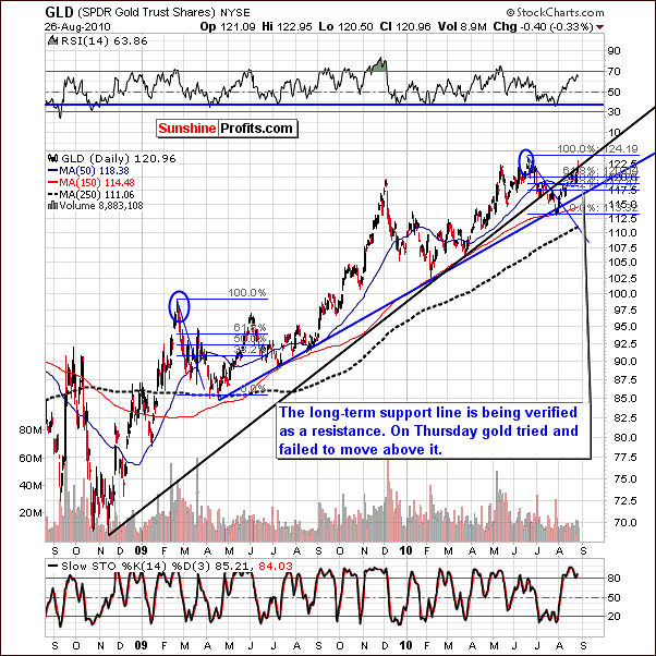
The long-term chart for gold this week shows that the long-term rising resistance line may very well hold this rally in check. Although we have seen an aggressive intra-day attempt to move back above the line on Thursday, the market finally closed below it and therefore price action failed to verify any breakout. Indications are that the probability of a correction is fairly strong.
In the past, we have seen the post-decline quick rally followed by lower prices but this is not the case today - yet. In the period following the 2009-high, gold's price moved above the 61.8% Fibonacci retracement level but not to the level of previous highs. It declined soon afterwards.
In the short-term chart this week, we see a larger target area, between $112 and $116. This is based on the July low as well as the 150-day and 250-day moving averages. These two moving averages used to stop declines in the past.
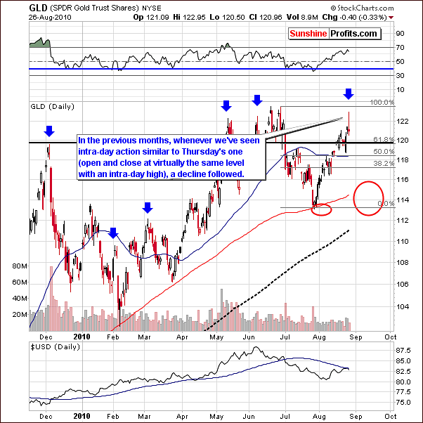
The intra-day price action on Thursday was particularly interesting - the price moved much higher on an intra-day basis only to close at the level close to its opening price. This has created a "shooting star" candlestick bearish pattern. Before stating that this is indeed bearish we were searching for a similar price action following a rally, and we found several previous occurrences. Each time, a decline in price followed. - Please take a look at days indicated by blue arrows on the above chart. This is yet another confirmation that investors who are short presently are likely to profit rather sooner than later.
From a non-USD perspective, the most obvious development is seen in the RSI section above the chart. The RSI has moved very quickly from 30 to 70 and previous moves which have been this sharp have been followed by periods of decline. Notably this happened in September 2008 when the subsequent decline was in excess of 15%. Also, the July 2008 top was preceded by a similar action in the RSI.
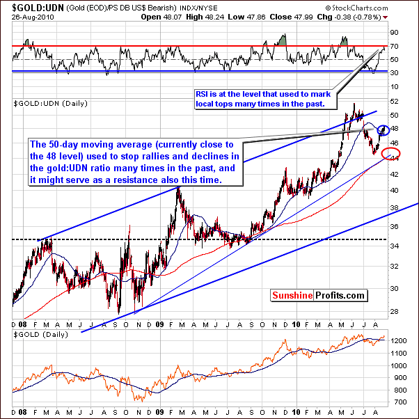
The 50-day moving average is presently near the 48-level and has stopped rallies in the past. This may very well be seen again. Betting on higher gold prices in the near-term appears to be very risky at this time (speaking of speculative capital of course - not long-term investments).
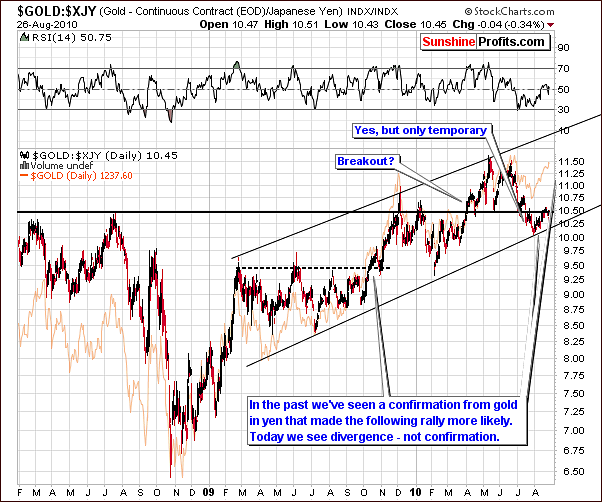
Looking at gold in terms of the yen gives us a new perspective and yet another tool for confirmation or non-confirmation of market trends. While USD/yen currency exchange rate is included in the USD Index, and consequently it is included in the UDN ETF, and thus in the gold:UDN ratio, its weight is much smaller (13.6%) than the one of USD/euro (57.6%), which is why the above chart is not really similar to the gold:UDN ratio chart. This lack of similarity is valuable here, as it provides us with a way to confirm the analysis of other gold charts. The 2009-breakout (and the following verification) was confirmed by this chart and it is clear to see that this is not the case today. No confirmation is seen and in fact a divergence is supported. The one message given by this chart is clearly "Something is not right with this rally".
Summing up, when analyzing gold with the usual charts and tools as well as incorporating new methods, multiple sources provide evidence supporting a likely correction in gold prices as being probable. Further support of this outlook will be provided in sections which follow. The likelihood of the decline still appears to be about 70% at this time. The recent price increases have not changed the short-term outlook for gold.
Silver
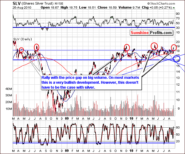
The most visible development in silver in the past few days has been a big move higher on high volume that created a price gap (a price gap is when the opening price is higher than the previous day's close). These are normal bullish signals for strong markets and commonly seen in rallies, which do not appear to be drying up. However, these signals simply do not hold true for silver.
Please take a look at the above chart - at the areas marked with red ellipses. These are moments when silver appeared to be breaking out (at times on strong volume) that created a price gap. What type of action followed? Declines - not rallies.
As mentioned in several previous updates, silver is quite tricky and frequently, the typical market signs do not apply. General speaking, before applying a technical tool to any market, one should check if it did indeed work in the past (if it didn't - don't bother using it, unless you have very strong reason do to so), and keep in mind that individual market's specific behavior (here: silver) is more important than the "typical rules".
In the past, periods in which price gaps and high volume were seen have not necessarily coincided with rallies. These signs have been seen both near market tops and bottoms and in actuality are simply not bullish today.
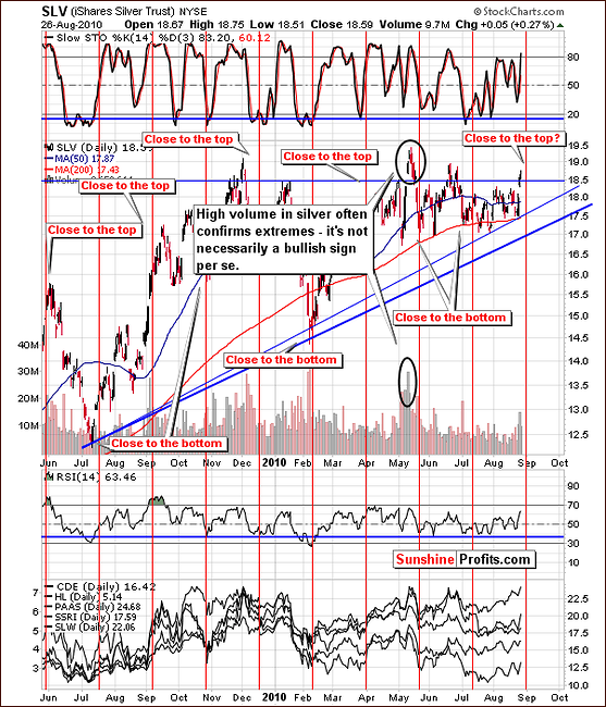
The short-term chart this week features an example of a "fake-out" on a very strong volume that also created a price gap. At that time, silver's price dropped more than 12% in a very short time.
Another factor which we must keep in mind is the approaching turning point as indicated by the red vertical lines in our chart. We have discussed these periodically and it appears that signs point to a local top soon to be seen. The possibility exists that the top is already in. Whether this turns out to be true or not, lower prices seem quite likely in the very near future.
Summing up, normal market signals frequently do not apply to silver, which routinely moves in volatile and uncertain manners. In this case, signals that normally appear bullish should be taken with proper distance in case of the white metal.
Precious Metals Stocks
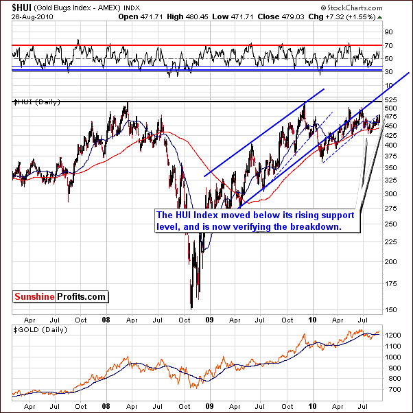
In the HUI Gold Bugs Index chart this week, we see an attempt to move above the trading channel. In early July, a downturn moved prices below the trading channel and recent moves have been back close to this level. It is important to note however that no move managed to take the index back above this rising resistance line. This is a slightly bearish factor that likely points towards yet another downturn in the days ahead.
As mentioned in the latest Message that we've sent to you the very-long-term XAU Index chart shows that precious metals stocks are on the verge of breaking below a multi-year support level. If they do, things could get ugly.
Let's take a look at the chart below for details.
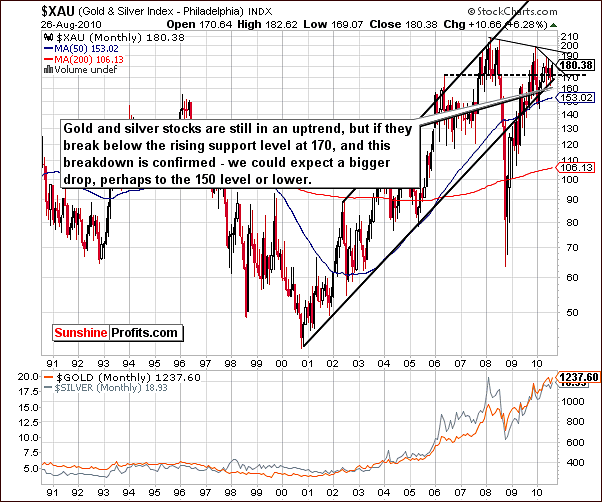
The very long-term XAU Index chart clearly shows precious metals stocks in general to be at a critical juncture. Present levels are slightly above the lower border of the multi-year trading channel at a level just below 170. The weeks ahead could be very ugly for precious metals markets if the XAU Index manages to move below this particular level. Only once before have we seen a break below this trading channel. This happened in 2008 and the decline was truly severe. As measured by the XAU Index, precious metals declined about 50% from the point of breaking below the lower trading channel border.
If, however, the support line holds and prices move slightly higher, a strong rally could follow. The odds at this time clearly favor a quick move lower and a likely temporary period of decline. The severity does not appear likely to be what it was in 2008 but the risk of a strong decline is relatively high. We will elaborate on that once the prices break below the 170 level, and this breakdown is verified.
Meanwhile, let's take a look at the short-term picture.
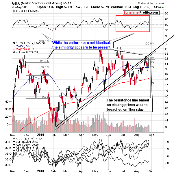
In this week's short-term GDX chart we see the resistance line which is based on closing prices has been touched but not broken. This gives clear indication that the trend is not clearly up at this point. Intra-day highs have temporarily moved above the resistance line but the price did not manage to close there - it always retraced, which is not really a bullish signal.
Furthermore, the RSI closely resembles the pattern seen at the time of the December top and therefore point towards likely lower values in the short-run.
Summing up, precious metals stocks overall did not show enough strength to break higher above resistance levels. This gives strong indication that the general direction in the near-term for gold, silver and mining stocks may very well be down.
Ratio Analysis
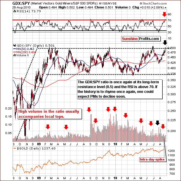
The GDX:SPY ratio is currently right at its strong multi-month resistance line. The current level of .50 indicates that two shares of GDX ETF equal one share of SPY ETF. Previously, this ratio level was seen resulted in a local top and an RSI in the 70-level range. Historically, this has meant lower prices soon.
Speaking of the RSI, the shape of its pattern is also worth noting. Favorable comparisons of this type can be seen with June 2009 and December 2009 tops. Each of these rallies took RSI from 30 to 70, lasted about a month and was followed quickly by sharp declines. Lower prices are likely to be seen soon in the precious metals markets.
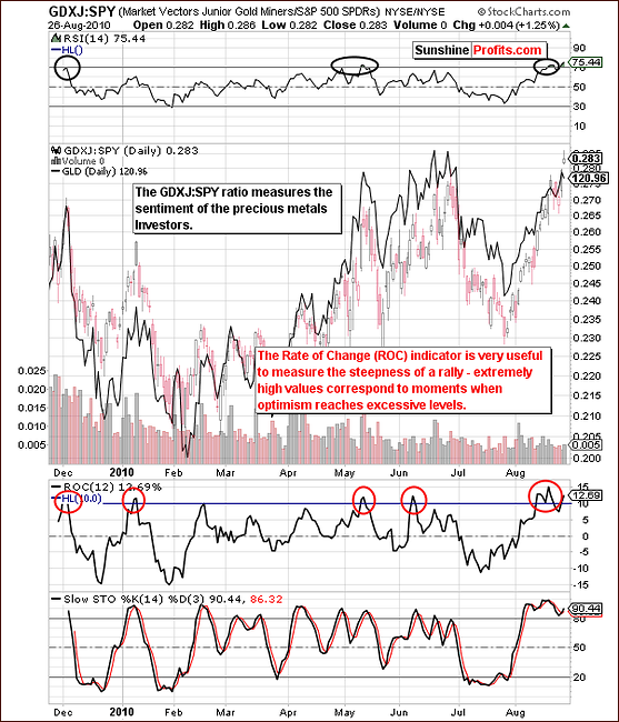
As we have thoroughly explained last week, the GDXJ:SPY ratio serves to isolate the emotionality regarding gold. The GDXJ represents juniors. Normally the smaller companies outperform larger mining companies (seniors) when stocks are rallying and underperform when stocks are declining. The emotions of individual investors greatly influence this market.
When the ratio is excessive, emotionality is in great supply and a local top is likely to be seen. In last week's update we stated the following:
(...) we've been striving to find a way to measure this phenomenon and we believe we found two ways to do it.
First is taking a look at the values of size of a rally in the ratio and comparing it to the size of the rally in gold. If it's bigger it means that the public is very excited about this rally, which suggests that a correction will be seen quite soon. We've seen that in early January, May, and June 2010.
If the rally is smaller than that of gold, it means that people are still waiting on the sidelines and are ready to jump back into the market once they get more convinced about the rally. When would that take place? When price rises. Consequently, when the prices rise, people will buy more and the prices will rise even further. Yes - it is against the buy low, sell high rule, but this is how things play out most of the time. We've seen that since February to early April 2010 - and the rally continued afterwards.
The second way to analyze the ratio is to apply indicators, and two of them appear particularly useful. The less useful of these two is the well-known RSI indicator - please take a look at the areas marked with black ellipses. The signal is visible only for most important tops (it is visible today though...).
The most useful indicator here appears to be the Rate of Change indicator. As it name suggests, it measures the rate of change, which is another way of calling the "steepness of the rally" or its "rapidness". High values here indicate optimism. As visible on the chart above, excessive emotions result in an ROC greater than 10, which likely results in a top forming soon thereafter. The ROC indicator was just at the 15 level - actually an all-time high for this indicator when applied to this particular ratio, which serves as a strong indication that the local top is in or is very close to being in.
As you may see on the chart above, we see further indications of the excessive optimism among precious metals Investors. One of the questions that we've received this week was about the fact that most of the time this ratio appears undervalued. Generally, that is true, and the long-term implications are bullish for the metals. Most of the time we don't have the excessive optimism like we have today and the trend remains up, as new Investors "discover" precious metals and enter the market.
This week, we would like to supplement the above analysis with one more chart measuring this phenomenon - from a different angle.
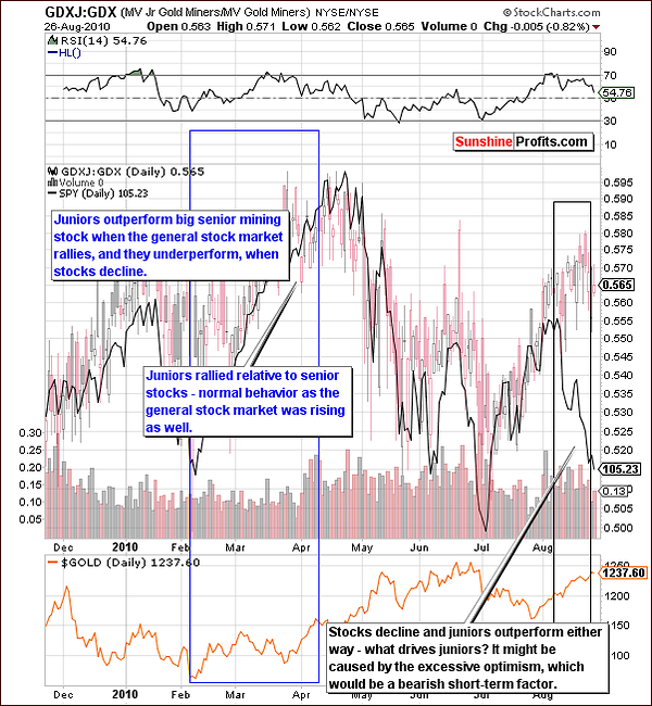
The GDXJ:GDX ratio involves both juniors and seniors and gauges the emotions relative to the general stock market only. In other words, while the GDXJ:SPY ratio is designed to isolate the influence of the emotions related to gold, the GDXJ:GDX ratio aims to isolate the influence of the general stock market on juniors. In the past we have emphasized many times that the junior sector is influenced by moves on the general stock market, and if that is the case, we should see that in the ratio - and we certainly do.
Please note how perfectly the candlestick and line patterns align - juniors' performance relative to seniors is clearly driven by developments on the general stock market (while the chart doesn't say that, it's obvious that the relationship is not the other way around - it's hard to imaging Google, McDonald's, Walmart, and thousands of other stocks being driven by the small juniors mining companies). Remember the 2008 carnage on the general stock market that caused a deep decline in the values of many junior stock companies? Many analysts (who lost their money as they didn't diversify between many parts of the precious metals sector, not to mention diversification between strategies) were screaming about manipulation that had supposedly taken juniors down. It would most likely not be the case had they known about the abovementioned relationship.
Anyway, the important thing on the chart above is that since early August we see a very strong divergence between the GDXJ:GDX ratio and the SPY ETF (proxy for the S&P 500 Index). Since the second week of August, this ratio has rallied while stocks have declined.
Our interpretation of this fact is that something else is driving juniors and that it has to be related to emotions concerning gold and silver. Right now, optimism is excessive enough for the ratio to move higher even despite stocks' decline. One of Warren Buffet's quotes - "be fearful when others are greedy and greedy when others are fearful" is profoundly applicable to today's trends, as the above chart should make one concerned about the healthiness of the current rally. Local tops are likely forming or will be formed soon. Lower prices will probably follow.
Other Information
We've received several questions this week (thanks) - we've already replied to some of them earlier in this update, but there are several that we would like to comment on separately. The first one is not really a question, but a link to a report it might be worthwhile to read - its title says it all - "Goldman Tells Its "Special" Clients To Sell Gold Even As It Raises Its Price Target On The Shiny Metal".
The particularly interesting topic that we were asked to comment on is the Hindenburg Omen (it name comes from the Hindenburg catastrophe of May 6, 1937, when the German Zeppelin Hindenburg was destroyed). We believe that the reason that we received questions about this phenomenon is that it flashed two signals in the past two weeks.
Without going into details - this is a rather sophisticated technical indicator that is based on the number of stocks that formed a new 52-week high, and that reached a 52-week low. Other exchanges can be used, but typically NYSE is. The idea is that when there is a large number of both new lows and new highs on the market, then there is a high probability of a big downswing in the market in the following several weeks/months.
Therefore, the Hindeburg Omen is a long-term indicator, not necessarily a short-term one, which doesn't invalidate points made earlier in this update - that a short-term rally could be seen in stocks soon. Bigger decline could follow then.
However, before summarizing we would like to state that we see the logic behind this indicator as credible. We have not tested/verified the accuracy of this indicator ourselves, but the reason is that... We've come to the similar conclusion on our own regarding the precious metals market about 1.5 years ago. Our Premium Charts section includes a Details and Performance link, where you can expand the box "Find out how we created one of our Indicators" - it's about our SP Gold Stock Extreme Indicator (note that it flashed a signal when the HUI Index topped in May 2010). Once you go there, you will notice that while our road toward similar calculations was different, but the main point is very similar. Quoting from that page: "if the abovementioned assumptions are mostly true, then the ratio between 'top' PM stocks and the rest should behave specifically around bottoms and tops". While we don't provide the exact formula, the idea is that we also (like it is the case in the Hindeburg Omen calculations) take a look at the divergence between leading and lagging stocks - when it's huge, the indicator flashes an "extreme" signal.
This is just a speculation at this point - but, if this indicator is correct, and the general stock market moves significantly lower and the recent correlation between stocks and gold remains negative, it could translate into the next massive upswing in the whole precious metals market. Again, we don't see that happening immediately, and we will certainly get back to this once we have more information in the following weeks.
Summary
Points made in recent Premium Update and in Messages issued this week remain unchanged as gold, silver and mining stocks are still likely to move lower soon. The probability of decline in the precious metals sector is still estimated to be around 70% with considerable chances that it will begin very soon.
Meanwhile, the Euro Index may have reached a local bottom, which will likely also align with a top in the USD Index. Stock market provides further confirmation of incoming decline for gold, silver and mining stocks, as it have reached expected initial target levels on the downside. We realize that it might be difficult to bet on lower precious metals prices at this point, but there are too many bearish factors not to take this scenario into account. We will thoroughly comment on the downside targets, when we are certain that the top has been formed.
Additionally, please note that the hardest investment decision that one can make is often the best one - most people do what they find easier to do (including investment-related decisions) and most people lose money through speculation.
As always, Sunshine Profits will continue to closely monitor all developments and notify our Subscribers immediately when the situation warrants.
This completes this week's Premium Update.
Thank you for using the Premium Service. Have a great weekend and profitable week!
Sincerely,
Przemyslaw Radomski

