
This week we saw evidence that this could be a long, hot summer for Wall Street. On Tuesday, fears that the global economy will tank cut a swath through the financial markets. Unpleasant economic news that in better days would have been shrugged off like water on a duck's back sent the broad stock market tumbling to its lowest level this year with the S&P 500 sinking 3.1 percent. Tuesday's decline left the index down nearly 7 percent for the year.
The immediate catalyst was concern that the Chinese economy might cool off and glum news about American consumers added to the unease. But investors already have plenty of other things to worry about; the fragile state of the U.S. economy and the financial crisis in the eurozone. If you add to the simmering pot the economic collapse in Greece, the frightening "flash crash", the BP oil spill in the Gulf of Mexico and the battle over financial regulation in Washington, you see why nerves are frayed.
And what did nervous investors do on Tuesday? They fled to traditional havens like U.S. Treasury securities and gold.
We understand the gold part, but U.S. Treasury securities? Many people still believe the new "classic zero-risk" asset is going to protect their wealth. They will be right in the vast majority of cases, but the problem is that the few remaining cases will cause their portfolios to decline in value in a spectacular way. We're talking about major events that would influence the global financial markets, such as the death of dollar (or euro) or massive sales of US bonds by foreign central holders (for instance China and Japan). The point here is not to create gloomy scenarios, but to put the emphasis on the fact that gold has been store of value throughout the history, and the fiat money, or any financial instruments were not. We live in particularly interesting times, so we find it crucial to make sure that our portfolio is safe in virtually all cases, not only in the majority of them.
Follow the Yellow Brick Road
Most of you must have seen the 1939 Hollywood classic, The Wizard of Oz, starring Judy Garland. In the film, Dorothy, a 12-year-old Kansas farm girl, is knocked unconscious during a tornado. (Read that as a metaphor for financial meltdown.) She, and her dog Toto, and the farmhouse are transported to the magical Land of Oz. There she sets out on the Yellow Brick Road to the Emerald City to ask the Wizard of Oz to return her to Kansas.
Think of the Yellow Brick Road as a metaphor for gold and the Emerald City as a metaphor for the fiat "greenback" paper dollar. The Emerald City's splendor is fraudulent and has value only because of an illusion shared by its citizens. Dorothy realizes that the Wizard (read as politician) has been using elaborate magic tricks and props to maintain the illusion.
You really would have to believe in fairytales and in magic to believe that a government can paper over every crisis infinitely without serious consequences.
Somewhere Over the Rainbow
That is why we find it strange that most people would seek safe haven in times of financial turmoil only in U.S. Treasuries. The yield on 10-year Treasuries pushed below 3% Tuesday while at the same time, gold rose to $1,242 and remains near record highs. As one writer put it, this seems "schizophrenic."
Why would anyone want to lock their dollars for 10 years at such a low rate? That would only make sense if they believe there is no inflation on the horizon.
Traditionally gold represents a hedge against inflation so people who bought gold believe there will be inflation - that is under the current economic system, where fiat currencies are used instead of the gold standard. Therefore, we believe investors who are betting on inflation and gold will do better in the long run than those who sought safety in Treasuries.
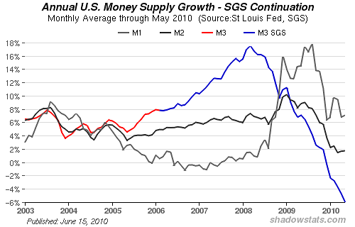
The question of whether the next few years will be dominated by inflation or deflation remains unanswered - the M3 growth is negative at this point according to shadowstats.com. Please take a look at the chart below for details.
In periods of inflation, tangible assets are the preferred asset class, whereas in times of deflation, cash is king. But please keep in mind that gold is liquid, indestructible, can be easily transported. It also has a worldwide market and it is no one's liability. It is cash of the highest quality. Therefore gold is the optimal investment both in deflation and inflation.
In any case, it is not likely that the Federal Reserve would allow deflation. It would probably begin quantitative easing to avoid getting caught in a Japan-style deflationary trap. Federal government stimulus spending would likely trigger a steep dollar fall, certainly against gold. The Fed would again print too much new money, causing inflation.
If deflation did take hold, gold would most likely still provide safe haven against more upheaval in the global-banking system. There is only one reason not to invest in gold. You should not invest in gold or silver if you believe that Somewhere Over the Rainbow skies are blue, sovereign debt problems will disappear and economic recovery is just around the corner.
The Group of 20 Wants to Cut Debt?
Speaking of sovereign debt, last week just after we published the issue of the Premium Update, the leaders of the world's biggest economies agreed on a timetable for cutting deficits and halting the growth of their debt. They also acknowledged the need to move carefully so that reductions in spending did not set back the fragile global recovery. The summit marked a major shift. Only 18 months ago the leaders were endorsing massive government spending to prevent the global recession turning into a depression. Last week they promised to work towards halving their budget deficits by 2013 and ensuring their national debts were stabilized or falling by 2016.
The action at the Group of 20 summit meeting signaled the determination of many of the world's wealthiest countries to move towards debt reduction. The example of Greece struck them with the fear that deficits represent the biggest threat to their economic stability. Speaking of debt reduction is one thing, and taking real steps to cut the expenses is something quite different. So, instead of opening the champagne and celebrating the fact that the governments have decided to take real steps against their problems (instead of temporarily printing their problems away), we will wait to see of any significant action follows.
President Obama advocated a measured approach to debt reduction that would not stymie growth that could lead to a double-dip recession.
Nobel Prize winning economist, Paul Krugman, is not thrilled with the result of the Group of 20 summit. He believes a third big depression is on its way. He wrote in a column recently in the New York Times:
And this third depression will be primarily a failure of policy. Around the world - most recently at last weekend's deeply discouraging G-20 meeting - governments are obsessing about inflation when the real threat is deflation, preaching the need for belt-tightening when the real problem is inadequate spending... In the face of this grim picture, you might have expected policy makers to realize that they haven't yet done enough to promote recovery. But no: over the last few months there has been a stunning resurgence of hard-money and balanced-budget orthodoxy.
You can't please everyone. But as we said previously, we believe gold will do well in both inflationary and deflationary scenarios.
And by the way, the movie The Wizard of Oz was based on the 1900 children's novel of the same name by L. Frank Baum. He wrote several books in the series, in which Dorothy returns to the Land of Oz. The books were almost prophetic for the purposes of our metaphor. In one of the books Dorothy moves Aunt Em and Uncle Henry to Oz when they are unable to pay the mortgage on the new house that was built after the old one was carried away by the tornado. That is true for many people today who have lost their homes in the financial tornado.
World's Largest Gold Coin
Last week the world's largest gold coin was sold at auction in Vienna for $4 million. A 2007 maple leaf coin with a face value of 1 million Canadian dollars weighs 220 pounds (100 kilograms) and has a diameter of 21 inches (53 centimeters). It was bought by Spanish precious metal trading company Oro Direct. The auction house said the impressive sum the coin fetched was largely influenced by the high price of gold. The coin was originally produced as a promotional product to give the Royal Canadian Mint a higher international profile.
It would certainly be nice to own one of the five coins that were produced in that series. To see how the price of gold will do in the near future let's begin this week's technical part with the analysis of the currency indices. We will start with the euro chart (charts courtesy by http://stockcharts.com.)
Euro and USD Indices
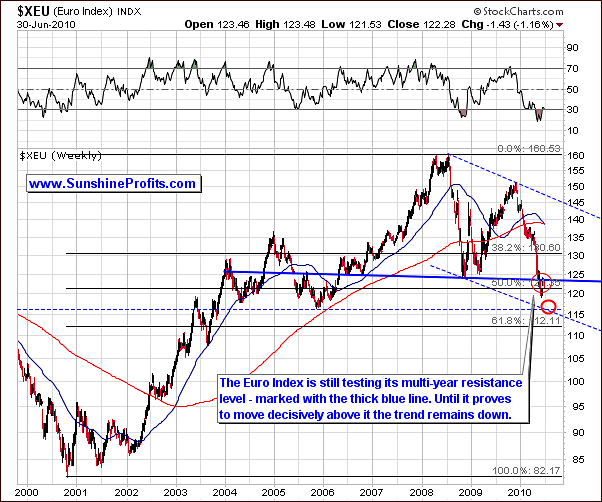
The downward trend in the Euro Index continued this week. A development of note is that the multi-year resistance level has been broken. This is a verification of the current downtrend as we indicated in last week's update and will likely result in further declines.
A close inspection of the RSI in the above chart reveals a slight increase which may seem to indicate a divergence from recent trends. Keep in mind that although that this will eventually happen, this slight clue from the RSI in no way indicates the exact timing in such a change. The fact that we do see this reversal in the RSI may indicate that a bottom is perhaps close but it may not be seen for a few weeks.
The most important point here is that the target bottom does not appear to be far away, but there are no indications that the bottom is in. The thick, red ellipse on the above chart is used to illustrate a likely target for the eventual bottom of this downtrend somewhere near the 115-116 area.
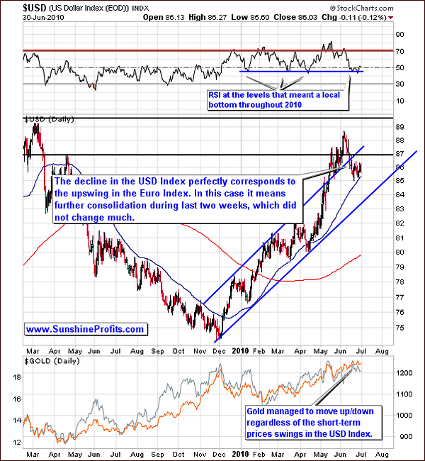
This week's long-term USD chart is, of course, a reflection of the Euro Index chart in the opposite direction. It seems a double-bottom has formed at the level of the 50-day moving average, which is indicated in the chart by a thin, blue, upward-sloping line.
This continuation of recent trends seen in the USD Index has also been accompanied by ongoing, independent trading within the precious metals sectors. The currency indices have had little direct impact on the PM sector in the most recent weeks.
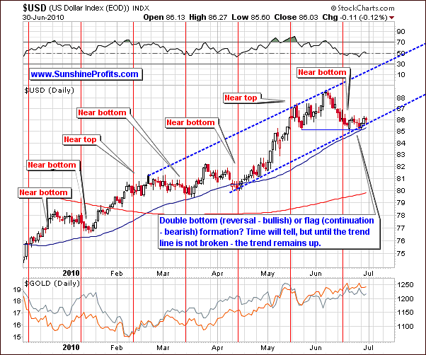
The short-term chart this week clearly shows how the USD decline has been stopped by the 50-day moving average. At the same time the lower border of the trading channel has also provided resistance to further declines.
There seems to be a good chance that the upside of the rally to come maybe above the level of previous highs. It is a bit premature to state this today; however a possible rise to the 90 level is within reach according to a general analysis of today's signals.
Most importantly, the USD Index trend is still likely to continue upwards. The price action seen over the past two weeks could be a double bottom pattern formation. We will have a much clearer insight on this in the coming days.
The implications for precious metals are nil at this point (unless you live outside of the US, but we will get back to this topic in the gold section). These markets have been moving independently, seemingly unaffected by the euro and the USD.
Summing up, last week's commentary at the end of this section still holds true. "The euro and the USD have recently wavered and no clear direction has been evident. For this reason, the PM sector has felt little impact from these indices." It is likely that gold and silver will be affected to a much greater extent soon, as the gold rally will eventually top out and the other precious metals will likely become more susceptible to market influences. As always, we will continue to monitor this situation on an ongoing basis and keep our Subscribers informed of any and all important developments.
General Stock Market
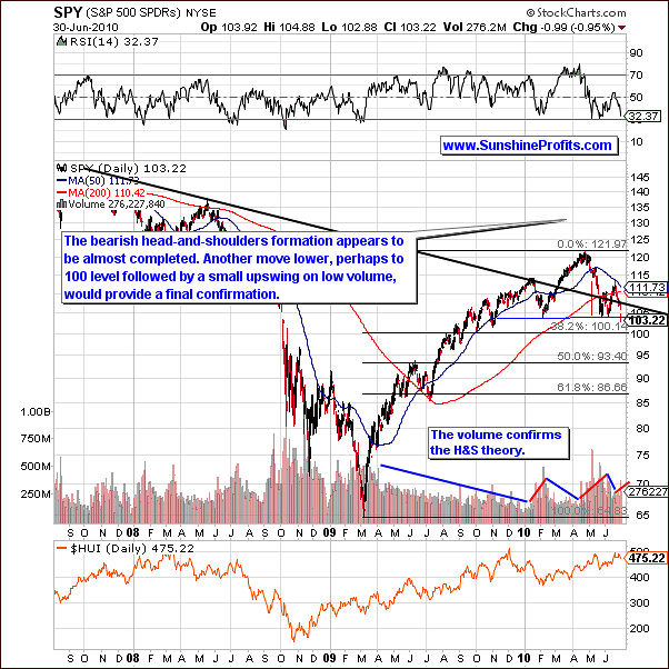
This week's SPY chart clearly shows a continuation of the bearish trends which were prevalent to last week. There has been continued development of the head-and-shoulders pattern and this has been confirmed by an increase in volume. The long-term chart above suggests that the pattern has yet to complete.
Note the low point is below two previous bottoms. Also, note the pattern in the chart of weekly volume levels. This bearish head-and-shoulders formation has and will probably continue to spell trouble for the general stock market. More details will be seen on the short-term charts.
The final confirmation of pattern completion will likely come from price movement in the SPY ETF or directly from the main stock indices such as the Dow Jones Industrial Average. Visible declining below the neck level (SPY: $103) and then increasing only slightly, accompanied by low volume increase would be a final confirmation of the bearish trend. Subscribers who seek to short the general stock market may wish to watch these signals closely as there may well be some good profit opportunities in this speculative activity.
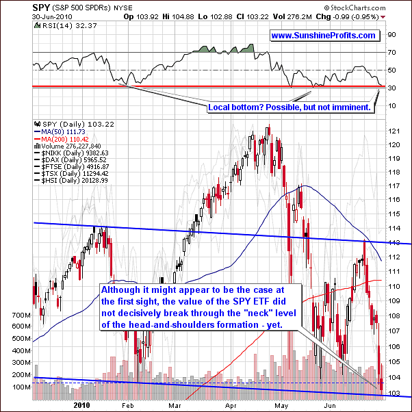
This week's short-term chart reveals that the June top is slightly below the one seen during in January. Since the right shoulder in the pattern is lower than the left, the neck is likely skewed as well.
The price would need to move below the solid blue line in the chart for completion of the formation. Without this type of movement, the breakdown is not complete although it may appear to be.
The RSI is presently in the 30 range, which corresponded to local bottoms in early May and February. However the late January RSI in this range did not result in a local bottom until a week later. In late May the 30 level in RSI did not mark the final bottom either.
Consequently, the RSI alone does not imply that the bottom is imminent. If price were to move sideways and then lower or simply move lower immediately the implications would likely result in the SPY ETF below a level of $103 and then moving up on low volume would be a bearish signal.
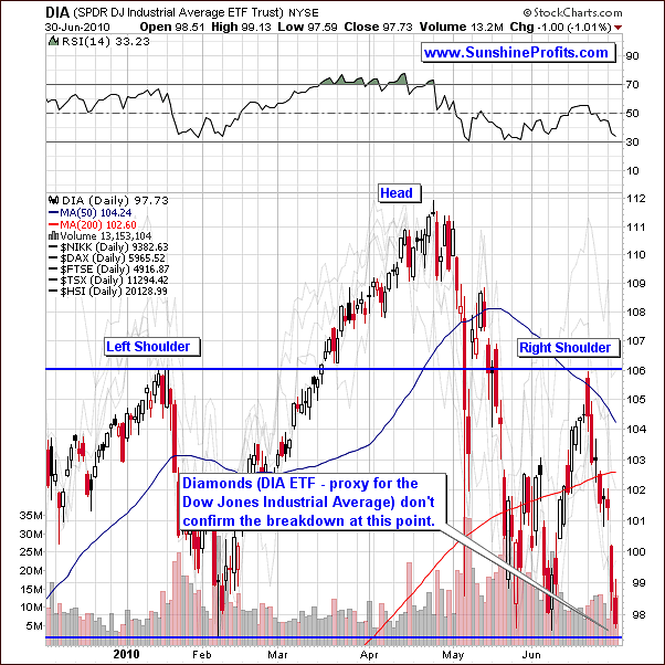
The DIA ETF, a proxy for the Dow Jones Industrial Average confirms the above comments about the non-existence of the breakdown at this point. The left and right shoulders are relatively equal - no breakdown has yet been seen here.
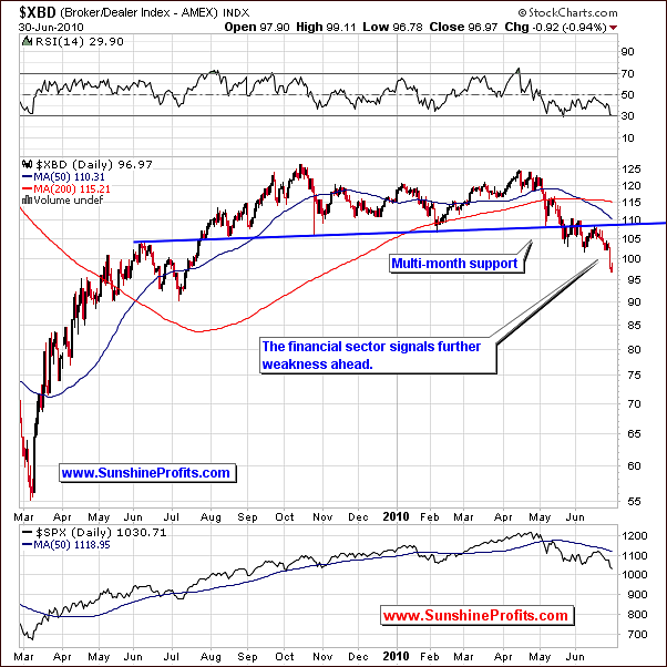
The Broker-Dealer Index this week indicates the likelihood of a breakdown. The financials have been very weak for several months and especially in recent days. This is normally a clear indication that declines will follow in the main stock indices.
Summing up, The odds favor a breakdown from the recent head and shoulders pattern in a continued move downward. Although this is not a certainty, it is probable. If the general stock market moves below the neck in this pattern and then rises slightly on low volume, shorting SPY ETF could be profitable.
Part of the precious metals sector, namely silver and mining stocks are at risk when the general stock market is trending in ways seen today. In does not seem to be the best time to speculate using them. As has been the case recently, gold continues to be preferred over silver and mining stocks for betting on higher short-term prices.
Risk and Reward - an Explanation and Example
We have frequently commented on comparisons between gold and silver investments. Recently we have repeatedly stated that silver and mining stocks are a much greater risk than gold as far as short-term speculation is concerned. This does not necessarily mean their prices will decline. It simply indicates that these metals are more vulnerable to general stock market weakness and therefore carry a higher probability of not moving higher. This can also be stated as a higher risk to reward ratio.
Caution: the following is an example to be used only for illustrative purposes. The quantities, percentages and dollar amounts quoted are not in any way implied to be meaningful except in explaining the risk to reward ratio.
Let us say, for example, that gold has a 90% likelihood of increasing in price, silver has a 70% chance and mining stocks have a 60% chance and all of these markets would move up or down by the same amount during the move. All would be likely to move higher since, in this example, all percentages are greater than 50. Since gold is the most probable to go higher, it would be less risky. Therefore, gold would be preferable over silver and mining stocks even if all of them are likely to rise.
To address the subject of risk to reward ratio, let us go a step further with our previous illustration. Suppose that we invested $1,000 in each of the situations above. Let us further hypothesize that the upside potential or likely profits were $400 for each if our investments all reached their full potential.
The likely gain, or reward, would be $360 for gold since there is a 90% chance of the $400 profit, $280 for silver which has a 70% chance of the $400 profit, and $240 for mining stocks. Since the risk for each was the investment of $1,000, the risk reward ratios would be 2.50, $1,000 divided by $360, 3.57, $1,000 divided by $280 and 4.20, $1,000 divided by $240 respectively. The statement gold has a lower risk-to-reward ratio that the other precious metals is thus supported by this example.
Another example: gold has a 90% likelihood of rising 10% higher (and if it moves lower, it would move 10% lower), silver has 90% likelihood of rising 11% higher (and if it moves lower it would move 50% lower). Which of them has the better risk/reward ratio? Gold - because even with higher profit potential for silver (11% vs. 10%) the real difference is what happens if the move up does not materialize at all (only 10% probability). In this case gold investor loses 10%, while silver investor loses 50%. We get the feeling that at this point you would have preferred to own gold instead of silver even though it had smaller profit potential. Of course, you cannot go back in time, so you need to take the negative outcome into consideration before you put your money on the table. In this case it would mean buying gold instead of silver even though it was likely to gain less during an upswing. Moreover, those who invested in silver could brag about their higher profits not mentioning the fact that they were risking 50% of their money, while gold investors only risked 10%.
Let's run a simple simulation for the above example. Speculation is not a one-time bet - it's a set of many bets, and what matters is if you lose or gain money in the long run. So, let's see what would happen if there were many similar situations to the one described above.
With 10% of losing and 20 trades the average value of losing trades would equal 2, so we would have on average 18 winning trades and 2 losing ones.
For 20 trades with the abovementioned odds and gains/losses the gold investor would gain 1.10*1.10*1.10*...*1.10*0.9*0.9 (18 times winning 10% and 2 times losing 10%). So, in the end the effect would be 1.10^18 * 0.9^2 - 1 = 3.50 meaning that the investor would gain 350% of their initial capital.
At the same time with the abovementioned odds and gains/losses, the silver investors would gain 1.11*1.11*1.11*...*1.11*0.5*0.5 (18 times winning 11% and 2 times losing 50%). So, in the end the effect would be 1.11^18 * 0.5^2 - 1 = 0.64 meaning that the investor would gain 64% of their initial capital.
Shocking isn't it? One could achieve over 5 times bigger profits just by paying attention to the "what if we're wrong" question. Moreover, if the gains and losses were spread evenly, the first loss would occur after 9 winning trades. Please recall that the profit potential alone was bigger for silver, meaning that if we had only winning trades one would have biggest gains by investing in this particular market. The point here is that up to this tenth trade gold investor would have smaller gains than his silver colleague, and the latter might argue that paying attention to losses makes no sense if markets are moving only up, and that the gold investor is wrong for preferring the yellow metal over the white one. The silver investor would have no idea that after his next trade he will wish that he had joined his golden colleague in the first place.
Please note that the above situation is just an example, in the future it could be the case that the risk/reward for silver is more profitable that the one present on the gold market.
Summing up, we strongly believe that the risk/reward ratio with focus on the long-term growth of one's portfolio is the most profitable way to approach any market, and that paying attention many factors instead of looking at the day-to-day gains will eventually prove very useful. Please keep the above examples in mind while reading through the silver and mining stocks' sections.
Correlations
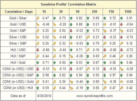
The correlation matrix has some changes this week compared to our previous update. The positive relationship for silver and mining stocks with the general stock market has declined somewhat. The corresponding coefficient for gold with the general stock market still remains lower than the other metals. What this means is that gold will generally be more resilient during a downswing; it will hold its value more so than silver and precious metals' stocks.
The significant declines seen early this week in the general stock market did not carry over to silver and mining stocks. This does not change our belief that gold remains a safer investment than these other sectors. History strongly suggests that this lack of impact upon silver and mining stocks could be short-lived.
Summing up, gold continues to be the best option for short-term trades. Our sentiment on the yellow metal has been consistent for several weeks. As we illustrated earlier in this update, the risk/reward ratio has been and continues to be more favorable for gold.
Silver and mining stocks could move higher from here along with gold, but should a significant decline occur (accompanied by further downtrends in the general stock market), they could decline more than the yellow metal. Simply put, gold is preferred in the short and medium-term. Silver and mining stocks continue to be quite risky for speculative capital at this time.
Gold
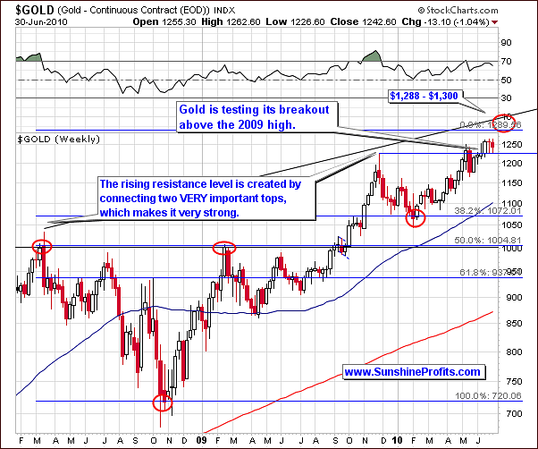
There has been very little change in this week's gold charts; we have basically seen a repetition of recent weeks with general sideways movement. The 1.04% decline this week is of little significance and the $1,300 target is still in place as an estimate top for this rally.
The fact that gold has maintain price levels above its 2009 top is further verification of the breakout. The main trend is unchanged and the target has not been invalidated.
The local top we have been moving towards still appears to be 1-3 weeks away.
Gold's daily activity from a long-term perspective continues as in previous weeks. The trend has not been broken although gold's price did drop below the rising support level for one day before moving up and closing above this support level.
In the past, significant tops frequently have formed when the stochastic indicator was above the 80 level. This situation is not in place today and it is possible that gold's price will go higher in the days or even weeks ahead. Let's take a look at the short-term chart for details.
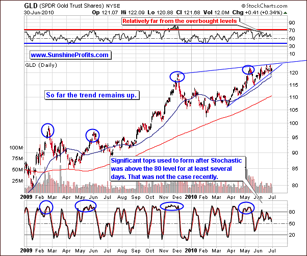
In this week's short-term chart, we clearly see that gold has continued trading within its recent triangle pattern. This is generally a sign that the current trend will continue and for this reason it is interpreted as a slightly bullish signal. Of course it would be much more bullish if the price had broken above the pattern and verified the breakdown, but remaining in the triangle is also bullish as most triangles are broken to the upside, especially if the preceding move was up.
Prices did show some sideways movement and some significant volatility within recent trading days. However, when this short-term noise is removed from the equation, we basically have a situation unchanged from last week. The triangle pattern will likely be eventually broken with a move to the upside and thus our target remains in place and our bullish sentiment continues.
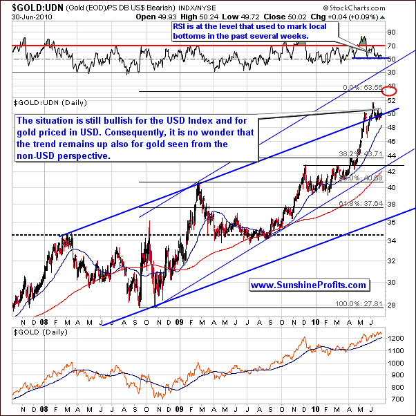
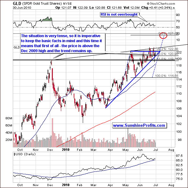
From the non-USD perspective gold prices are likely to continue upwards. As the USD Index continues to rise and gold priced in USD is also still likely to move upwards, the value of non-USD gold could increase because of both of the these factors.
Summing up, although in our latest Market Alert we indicated a possible downturn in gold prices, no verification of this has yet been seen. Gold's price trend likely will continue upwards, and our outlook for gold is once again bullish for the short-term. The top is likely to be reached in 1-3 weeks, with mid-July as the most probable time for this event. This is consistent with what we have stated in our recent updates.
At this point it's too early to say how low could gold go once the top is formed. We will get back to this topic once we are sure that the top is in.
Silver
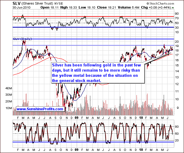
Silver prices did not plunge this week, which is encouraging news for those invested in the white metal. However, much of silver's recent success can be attributed to the strength of gold, which has significantly minimized the impact of the general stock market's decline upon the precious metals sector in general. It could be said that silver has recently ridden on the coattails of the gold rally. It does not appear to have the strength needed once the current gold rally completes, especially in times of a very bearish general stock market.
Historically, correlation between silver and the general stocks market is generally more positive than it is the case with gold. It is therefore more likely for silver than it is for gold that it will eventually follow the general stock market and the bearish times ahead do not bode too well for it in the short and medium-term.
As has been the case for several weeks at least, there is still greater risk in investing and speculating in silver as compared to gold.
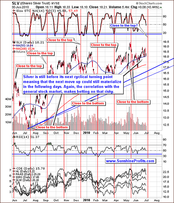
This week short-term chart was relatively unchanged from our last update. Indications point to the likelihood that a turning point will be seen soon, possibly along with the one in gold in 1-3 weeks. At the same time the risk associated with the general stock market causes silver not to be our metal of choice at this time.
Summing up, as we have stated in prior updates silver frequently will outperform near the end of a rally. Currently trading in the $18 to $19 range, silver may actually outperform gold on a very short-term basis, but it will be profitable to bet on it only after gold will break out of its triangle pattern and this breakout is confirmed.
Precious Metals Stocks
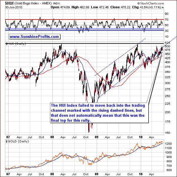
This week long-term HUI Gold Bugs Index chart shows little change from our previous update. We have seen continued sideways price movement as the rising resistance line has continued to hold. This does not automatically mean that a final top is here. As is normally the case, more details can be seen clearly in the short-term chart.
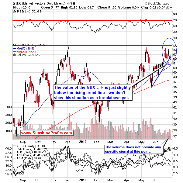
Volume level seen here at first glance seems to be slightly bullish. Price declines have been accompanied by low volume suggesting that many investors refuse to sell their gold and silver stocks. However, mining stocks are positively correlated with gold, so we would like the signals from volume to be in tune with each other for both GDX and GLD. That was not the case. The GLD ETF shows low volume but - unlike it was the case with GDX - prices have increased slightly. This also lacks the required clarity. Therefore, volume is not providing a clear signal and consequently we refrain from drawing inferences from this.
The GDX ETF is holding slightly below the rising support line. The move below this line has not yet been confirmed so we cannot yet speak of a breakdown. Two more consecutive days would be needed to confirm this breakdown. Another option that would confirm would be a move lower on high volume. There does not appear to be significant evidence supporting this possibility as of now.
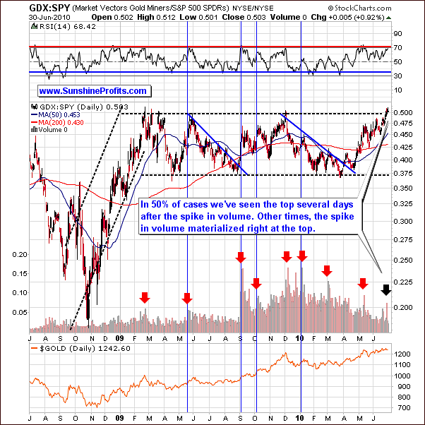
The GDX SPY was one of the topics discussed in our recent Market Alert and the fact that the spike in volume for this ratio often signals a local top in gold, silver and mining stocks. In the Alert we wrote the following:
On the other hand, at times (Sep 2009, Oct 2009, Jan 2010), this signal was a bit premature meaning that the final top is yet to be seen in the following days.
In addition to the above, the signal was also early in May 2009 - please take a look at the above chart for details. The vertical blue lines mark points when the single spike in volume was seen slightly before the top, not right at it. In sum, that was true in 50% of cases. Consequently, it appears likely that the top is close, but the decline from here is not imminent.
Combining the above with our earlier gold analysis, the suggestion is that the upward trend should continue and our targets are still valid and obtainable. The $1,300 level for gold is still a viable target and we expect a decline once such a level is reached.
Summing up, the situation in the precious metals stocks is similar to the one on the silver market. The level of risk certainly appears to be greater for gold mining stocks than for investment in gold itself. Still, mining stocks are not very likely to outperform during the final stage of the upswing as it the case with silver.
Additionally, please note how important it is to wait for a confirmation of a given move, for instance in the form of similar signals coming from a different type of analysis. Without such safety belt one would be very vulnerable to short-term volatile (yet, very temporary) swings, caused by a single big trade, which would not be a good representation of the whole market - for instance we sometimes see such volatility around futures and options expiry dates. By the way, we are investigating these patterns and plan to integrate the outcome of this analysis with the recently featured seasonal patterns.
Juniors
As stated in the Key Principles section, the list of top juniors will be updated approximately every 4 weeks, so this is the Update that should contain the revised version of the list. However, before providing you with details, we would like to comment on this sector's performance in general.
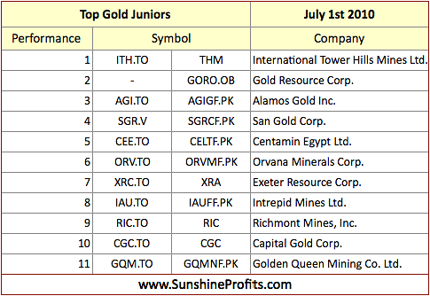
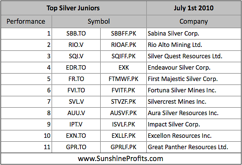
Once again, there are virtually no changes since the last month, meaning that the stocks that were strong (on a comparative basis) last month are still holding relatively well. Therefore, if you've been taking our rankings into account when selecting junior stocks to your portfolio, it seems that you will not need to make significant adjustments this month.
Other Information
In the latest Market Alert (and earlier in this update) we have examined the GDX:SPY ratio and one of the messages that we've receive this week includes a question about it. Namely, how can one track the GDX:SPY ratio and the corresponding volume and check for extreme levels of the latter. Generally, the procedure can be divided into just two short steps. Firstly, go to the http://www.stockcharts.com website (there are other websites offering stock charts, but this is the one that we've been using while preparing our Premium Updates). Secondly, in the symbol field at the right side of the page type GDX:SPY and either press enter or click the "Go!" button. That's it; the page will soon load the GDX:SPY chart.
Another question that we've received this week was about mining companies' net income. We were asked to explain how is it possible that many of the precious metal miners are reporting such meager per share earnings. For instance - the question continues - Goldcorp, Inc. (NYSE: GG) brags about their low cost to produce an oz of gold - why aren't they reporting outstanding earnings per share?
Generally, the answer is that there are many more things that can influence companies' profits (here: net earnings), than just the price of gold and cash cost per ounce (cost of production at site level - includes transport, refining, administration costs and royalties, but excludes costs not at site level, and it excludes non-cash costs such as depreciation). On the other hand, the net profit includes all costs, also the non-cash ones. Therefore, if the company has massive non-cash costs (for instance depreciation/amortization), the net income can be small even if the company's operating profit (profit from company's regular activities - here: mining) is big.
Taking a look at Goldcorp's 2010 First Quarter Report provides us with a perfect example. On page 5 of the report company explains the fact that they have a net loss of $52.3 million in the first quarter of 2010, even though their cash flow from operating activities (mining) was $314.4 million.
Out of the several featured points one is bigger than all other combined: $211.8 million non-cash foreign exchange loss in the first quarter of 2010 on the translation of future income tax liabilities on mining interests arising from acquisitions, compared to a $121.4 million gain in the first quarter of 2009, due primarily to the strengthening of the Canadian dollar and Mexican peso.
Without getting into details - in this case it was the strengthening of the Canadian dollar and Mexican peso that greatly contributed to the decrease in company's net earnings - a figure not directly related to mining at all. The point is that there is much more to gold mining company's net earnings than just price of gold and cash costs per ounce.
By the way, if you are evaluating companies using the classic fundamental analysis, we suggest using NOPAT (net operating profits after tax) or even better base one's analysis on cash flows in the first place instead of using net earnings. The latter figure is much easier to manipulate because of the non-cash, non-operating elements included in it.
As far as we are concerned, we prefer to use this data through the charts. Yes, through the charts. In fact, we are not using charts instead of using the fundamental data - we are using charts as a way of using the fundamental data. Ultimately, the price/volume is based on the fundamental information + market's perception toward it and by applying reliable tools and indicators we can infer many implications directly from the charts. Yes, chart analysis has its limits, especially for rather illiquid markets (small juniors), but combining it with proper diversification and managing one's risk through limiting one's positions we believe that one can greatly increase one's portfolio over time.
Another way to took at the fundamental data is to apply statistical tools, which is particularly useful in combination with technical analysis. The latter provides us with timing details, whereas statistical measures are great for selecting stocks for one's portfolio. Of course different stocks might be more appropriate to different Investors/Speculators, so we provide you with the Leverage Calculators in the Tools section that will create a ranking of gold/silver stocks perfect for you.
Summary
Precious metals have shown independent movement of late. This is not likely to continue for any extended period of time. Silver and mining stocks clearly continue to appear to be higher risk investments than gold. This is based upon historical trends and the current situation in world stock markets, and it does not mean that silver has to decline immediately, but it suggests that from the risk/reward perspective gold is currently preferable speculative vehicle.
The trend still appears to be up for gold. Previously stated targets stand and still appear to be obtainable. The GDX:SPY ratio does show some negative signals and is normally quite reliable for local tops, but the latter does not need to form immediately - instead it could be formed in the following weeks. There is still no clear signal that gold's final top has formed or that it is imminent as of today. The likely timing of this event is mid-July.
At the moment of writing this summary we see gold about $25 lower than it closed on Wednesday, but its still early, so it might be the case that the price reverses on an intra-day basis just like it did just a few days ago. The breakdown in the USD Index would also have to be verified before we can state that there are indeed strong bearish implications. As always, should we change our view on the precious metals market, we will send out a Market Alert.
This completes this week's Premium Update.
Thank you for using the Premium Service. Have a great week!
Sincerely,
Przemyslaw Radomski

