
All the fundamental factors that have made gold such a stellar investment for the last decade are still intact. Fiat money is still being produced on easy street around the world, which in turn fuels worries about the dwindling purchase power of the currencies; central banks are still accumulating gold; real interest rates are still negative so investors don't give up any interest rate by investing in gold.
However, there are several things that have been affecting gold negatively over the past few months, much to our dismay. One of them is the dollar's strength against the euro and gold's recent tendency to move inversely to the dollar and in line with more risk-linked assets. This has undermined some of its safe-haven appeal.
It is the euro weakness that is having a negative impact on gold, via its impact on the dollar. Will the Euro survive and, if it does, will it ever attain the status of a world reserve currency? That does not seem likely at this point. China's currency is being groomed for the world stage, but is not yet ready to take the limelight. So, for the foreseeable future, for the lack of better alternatives, it looks like the dollar and US Treasuries will be seen as a financial safe haven in an uncertain world.
We read much about gold no longer behaving as a safe haven, but is that really true? We have to differentiate between short-term day-to-day traders and long-term holders of gold, both private and institutional. For the latter, they hold gold for the long haul for wealth preservation and portfolio diversification. The short-term fluctuations up and down of the gold price are largely immaterial to them.
Another aspect affecting gold negatively is the period of the year known as the “Summer Doldrums.” In addition, investors seem to be waiting on the sidelines for a clear statement from the Fed on quantitative easing. Here is just a short recap. When the US launched its first quantitative easing program at the end of 2008, gold rose around 36% in the four months that followed. When QE2 was announced, gold rose again by 11% to $1,500. Then, in September 2011, gold hit its record high on the expectation that the Fed would have to step in again to help out the ailing economy.
The Federal Reserve will hold a two-day policy meeting on July 31 that is expected to yield no change in U.S. interest rates, but markets will analyze and dissect every word of Chairman Ben Bernanke for any clues that the central bank will do more to promote economic growth. Already it seems that three top Federal Reserve policymakers on Monday laid the groundwork for a third round of bond purchases by saying the U.S. recovery was weak and unemployment too high, but at the same time they said the situation is not bad enough to warrant another QE right now. In the June 22, 2012 Premium Update we wrote that Bernanke's speech could be interpreted in the following way: the economy is not yet weak enough for QE III and we want to see lower stock and commodity prices before we make another move. Lower stock prices appear more probable from here. This is certainly up-to-date.
Wednesday COMEX gold futures prices ended the U.S. day session lower in the aftermath of an afternoon Fed meeting that provided no fresh clues on any forthcoming easing of U.S. monetary policy. On Wednesday we also saw record low yields on German 10-year bonds at 1.31% which should theoretically suggest investors' uncertainty that could stimulate safe-haven demand for gold in the near future.
Surprisingly enough, last Thursday, when global central banks went on the offensive against the faltering world economy cutting interest rates and increasing bond buying, gold barely reacted to the news. In a 45-minute span, the European Central Bankand People's Bank of China cut their benchmark borrowing costs, while the Bank of England raised the size of its asset-purchase program. Thursday's move by three central banks should have been a shiny red cloth in front of a bull, but instead, gold declined, more affected by a burst of dollar strength due to a tanking euro. This is a bearish sign for gold.
Meanwhile central banks, especially in emerging markets, continue to buy gold both from local production and in the open market lending support to gold on the downside. They aim to raise the percentage of gold they hold in reserves which at the moment, is nowhere near the levels stored in the bank vaults of the developed world. Since the financial crisis of 2008, nations such as Turkey, Russia, Mexico, the Philippines, Thailand, Kazakhstan, Ukraine, Saudi Arabia, and India have loaded up on gold. Russia alone has added an impressive 400 tons of bullion to its reserves, mostly from domestic purchases. Mexico has added over 120 tons. Turkey has amended its regulatory policy late last year to allow commercial banks to count gold towards their reserve requirements, adding over 120 tons to its official reserves.
In May, gold imports by China from Hong Kong jumped six fold to 75.6 metric tons from a year earlier, according to Hong Kong government data. The nation “remains the most important player on the global gold market,” Commerzbank AG said in a report. The World Gold Council has forecast that China will top India this year as the world's largest consumer because rising incomes will bolster demand. From the point of view of the individual Chinese investor, the Yuan is not appreciating and earns a negative rate of interest, so gold is a natural alternative.
It's just about the middle of the year and some analysts are making predictions for this year and beyond. In its recently published Gold Quarterly Review, Scotia Capital forecasts an average gold price of $1,750/oz. for 2012 to 2014, $1,500/oz. in 2015, $1,400/oz. in 2016, and $1,200/oz. for 2017 and beyond.
"We expect high levels of volatility in the gold price to continue into the foreseeable future and expect the gold price to perform better following the summer vacation season (seasonally a weak price for gold)," wrote Scotia Capital gold and precious metals analysts. “We expect high levels of volatility in the gold price to continue and expect a stronger performance in the latter part of the year." This opinion reflects gold market's seasonality.
To see what is in store for precious metals let's turn to this week's technical part with the analysis of the Euro Index. We will start with the long-term chart (charts courtesy by http://stockcharts.com
Euro and USD Indices
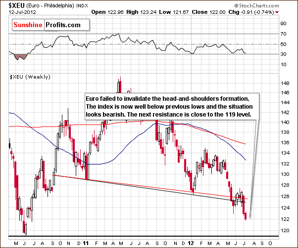
We begin this week with a look at the long-term Euro Index chart. Significant moves to the downside have been seen during the past two weeks. The breakdown below the neck level of the bearish head-and-shoulders pattern has been well-verified. A much lower move appears to be in the cards based on this chart.
An estimated downside target level for the decline appears to be in the 105 range which is approximately 15% below Thursday's closing index level. The next resistance level to be encountered is in the 119 trading range, nearly three points below the current index level. It seems likely that declines to this level and lower will be seen based on the medium-term and short-term trends of the Euro Index.
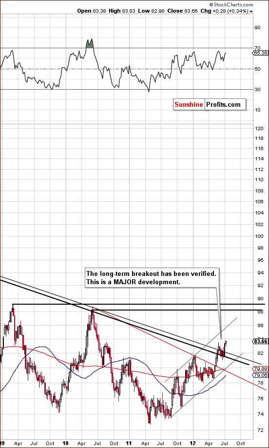
In the long-term USD Index chart (please click the above chart to enlarge), the bullish implications expected from the recent trends in the Euro Index are clearly seen. The long-term breakout has been verified and with two former resistance lines now acting as support lines and with no major resistance lines ahead, this is indeed a major development. The index moved higher this week after consolidating a bit after the move above the long-term declining resistance line based on the highs of 2002 and 2010. This now becomes a support line and the rally will likely continue from here. A likely upside target level for the USD index appears to be in the 88-90 range, a move which has clearly bearish implications for the precious metals sector.
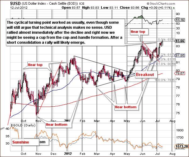
In the short-term USD Index chart, a decline was seen around the cyclical turning point and this was immediately followed by another rally. In our Market Alert June 30th, we agreed with Jim Rogers' quote: “How many times has this happened in the last three years - they (EU leaders) have had a meeting, the markets have rallied, two days later the market says wait a minute this doesn't solve the problem.” This appears to have been the case once again.
The dollar quickly moved higher and is now at June highs. Once this level is taken out, a bigger rally appears in the cards.
Summing up, the situation is clearly bullish as there is no significant resistance is in place (except the current on – June high) to stop a rise to perhaps the 90 level. The rally in the USD Index is likely to continue but perhaps a consolidation around the 83 level will be seen first. The index is close to its early June highs and a bullish cup formation seems to be developing. If we see a consolidation here, it simply might create a handle of the pattern – the rally would then be very likely to continue in 1-3 weeks.
General Stock Market
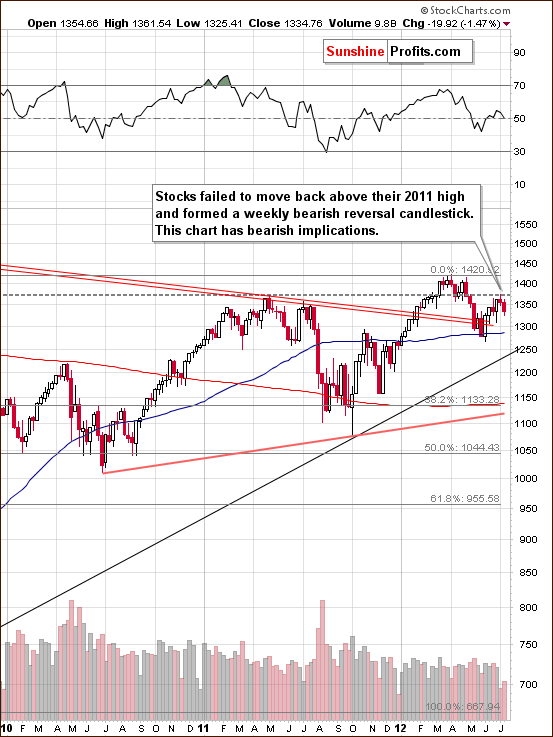
In the long-term S&P 500 Index chart (please click the above chart to enlarge), we see a bearish indication this week. Stocks did not verify the move above the 2011 highs and have moved below this level once again. The lack of strength in holding above this level is a clearly bearish sign for the weeks ahead
On the other hand, price is still above the rising black support line and the declining red ones, so one could say that the trend is still up. All in all, we view the above chart as moderately bearish at this point.
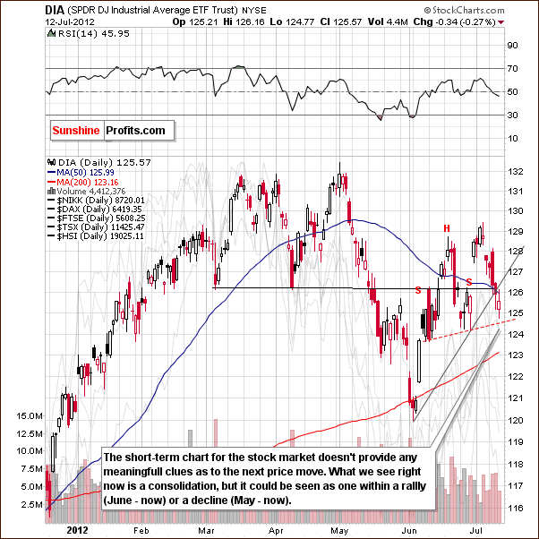
In the short-term DIA (a proxy for the Dow Jones Industrial Average), we also have a relatively mixed picture this week. This ETF has been consolidating since mid-June. This could be viewed as a consolidation of the rally beginning in June or a consolidation after the decline which began in May. The situation is slightly more bearish than not as the short-term rising support line was broken on Thursday.
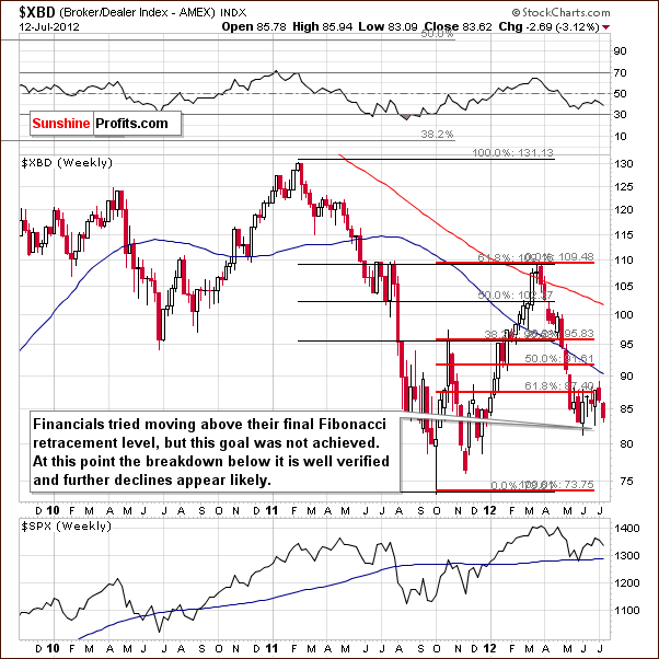
In the Broker Dealer Index chart (a proxy for the financial sector) we see bearish implications once again. The financials have been consolidating for several weeks now. After a breakdown below the 61.8% Fibonacci retracement level, the situation is now clearly bearish. The breakdown has been confirmed and with several weeks of consolidation behind it, the index is likely to now move lower. This will further contribute to the bearish outlook for the general stock market.
Summing up, the situation in the general stock market is a bit more bearish than not based on the above charts. The most bearish factor that we currently see is Fed’s approach suggesting that stocks didn't fall low enough to justify another round of QE.
Crude Oil
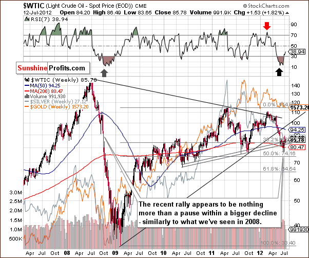
Turning to the crude oil price chart, we see that prices have moved up nearly 10% in the past two weeks, although this week has been nothing more than four days of small moves, two to the upside and two down with Thursday's close only about $1.50 above the closing price seen last Friday. It seems likely that the small rally, correcting less than a fourth of the decline seen since the late-February high, is probably nothing more than a pause within a bigger decline. This would be very much in tune with what was seen in 2008.
Correlation Matrix
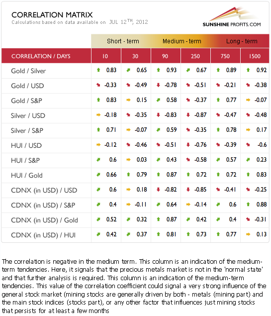
The Correlation Matrix is a tool which we have developed to analyze the impact of the currency markets and the general stock market upon the precious metals sector. The short-term coefficients this week are a bit unclear, especially those between the general stock market and the precious metals. Traditional values are seen in the medium-term, 90-day column with negative coefficients between the USD Index and the metals and positive values between stocks and gold, silver, and the mining stocks. The overall picture based on the currency markets and the general stock market is bearish for the precious metals sector.
Gold
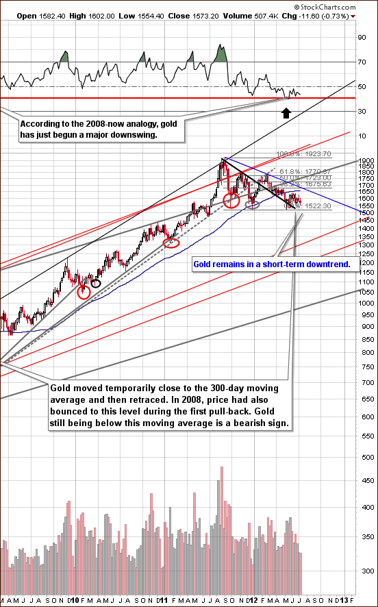
In the very long-term gold chart (please click the above chart to enlarge), not very much has happened here for several weeks now. Gold prices have moved back and forth around the $1,600 level and the RSI is no longer in oversold territory. With the RSI level above 40, further declines could be in the cards. To be clear – this is not a bearish factor on its own – the point is that it's no longer a bullish one.
Gold took a breather after initial moves to the downside and it's important to remember that once the $1,500 level is broken, no major support will be encountered until gold's price moves below $1,350. The situation looks quite dangerous based on this chart.
Again – to be clear – the combination of support lines close to $1,500 makes the decline likely to accelerate once this level is broken, but will not be a bearish factor until the breakdown is seen and is verified. The above chart alone is currently a bit more bearish than not.
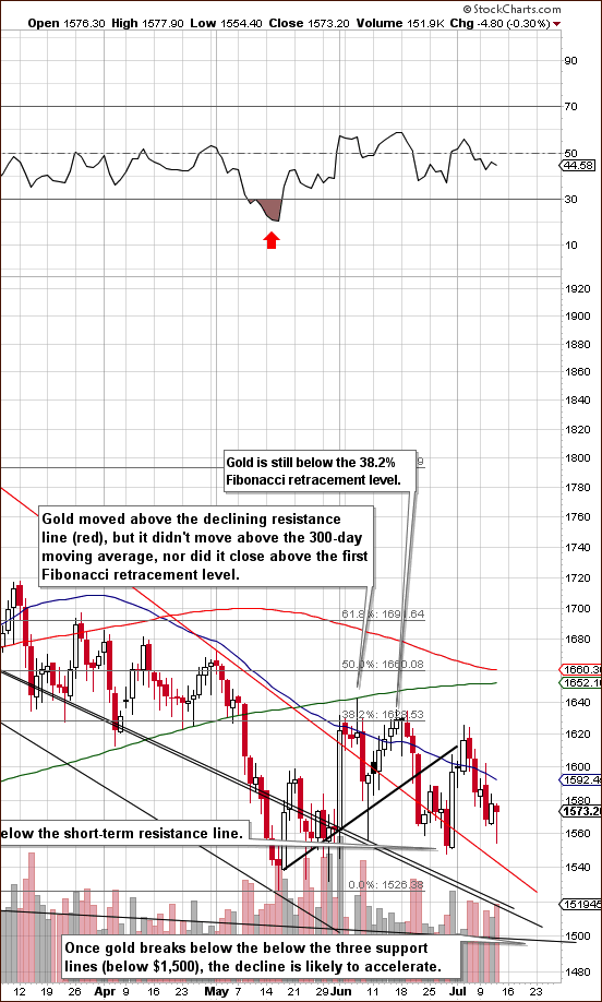
In gold's short-term chart (please click the above chart to enlarge), we can see an uncompleted head-and-shoulders pattern (June price action being the head and July price action being the right shoulder) and there is really no clear picture here this week. Gold prices remain above three support lines with the lowest of these at the $1,500 level.
There is still a good possibility that the bearish head-and-shoulders pattern will be completed and, if so, gold's price is likely to move below $1,500. This would likely, as discussed earlier, lead to quite a volatile decline thereafter.
Besides the above, this chart is really not too useful this week. The charts of several other perspectives appear to be much better in determining gold's future price moves at this time.
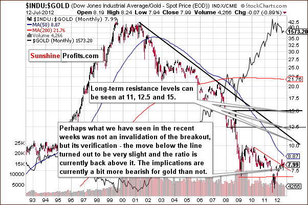
In the Dow to gold ratio chart, the ratio is now visibly above the declining resistance line. This is a bearish development for gold as it suggests that stocks will now outperform gold for some time. We will discuss this topic in more detail in the "Letters from Subscribers" section of this week's Premium Update.
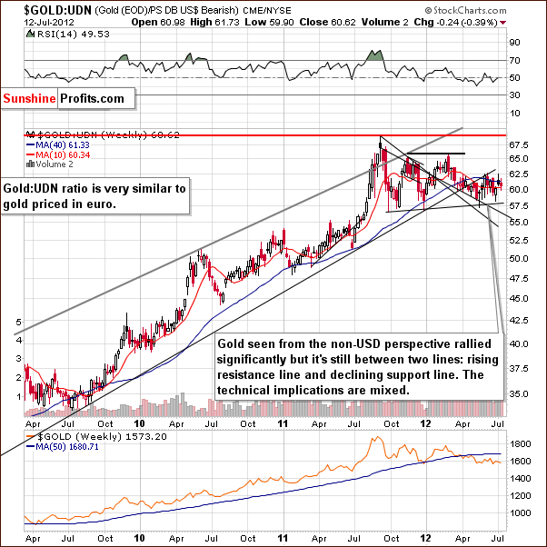
In this week's chart of gold from a non-USD perspective, once again we regret to say there is really no change here. The chart remains mixed. There is no meaningful impact to be seen here upon gold at this point, and although we would rather discuss something more meaningful, we simply have to say it isn't here.
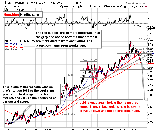
In the gold to bonds ratio chart, we see that the ratio is now below both the red and gray rising support lines. This suggests that the consolidation period is over and that gold prices are likely to move lower once again. Once the big decline starts, there is no significant support line in place and bigger price drops are very probable.
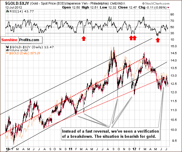
We see not big changes in the chart featuring gold priced in the Japanese yen this week. The consolidation below the rising red resistance line has been seen since mid-May and the breakdown below it is not well-confirmed. The implications are bearish.
Summing up, the situation for gold remains medium term bearish; however, the short term is a bit unclear based on the gold charts alone.
Silver
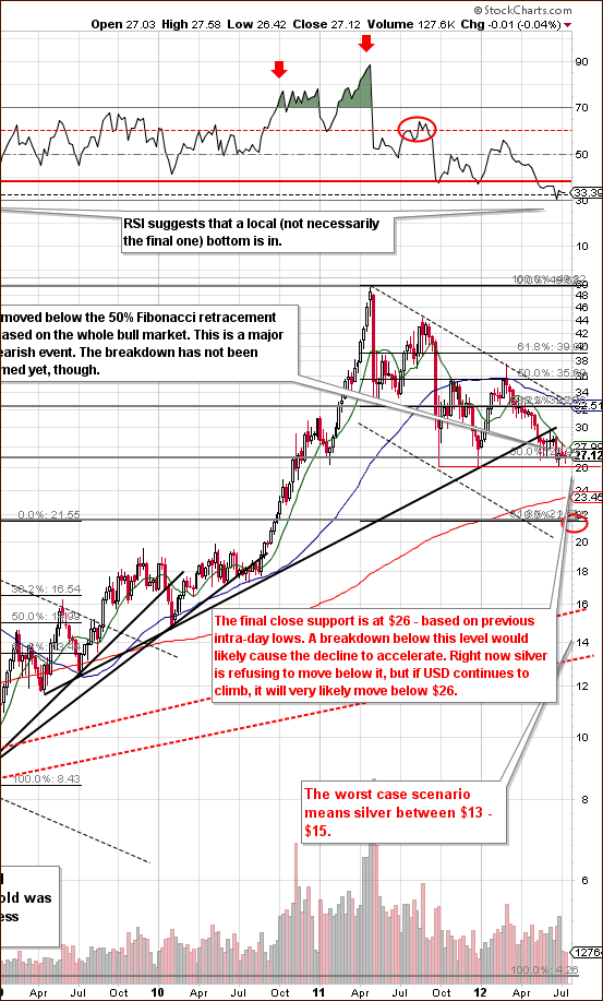
In the very long-term chart for silver (please click the above chart to enlarge), we see that silver has consolidated close to the previous intra-day lows. Since it will likely close the week around this level, the situation is quite extraordinary – when previous lows were formed in 2011, the reversal was almost immediate.
The major point here is that silver appears to be consolidating ahead of further declines instead of bottoming here. The 10-week or 50-day moving average has been providing resistance and silver's price remains below this level. Silver recently moved below the rising medium-term support line (the black one), which has now become resistance. This breakdown has been verified and lower prices have followed.
The situation is bearish, and right now, silver is resisting to move below the $26 level. Once it breaks below it, which is probable when one considers the situation in the USD Index, a much more volatile period will likely be seen, and investors should prepare for this now.
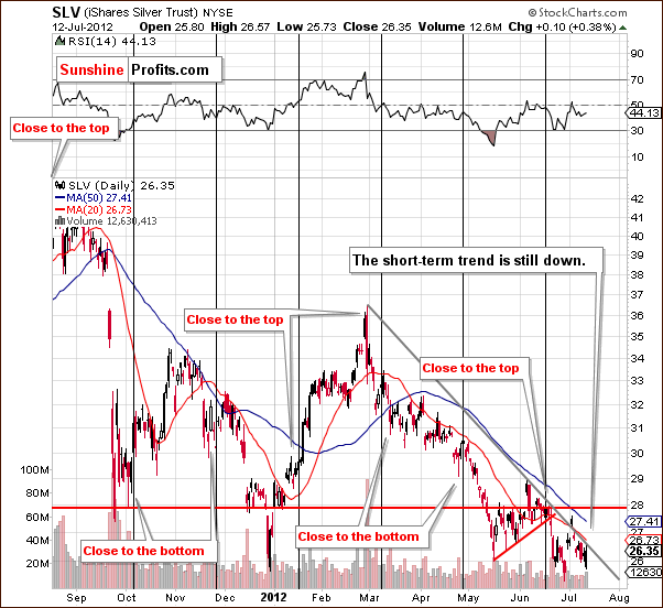
In the above SLV ETF chart, we see that the short-term trend for silver remains down. Generally declines are seen following cyclical turning points and the recent lower prices were somewhat expected. However, silver's intra-day behavior on Thursday may have pointed to a short-term rally in the next day or two. This would not surprise us, and as long as SLV remains below $28, the bearish outlook will not be invalidated.
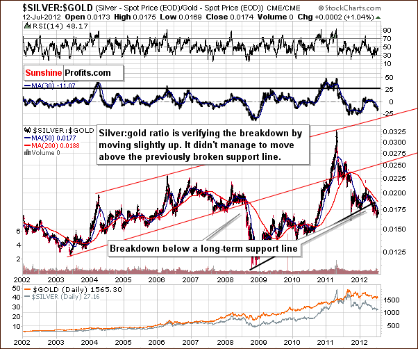
In the silver to gold ratio chart, we see a decline below the rising support line, which is solid and clearly visible in this long-term chart. Although the ratio has moved back and forth daily, the medium-term trend has been down for a few months now. The outlook here is bearish going forward, and this applies to the whole precious metals sector as well.
Summing up, overall the situation for silver is bearish for the medium term but the outlook for the next few days is a bit unclear.
Gold Mining Stocks
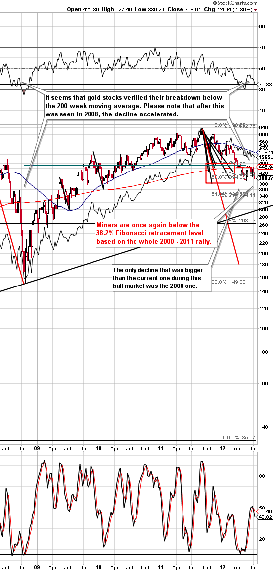
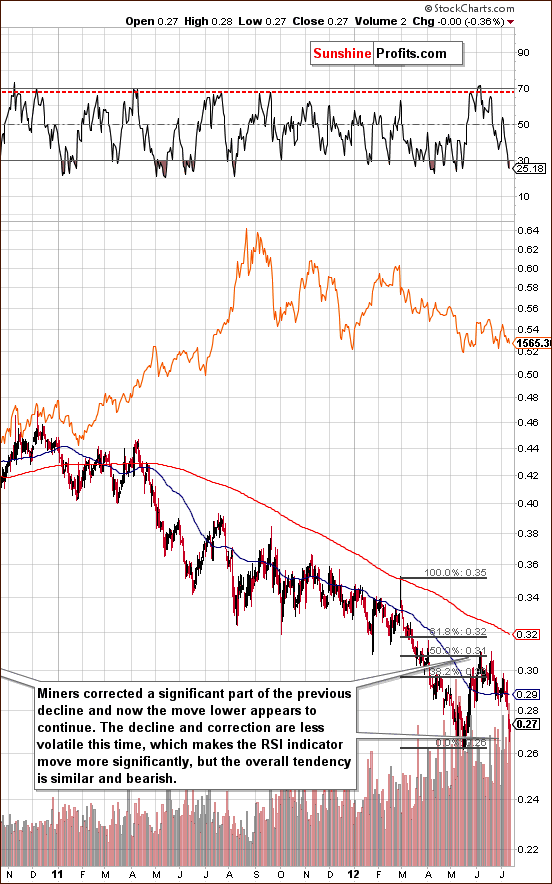
In this week's long-term HUI Index chart (please click the above chart to enlarge), we see that the miners have moved lower, declining for six consecutive days now. Thursday, they closed below the 400 level. This is an important and bearish development.
The bullish, intra-day reversal seen on Thursday does not change the medium-term bearish picture which is in place here. A pullback has been seen recently following the significant March - May decline and it seems that a continuation of the decline may now be seen.
This is in tune with what was seen in 2008 but declines and rallies are less volatile this time as they are taking more time to play out. Nonetheless, the bearish implications remain, and mining stocks’ investors should seriously consider limiting exposure if this has not yet been done.
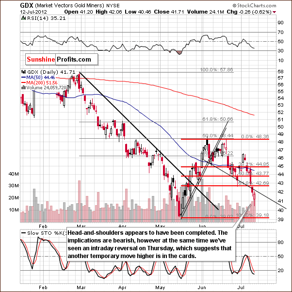
In the GDX ETF chart, we have a bearish confirmation, as the mining stocks moved below the lowest Fibonacci retracement level and have closed there twice. If Friday's close is below $42.69, the breakdown will be confirmed. Furthermore, if the close is below $42, the breakdown below the head-and-shoulders pattern will be confirmed. This would be a very bearish sign.
In any case, the situation is bearish and short positions should be kept open at this point. Based on the long-term chart, the period of decline has not ended even though a temporary rally may be seen in the short term.
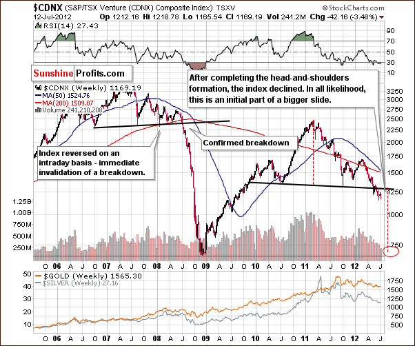
In the Toronto Stock Exchange Venture Index (which is a proxy for the junior miners as so many of them are included in it), the head-and-shoulders pattern has clearly been confirmed and verified, and the bearish implications remain. The comments made in our last Premium Update June 29th remain up-to-date and are therefore repeated here:
Prices have moved below the neck level here in the bearish head-and-shoulders pattern. A downside target level has been created based on the size of the head in this formation and it is close to the 2008 low. It's also much lower (40% or so) than current price levels.
Investors are encouraged to exit juniors if this has not already been done. It seems that hedging or selling, preferably hedging, is a good move to make at this time. We suggested doing so a few weeks ago, but if you didn't proceed at that time, it may be a good idea to reconsider it now.
In the miners to gold ratio chart, we see that the ratio declined heavily this week. The ratio also had a pullback in 2008 – consequently, what we have seen since last May is not overly surprising. The trend remains down and right now we appear to be in another wave lower within a bigger downtrend. Short positions appear justified in the miners at this time.
Summing up, the outlook for the mining stocks is bearish for the medium term. The short term is a bit unclear based on the intra-day developments seen on Thursday.
Sunshine Profits Indicators
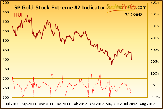
Looking at the SP Gold Stock Extreme #2 Indicator, we see that it has suggested at least a temporary rally in the mining stocks – the indicator moved below the dashed line based on Wednesday's closing prices. The intra-day decline on Thursday followed by higher prices later in the session may have been what was suggested by this indicator a few days ago – the second part of the session.
Maybe more short-term rally will be seen or maybe not – at this time, it is unclear in our view. The long-term charts suggests lower prices are ahead however, so we stick to this outlook, and prefer not to trade immediate term moves here.
Letters from Subscribers
Q: What do you think about this poll from finance.yahoo.com?
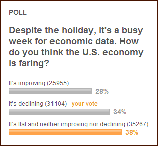
A: It shows that people are neither overly bearish nor bullish about the economy and thus the stock market. Therefore, we might see a rally or a decline. We are not at a sentiment extreme here, so neither a rally nor a decline is a sure bet. However, based on the Fed's indications, lower stock prices are more likely.
Q: What would it take for you to change your mind from bearish to bullish on precious metals?
A: There are many things that could make us turn bullish on precious metals in the medium term. For one, a sharp decline to $1,300 in gold. Another is a breakdown in USD below the 80 level. Also, a $100 rally in gold, or even a $70 rally that is accompanied by a rally in the dollar. There are many possibilities and it's impossible to list all of them. For now, the situation looks bearish. We will keep monitoring the situation on a daily basis and will report to you if our views on the market change.
Q: Could you share your thoughts on this? What impact will there be on global gold prices?
http://www.nytimes.com/2012/07/10/science/vast-deposits-of-gold-and-other-ores-lure-seabed-miners.html?hp
A: Seabed mining (and the same can be said about phytomining) is a very interesting concept that might increase the supply of gold in the future. However, operations will not be significant for years because of the time required for further development and research, not to mention various environmental & bureaucratic issues. So, at this point, this remains just a possibility, not a real factor in the gold market.
Q: You probably already know this, but the St. Louis Fed has added gold to the database of instruments you can chart on their website. Here is a link to a collection of charts on an investment blog, all made with the FRED database:
http://www.investorvillage.com/smbd.asp?mb=144&mn=98635&pt=msg&mid=11887538
The second chart, showing the S&P versus gold, is quite interesting. Does this indicate the time is approaching to switch from gold to stocks? Somehow, that doesn't "feel" right. Perhaps at some point. But now?
A: The St. Louis Fed's action is positive for the gold market on one hand, but bearish on the other. If you recall we have written that governments often sell gold at the bottom and buy at the top. Could it be that the purchases we reported in recent months indicate that a local top has formed? Not necessarily, because gold is not yet extremely popular with the investing public. But it suggests that a correction might be necessary for the bull market to continue.
About the S&P:gold chart – we have featured that same chart several times in recent weeks (also this time). However, we used the Dow as a proxy for stocks and we used the logarithmic scale which is more appropriate for long-term trends – this perspective shows that the ratio can still fall further. However, the current action in the ratio indicates that we might be in the early stage (or in the middle) of a correction similar to what we saw in the mid-1970s. Back then, as the ratio moved higher, precious metals prices declined. The same thing could happen this time, and it would still not invalidate the secular bull market in precious metals.
Q: I am thinking of signing up later this month if the latest news is as negative as you say. Does the CDNX chart definitely mean a big decline is coming for Juniors? Is there any possibility the chart might reverse upwards from here?
A: Yes, there is always a possibility that any stock or index may reverse. Technical analysis, which we used to identify the bearish head-and-shoulders pattern, doesn't tell you what has to happen, just what is likely to happen. Right now the formation is in place and the implications are bearish for mining stocks, especially for the junior miners. There are no guarantees, though.
Summary
The outlook for the USD Index is bullish and the outlook for stocks is rather bearish. The implications for the precious metals market are bearish.
The picture for gold is a bit unclear in the short term and more bearish than not for the long term. Given the impact for the USD Index, it appears that being out of gold with at least a portion of long-term capital is a good idea. The same holds true for silver and the mining stocks.
Keeping a bet on lower prices for mining stocks may be a good idea even though the immediate term is a bit unclear today. Factors other than what was seen in our Gold Stock Extreme #2 Indicator point to lower values being very likely in the medium term.
This completes this week’s Premium Update. Our next Premium Update is scheduled for Friday, July 20, 2012.
Thank you for using the Premium Service. Have a profitable week and a great weekend!
Przemyslaw Radomski

