Remember the disaster movie, “The Day After Tomorrow,” in which melting polar ice causes disruption to the north Atlantic currents precipitating a new Ice Age? The main character, a paleoclimatologist played by actor Dennis Quaid, warns government officials of the approaching disaster, but no one heeds his warnings. One of the fears of global warming is a disruption to the nature of ocean currents that could bring profound and possibly destructive changes to our weather patterns.
In economics there are also great currents that have natural patterns and it looks like they are undergoing profound changes. Weather patterns can take centuries or even eons to evolve, but in economics, things can happen in lightning speed.
The most dramatic change to the world economic structures in recent history has been globalization and it’s only several decades old. The Financial Times said in an editorial this week that “those who worry that the old continent no longer has influence on world affairs are wrong. The impact of Europe’s inability to sort out its problems is clearer by the day, and the diagnosis is indisputable: the entire world is now contaminated with the eurozone virus.”
As if to underline the dangers in the single currency bloc, Moody's cut the credit ratings of several banks in Germany citing a greater risk of further shocks from the region's debt crisis.
Speaking in an economics convention in Italy this week, legendary financial genius George Soros said that: “In my judgment the authorities have a three months’ window during which they could still correct their mistakes and reverse the current trends. By the authorities I mean mainly the German government and the Bundesbank because in a crisis the creditors are in the driver’s seat and nothing can be done without German support.”
He also said European governments had failed to comprehend the nature of the euro crisis: "They thought it was a fiscal problem while it is more of a banking problem and a problem of competitiveness," he said. "And they applied the wrong remedy: you cannot reduce the debt burden by shrinking the economy; only by growing your way out of it."
He added: "The crisis is liable to come to a climax in the autumn. By that time the German economy will also be weakening so that Chancellor Merkel will find it even more difficult than today to persuade the German public to accept any additional European responsibilities. That is what creates a three-month window."
It wasn’t that long ago that Europe was divided into two blocks, East and West with very little commerce between them. South East Asia and South America acted as separate units. The main flow of commerce moved along the axis of Western Europe and the U.S.
Now, in this new Great Trans-Pacific Current Pattern, citizens from the rich Western economies buy consumer goods manufactured in Asia using money they don’t have, and in the process, mortgage the future of their children. The manufacturing capacity of the West shrinks, but what grows is the supply chain of services and the financial sector which handles the mortgaging of the future.
In Asia there is also a great transformation as workers leave the traditional agricultural way of life and flock to the cities to labor in factories. This massive transformation has taken place in our lifetime, in the past two to three decades.
If we get back to our ocean currents analogy, the currents travel the world over and return to the point of origin. In the economic currents there is no circular continuity. After the West has purchased the goods and mortgaged its children’s future, it has nothing to give in return.
We have all seen the newspapers headlines about the troubles in Greece, Spain, Portugal, Ireland and the entire eurozone. The situation in the U.S. is not much better, even if the press is ignoring it for the moment. In both blocks there is high debt and large, long-term entitlement programs for citizens without any clear notion of where the money to fund these programs will come from. (Hint—the printing press.)
The global economic situation is unstable and untenable. How long can citizens in the West continue to buy more and more imported manufactured goods from the East? When the West’s appetite for unessential consumer goods will lessen as people learn to do with less because they have no choice, the economic situation in China and South East Asia will be even worse than it is in the west. The West can always go back to manufacturing, but it’s unlikely that Asia can go back to agriculture.
The month of May was possibly the worst month for gold prices in three decades, but it was unexpectedly followed on Friday, June 1, by the best daily climb--$66 -- since last August. The principal catalyst was the dismal US job report by the US Labor Department. Economists had hoped to hear about the creation of 150,000 positions, but the actual number was half that, 69,000, which brought on expectations of another round of QE, (that is, Quantitative Easing, not Queen Elizabeth who celebrated her 60 years Jubilee this week). It was interesting to note how the same financial media outlets that had eulogized the bull market just a week ago were now celebrating its return as a safe haven.
We sent out a Market Alert on Monday presenting three factors that have improved the prospects for gold, this despite the fact that we are now entering the part of the year that is traditionally unfavorable for precious metals. We stated that we believe that the probability of a major decline in the precious metals sector is now lower - no longer 70%, but now 55% or so. Moreover, it seems that if a decline is in the cards, silver and miners will be affected more than gold. Therefore, we suggested getting back in the market with the long-term part of one's capital that is related to gold and staying out with the silver, platinum and mining stocks parts.
With that in mind, let's take a look at the technical picture. Let's begin with the analysis of the interest rates (charts courtesy by http://stockcharts.com.)
Interest Rates
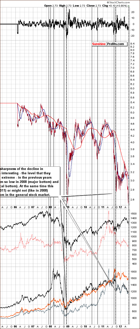
We begin this week with a look at the long-term Interest Rate chart for 30-Year Treasury Bonds (please click the above chart to enlarge). Today the yield is close to where it was at the time of the 2008 market bottoms. The recent decline has been very sharp and is similar to what was seen in late 2011. Quoting from the Market Alert we sent out on Monday:
The long-term interest rates are now very close to the level that they reached in 2008. Back then, metals were already rising after a major bottom and stocks were yet to bottom. The implications are bullish for metals and bearish for stocks in the short term and bullish for the long term. Rates could move even lower, however such a move would likely be quite quick and it would not invalidate the above. In 2008 gold bottomed before the rates and this could be the case also this time.
It seems that we have a situation where investors believe the US government is willing to hold these rates for a long time. This means that people believe that more money is going to enter the system and inflationary pressures (if we define inflation simply as rising prices, which is an oversimplification in our view) remain considerable. Such a mood is bullish for stocks and precious metals, not necessary immediately (especially in the case of the former), but rather on a long-term basis.
Euro and USD Indices
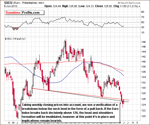
In the long-term Euro Index chart, we see that the bearish head-and-shoulders formation has been completed. The Euro Index clearly moved below the neck level and then back to the neck level based on weekly closing prices. The breakdown has not been invalidated, and the bearish implications remain.
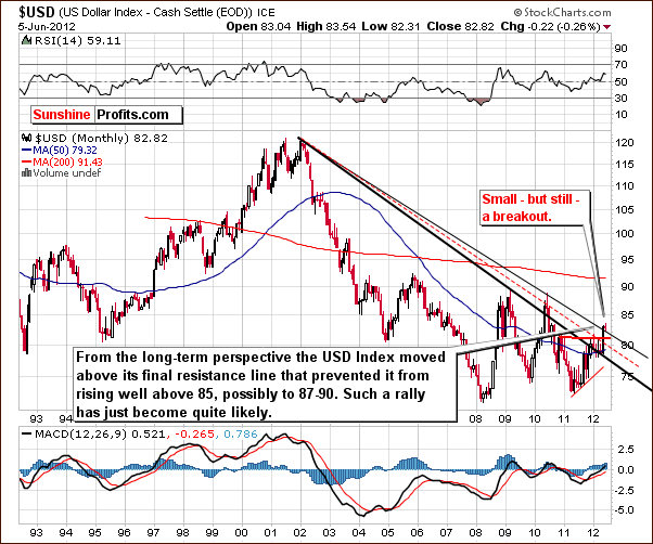
In the long-term USD Index chart we see that the breakout is in, but to make sure we decided to provide a more detailed picture featuring similar time frame.
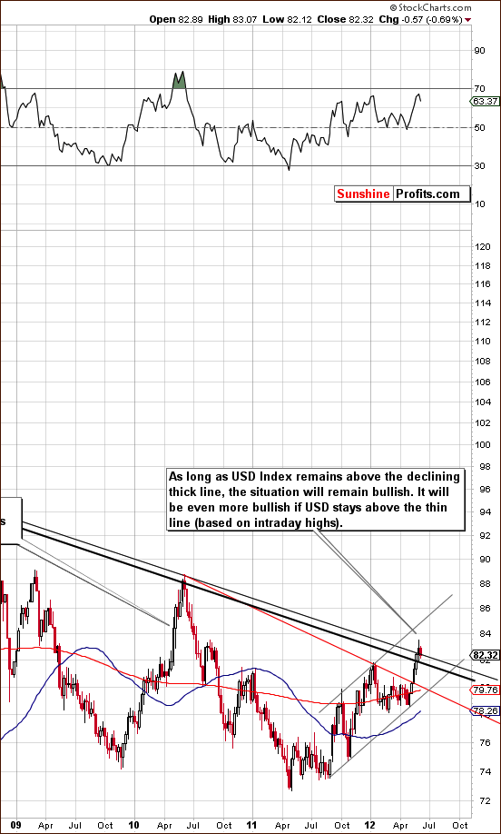
On the above chart (please click the above chart to enlarge) we again see a breakout above the long-term rising resistance line – actually, above two lines: one passed on closing prices and the other based on intraday highs. This has profound bullish implications as we have discussed in previous weeks.
Based on this weekly chart, the breakout is in and prices could dip a bit, perhaps below the 82 level – to the declining, thick line. The index would still remain in an uptrend. In other words, if prices were to move to the early 2012 high and then back up, the breakout would still be in and confirmed. The next target levels would be much higher if this occurs, probably above 85 and possibly close to 90. At this point, it’s hard to tell.
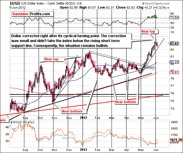
In the short-term USD Index chart, we see an overbought short-term situation. There has been a small consolidation similar to mid-May, which began right after the cyclical turning point. In the last Premium Update, we stated that:
The index is close to a cyclical turning point and may top relatively soon. This would be bullish news for gold; however, momentum appears strong and it seems that the dollar could move above the 82.5 level and correct at or slightly after the cyclical turning point – thus verifying the breakout.
This appears to be exactly what is happening right now and the outlook for the dollar appears bullish from both the long and short term point of view at this time.
Summing up, the situation continues to be bearish for the euro and bullish for the dollar. This is likely to have bearish implications overall for precious metals.
General Stock Market
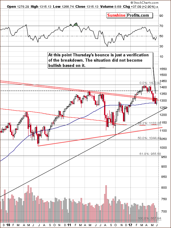
In the long-term S&P 500 Index chart (please click the above chart to enlarge), we’ve seen a breakdown below the long-term support line which is now being verified as resistance. Stocks rallied significantly on Wednesday, but the breakdown has not been invalidated. If stocks move higher and close the week above the above-mentioned declining resistance line, the outlook will likely change to bullish but it is too early to say this today.
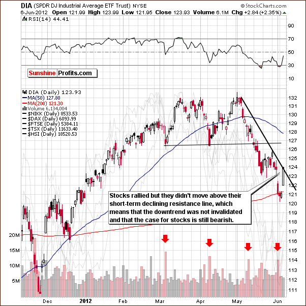
In the short-term DIA ETF (a proxy for the Dow Jones Industrial Average), a short term resistance level has been reached but it was not broken. The downtrend has therefore not been invalidated and remains in place.
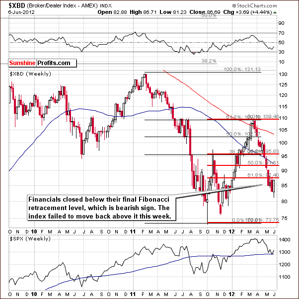
In the Broker Dealer Index chart (a proxy for the financial sector), the financials have not moved high enough to invalidate the move below the final Fibonacci retracement level. The short-term trend is still to the downside and the decline here is not viewed as a correction of the previous rally. It is likely that further declines will be seen.
Summing up, the situation for the general stock market appears to be bearish for both the short and medium term.
Crude Oil
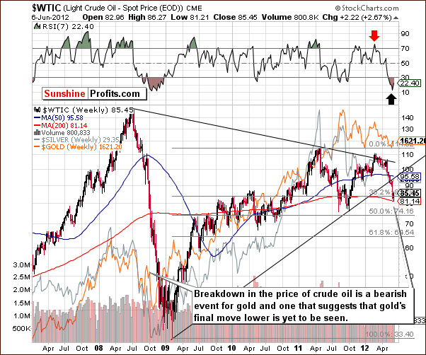
We now look at the crude oil price chart, where we see oil prices continue their breakdown. This chart suggests that oil is likely to decline much more (to 74 or likely to 65 or even lower) and that gold prices have merely seen a small pause in their downtrend, much as was the case in 2008. The implications here are bearish for gold and the entire precious metals sector.
Correlation Matrix
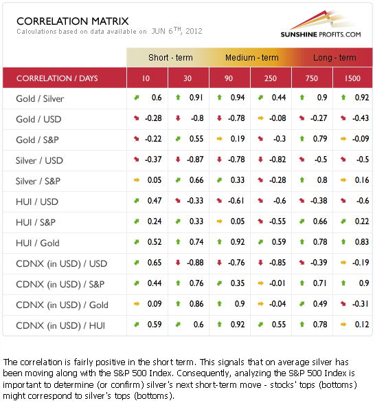
The Correlation Matrix is a tool which we have developed to analyze the impact of the currency markets and the general stock market upon the precious metals sector. This week, we see some confirmation that the link between gold and the USD Index continues to be negative for the short and medium term. Although this was not the case when gold rallied on Wednesday, at this time the above numbers suggest that this one day was most likely just an anomaly or one-time event.
Based on the past 30 days, the correlation remains negative between gold and the dollar. Since the breakout in the USD Index continues to support its bullish outlook, the implications for gold, silver and the miners are negative especially when considering the impact of gold on the sector as a whole.
Gold
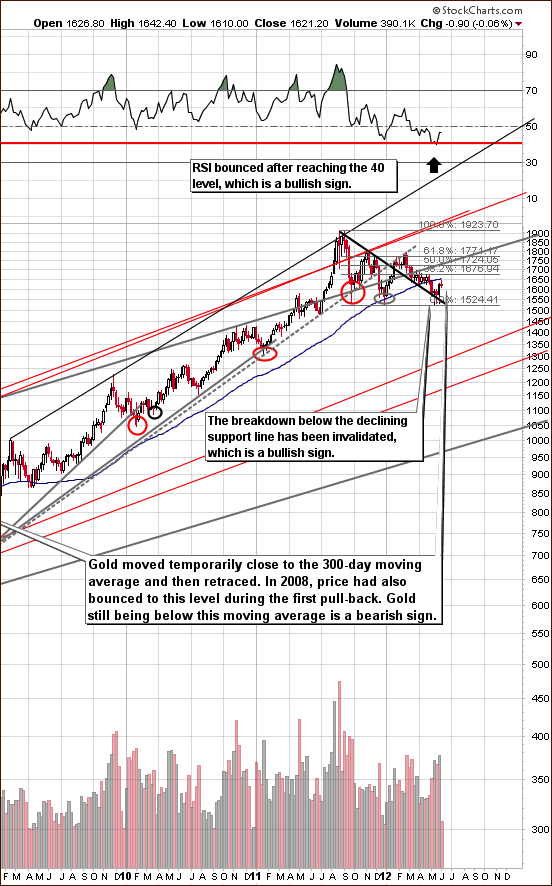
In the very long-term gold chart (please click the above chart to enlarge), we have three very interesting topics to comment upon this week. First is the interaction between the 300-day moving average (blue line) and gold prices. We see that prices moved to this level and then immediately declined. This moving average has been an important support many times in the past, which makes it important also this time. In 2008, in fact, it provided resistance when gold prices retraced after significant declines. This serves as a confirmation of what the crude oil price suggests.
Secondly, the RSI levels here appear quite bullish as they bounced after reaching the 40 level in a manner similar to 2003 and 2004. This in itself is a bullish signal. Finally, the breakdown below the black declining support line has been invalidated as gold prices have recently rallied. Although this line could be broken once again, the situation is simply not as bearish as when gold prices were below this line.
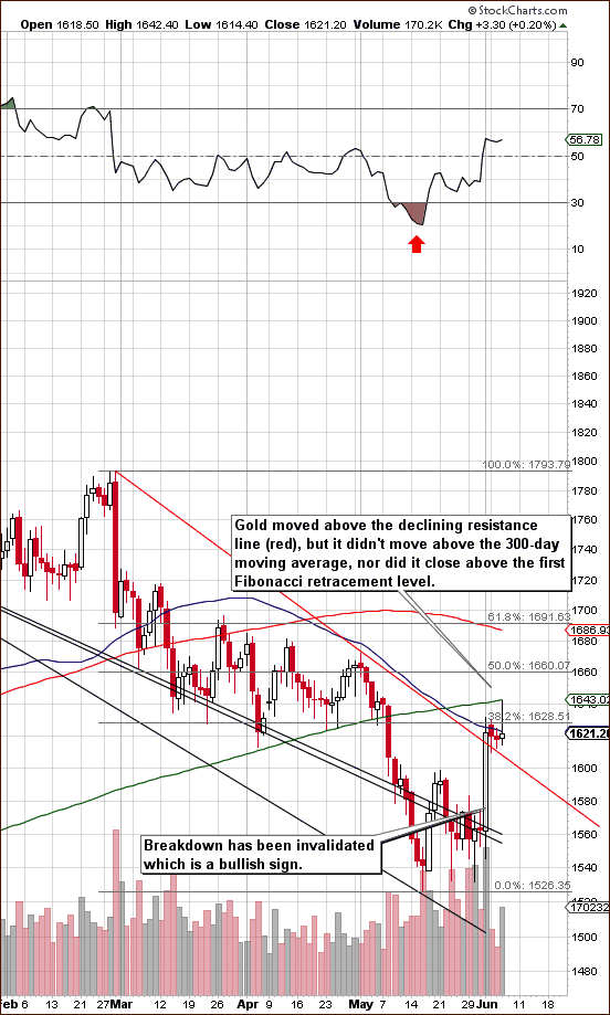
In gold’s short-term chart, we see that the green, sloping 300-day moving average has been reached perfectly (intraday on Wednesday). This line provided intra-day support during in April-May (and multiple times in the past) and is now a resistance line. This is a bearish factor.
On Wednesday, gold prices moved higher early in the trading session and then fell sharply and were little changed for the day. This could be viewed as a shooting star candlestick, which is a bearish short-term signal. We have seen a confirmed breakout with a move above the declining resistance line and this is clearly bullish. We have not however seen a breakout above the first 38.2% Fibonacci retracement level.
So, two important breakouts above the black and red declining resistance lines have been seen. There are now two important resistance lines in place. A bounce was seen off the 300-day moving average and the first Fibonacci retracement level has not been surpassed. In short, the situation simply cannot be described as clearly bullish.
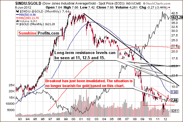
Turning to the Dow:gold ratio chart, we saw an invalidation of a breakout last Friday as stocks declined and gold prices rallied. The long-term picture for gold no longer is necessarily bearish based on this chart alone.
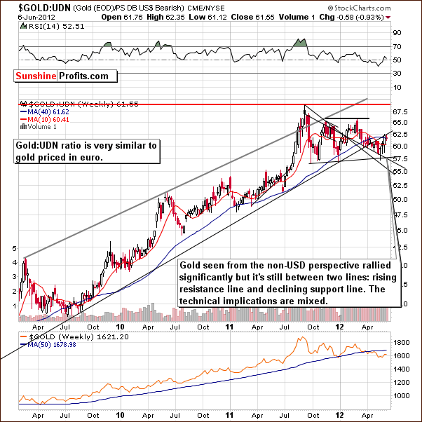
In this week’s chart of gold from a non-USD perspective, we see that prices rallied strongly last week, but overall there has not been much change here. The previously broken support line has not been breached, and the technical picture remains mixed.
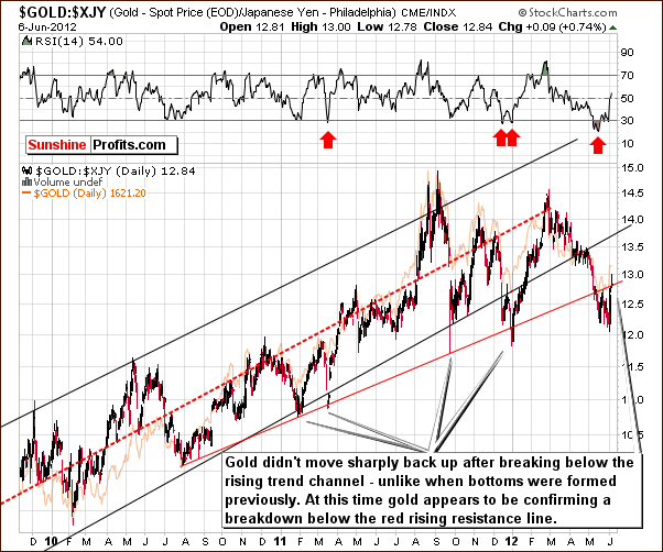
Looking at gold from the Japanese yen perspective, the outlook is more bearish than not as prices failed to rally back into the rising trend channel. It appears that the move below the rising red resistance line is being verified now.
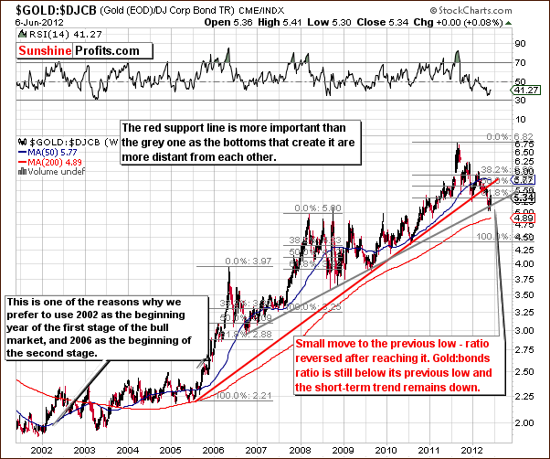
In the gold:bonds ratio chart, we see a bounce after the grey support line was reached. The ratio did not move above previous lows or above the rising red resistance line. All-in-all, the implications from this chart are more bearish than not for gold.
Summing up, the situation for gold is very difficult at this time. We have seen an invalidation of a breakdown below the declining support line. This is visible on the very long-term gold chart. We have also seen an invalidation of a breakout in the Dow:gold ratio chart, which is bullish for gold. At the same time however, crude oil is declining, gold prices are still below the 300 day moving average, gold:bonds ratio didn’t improve, and the bearish shooting star candlestick would suggest that the short-term direction might be to the downside. From a non-USD and yen perspective, the situation in gold remains overall mixed.
Most importantly, the breakout in the USD Index is in and the situation in the general stock market appears weak on a short- and medium-term basis. Additionally, we are now entering the unfavorable period for the precious metals sector – it used to decline during this time of the year in the majority of cases during this bull market. On top of that we have just seen a bullish piece of news on gold on finance.yahoo.com – the suggestion was that it is now a good time to go long gold. After these comments were made, gold rallied and then declined, thus creating the bearish shooting star candlestick. This suggests that at least a short-term correction is likely.
All-in-all, in the long term, it still appears to be 55% probability as to whether bigger declines will be seen. In the short term, we believe there is about a 60% probability of lower prices based mainly on gold’s recent intra-day price actions.
Silver
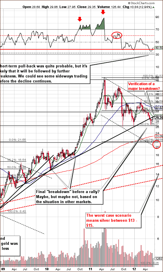
We begin this week’s silver section with a look at the white metal’s very long-term chart (please click the above chart to enlarge). Prices rallied on Wednesday, taking silver much higher but not above long-term resistance levels. These are the 10-week moving average and the long-term resistance line which was previously broken. At this time, we could still be seeing a verification of a medium-term breakdown here.
The RSI reversal is not necessarily bullish, since it was previously below the horizontal red line. Therefore, what we have now could be described as similar to the middle of 2008 decline. The situation is still not clear enough to get back on the long side of silver with long-term capital based on this chart alone.
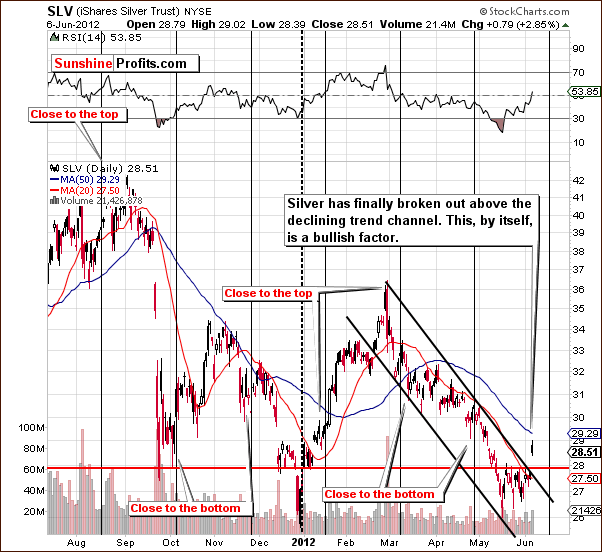
In the short-term SLV ETF chart, a clear breakout is seen although we are not overly excited since it is in conflict with the long-term picture where no breakout is seen. It could very well be the case that the short-term move to the upside will be invalidated especially if stock prices move lower. Silver’s rally was seen when stock prices rose significantly so a downturn in stocks could cause lower prices for the white metal.
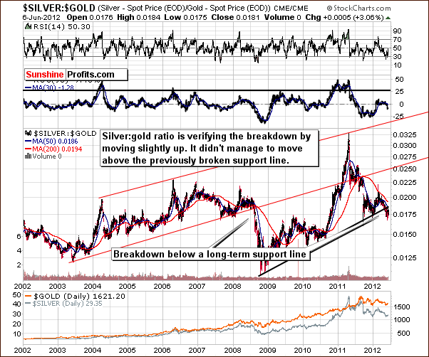
In the silver:gold ratio chart, we see values which are still below the rising resistance line. The breakdown below this line is clearly visible and the implications are bearish.
Summing up, the short-term picture improved somewhat based on the short-term breakout. The link between silver and the general stock market, however, makes us hesitant to enter positions in the white metal at this time. From a long-term perspective, caution still appears warranted for silver investors.
Precious Metals Mining Stocks
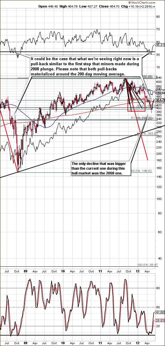
In this week’s long-term HUI Index chart (please click the above chart to enlarge), we see that prices moved higher after moving below the 200-day moving average (red line). Then, miners moved to this line – this is quite similar to what was seen in 2008. At this time we are not so certain that worst is behind us especially with the gold situation being unclear and the outlook for stocks bearish.
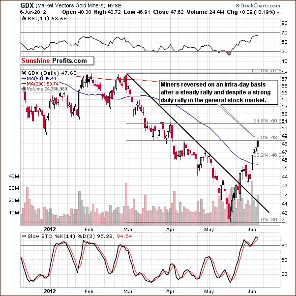
In the short-term GDX ETF chart, it seems that lower prices will be seen soon. The miners moved nowhere on Wednesday even though stocks rallied and gold initially moved higher as well. The candlestick that we saw on Wednesday is not a shooting star pattern (which is the case in the gold market), but it is bearish anyway based on the intraday reversal.
The miners have corrected 50% of their previous decline and may very well be ready for at least a breather (in case a bigger decline is not seen soon). The short-term indication is that a reversal is coming based on Wednesday’s price action, the situation in gold, the situation in stocks and the True Seasonal patterns and this makes the outlook bearish here.
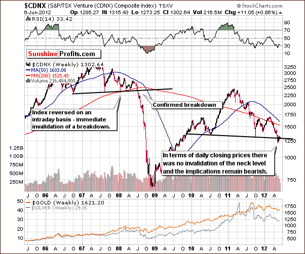
The Toronto Stock Exchange Venture Index (which is a proxy for the junior miners as so many of them are included in it) still remains bearish this week. Though it seems that an invalidation of the neck level took place in terms of intra-day lows, this is not really the case. The neck line, which is based on daily closing prices is more significant, and when this line is taken into account, no invalidation of the head-and-shoulders pattern has been seen. If declines continue, the index will likely move below 1000, significantly lower, and perhaps close to 800 or so. This would have bearish implications on mining stocks and especially on the juniors sector.
Summing up, the situation appears quite bearish for mining stocks. The medium-term picture is more bearish than not (we estimate the probability of bigger decline at 65% or so) and the same is the case with the short term based on the lack of reaction to Wednesday’s stock market rally. We are also entering a normally weak period for mining stocks.
Opening speculative short positions in the mining stocks could be a good idea. We should see at least lower prices in the short term and this could even be the beginning of another significant move to the downside. The probability of a decline in the short term is about 65% in our view and the target is $42 in the GDX ETF (400 in the HUI Index).
Junior Mining Stocks
As stated in the Key Principles section, the list of top juniors will be updated approximately every 4 weeks, so this is the Update that should contain the revised version of the lists.
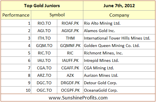
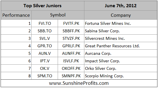
The rankings didn’t change much since last month and the most important point about the junior sector at this time should be made with regard to the situation in the general stock market and the TSX Venture Index. In particular based on the latter, it seems that we are on a verge of another significant move lower in the prices of juniors, and therefore, we no longer prefer junior mining stocks to senior miners. In fact, we believe that selling or hedging a part of one’s long-term mining stock investments (including juniors) is a good idea.
Letters from Subscribers
Q: A question on investing in NUGT or DUST. Didn’t you have an article out on these investments? What are your thoughts on these vehicles vs. options?
A: Yes, we used to write about these trading vehicles.
DUST is the symbol for the Direxion Daily Gold Miners Bear 3X Shares and just like its name suggests, it's a fund that moves inversely to mining stocks (specifically the GDM Index) while providing a 3x leverage. This makes it a useful trading tool for those betting on lower mining stock prices.
Generally, options are more customizable, but the time decay is a disadvantage. When going long with options, you can lose in a bull market if the move doesn't materialize soon. In case of NUGT, you could just wait it out. All in all, options are usually better for more advanced investors, while ETFs/ETNs are better for those who are less advanced or simply prefer less risky trading vehicles (3x leverage means that it's still risky, but not as risky as a short-term option).
Q: I have the junior silver miners in my portfolio. Suppose they have a value of $100k. How can I hedge this using ZSL? Do I need to purchase the same amount, $100k? I don’t have enough money for that strategy!
A: Please note that hedging silver juniors with an ETF will not result in a complete immunization of the portfolio to lower prices, because the prices of the shares will move a bit differently than silver, even if they move generally in the same direction (the link between gold and GLD ETF is much stronger, for instance). So, selling a part of the position and hedging the rest appears justified to be better idea in case of juniors. We will move to that in a few paragraphs.
It's impossible for us to calculate the necessary amount of ZSL or any other ETF/ETN because we don’t know the exact structure of the holdings. Generally, we would regress the average performance of that portfolio against ZSL to calculate the beta coefficient. However, there is also a much simpler approach that you can use. It's less precise, but should produce a similar result:
Step 1. Check how much your portfolio declined over the last month. Let's say it was 10%. This will be A.
Step 2. Check how much higher ZSL moved over the last month. Let's say it was 30%. This will be B.
Step 3. Calculate the following: (Current value of your portfolio / Current price of ZSL) * (A / B). You will get the number of ZSL shares that you should buy to hedge your portfolio if there is another move lower in silver.
Assuming that you had $10,000 and ZSL's price was $60, you would buy: (10,000 / 60) * (10% / 30%) = 55.56 => 56 (rounded) ZSL shares.
If you can't afford to purchase the hedge, then you could sell part of your holdings and use it to buy a hedge for the remaining part of the portfolio. The amount that you would need to sell is: (Current value of your portfolio * A) / (A+B). In the above example, that would be ($10,000 * 10%) / (10%+30%) = $2,500. So, you would sell $2,500 and use it to purchase ZSL. Since in this example ZSL moves 3x more than your portfolio, you should theoretically have a hedge that is 1/3 as big. And this would be the case as $2,500 is 1/3 of the remaining amount which is $7,500.
Summary
The situation in long-term interest rates is currently favorable for precious metals and the general stock market. The bullish technical picture for the USD Index has bearish implications for the precious metals as does the bearish technical picture for stocks.
Gold rallied significantly last Friday but failed to move above the 300-day moving average this week. It formed a shooting star candlestick on Wednesday which has bearish implications for the short term. Combining this with stocks approaching two important resistance lines on Wednesday lead us to believe that mining stocks are likely to decline soon and betting on their lower prices with one’s speculative capital appears to be a good idea right now.
The situation is somewhat unclear for silver as a significant breakout was seen in the short term but not in the long term. This still makes us cautious for both the long and short term. We are also entering a post-early-June True Seasonal pattern, which is unfavorable for precious metals and likely to put downward pressure on prices.
The probability of lower prices for mining stocks appears to be about 65%. We continue to believe that long-term investment capital in gold is a good idea but part of the long-term investment capital should be out of the silver and mining stocks markets at this time.
This completes this week’s Premium Update. Our next Premium Update is scheduled for Friday, June 15, 2012.
Thank you for using the Premium Service. Have a profitable week and a great weekend!
Przemyslaw Radomski


