A small number of investment professionals are jostling behind the scenes to turn the gem into a commodity that would be available to investors through ETFs. Financial industry players figure that if investors are willing to invest money in gold, silver and platinum ETFs, than why not diamonds. The SPDR Gold Shares is one of the world’s largest exchange-traded funds, with a market capitalization of about $70 billion. But it is unlikely that the diamond fund will be able to replicate the phenomenal success of GLD. Annual production of gold is about $100 billion, whereas the annual production of polished diamonds is only about $18 billion.
Some argue that diamonds are not a commodity but unique items that need to be evaluated individually. But on the other hand, the supply of new diamonds is not expected to rise while demand from India and China is expected to increase steadily.
Economic Suicides
The New York Times reported on a growing phenomenon in Europe:“suicide by economic crisis.”Apparently people are taking their own lives in despair over unemployment and economic failure. Paul Krugman in his column in the New York Times wonders if it isn’t the case that European leaders are committing economic suicide for the Continent as a whole.
Just a few months ago I was feeling some hope about Europe. You may recall that late last fall Europe appeared to be on the verge of financial meltdown; but the European Central Bank, Europe’s counterpart to the Fed, came to the Continent’s rescue. It offered Europe’s banks open-ended credit lines as long as they put up the bonds of European governments as collateral; this directly supported the banks and indirectly supported the governments, and put an end to the panic.
The question then was whether this brave and effective action would be the start of a broader rethink, whether European leaders would use the breathing space the bank had created to reconsider the policies that brought matters to a head in the first place.
But they didn’t. Instead, they doubled down on their failed policies and ideas. And it’s getting harder and harder to believe that anything will get them to change course.
Of course, now it is Spain that is feeling the pain. Krugman asserts that Spain is in a full depression with an overall unemployment rate of 23.6 percent. Unemployment among the young is a staggering 50 percent. Spain wasn’t fiscally profligate like Greece. On the eve of the crisis it had low debt and a budget surplus. The rain that hit Spain in the plain is an enormous housing bubble, made possible in large part by huge loans from German banks.
Krugman states that fiscal austerity will depress Spain’s economy ever more. He suggests that the solution is an exit from the euro and a restoration of national currencies.
So it’s hard to avoid a sense of despair. Rather than admit that they’ve been wrong, European leaders seem determined to drive their economy — and their society — off a cliff. And the whole world will pay the price.
IMF optimistic about global economy
The International Monetary Fund apparently doesn’t agree with Krugman. It is more optimistic about the global economy after seeing faster growth in the United States and a coordinated effort in Europe to address its debt crisis, the group said Tuesday. In its latest economic report the IMF said that the American economy should expand 2.1 percent this year. (It was last year at this time that the ratings agency Standard & Poor changed its outlook on America’s credit score to “negative”, the first step in the U.S. losing its stellar triple A rating.) Europe is likely to shrink 0.3 percent and the world economy should grow 3.5 percent. All three of the I.M.F.'s estimates are slightly better than its January's forecasts. The group praised European leaders for bulking up its bailout fund and taking other steps to address the crisis. Both the IMF and Krugman agree on one thing-- that the eurozone crisis continues to loom as the biggest threat to the global economy.
Higher than expected inflation in India
In other parts of the world, the Reserve Bank of India on Tuesday surprised investors with a bigger-than-expected half-percentage-point cut to its key lending rate, sending it to 8%, saying the state of India's economy is "a matter of growing concern." Assuming a normal monsoon season, continuing improvement in industrial production and in the global outlook, the RBI said it expects growth for the current year at 7.3%. Inflation in India slowed less than expected in March. Indians, who love gold in any case, could turn to it as an inflation hedge. Meanwhile, the Indian Post office system is offering a 6% rebate on gold coins of various denominations for the forthcoming Akshaya Tritiya festival, which is one of the biggest gold buying festivals in the country. At present, gold coins are available at more than 800 post offices across India. For small investors the post office is an attractive option since they can buy gold coins in low-end denominations like 0.5 gram, 1 gram, 5 gram and 8 gram. Traders say high sales are a sign that the yellow metal is gaining acceptance as an ideal investment in the world's biggest gold consuming nation.
There are some places in the world that don’t seem to feel the pinch. A 24K gold plated iPad 3 will be unveiled at Damas Jewellery in Dubai Mall next week before being auctioned off for charity. If you’re considering buying one of these gold iPad 3s, keep in mind that it can handle overheating issues and it is corrosion free. Gold is one of the most non-reactive precious metals on Earth. The gold plated iPad 3 costs more than $5,499.
And the best part is, just think how good our gold charts will look on that gold plated iPad. Speaking of gold charts, let’s turn to the technical part with analysis of the US Dollar Index. We will start with the very long-term (charts courtesy by http://stockcharts.com.)
USD Index
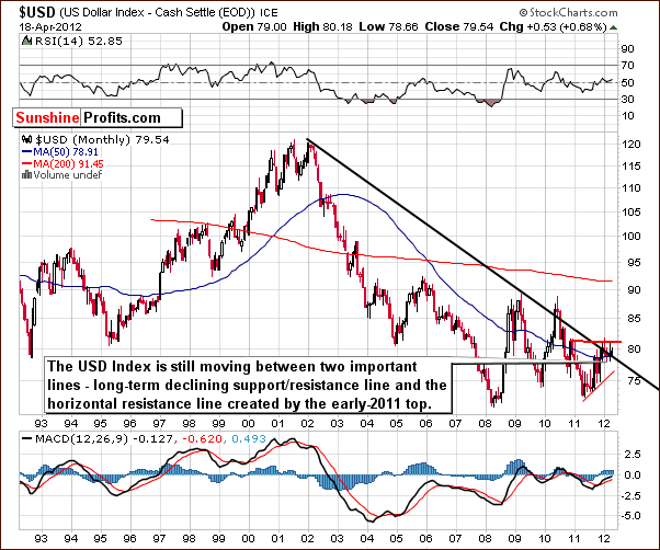
In the very long-term USD Index chart, very little has changed since last week. We have therefore decided to quote from last week’s Premium Update:
We see that the sideways trading patterns continue between the two levels which are quite important from a technical perspective. These are the declining long-term support line and the horizontal support line based on the early 2011 high. At this point, the very-long term chart remains mixed as the USD Index moved a bit higher once again this week, but no breakout has been confirmed thus far.
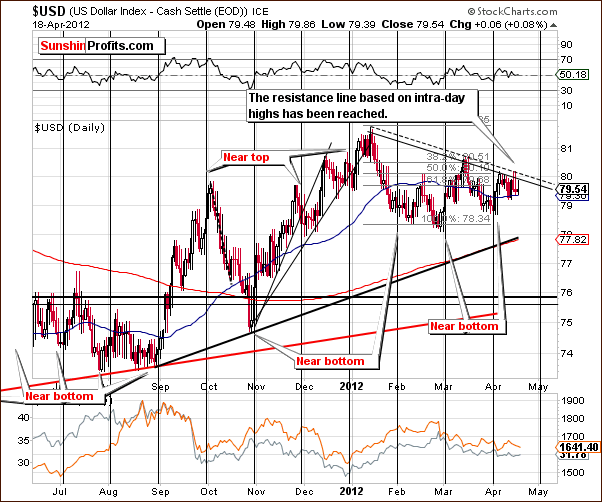
In the short-term USD Index chart, we have seen that the index moved to its upper resistance line based on intra-day highs. Actually, last week we wrote (on the chart analogous to the above one) that the USD Index is ready to move lower, but on the other hand a small move above this line (to the dashed line based on intra-day highs) would not be surprising either.
Since the trend remains down for the USD Index, it seems that the precious metals could very well rally once this index begins to move lower.
Summing up, the short-term and long-term picture continue to appear a bit more bearish than not and the implications for the precious metals are generally positive.
General Stock Market
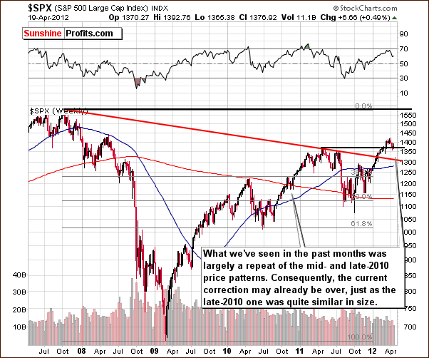
In the long-term S&P 500 Index chart, we see that the RSI level is no longer close to 70, and thus the situation is even more similar to late-2010 than it was weeks ago. Consolidation around previous tops is something what we’ve seen back then and what we have right now. A substantial rally followed back then, so this is a likely outcome also this time. The long-term picture is clearly bullish.
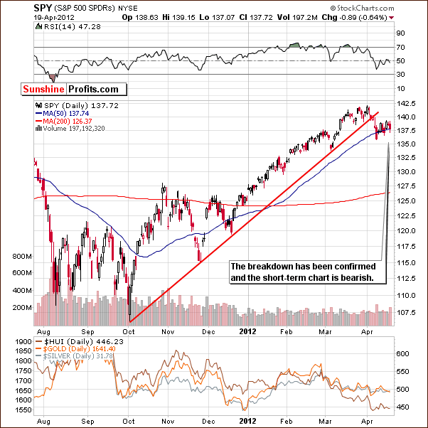
In the short-term S&P 500 chart, we have a bearish picture. Prices have slipped below the short-term resistance line and consolidated close to the 50-day moving average. Consequently, the breakdown has been confirmed with three consecutive closes below the line.
Summing up, the outlook for stocks appears to be slightly more bullish than not. When long- and short-term pictures are in conflict, the long-term implications usually prevail. Therefore, the overall situation in the stocks is rather bullish in our view.
Correlation Matrix
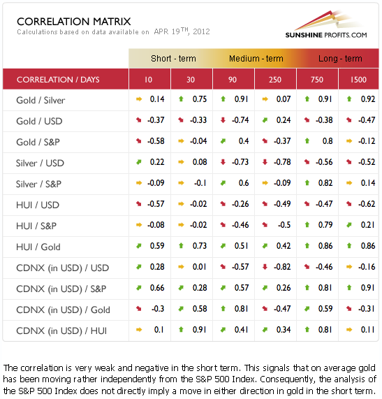
The Correlation Matrix is a tool, which we have developed to analyze the impact of the currency markets and the general stock market upon the precious metals sector. Focusing on the correlation of the precious metals markets with the USD Index and the general stock market, we see very weak coefficients this week. This indicates that the situation in precious metals is being driven by the metals themselves.
The impact is weak, yet bullish. The strongest coefficient is the negative one between the USD Index and gold. The bearish short-term outlook for the USD Index therefore has bullish implications for gold. Since gold is the most important key to the precious metals sector on the whole, the rest of the precious metals sector is likely to rally as well.
Gold
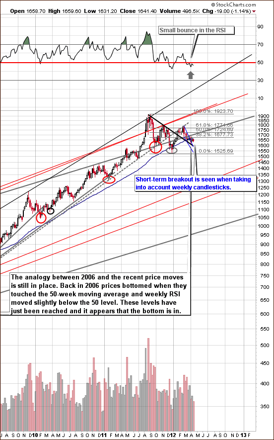
This week we begin our gold section with a look at the long-term chart (please click the above chart to enlarge). The situation has not changed in any meaningful way and is still resembling the similar trading pattern seen in late 2006 into 2007. The post breakout consolidation is a bit longer than 2007 and shaped somewhat differently, but similarities are generally still very much in place. It seems that now that the consolidation may be close to completion, and the possibility of another powerful rally is at hand.
After prices declined back in the 2006-2007 period, a rally was seen to the level of previous highs but not immediately above this price level. Still, the price rise was considerable. A similar rally is expected this time as well, especially with the recent breakout now clearly confirmed.
It is important to note here that the short-term decline appears to have ended as a breakout out of this downward trading pattern has been seen. While this may not be so visible in the short-term chart, it is clearly seen in the chart based on weekly candlesticks. Since the implications of long-term charts are more important than those of the short-term type, this is a noteworthy development and points to a likely bullish period ahead.
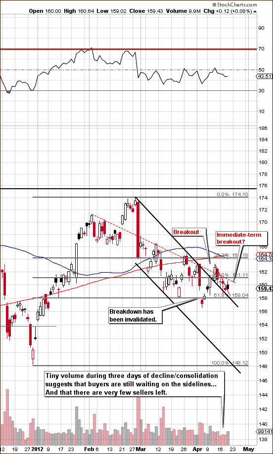
Looking at the short-term GLD ETF chart (please click the above chart to enlarge), the declining trading channel which was blue in the previous chart is shown in black here. The breakout of a week ago is now in the process of being verified. Remember that declines seen on low volume are normally just corrections or small consolidation moves.
The short-term situation has improved since last week. This consolidation period differs from other ones seen recently in that the decline was not as sharp and was seen on lower volume.
The very short-term picture, including Thursday’s slight uptick seems to be the start of a small breakout and the verification of it on relatively high daily volume. This suggests that the consolidation could be over and a rally underway with the possibility of very big moves in price to the upside. Unfortunately, stockcharts.com doesn’t allow us to provide intra-day charts from their website, but when taking that picture into account, it is clear that Thursday’s price action is actually an immediate-term breakout – consequently, visible volume on that day is quite bullish.
It could be the case that the small breakout is the spark that will ignite a much bigger move to the upside. On the other hand, if gold doesn’t rally immediately, but stays above the upper declining black line (currently a support line), the situation will still remain bullish.
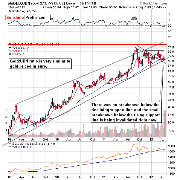
In this week’s chart of gold from a non-USD perspective, we also see signals which are quite bullish. There was no breakdown below the declining support line, and the move below the rising support line is now being invalidated. The latter is based on intra-day lows.
The recent price action is similar to what was seen in mid-2009 and late-2011 when prices approached but did not break below this rising support line. Based on these prior, similar patterns, the outlook now is bullish as no lower prices were ever seen in either of these previous cases.
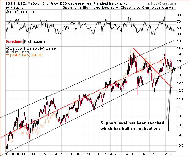
Once again, we have included a look at gold from the Japanese yen perspective. The index level is close to the lower border of the rising trend channel today and in the past this has been a buy signal. Moves to the upside have followed all recent trading periods when the index touched or crossed this support line, and the move has usually been seen rather soon and has also been generally sharp.
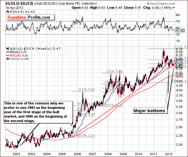
Finally, we look at the gold:bonds ratio chart. This chart is unchanged from last week but is included because it gives us a different perspective. Here we see that a major bottom has formed and it is likely that moves to the upside will be seen soon. The recent trading patterns here strongly resemble what was seen in the first half of 2010, and the second half of that year saw a steady move to the upside which lasted nearly six months and saw ratio levels rise close to 20% along with similar move in gold.
Summing up, the outlook throughout the gold sector remains bullish and short-term indicators suggest that higher prices are likely just around the corner.
Silver
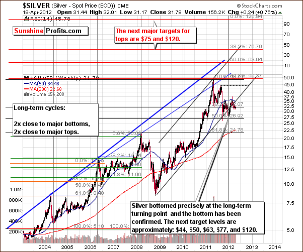
We begin this week’s silver section with a look at silver’s very long-term chart. The short-term volatility which has been seen over the past couple of weeks is not really visible here and silver’s price has remained close to the long-term support line and the 38.2% Fibonacci retracement level based on previous highs.
It is most important to keep in mind that this chart shows the long-term cyclical turning points which generally mark major tops or major bottoms. After the previous major bottom was formed early in 2010, lower prices were never seen. A period of sideways trading was seen initially followed by a history-making rally which continued for over a year. A major bottom was seen in mid-2004 and this too was formed at a price level low which was never reached again.
A move below or to this major bottom level which was just above $27 is quite unlikely based on these historical trends – price didn’t use to move back to it after the long-term cyclical turning point. In addition, the 38.2% Fibonacci retracement level is in play as well, which also supports the bullish scenario which has emerged here. The next major upside target level for silver is well above the current $32 trading range and for long-term investors, short-term price fluctuations such as have been seen recently are pretty much meaningless.
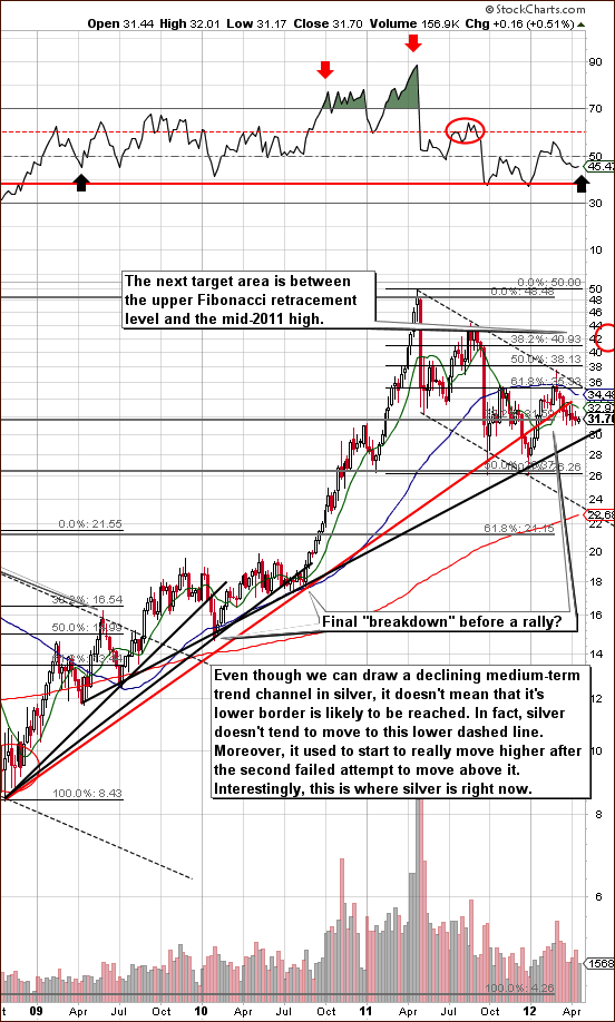
We now turn to silver’s long-term chart (please click the above chart to enlarge). Not much has changed this week and we would now like to address an inquiry we received regarding the likelihood of the recent downtrend continuing.
Since silver is in a medium-term downtrend, does this mean that prices are likely to move to the lower part of the trading channel now or is a breakout more likely? Can we expect to see moves resembling last May, last fall, or even what we saw as 2012 began?
Throughout the past four months, silver has not appeared too eager to attack previous highs even despite the fact that a significant correction has already been seen. Even more interesting is the possibility of a move above the upper border of the declining trend channel. In the past, strong moves to the upside followed the second failed attempt to break out and we are in such a post second attempt phase now.
Back in late-2005, late-2007, and mid-2009, the resistance line was not immediately broken as a period of consolidation was seen first and quickly followed by higher prices. Some suggested moves to the downside (to the previous lows or even lower) back then as well, but this simply did not happen. The 2012 decline is much bigger than the late-2005 and late-2007 ones but still, it’s not so surprising. An even bigger decline was seen in 2009, but just as was the case then, we do not see the current price action as the beginning of a slide towards the lower dotted line in the chart.
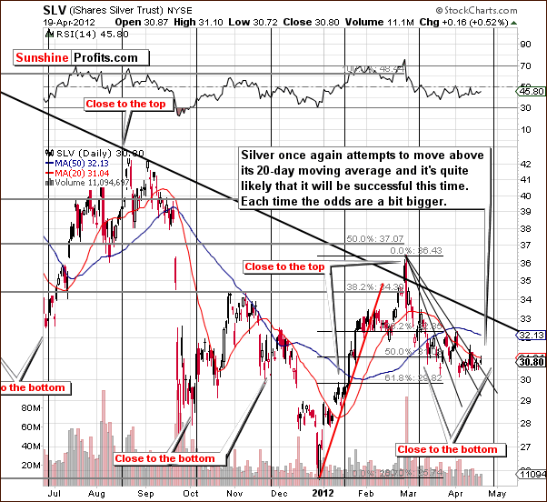
In the short term SLV ETF chart, there are two important points to discuss. First, the cyclical turning point is close-at-hand and is likely suggesting a rally for the white metal. Second, we have seen a move above another declining resistance line based on previous short-term highs. Small breakout above this analogous line suggests that a true move to the upside might finally be underway.
We would like to stress that the short-term situation in silver is much less clear than the short-term picture for gold. Much of the bullishness for silver is based upon the strong case already made for higher gold prices.
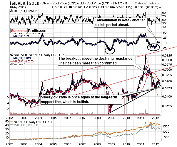
In the silver to gold ratio chart, we see a major support line in play and the suggestion is that a move to the upside here is very likely. Based on this chart, silver is likely to outperform gold in the months ahead, though not necessarily immediately.
Summing up, the situation remains bullish for silver even with the lack of a significant price upswing in recent weeks. Better days still appear to be ahead for the white metal.
Platinum and Crude Oil
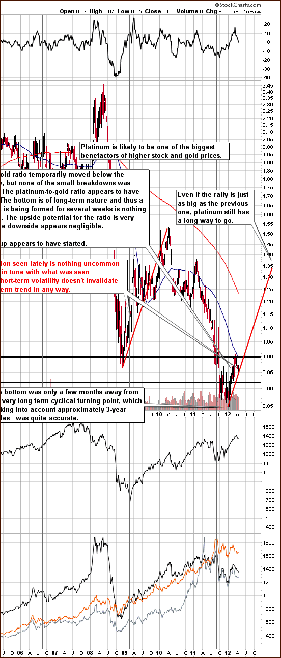
In the platinum to gold ratio chart (please click the above chart to enlarge), we see that platinum is once again cheaper than gold (the ratio is less than 1.0). We have been asked to comment on this. It is important to keep in mind that the ratio has rallied sharply since January 1 so a pullback is not all that surprising.
Let’s compare it to the last rally which was seen after a considerable decline. In the 2008-2009 trading period, the short-term volatility was in place and this did not invalidate the bullish trend at all. The ratio was actually a bit higher then as compared to its extremely low value at the start of 2012. The potential to catch up this time has been enormous so we continue to believe that platinum is a very good long-term play in and of itself as well as relative to gold.
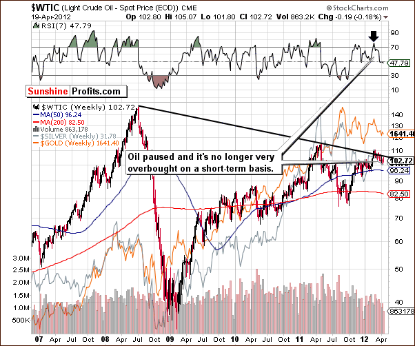
In the crude oil prices chart, we see that some consolidation took place after prices reached a resistance line earlier this year. The suggestion here is that once the consolidation is complete, prices will rally once again. The correlation with precious metals on a medium-term basis has not been very meaningful. Prices have been below their 2008 highs while, at the same time, gold prices have been above theirs.
Short-term moves often align, however, and it now seems that once oil prices begin to rise, gold prices will do so as well. They have pretty much moved in tandem since the beginning of the year and the situation therefore looks quite favorable for gold based on the signals seen in this chart.
Gold and Silver Mining Stocks
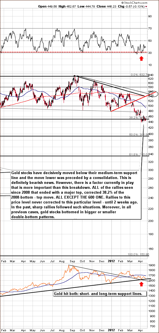
In this week’s medium-term HUI Index chart (please click the above chart to enlarge), virtually nothing has changed since last week as prices really did not move. The RSI is no longer oversold so prices could move lower, but this appears unlikely based on the situation in the gold market.
Current trading patterns are very much in tune with what has been seen in previous corrections with a move close to the 38.2% Fibonacci retracement level of the previous rally. Bigger or smaller double bottom patterns are quite common at this point in the correcting move. At times, the bottoms were more spaced out but we are seeing something very much in tune with long-term trends. So what appears to be quite scary at first glance is a bit less so as we take a closer look.
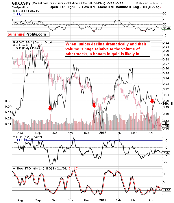
This chart shows the performance of junior mining stocks as compared with other stocks. We continue to get a buy signal here from the Junior Gold Miners Index as an early-April bottom was formed on huge volume. This indicates that the volume of juniors was significant to that of other stocks and previously this was seen when gold reached a major bottoms. So this supports the premise that gold has indeed reached its major bottom and a rally is likely in the weeks ahead.
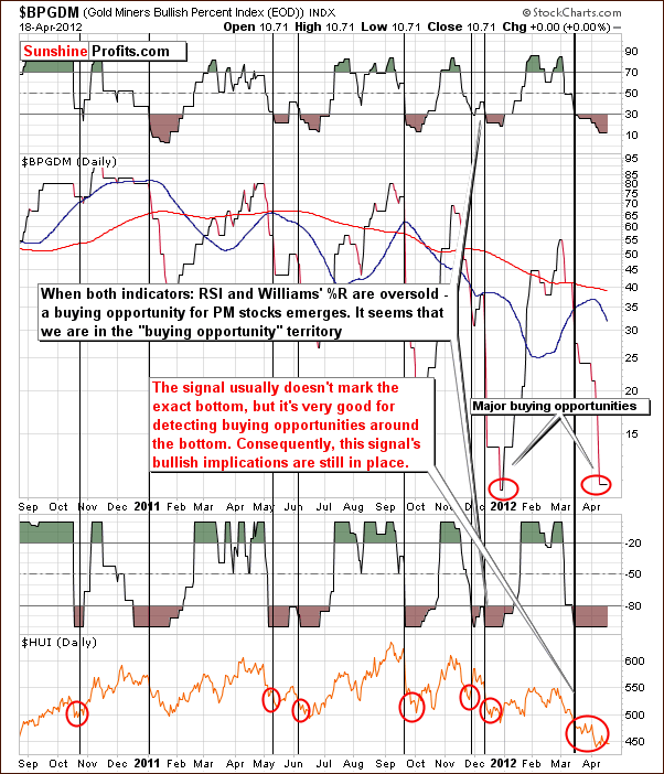
In the Gold Miners Bullish Percent Index chart, once again we have a confirmation that we are seeing a major buy opportunity not only for the mining stocks but for the whole precious metals sector. The signals are clearly bullish here.
Summing up, the situation in mining stocks is quite critical yet it remains bullish. This is based on historical patterns, the HUI Index, the Gold Miners Bullish Percent Index, and most of all, the situation in gold.
Letters from Subscribers
Q: Can you comment on this video please? Thanks.
A: In our opinion the comments made in this video are exaggerated.
First of all, yes, we agree that erosion in the value of the USD as a fiat currency is a factor that greatly contributes to inflation which results in higher oil prices. However, we don't agree with that being the only factor in play. In particular, the analysis of supply and demand for oil is crucial in determining the long-term direction of its price - just as with virtually any other good.
The video includes comments about a strong link between gold and oil. From the investment perspective, there were times when gold underperformed oil and there were times when it outperformed significantly for a considerable amount of time. Consequently, presenting the current oil:gold ratio as the foremost tool for pricing oil and gas is a bit misleading.
Actually, we have written two essays on the oil-to-gold ratio - you might want to read them here:
http://www.sunshineprofits.com/research/gold-and-crude-oil-should-you-be-afraid
and here:
http://www.sunshineprofits.com/research/gold-and-crude-oil-give-important-signals-gold-stock-investors
Q: Would there be a way to trade in the copper pennies for the new global currency at a higher value during the hyperinflationary period? If this new currency is electronic (like in Switzerland) I am guessing pennies might be a total mistake.
A: We believe that there is no way of really inferring whether or not the "new currency" would allow conversion for copper pennies/ nickels. Our best guess is that it will not be interchangeable, but one will still be able to sell them at a higher price than today due to increased commodity prices in general. Taking our best guess further, it seems that their value would not rise as much as gold and silver, so keeping them could be viewed as a form of diversification. But we wouldn't count on anything more with any significant probability.
Q: Steve Saville in 321 Gold says the US won’t have a blatant QE before the elections, as the Republicans would protest. If there is no QE3 next Wednesday, 1478 will come quickly. However, if gold moves above 1764 I’ll be getting the news.
A: If QE is proposed then anyone who objects will risk being responsible for the lack of growth or rising unemployment by its proponents. This is a very significant political cost, so we wouldn't "bet the farm" on the Republicans protesting. Generally, according to the political cycle, the most expansive (boosting the economy temporarily) decisions are made before the elections so that those in charge can say "look, we're good guys, see how much we give you?" in hopes of getting more votes. Then, restrictions and tough decisions (reforms?) come after the elections so that things that need to be done are done without significant political cost (as the next elections are still distant).
Q&A: Can you please comment on this as it seems very worrying despite your email alert earlier. [This relates to all questions and following replies below - Editor]
Q: "Gold, SPDR Gold Shares ETF (GLD) broke down below its lows of the previous 12 weeks on 4/4/12. Systematically, GLD remains neutral: below its 50-day and 200-day SMAs, but with the 50-day SMA above the 200-day SMA (although only slightly above now) every day since 2/11/09. Support: 156.58, 156.19, 154.55, 148.27, 147.19, 143.97, 143.42, and 142.55. Resistance: 163.20, 164.89, 166.57, 174.00, 175.46, 177.40, and 185.85."
A: The breakdown seen on 4/4/12 has been invalidated (!) and consequently it actually turned into a bullish signal. We have previously discussed and verified the accuracy of using the 50-day MA / 200-day MA ratio for the gold market - these signals were not really meaningful.
Q: "Gold Mining Stocks ETF/Gold Shares ETF Relative Strength Ratio (GDX/GLD) fell below the lows of the previous 3 years on 4/11/12, thereby reconfirming a bearish major trend for the long term. Systematically, GDX/GLD remains bearish: below its 50-day and 200-day SMAs, and the 50-day SMA has remained bearishly below the 200-day SMA every day since 2/22/11."
A: As far as moving average's ratio is concerned - as above. We believe that long-term trends require long-term perspective and charts. Please take a look at the HUI Index chart included earlier in today's update - the move lower in gold stocks is in tune with previous major moves. The situation is indeed critical, but to say that there was a long-term breakdown is an exaggeration in our view.
Q: "Silver, iShares Silver Trust ETF (SLV) broke down below its lows of the previous 11 weeks on 4/4/12, suggesting renewed downside momentum for the medium term. Systematically, SLV remains bearish: below its 50-day and 200-day SMAs, and with the 50-day SMA below the 200-day SMA every day since 10/27/11. Support 30.11, 28.63, 27.83, 25.65, and 24.44. Resistance: 32.34, 33.44, 36.44, 40.23, 41.49, 42.30, 42.78, 44.71 and 48.35."
A: Breakdown has been invalidated, as we mentioned above. Also, breakdowns in silver - seen without a corresponding action in gold - are not really meaningful, as the white metal's market is much smaller and more prone to price manipulation. We see no good reason as to why SLV below 200-day moving average would be a bearish sign. Actually, when that was the case in the past, it was a great time to buy silver. Take mid-2007, early 2010, and mid-2010 - major buying opportunities. The same goes for the comparison between 50-day MA and 200-day MA. 50 DMA was below 200 DMA only two times in the case of the SLV ETF: in mid-2007 and late 2008 - early 2009. Major bottoms were formed during these times - so is that really a bearish factor?
Q: "Silver/Gold ETFs Ratio (SLV/GLD) broke down below its lows of the previous 12 weeks on 4/13/12, confirming renewed downside momentum for the medium term. SLV/GLD remains below its 50-day SMA, below its 200-day SMA, and the 50-day SMA has remained bearishly below the 200-day SMA every day since 8/30/11."
A: History doesn't confirm that the ratio being below the above-mentioned averages was something unfavorable. Actually, the silver:gold ratio is very close to its long-term support line (based on late-2008, mid-2010, and late-2011 bottoms) which is a very bullish signal for the ratio, silver, and precious metals bull market in general as far as the medium- and long-term are concerned.
Q: “Why would you recommend metals and stocks when there are such bearish technicals? Is it better to wait for a better buying opportunity? I have already bought based on your email alert today only to find I am already losing significantly. If gold and silver do fall then can you advise subscribers what level they should consider for purchases? Gold has dropped nearly $15 as of now.”
A: We do not make any recommendations, as we are not yet registered investment advisors. However, we believe that this is a very good moment to be long precious metals, as multiple technical and fundamental factors support it, and the investor sentiment is very negative. Consequently, the risk/reward ratio is very favorable.
We respectfully disagree with the above analysis due to the reasons mentioned above. We do not ask you to take our word for it. In fact we encourage you to check the charts yourself and see how gold and silver actually performed when they were below their 50- and 200-day moving averages and when the 50-day moving average was below the 200-day one.
Summary
The situation in the USD Index is bearish for the short term and the outlook in the general stock market is more bullish than not. There has been a short-term breakdown in stock prices, but the long-term picture remains bullish. The implications for precious metals are slightly more bullish than not based on the influence of these two other markets.
The situation in gold remains bullish, and this outlook is confirmed by multiple charts in this week’s Premium Update. We have seen a breakout in gold prices and a likely verification, so it appears that the long period of consolidation is ending. A rally in gold prices appears very probable.
Silver has an outlook similar to that of gold though not quite as clearly defined. It is, of course, closely tied to gold and the very long-term cyclical turning point reached recently was a major bottom indicating that higher prices are likely in the medium and long term. Short-term indicators and a comparison to the past suggest that the next attempt to move above the declining resistance line is likely to succeed. Based on this analysis and other factors, it appears that considerably higher prices for silver are quite possible in the coming months.
The situation in the mining stocks is critical. A double-bottom pattern has been seen numerous times when prices have corrected to the 38.2% Fibonacci retracement level. The lack of an immediate rally is therefore not all that concerning at this time.
Additional short-term volatility has been seen in the platinum market, but this is not unusual. Platinum seems poised to outperform gold in the medium and long term, but the short-term situation is somewhat unclear at this time. Consequently, nothing changed regarding our views on this sector.
All-in-all, long-term speculative and long investment positions in the precious metals sector appear well-justified at this time. We currently view the probability of an upswing in gold (before a move below) $1,600 at 75%-80% - a very high number. Target levels remain as follows: slightly above $1,900 for spot gold, $40 to $45 for spot silver, 550 for the HUI Index, and $55 for the GDX ETF.
This completes this week’s Premium Update. Our next Premium Update is scheduled for Friday, April 27, 2012.
Thank you for using the Premium Service. Have a profitable week and a great weekend!
Przemyslaw Radomski


