
This week we are proud to invite you to explore Sunshine Profits’ brand new website loaded with new features, tools, reports,charts and everything else under the sun (shine) that can give you a competitive edge.
There was plenty of hoopla last week. The Federal Reserve's announcement Thursday of a third round of quantitative easing sent investors scrambling for gold and silver. The Fed injected a liquidity fix by announcing the purchase of an additional $40 billion per month in mortgage-backed securities, increasing its holdings of longer-term securities by about $85 million each month through the end of the year, as well as keeping interest rates "exceptionally low" until 2015. In a race to debase the Bank of Japan joinedthe party this week announcing an asset buying program intended to stimulate spending. This month, European Central Bank PresidentMario Draghigave details on a plan to buy debt of member states, while China approved infrastructure spending.
As Milton Friedman once said, "Only government can take perfectly good paper, cover it with perfectly good ink and make the combination worthless."
In a recent interview Peter Schiff was asked how high the price of gold may reach. He answered that there is no ceiling for the precious metal, because there is no limit on how much money will be printed. He’s right again. In its latest announcement the Fed basically said as much.
The thing to notice here is that QE 3 is open-ended, in the words of the Fed "will remain appropriate for a considerable time after the economic recovery strengthens." In other words, the Fed is promising that it won't start raising interest rates as soon as the economy looks like it is recovering but will wait until the economy is actually prospering.
Apparently, this is the first open-ended QE program in the Federal Reserve's history.
While Keynesians and Austrians may debate the pros and cons of this new round of QE, it is clearly good news for precious metals investors. Even though the expectation for stimulus was, to a certain degree, already priced in, precious metals went on a binge.
The Fed standard operating procedure for dealing with a weak economy is to buy short-term U.S. government debt from banks which adds to bank reserves and enables the banks to lend money to consumers and business. This is supposed to give the economy a booster shot. The former QE rounds didn’t work because the banks had little incentive to lend money due to the low interest rates that they can earn. So, they prefer to sit on their reserves. But the Fed announcement is supposed to change that.
Paul Krugman in his recent column in the New York Times explains this nicely:
The idea here is that by indicating its willingness to let the economy rip for a while, the Fed can encourage more private-sector spending right away. Potential home buyers will be encouraged by the prospect of moderately higher inflation that will make their debt easier to repay; corporations will be encouraged by the prospect of higher future sales; stocks will rise, increasing wealth, and the dollar will fall, making U.S. exports more competitive.
Already several banks have issued statements to their clients predicting the trajectory of the yellow metal’s price for the rest of the year and beyond.
Gold and silver are likely to benefit most from the Fed's announcement, according to a note out from Standard Bank on Friday. The bank said it expects gold will trade towards $1,900 in the fourth quarter of this year. On Tuesday both Deutsche Bank and Bank of America predicted in research notes that gold will go up in the near term. Deutsche Bank said gold prices would top $2,000 in the first half of 2013, which would represent a 13% gain over Tuesday’s settle price of $1,768.40 in the New York futures market.
Bank of America predicted a new “target” of $2,400 for gold for the end of 2014, saying in a note to clients that “Given the new open-ended nature of QE3, the upward pressure on gold prices should continue until employment is strong enough to warrant a change in policy. In our view, this is unlikely to happen until the end of 2014."
We have sent out a Market Alerts every day this week basically saying that the precious metals sector might move only a bit higher before correcting. We continue to believe that it is a good idea to be in the precious metals sector with long-term investment capital while waiting on the sidelines with speculative capital.
This week we saw platinumgive up some of its recent gains on news that Lonmin’s striking workers in South Africa have agreed to a pay increase and will return to work. News of the strike reverberated around the world late last month when South African police fired into a crowd of strikers and protesters. To date, 45 deaths have been linked to the strike. The work stoppage at Lonmin created labor unrest in South Africa, where about 80% of platinum’s supplies come from. It also showed us the vulnerability of the platinum supply chain.
In India, buoyed by demand for the wedding season, gold pricesclimbed to a fresh record high. Gold jewelry sales across the subcontinent have shot up by 10-20%. Indian prices are also going up due to a weak rupee. A revival in monsoon last month and this has helped boost market sentiment.
We want to bring this news story to your attention with the caveat “Buyer Beware.” There are counterfeit bars of gold making the rounds. A New York man who paid $100,000 for gold bars drilled into several of the bars and found gray tungsten, which has nearly the same density as gold, making it difficult to detect. The same thing reportedly happened in Great Britain earlier this year. The sting apparently involves a genuine gold bar that is purchased with serial numbers and authentic documents and is then hollowed out to be replaced with tungsten. The bar is then closed up to finalize the sophisticated operation.
You might also, just for fun, want to read this story about a recluse who dies with just $200 in the bank... and $7million worth of gold coins piled in his garage. His cousin, who hadn't spoken to him for a year, will inherit the lot.
And since most of us don’t have cousins who will leave us millions in gold coins, we will now turn to the technical portion of the update and begin this week's with the analysis of the US Dollar Index. We will start with the very long-term chart (charts courtesy byhttp://stockcharts.com.) Please note that from now on you can now click on any chart to enlarge it.
USD and Euro Indices
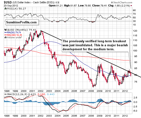
We begin this week with a look at the long-term USD Index chart. There was really no change to speak of this week, and we continue to see an invalidation of a major breakout. This is an important bearish phenomenon for the medium term, and the implications for the month ahead are quite bearish. It seems that we could easily see a move below the 75 level based on this development alone.
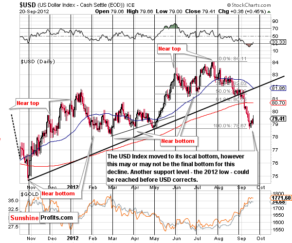
A look at the short-term chart this week shows us a near-continuous decline over the past 2 months. It seems that the USD Index is probably ready to take a breather any day now. About half of the correction is already underway, and the index level is not yet close to its cyclical turning point. In addition, the final support line has not yet been reached.
With the strong momentum shown of late, the decline in the USD Index is likely to be stopped by something more than a relatively weaker support line based on the May bottom. It seems that the 2012 low (formed in late February) would be a good place for the next bottom to form and this support line is quite a bit stronger. The very short-term picture is a bit unclear at this time as a rally could be seen from here because the USD Index is so oversold. However, we believe that a small decline and then a rally around the end of September is a more likely outcome. This would coincide with the next cyclical turning point.
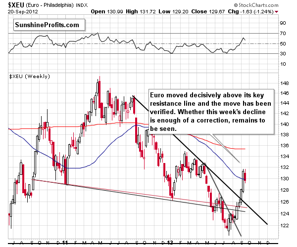
In the long-term Euro Index chart this week, we see somewhat of a reflection of the USD Index – no wonder, more than one half of the index is the euro to dollar exchange rate. The Euro Index has clearly broken and verified a breakout above the medium-term declining resistance line, and the medium-term picture is now bullish.
This chart does not tell us if the consolidation is over or not, as we have had some consolidation throughout the short rally. This could resume or we could see more declines here, something which would not invalidate the bullish outlook. We would need to see a move back below the 125 level for the picture to become bearish, and this is a long ways from where the index is today.
Summing up, at this time, the medium-term outlook is bearish for the USD Index and bullish for the Euro Index. On a short-term basis however, it seems we are likely to see some kind of correction which could take the dollar higher. This is something which may not happen until late September or even early October, that is to say, it may not be immediate.
General Stock Market
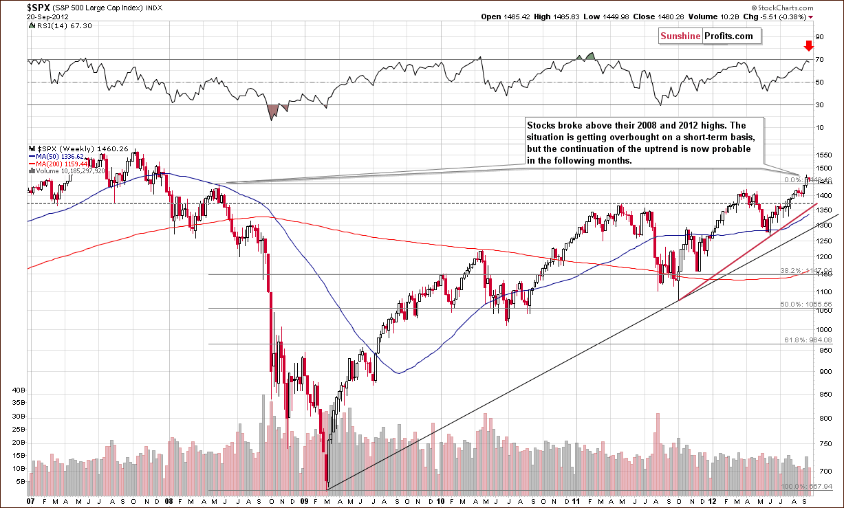
In the very long-term S&P 500 Index chart (please note that you can click on this or any other chart to enlarge it), we see a situation more or less the same as what we had last week. Stocks are less than a half percentage point below last week’s closing price level. We have seen some consolidation recently, but, given the size of the previous rally, it seems that this is not the end of it. The RSI level reflects a reading very close to 70 and the situation is quite overbought on a short-term basis. The next significant resistance line is at the 2007 highs, at 1550. A move to this point appears to be very much in the cards although a consolidation could be seen first.
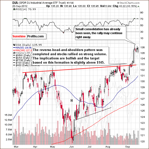
In the short-term DIA (a proxy for the Dow Jones Industrial Average), we really don’t see many important details this week other than a projected target level of $145. This chart does not tell us if the short-term consolidation is over or not. It could be the case that we’ve seen enough to verify the breakout and have the rally resume, or we could see a short-term decline from here, especially if the USD Index moves higher.
Summing up, the outlook for the stocks in general is bullish for the medium term and rather unclear for the short term.
Correlation Matrix
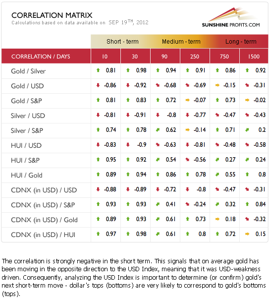
The Correlation Matrixis a tool which we have developed to analyze the impact of the currency markets and the general stock market upon the precious metals sector. The question is this: What picture does our previous analysis of currencies and stocks (above) paint for the precious metals market?
Well it seems that the outlook is very bullish for the medium term but rather bearish for the short run. The unclear situation in the general stock market doesn’t provide us with much information, but the good possibility of the pull back in the USD Index gives us some indications that the precious metals could decline in the coming days or weeks.
Gold
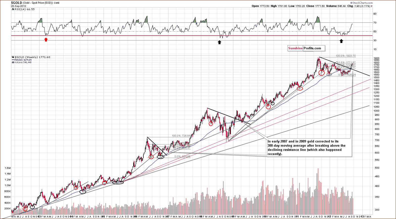
In gold's long-term chart (please note that you can click on this or any other chart to enlarge it), please recall the analogy we outlined last week in that after gold breaks out above an important medium-term resistance line, it often corrects to the 300-day moving average. Gold’s price is now close to the $1,680 level. Let’s continue this discussion with a look at the medium-term GLD ETF chart.
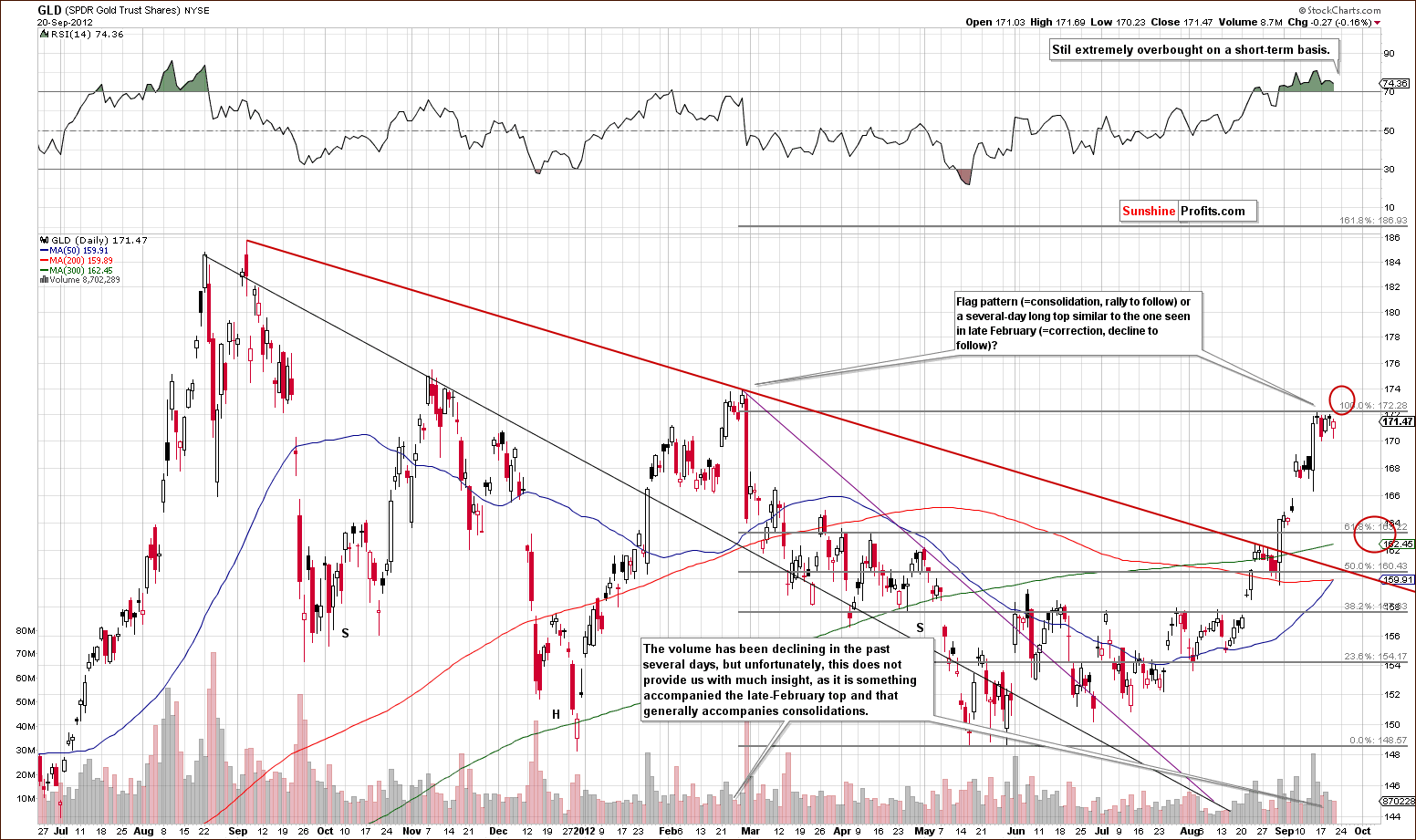
In gold’s medium-term GLD ETF chart, we see the previously mentioned 300-day moving average as the slope in green. This moving average will be very close to the first Fibonacci retracement level in late September or early October. It seems that we could see a local bottom around this time and in this price level range ($1,680 – $1,700).
The RSI level is still reflecting an extremely overbought situation. On a short-term basis, however, a move to the upside could be destined to fail, and a period of correction could very well begin. This is exactly what was seen in late February. Volume levels have been fairly weak of late but this really doesn’t say much as it could be due to consolidation with a rally to follow or simply due to the analogy of the February trading patterns.
If a correction is seen, the GLD ETF is likely to fall to $164 or so and this would create a bullish cup-and-handle pattern. The March to September period forms the cup, and the coming correction would form the handle of the pattern. This would be a bullish price pattern and after the correction, another strong rally would likely follow.
There are virtually no changes in the following long-term charts, but we’re providing them in order to show you that the medium-term outlook for gold is well confirmed.
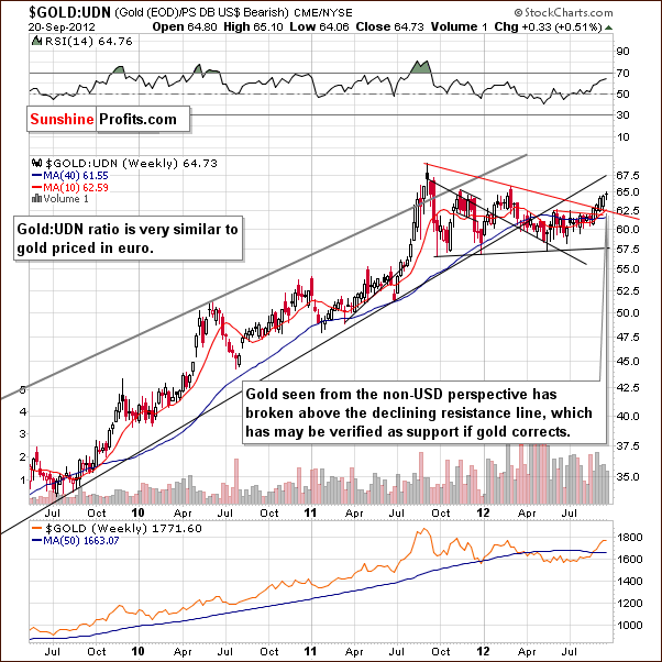
In the chart of gold from the non-USD perspective, a breakout is also seen. This is another confirmation that the medium-term picture for the yellow metal is indeed bullish.
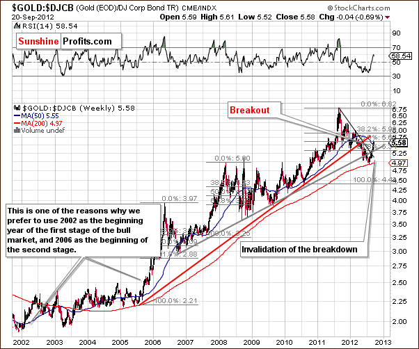
In the gold to bonds ratio chart, we again see a breakout and an invalidation of a breakdown. Again, this is a bullish combination for the medium term.
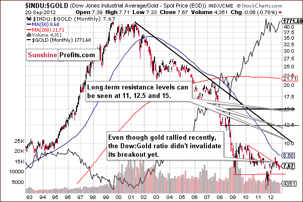
In the Dow to gold ratio chart, we have not seen an invalidation of the breakdown. We are rather seeing the ratio more or less at the declining support-resistance line based on previous important tops. The situation is mixed here. With the other charts being bullish, however, the overall picture is bullish for the medium term.
Summing up, it seems that a correction is likely in gold prices, perhaps after another couple of days of rally. If seen, the correction will likely take gold to the $1,680 - $1,700 range. After that the bullish cup-and-handle pattern in gold is completed and gold will be ready to rally strongly once again. At this time there are no immediate sell signals, though, so opening short positions is not justified in our view – at least not yet.
At the time of finishing this update, gold moved to its February 2012 high, so we might send a go short alert later today, if we get a reversal or other bearish factors emerge. This is not a go short signal yet.
Silver
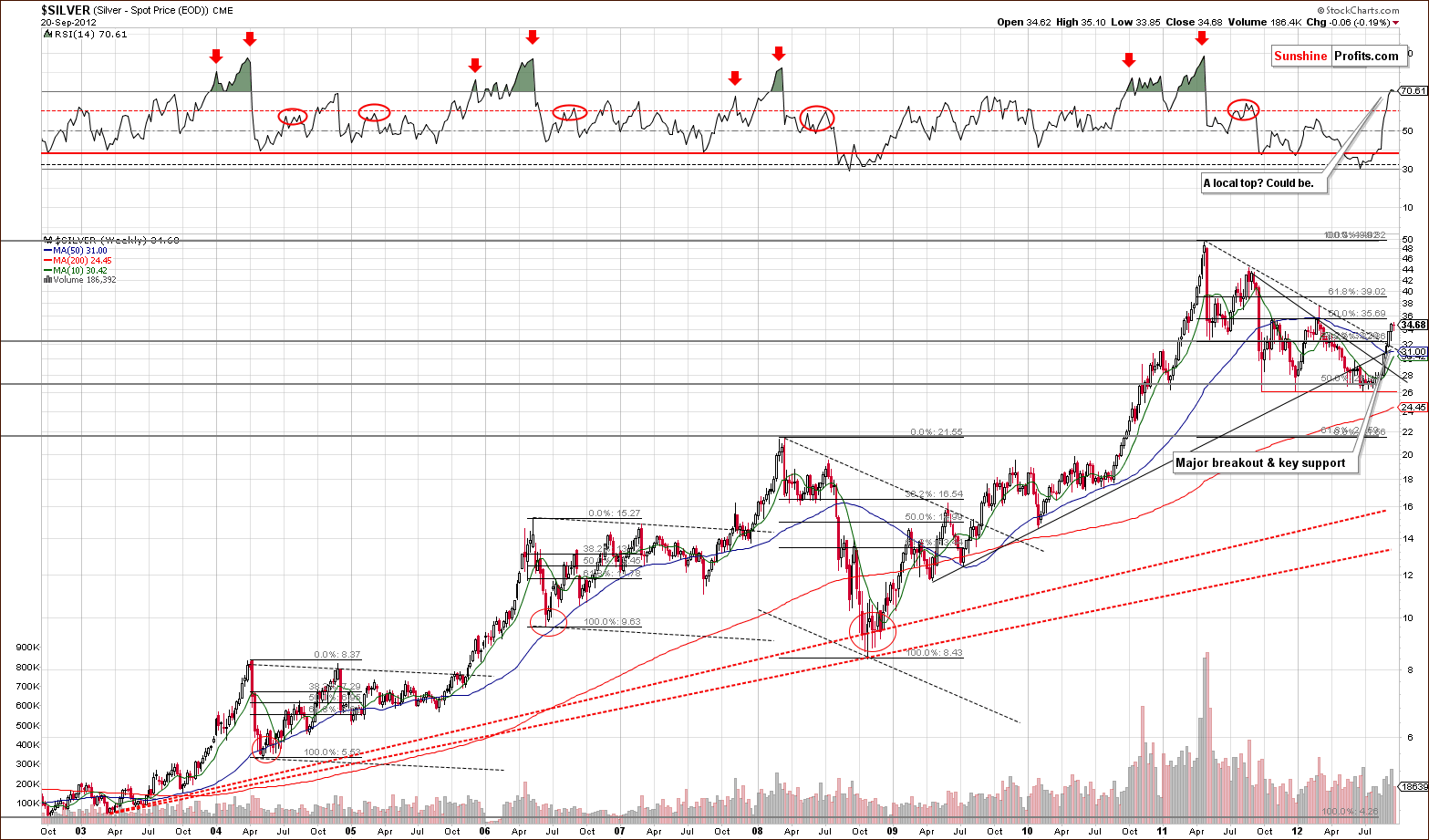
In the long-term chart (please note that you can click on this or any other chart to enlarge it) for silver this week, the RSI level has moved above the 70 level suggesting that the local top could very well be in. An analogy to the previous breakout is also in place here. After the breakout above the dashed line materialized, silver’s price corrected a bit. A somewhat similar trading pattern is underway now but to be clear - the analogy is quite weak. Still, when gold and the USD Index are taken into account, these signals fit the overall picture and that makes them more reliable.
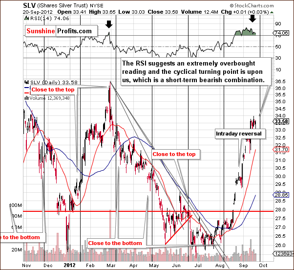
In SLV’s short-term chart this week, we see that silver is approaching its cyclical turning point as is the USD Index. Neither is at this important point but both are close. After a huge rally and an overbought condition on a short-term basis, the cyclical turning point becomes a bearish factor. All-in-all, a correction appears to be looming for the silver market.
Downside target levels are pretty difficult to determine here, and it seems best to watch the gold market, the current leader of the precious metals sector in terms of charts’ clarity. When gold reaches its downside target level, silver will likely be at or near its bottom as well.
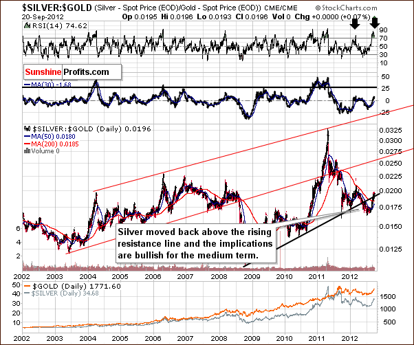
In the silver to gold ratio chart, the medium-term breakdown below the rising support line has been invalidated. This has bullish implications for the medium term.
Summing up, the short-term situation appears to be rather bearish for silver, as a correction will likely start within a week or so. The medium- and long-term pictures are bullish, though, so being invested with one’s long-term capital appears a good idea right now for the vast majority of investors.
Platinum & Palladium
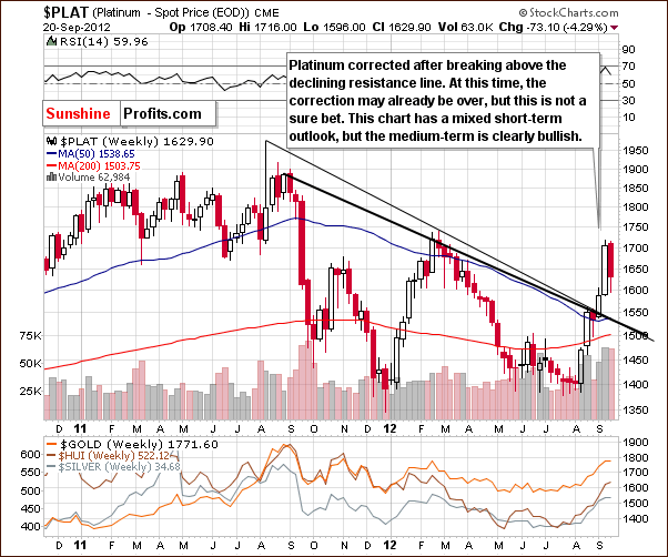
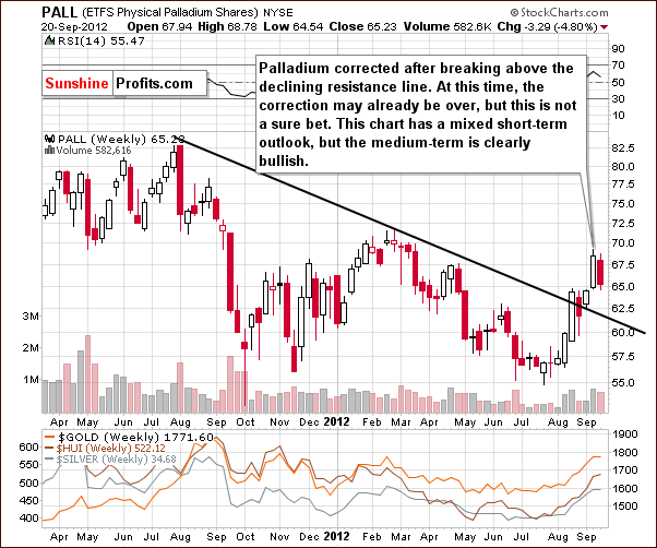
In both the platinum and palladium charts, we basically have the same technical picture and consequently, the description on the charts is analogous. Some consolidation has been seen this week, and it may or may not be over. The charts are inconclusive with respect to further strength or weakness in these metals.
Traders who are inclined towards these metals should know that we advise against any bets right now on a short-term basis. Moreover, the situation in these two metals is something that makes us not open short positions in other parts of the precious metals sector.
Mining Stocks
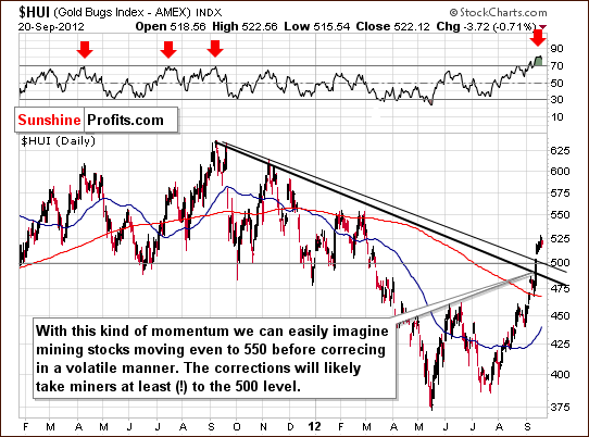
In this week’s medium-term HUI Index chart, we continue to see signs of strength even though prices declined a bit on Thursday – gold stocks were higher than they were a week ago, despite a small move lower in gold and silver. However, with RSI levels extremely overbought and the rally huge on a short-term basis, a correction appears very much in the cards. If gold and silver move higher from here before correcting, miners will likely rally as well, however we expect them to eventually (in a week or so) correct to the 500 level or even lower.
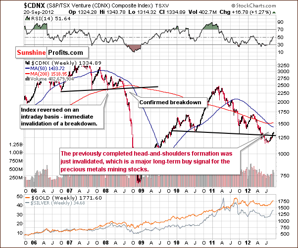
In the Toronto Stock Exchange Venture Index (which is a proxy for the junior miners as so many of them are included in it), we have a bullish signal here supporting what we just discussed with respect to gold and the HUI Index. There is an invalidation of a recent clear and bearish price pattern, a very unlikely development. This showed the true strength of the sector in spite of bearish technical indication. The suggestion here is that the next big move will be to the upside and herein lies what appears to be a good long-term capital bet.
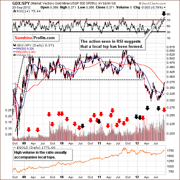
In the miners to other stocks ratio chart, we see some suggestions that the local top is in or very close. RSI levels are extremely overbought, and the ratio of volumes spike high (miners have high volume relative to stocks) is a sell signal. In the past, this combination has coincided with local tops. That was especially the case when the ratio itself encountered a resistance level – and this is the case right now – the ratio is at its 200-day moving average (close to it) and the previous 2012 top.
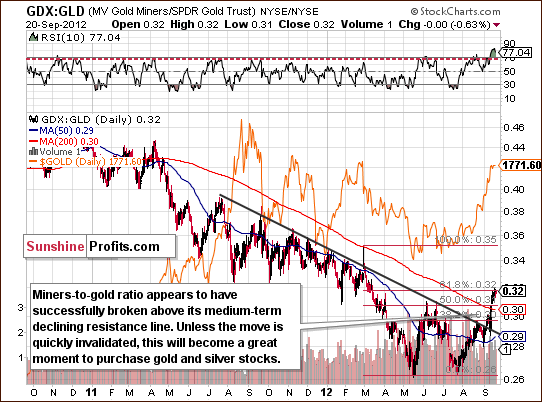
In the miners to gold ratio chart we see a breakout above the declining resistance line, and the ratio is very much overbought on a short-term basis. A correction appears very much in order here.
Summing up, the situation in mining stocks looks very favorable on a medium-term basis but not as good for the short-term. A correction appears likely based on short-term factors here. In all probability, this will provide a near perfect situation for investors to add to their gold and silver mining stock holdings.
As far as price targets are concerned, this is currently one of the hardest markets to follow and to establish target levels for, because not only are stocks relatively far from their previous highs, but also their performance relative to gold recently changed substantially. All in all, watching gold is the key here. If gold’s price declines below the $1,700 level, say to $1,680 or so, a bottom will likely form. The bottom will probably be in for the HUI Index as well at whatever price level it happens to be at the time. Our best estimation is that the HUI Index will be close to the 500 level at that time.
Letters to the Editor
This week there is no regular letters section, because we received only one general question that we tried to answer throughout the update. Please note that you can access previously answered questions that are universal in a way (relevant also months after they are replied) in our Question & Answer Panel. We will be updating this section with the questions that we replied recently shortly, but you might want to take a look at that section now just to check if maybe there is something there that you have been thinking about in the previous days – we might have already commented on it in the past. For instance, you might have considered purchasing gold using debt and this is something that we commented on previously.
Summary
Not much has changed since last week or with what we have reported in our Market Alerts over the past few days. The situation in the USD Index is bearish for the medium term and bullish for the short run. The general stock market, however, while being bullish for the medium term as well is somewhat unclear for the near term. This makes the overall situation for precious metals medium-term bullish but short-term cautious.
It seems that the charts of the precious metals confirm the suggestions from the USD Index. Simply put, it seems that gold will correct after perhaps a several-day long rally and then decline to $1,680 - $1,700. Creating price targets for silver and the mining stocks is much more difficult. It seems best to focus on the gold market in order to know when to purchase other precious metals. When gold bottoms, it is likely that silver and the mining stocks are likely to bottom as well. Finally, the coming correction is very likely to provide excellent buying opportunities for the mining stocks.
At this time, it seems best to have long-term capital in the precious metals: gold, silver, platinum, and mining stocks. Speculative capital is probably best kept on the sidelines at this time awaiting a better risk-reward situation.
At the time of finishing this update, gold moved to its February 2012 high, so we might send a go short alert later today, if we get a reversal or other bearish factors emerge. This is not a go short signal yet.
Editor’s Website Comments
This is it. The new SunshineProfits.com website was launched this week. Just as I promised, the changes were not minor, and everything looks, and to some extent works differently. Actually, there are multiple features that are waiting to be released (meanwhile, we continue to test and improve them), but I think it will be best for you to initially focus on what we just gave you and make sure that you make the most of it.
To be honest, when I first saw the graphical concept of new website in its current form I wasn’t sure if I liked it – I found it to be beautiful, but I thought that there’s just too much features while all I wanted to see was a place for updates and for tools. However, after the initial version was up and running I soon learned to appreciate the additional features like videos. Whenever I introduced someone to the new website (for testing purposes) they had the same feelings – they were first overwhelmed by the amount of features and wanted to stick to the part that they knew (updates), but after I started showing them one new thing at a time (!), it took only several days for them to say that everything is just as it should be and that they can’t really imagine going back to the old website.
So, let’s start with just one new thing for today. The old website included a section called "Key Principles". The whole section was updated, but the part that I would like you to focus on right now is entitled Gold & Silver Portfolio Structure.
Although the old Key Principles section included an essay on Portfolio Structure (and a separate one dedicated to diversification) I recently found that these two essays were too unclear and not detailed enough and I created a completely new essay. So, even though the title seems like something that you already read some time ago – it isn’t. This part of the Key Insights section was finished last week so it’s very much up-to-date (it will not become outdated in the following months anyway because it is not market-dependent). Yes, I admit, I wasn’t really able to forget about the market or Sunshine Profits when I was in Egypt and I wrote a part of this essay when I was in the air and when I was waiting at the airport in Sharm (maybe that’s why I enjoy diving so much – you can’t take your laptop underwater and you’re guaranteed to relax when you’re there).
Why did I choose this part of the website first? Here’s a quote from the summary of the essay:
The results of studies vary, but we think it’s safe to say that the structure of one’s portfolio is responsible for at least 75% of the investment success in the long term. This means that even if your market timing skills are second to none, you will still not end up with piles of money in a few years if you don’t pay attention to portfolio structuring (assuming that money management is part thereof).
Simply put, I decided to completely update and start with this part of the website (by mentioning it today), because it is so important your long-term financial success. Let’s be clear on this one – this essay is long, detailed, and you might need to get a cup of coffee before you start reading it, but I promise you that it will be worth it. It is no coincidence that a link to this essay is at the top of the Reading block on our homepage.
Since we’re discussing the new website and its features – please let us know what you think. We would love to hear your thoughts about it regardless if it’s a general comment, suggestion, or anything else. We will be even happy to read about typos – we have been working on this website for a long time now and we might no longer be able to look fresh at it – it all seems clear and obvious to us, even though it wasn’t when we first looked at it – so if you think that anything about the website should be clarified or done differently, please let us know.
Even though we operate this website, we don't own it, in fact. You own it. This website is all about you. It is your portfolio that grows thanks to our research . It is you who benefits from our market updates,charts and tools. It is your contributions that finance our research, and make Sunshine Profits possible. This is your website. So thank you in advance for your contribution to your site.
Thank you for using the Premium Service. Have a great weekend!
This completes this week’s Premium Update. Our next Premium Update is scheduled for Thursday, September 27, 2012. Of course, we will continue to send out Market Alerts whenever appropriate.
Sincerely,
Przemyslaw Radomski, CFA

