
When a roller coaster plunges it’s gut-churning, heart-racing, blood curdling, in a word--petrifying. That’s how precious metals investors must have felt Wednesday when gold plunged more than 5 per cent to hit a low of $1,688.44 ounce, after earlier trading as high a $1,791.49 an ounce.
On Tuesday, the day before the plunge, we had sent out a Market Alert in which we included a list of bullish and bearish factors and reiterated our suggestion to stay out of the market with short term speculative positions as we felt that the situation was too dangerous. It seems that we were a lone voice and some of our subscribers even canceled their subscriptions annoyed that we were saying that the situation was bearish when gold prices were going up. We can only hope for their sakes that they didn't open any long positions.
Please allow us to digress a bit. Being a lone voice suggesting a downswing is one thing, but we have just learned that those analysts who didn't see the correction coming, are now blaming some certain events that took place on Wednesday or even resort to manipulation theory. We find it a bit odd. Yes, in a way, all markets are manipulated as the money supply / interest rates are subject to gov't control and there are indications that gold and silver markets are being manipulated, but that doesn't mean that all sharp moves (especially the "unforeseen" ones) should be viewed as resulting from price manipulation. Events - yes, there were some bearish news for precious metals on Wednesday, but on any given day there are multiple bullish and bearish pieces of news. Why do sometimes news affect price and sometimes they don't? Emotionality of investors and traders is the answer and technical analysis (and related approaches) can help one to prepare themselves for these sudden moves. Not all of them can be predicted, but a lot of them and just because other methodologies didn't allow one to see a plunge coming, doesn't mean that one should explain with manipulation. In this week's case, the markets were bound to correct based on the self-similarity between 2006 and now and many other technical/emotional factors and we've been writing about it in the past few weeks. Simply put - ignoring technical analysis can be costly and we believe that explaining all sharp market moves with manipulation theory is not appropriate - especially if they could have been reliably predicted using technical tools.
Wednesday was a tense day as the dollar rose, gold plunged and a rally in equities came to a halt. This was accompanied by a testimony by US Federal Reserve Chairman Ben Bernanke who dashed hopes for additional growth stimulus (this is one of the above-mentioned "events"). Bernanke testified that recent developments in the labor markets were “positive” and that inflation may go up “temporarily” given recent gasoline price increases. But the chairman gave no hint of further easing. Investors had hoped the Fed will launch another round of quantitative easing, pushing cheap money into the market that would boost inflation, against which gold is a traditional hedge. Our take is that we will see more cheap money, and what we have right now is temporary smoke and mirrors.
Keep in mind that although quantitative easing is good for precious metals, so is inflation. So, if the Fed chairman himself is talking about inflation, the market could just as well have taken that to be a positive indicator for gold prices – in a way, higher gold prices represent inflation (measuring a decline of dollar’s value against the true money). As we said in our Market Alerts and Premium Updates, gold’s long-term outlook remains intact.
The decline in gold was accompanied by a decline in stock markets a day after the Dow broke through 13,000 to hit a nearly-four-year high. And on Wednesday, the NASDAQ briefly topped 3,000 before pulling back as Bernanke's remarks took the air out of the rally. Even with the day's decline, the major indexes were able to post their strongest February in years. And even with Wednesday's decline, bullion is still up 10 percent this year, on track for its 12th consecutive annual gain.
With such a steep decline is it time to go in and buy? Asian jewelers, traders and investors certainly thought so and Thursday morning, when the markets opened, they rushed in to take advantage of the nearly $100 drop in prices overnight. Gold prices rose after the Shanghai Gold Exchange stared trading.
Speaking of China, the “bubble” talk gained some momentum this week when the World Bank released a report called China 2030: Building a modern, harmonious and creative high-income society. China must urgently implement sweeping economic and political reforms if it is to maintain growth of even half the level it managed over the past three decades, according to the report.
"China has now reached a turning point in its development path," Robert Zoellick, World Bank president, said on Monday. "As China’s leaders know, the country’s current growth model is unsustainable."
The report warned China that it must address a wide range of issues, from social inequality, government interference in the economy, corruption and horrible environmental pollution.
Although you read in press reports about the “China Bubble,” its economy is still the envy of the world. A world power has re-emerged. The monumental growth of the past three decades represents one of the most remarkable periods of social and economic change in history lifting some 300 million Chinese out of poverty. Not only will China’s economy be bigger than America’s in the next decade, by 2040 China’s GDP will reach $123 trillion, according to some estimates. In fact, some say China will be three times bigger than the entire GDP of the world back in 2000. By 2040 China will have 40% of global GDP, compared with America’s 14%. It wasn’t so long ago, back in 2000, that America’s GDP was 22% of the world’s and China just 11%.
After three decades of averaging 10 per cent annual growth, China is the world’s second-largest economy and the largest exporter of goods. But, according to the World Bank report, there is growing evidence that China’s export-dependent, investment-led growth model is running out of steam. Even before the report, troubling questions have been raised about China's over-leveraged banks, inflated housing prices and highly-indebted local governments.
Financial historian Niall Ferguson warns that while China is “gloating on our misfortunes” they are ignoring their domestic problems, pollution, real estate costs, market speculation, wages, employment, overpopulation, and more. China’s “headed for a collapse of its own.”
The World Bank predicts that even if Beijing implements steady reforms and avoids any major economic shocks, annual growth will decline to 5.9 per cent by 2021 and to “just” 5 per cent by 2026.
In the past few years, China has begun to recognize that the mountain of reserves in dollars and euros were losing value in real terms, so they began to diversify out of US dollar-denominated financial assets, and into the hard assets. Some purchases they have done quietly, away from the spotlight.
For five years China kept its large scale purchase program of gold under wraps until 2009 when China's State Administration of Foreign Exchange (SAFE) announced it had spent the previous five years buying gold in small lots. Then, in April of that year, they publicly announced that they had acquired 500 tons of gold, and transferred it to the People's Bank of China. At current market prices, this single transaction of 500 tons is valued at nearly $28 billion.
The Heritage Foundation, a conservative think tank, publishes a comprehensive database of large Chinese investments around the world.
With so much action in the precious metals markets let's begin this week's technical part with the analysis of the US Dollar Index. We will start with the very long-term chart (charts courtesy by http://stockcharts.com.)
USD Index
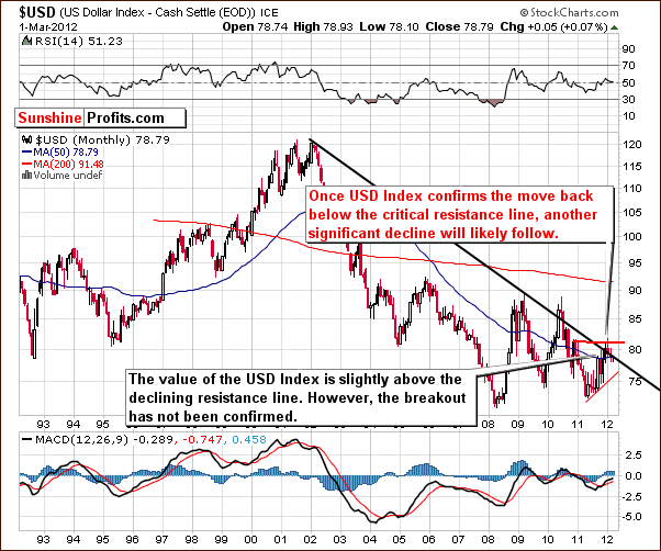
Our first chart this week one again is the very long-term USD Index chart. There has been no change so far this week. The situation is still very tense as the index is right at its long-term support and resistance lines.
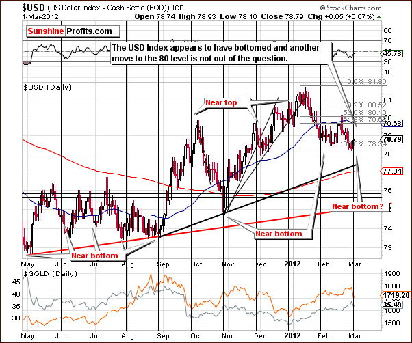
In the short-term USD Index chart, we see a move to the upside after the cyclical turning point was reached. This rally may continue for a while with the index level possibly moving to the 80 level. The rally could stop at 79.5 or even sooner, it’s simply too tough a call at this point.
Summing up, we will likely see some kind of rally in the USD Index in the days ahead but the true upside target level for this rally is simply not clear at this time.
General Stock Market
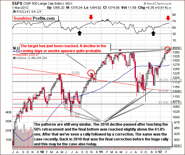
In the long-term S&P 500 Index chart, virtually nothing has changed this week and our comments in last week’s Premium Update are still valid.
Based on the similarity to 2010, a consolidation or period of decline is likely to be seen next in the general stock market. RSI levels are close to the range seen in October-November 2010 when the rally in stocks paused, only to resume with vengeance. In today’s market, the short-term outlook is bearish as stock prices are a more important factor right now, but a significant rally could very well be seen in the medium term (the medium-term picture is more blurry than the short-term one, though).
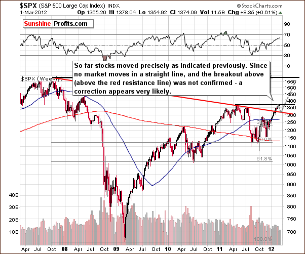
In this long-term S&P 500 Index chart, once again we have seen no changes this week. Our comments in last week’s Premium Update are still up-to-date.
In the long-term S&P 500 Index chart, we see that stock prices are clearly following the short-term trend.There was no real confirmation of the breakout above the red-resistance line which is now a support line. We believe that stock prices could move back to this support line and then move higher once again. The latter is based primarily on the extremely low interest rate environment we are currently in.
Summing up, there are still clear indications that the general stock market will see a correction fairly soon. The 1320 level in the S&P 500 Index is a probable downside target.
Correlation Matrix
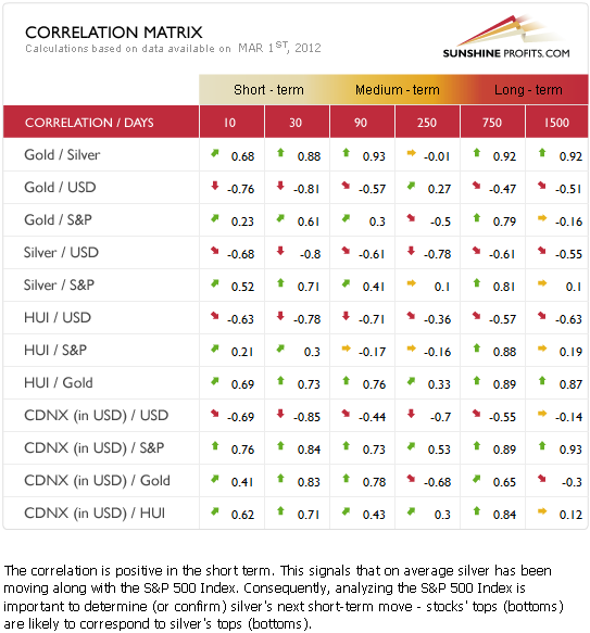
The Correlation Matrixis a tool which we have developed to analyze the impact of the currency markets and the general stock market upon the precious metals sector. There are significant changes in the matrix since last week.
The situation here is normal once again (metals move along with stocks and in the opposite way to the USD Index). Of utmost importance, the general stock market and precious metals show high, positive correlations, and this week’s analysis of the general stock market is clear and concise. With the outlook bearish for stocks in the short term and the correlations with precious metals positive, the situation is also short-term bearish for the precious metals sector overall. Therefore, long speculative positions in the precious metals sector appear risky at this time.
The coefficients between the currency markets and the precious metals, though significant are not as important due to the cloudiness in the currency market outlook at this time. Since the situation is unclear with the USD Index, a high correlation with it does not provide any additional insight useful to investors.
The only change this week is that the first small part of the rally in the USD Index has been seen this week and the precious metals reacted very negatively. Consequently, from USD and stocks’ point of view, the situation is not a bit more bearish for gold and silver than it was the case last week.
Gold
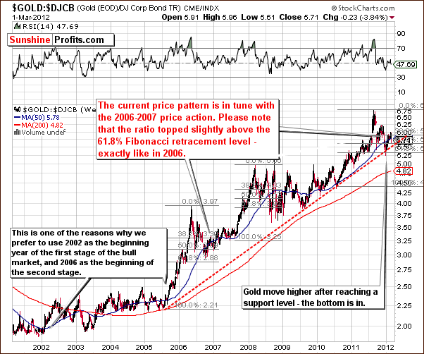
This week we begin our gold section with a look at the long-term view of gold and bonds. This gives us a unique insight into the similarities between 2006 and today from a perspective which is quite different from studying gold itself. This chart also provides us with similar signals and confirms the self-similar pattern.
In both time frames, we have first seen a correction (following the 2005-2006 and 2010-2011 rallies) to the 61.8% Fibonacci retracement level and then a move back up to the 38.2% level. The small moves in ’06 and ’12 above this line were both followed by declines. This is more or less where we are right now. In 2006, we next saw a small bounce and then a decline to the final bottom.
It appears that in our current situation, a small bounce could also be seen next followed by a decline slightly below the 50% Fibonacci retracement level. Although this decline does appear small from the ten-year perspective, the dollar value could actually be fairly significant.
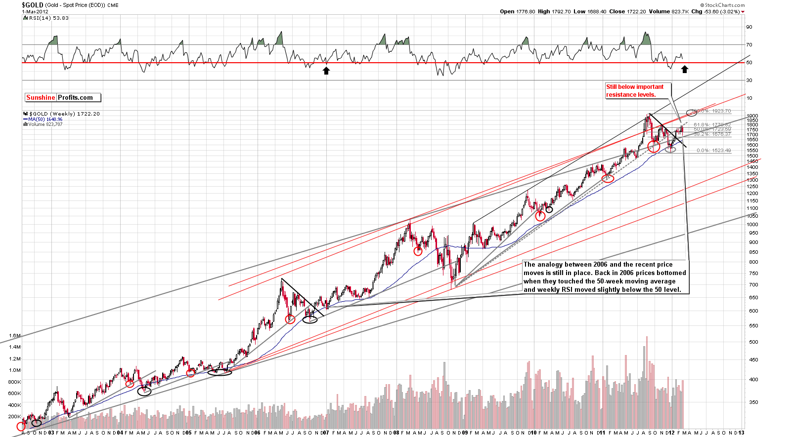
In this week’s long-term gold chart (please click the above chart to enlarge), we can clearly see a continuation of the self-similar pattern. Gold bottomed at the end of 2006 when it reached the 50-week moving average. Today, this moving average is still considerably below gold’s recent price levels. Since the 50-week moving average is trending higher, a week or two more of declining prices should result in gold’s price and the moving average meeting somewhere in the $1,650 range.
One other note concerns the RSI levels. In 2006, gold reached its bottom with the RSI level slightly below 50. Thursday’s close saw an RSI level close to 54 and declining, very much on pace to possibly close in to the very level seen nearly six years ago.
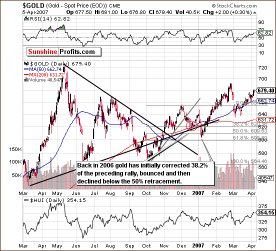
We now turn to the chart from 2006-2007 as we have done for a couple of weeks now. We have inserted a red ellipse to correspond to where we are presently in reference to the trading patterns seen back then. Based on this chart, it seems that a small rally is likely to be seen next. It does not appear large enough to bet on based on our analysis of current market trends however.
Now, gold’s next move to the upside (the above-mentioned bounce) could turn out to be as big as we saw back in 2006 but this is no guarantee that the analogy be as precise. So, based on this chart alone, we expect to see a move to the upside very soon followed by a decline to slightly below the 50% Fibonacci retracement level of the previous rally. Where would that exactly be? Let’s take a look at the current short-term chart to find out.
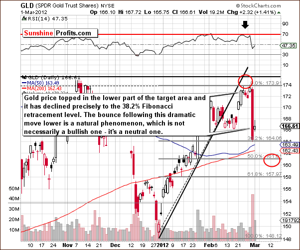
In the current short-term GLD ETF chart, we see that the downside target level for the coming decline is in the $160-$161 range. This corresponds to about a $1,650 price for spot gold. Recall that in 2006, the initial part of the decline was seen to the first Fibonacci retracement level.
We have seen this take place (on Wednesday this week) and also saw a bounce on Thursday. This bounce is quite a normal move coming immediately after a huge decline. Some sideways trading or a slight move higher on low/declining volume levels would confirm that the short-term trend is indeed now to the downside. The decline to our target area will likely be seen sometime in the next two weeks.
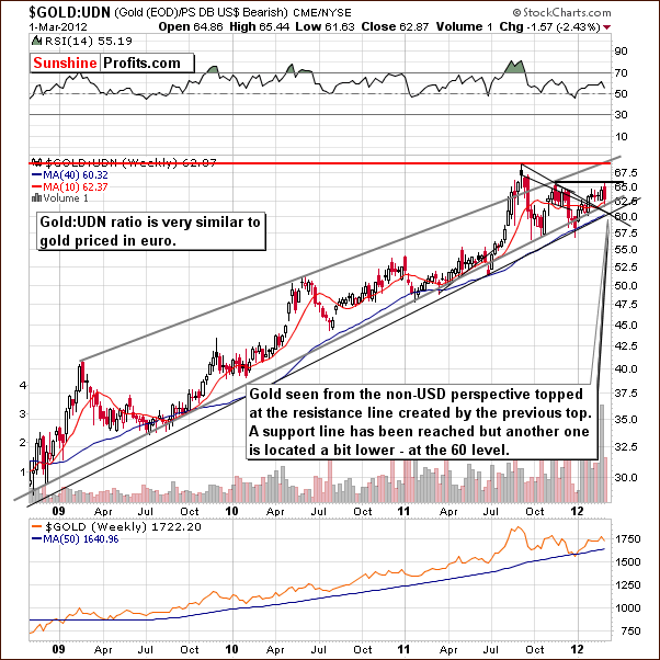
In this week’s chart of gold from a non-USD perspective, there was a development worth noting. You may recall that in last week’s Premium Update, we stated that we still see the index below the level of the previous local top. A significant resistance level is about to be reached, however, and our previous points have not been invalidated here.
From this non-USD perspective, gold actually declined to a support level this week after topping at the resistance line created by previous highs. If this support line (just below the 63 level) is broken, another is in place close to 60.
With respect to the USD Index, we have a few possibilities for the coming weeks. If gold declines without any real action in the USD Index, the ratio here will likely move to 60 or so, where it will encounter the second support line. If however, the USD Index moves higher and gold prices decline, the non-USD ratio will likely trade sideways and then resume its rally in a week or two. Specific details are not yet forthcoming from this chart.
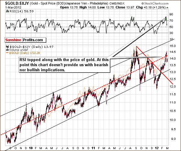
Looking at the long-term chart of gold from the perspective of the Japanese yen, we do not really see many signals this week. However, from an educational standpoint, providing this chart seems justified. The above picture confirms that the top is in with gold having moved to the middle of the trading range and RSI levels in the overbought range. This means that when we see this combination of signals again, we will likely have another local top.
Right now, the RSI levels have recovered somewhat and gold does not appear to be overbought or oversold at this time. This chart therefore does not provide us with any important timing details at this time.
Summing up, the self-similar pattern with 2006 is clearly still in place. We expect gold to bounce a bit higher and then decline to the $160-$161 level for the GLD ETF with a corresponding spot gold price around $1,650. The coming bounce does not appear large enough or sure enough to bet on and the short-term trend now appears to be bearish. If gold trades sideways or moves higher on low volume in the coming week, this will confirm the bearish outlook and it will likely remain in place for the next 2 weeks or so.
Silver
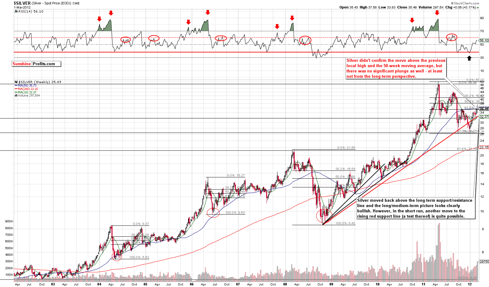
We begin this week’s silver section with a look at the long-term chart (please click the above chart to enlarge). There were very few developments from this perspective this week as silver’s price moved back and forth over the past several days. Thursday’s closing price level is quite close to where it was a week ago. No confirmed breakout has been seen with respect to the 50-week moving average, the first Fibonacci retracement level or the level of the previous late 2011 high.
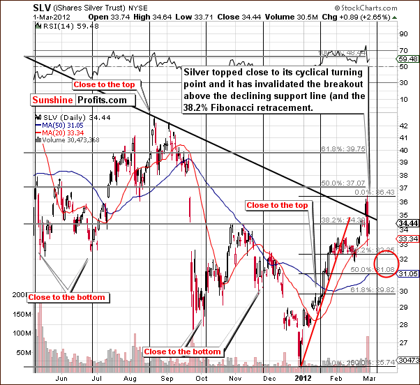
Looking at the short-term SLV ETF chart, we have some important developments this week. The breakout above the declining resistance line has been invalidated on high volume levels, which is a bearish sign. Silver appears quite likely to correct some more.
The rally seen before Wednesday’s plunge contributed greatly to silver having an overall good performance in the month of February. Declines from here will probably take silver’s price not much lower than its February low. The downside target level is between the 38.2% and 50% Fibonacci retracement levels, in the $31 to $32 range - in the SLV ETF.
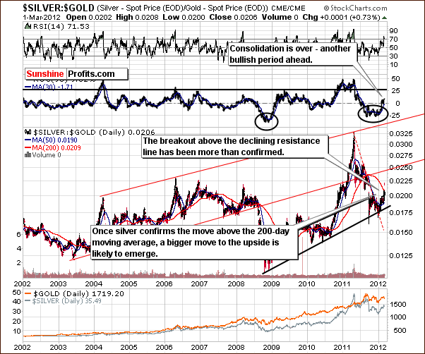
In the silver to gold ratio chart, silver has confirmed the breakout above the declining resistance line but failed to break out above the 200-day moving average. Concerning the silver to gold ratio and the 200-day moving average, on many occasions in the past, a significant rally in the ratio followed once the ratio moved above the moving average and it confirmed this move. This may very well be seen once again. Of course, silver must first confirm the breakout. Our best guess is that it will manage to do so once the current correction is complete (in 2 weeks or so).
Summing up, silver’s outlook is very dependent upon the gold market. We have created downside target levels of $31 to $32 for the SLV ETF and $32 to $33 for spot silver. After correcting, silver’s recent outperforming gold is likely to continue.
Platinum
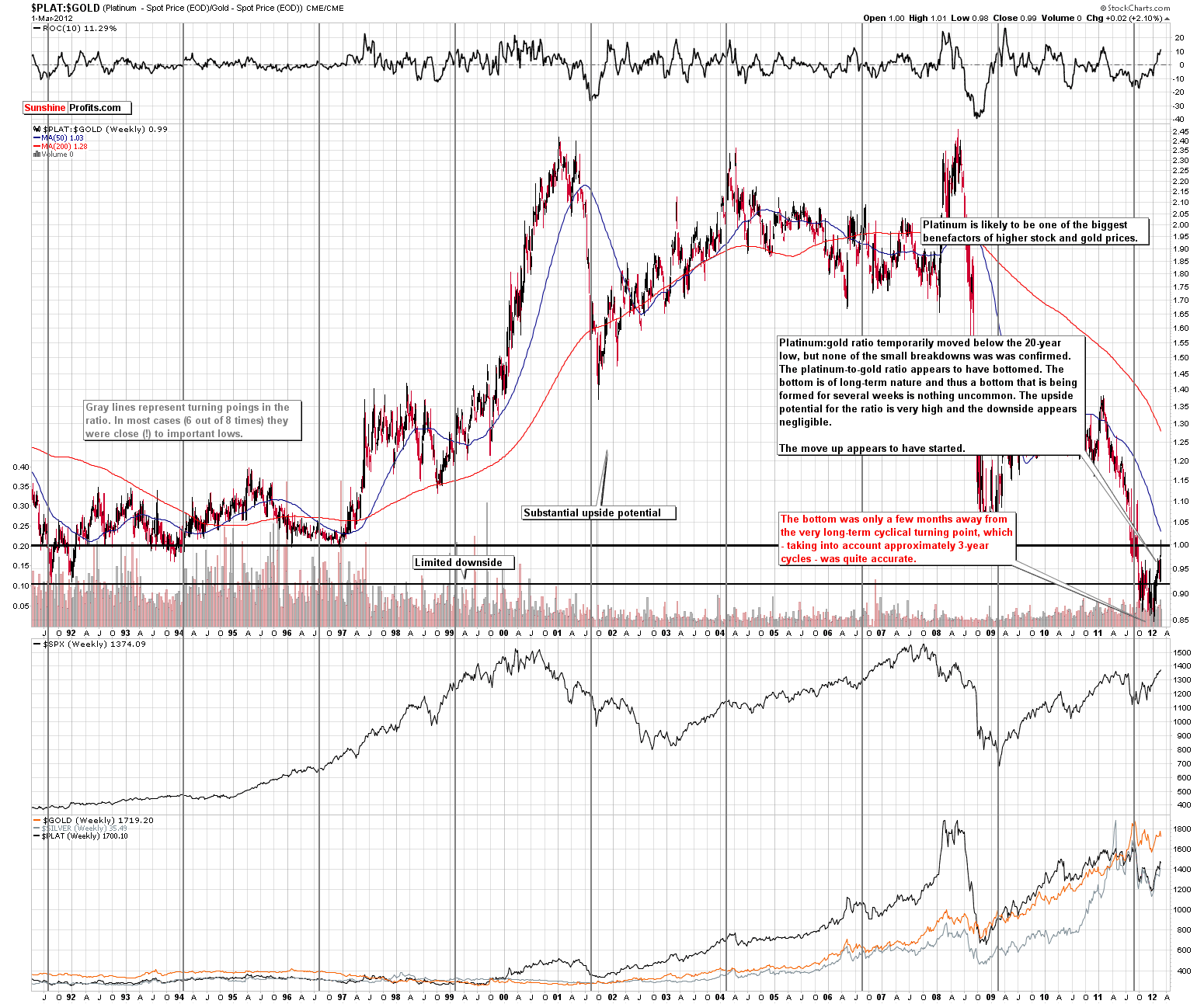
In the platinum to gold ratio chart (please click the above chart to enlarge), we can now see that the local bottom appears to be in. Several months ago, our analysis of the very long-term platinum to gold ratio chart discussed cyclical turning points and we stated that a local bottom was likely to be seen soon. Although this local bottom formed several months after the cyclical turning point, this is really not significant since platinum’s cycle, that is, time between its cyclical turning points is generally about 3 years. So, missing the turning point by three months is only a difference 1/12 of the cycle, quite minimal in fact. The implications going forward are bullish for platinum with respect to gold and as a standalone investment. We continue to expect much higher platinum prices than gold in the coming months.
Crude Oil Prices
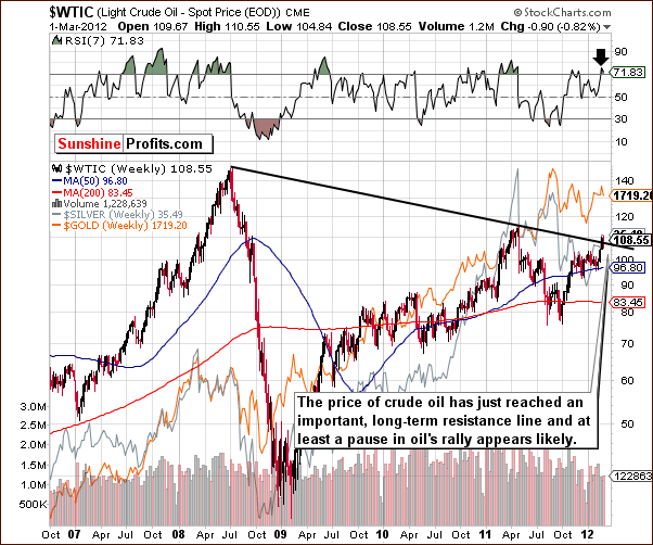
We include the crude oil price chart as we did last week. Our comments are still up to date as crude oil prices reached an important resistance line this week. A pause is likely in the rising price trend. Once we see a consolidation, there will likely be a breakout followed by another price rally. It does appear that a consolidation is likely to be seen first, however.
Gold and Silver Mining Stocks
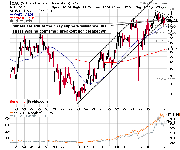
In this week’s very long-term XAU Index chart, we have seen no important developments this week. Comments made in last week’s Premium Update still hold true.
(…) the index level is right at the support/resistance line. The picture is cloudy here. Will there be a huge rally? Will there be a huge decline? The answers to these questions simply cannot be obtained from analysis of this chart and the situation is similar to the one that we’ve seen in the previous weeks.
(...)
Once the mining stocks finally decide to confirm a breakout or breakdown, a significant move will likely follow.
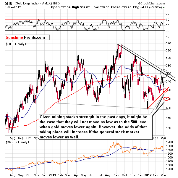
In this week’s long-term HUI Index chart, we see that gold stock prices have moved to the lower part of the target area but did not reach the target levels themselves. While this is a slightly bearish factor, the bullish news is that the following decline was not as sharp as the decline in gold prices. This is probably due to the general stock market trends this week – stocks simply did not decline significantly.
It seems that a 520 downside target level for the HUI Index could possibly be the next local bottom if stocks hold their current levels, but the 500 level could be seen if the general stock market declines in the weeks ahead.
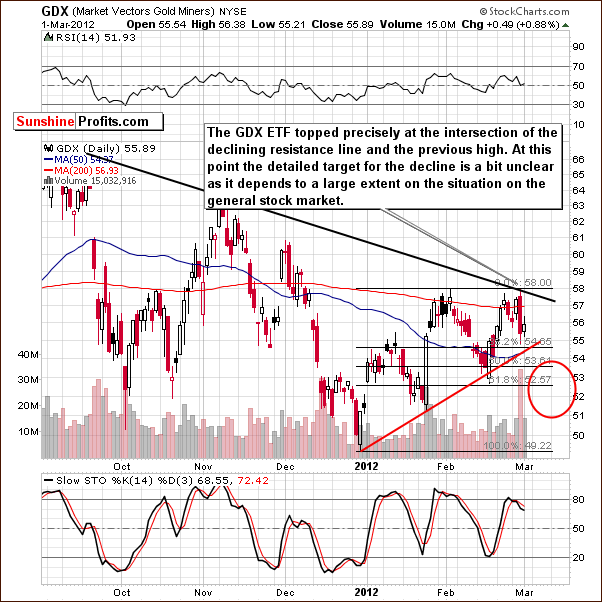
In the short-term GDX chart this week, we have much the same type of information. The GDX ETF topped right at the intersection of two resistance lines and the downside target level is a bit unclear.
There is a possibility that a head-and-shoulders formation (based on the whole 2012 performance) is developing and this would be a bearish sign. If the miners move below $54 and then hold below this level for three consecutive days, we could see further declines to the lower part of our target area as this bearish pattern further develops.
The area marked as a downside target is a fairly wide target range due to the uncertainty surrounding the general stock market.
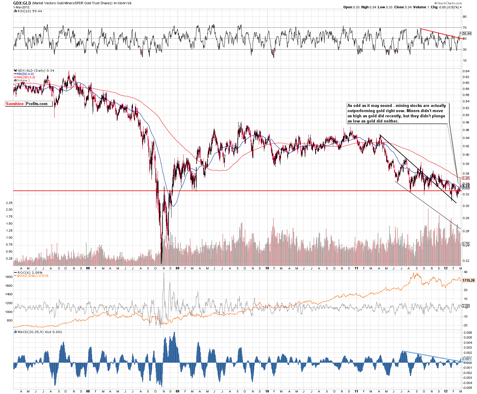
In the miners to gold ratio chart (please click the above chart to enlarge), we have seen the miners outperform gold this week. While it’s true that this is somewhat due to their decline not being as significant as gold’s, there are still some medium-term implications here. Both the MACD Histogram and the RSI Indicator are showing breakouts and this indicates that the recent move to the upside for this ratio could be – finally - valid. That is to say, the miner’s outperformance over gold could continue in the months ahead causing this ratio to move higher as well.
Summing up, much of the situation here depends on what happens with gold and in the general stock market. Gold and the mining stocks are likely to bottom at the same time, but the price level of the bottom in the mining stocks is quite dependent on the general stock market. If stocks decline, then the HUI Index could move to 500, whereas its downside target level otherwise would be 520.
Junior Mining Stocks
As stated in the Key Principles section, the list of top juniors will be updated approximately every 4 weeks, so this is the Update that should contain the revised version of the list. However, before moving on to the rankings, let’s take a look at the whole sector.
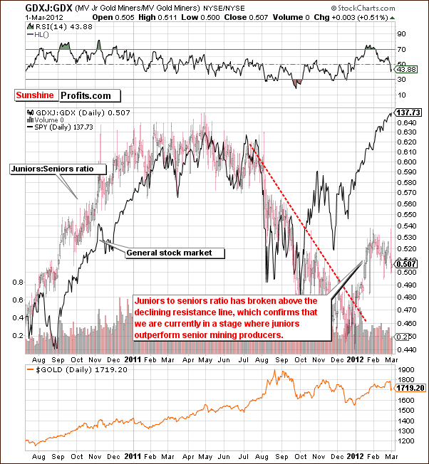
In the GDXJ:GDX ratio chart, we see how juniors are performing compared to seniors. The ratio here has broken out above the medium-term declining resistance line and rallied sharply. The ratio paused, but the trend is now up, so a consolidation is not a bearish factor. Juniors are now outperforming seniors and this is consistent with the outlook which we have discussed in our reviews of the sector over the past few months.
The Fed’s past statement about keeping the interest rates low for a long time, the situation in the long-term interest rates, and overall positive situation in the stock market (note that juniors are highly positively correlated with main stock indices stocks) bode well for the junior sector. Please note that correction in the main stock indices could temporarily cause juniors to lag seniors.
Since it’s a good time to be in the junior sector, let’s move to our top junior rankings (reminder: we usually post them every first Friday of the month).
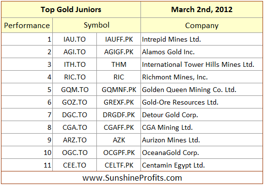
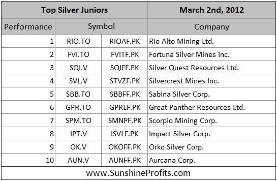
The noteworthy changes this month are the removal of the San Gold Corp. (SGR.TO) from our gold ranking (other stocks simply appear to have better upside potential) and adding SBB.TO and AUN.V to the silver ranking. SBB.TO was not present in our ranking last month as it looked vulnerable, however it seems that the damage to this company’s share price has already been done. Aurcana Corp. has been included based on its recent very strong performance – it seems that the rally will continue given silver’s upside potential.
Letters from Subscribers
Q: I occasionally use the stockcharts.com website and create a P&F chart similar to those featured in your weekly updates. I sometimes get different results depending on the scale factor setting. For example, if I create a P&F chart for $ Silver, the projection says "Bearish Price Objective 18." But if I zoom in to see a more detailed view by setting scale factor to 10, I see a different looking chart, and the projection now says "Prelim. Bullish Price Obj. 416" (which really means $41.60). Which of these conclusions is correct?
A: We personally don't find the P&F charts very useful for the precious metals market. However there is a universal rule for choosing the right parameters for various technical tools (in this case the scale factor is a parameter). The rule is: use the parameter… that really works.
In practice this means that one should change the parameter several times and check the accuracy of the buy/sell signals that result. Then stick with the parameter that provided the best signals in the past. The more correct buy/sell signals you get for a given parameter, and the fewer incorrect ones, the better it is. In this case, it means adjusting the scale factor.
Q: Great report! You have been spot on lately. I am almost gaining too much trust in your analysis and losing any skepticism. This can be dangerous for a trader!
A: While we appreciate your comments and we are thankful for other similar messages that we received yesterday, we decided to quote this message for an important purpose. No matter how good you think anyone is (including your editor) in predicting price behavior, please don't lose a healthy dose of skepticism. Losing skepticism and putting too great a probability on a given future price move makes one bet too much of one's capital.
While it will lead to greater gains if the price moves in the predicted way, the losses that result if price moves differently can be unbearable. The question that you need to ask yourself before putting your money on the table is not how much you can win, but will your portfolio be harmed if you don't win. Actually, it can be proven that using too little of one's capital (as a result of being too skeptical) is better than using too much of it (as a result of not being skeptical enough):
Q: Again, nice call Wednesday and Thursday. Apparently you called the top of the precious metals market. $35.50 on silver was right on the button!
I would like to suggest mentioning DUST to you subscribers when discussing the HUI stocks on Fridays. It involves a bit of decay as an ETF, but for a few days or a week it is a good trade at 3x leverage. This stock has an advantage over GLL or ZSL in that it goes down when gold goes down or the stock market tanks.
A: We agree that it’s a good idea to look at the DUST ETF. DUST is the symbol for the Direxion Daily Gold Miners Bear 3X Shares and, as its name suggests, it's a fund that moves inversely to the mining stocks (specifically the GDM Index), while providing 3x leverage. This makes it a useful trading tool for those who are willing to bet on lower mining stock prices.
Summary
We have seen only one change this week in the background information for the precious metals sector. The short-term situation is still bearish for the general stock market; the above-mentioned change is the fact that USD has already moved a bit higher thus making the following small rally more probable. This combination has bearish implications for gold, silver and the gold and silver mining stocks.
The huge declines seen on Wednesday were so significant that another day or two of higher precious metals prices could still be seen from here. In fact, this is what we expect based on the 2006 price performance. If these moves are matched with low or declining volume levels, the bearish outlook for the next couple of weeks will be confirmed.
The precious metals are likely to once again move lower after this very short-term bounce, a pattern which is well in tune with the self-similar pattern seen between 2006 and 2012. Our downside target levels are: $1,650 for gold, $160 to $161 for the GLD ETF, $31 to $32 for the SLV ETF, $32 to $33 for spot silver, and 500 to 520 for the HUI Index (depending on the general stock market). After the price corrections have completed, silver and platinum appear poised to continue outperforming gold and the mining stocks may finally do so as well.
At this time, holding positions in the precious metals sector with long-term investment capital appears justified. Holding speculative capital out of the precious metals sector appears to be a good idea at this time as well.
We continue to believe that juniors are likely to outperform senior mining stocks in the coming months, although they (juniors) may decline more significantly than the seniors on a temporary basis, should the general stock market correct.
This completes this week’s Premium Update. Our next Premium Update is scheduled for Friday, March 9, 2012.
Thank you for using the Premium Service. Have a profitable week and a great weekend!
Przemyslaw Radomski

