
We are on the cusp of a new year, and this is the time that we take a look at those brave (or foolhardy) financial analysts who take out their crystal ball and predict where precious metal prices will go in 2012.
But first let’s see how last year’s prognosticators (including Sunshine Profits) fared. We are talking about predictions for the very chaotic 2011.
Bank of America Merrill Lynch had forecast last year at around this time that gold would top at $1,500 in the near-term and that the second half of 2011 would be more challenging. Well, gold did a lot better than $1,500 this past year. It hit an all-time nominal high in August of $1,923.70 an ounce. Gold may be down about 16% from the August highs, but it’s still up roughly 14% from the 2010 settlement of $1,421, which still makes it one of the best performers this year. Even with prices falling again this week, the metal is still the top performing commodity of 2011.
Peter Schiff said about gold prices: “You ain’t seen nothing yet.” He was overly optimistic and predicted that gold will go up to $2,000. He might yet be proved right, but not in 2011.
James West, publisher of the Midas Letter, said gold was likely break through $1,700 an ounce by the end of 2011 and silver will likely see $35, and may even go through $40 an ounce. Well, he was right. Gold definitely broke through the $1,700 an ounce range.
Nick Barisheff, president of Canada's Bullion Management Group Inc., was looking at $1700-to $2,000 per ounce gold in 2011; he was within the right range.
At Sunshine Profits we also went out on a limb and guesstimated gold's high for 2011 at $1,800 and $45 for silver.
A review of 2011 shows a chaotic picture for the precious metals. During the first few months of 2011 the price of silver sharply outperformed the price of gold and by the end of last April the price of silver rose by nearly 56%, while gold rose “only” 9% from the beginning of the year. With the sharp rise in silver prices the CME raised margins which caused silver prices to decline to 7% above the initial price level of 2011. The next rally came from May to the beginning of September for both metals due to uncertainty about the stability of the U.S. economy and the debate about raising the debt ceiling. The rally came to a halt in September due to the CME raising margins and also because the Fed did not come up with QE3. The decline of precious metal prices soon followed.
So what are the gold experts predicting for 2012?
With the year drawing to a close, several Wall Street firms have recently published their gold price forecasts for 2012. Goldman Sachs predicts the price of gold will peak at $1,900 per ounce and average $1,810 per ounce in the coming year. Goldman attributes its bullish gold price outlook to further net buying by central banks and strong physical demand from investors, the ongoing negative real interest rate environment in the U.S., and continued European sovereign debt and global recessionary concerns.
The firm cautions that the biggest risk for the yellow metal is further strength from the U.S. dollar. As has been the case in recent months, investors could continue to view gold as more of a commodity than money and as a risky asset. Nevertheless, Goldman states that the factors influencing the yellow metal continue to point to higher prices in 2012.
Gold prices will rally again in 2012 to reach $2,000 to $2,500 per ounce according a commodities strategist at Bank of America Merrill Lynch.
UBS have reiterated their bullish outlook for gold and believe gold will average $2,050/oz in 2012.
Barclays Capital says gold will average $2,000/oz in 2012 – which is 25% above today’s spot price.
John Embry, chief investment strategist of Sprott Asset Management, said the price of the yellow metal could possibly exceed $2,500 in the next 12 months.
"Everyone wonders where gold's going and where silver's going, I prefer to look at where are currencies going? Today we're in the later stages of yet another failed experiment in fiat papered currencies and they're losing value at an alarming rate and as a result gold is rising in value denominated in these failing currencies," Embry told Business Television.
"It isn't that gold is in a bubble because it's up in price, it's the fact that the currencies are falling in value almost every day."
Australia's Bureau of Resources and Energy Economics forecast in its December quarterly report that gold prices in 2012 would still go up 17 per cent to $1,850 an ounce.
A survey of the Professional Numismatists Guild (www.PNGdealers.com), a non-profit organization composed of the country's top rare coin and bullion coin dealers, almost unanimously points toward price increases. Coin dealers’ predictions of where gold will close at the end of the first quarter in 2012 ranged from a low of $1,475 per ounce to a high of $2,155, with a mean average of $1,759.57. Their estimates for gold at the end of 2012 varied from $1,450 up to $2,575 with the average $1,976.22.
Predictions about silver in the first quarter varied from $24.35 per ounce to $57.50 with a mean average of $34.04, and from $23 to $130 with the average of $48.73 by the end of 2012.
The recent declines have left some gold investors feeling beaten, battered and bruised. But we have to keep in mind that over the long haul, gold is the ultimate safe haven and we believe that based on the underlying fundamentals which have not changed, it will go up in 2012. Our guesstimates for 2012 are $2,200 for gold and $50 for silver (silver is likely to outperform once it breaks through $50). Gold has risen 645% while the Dow Industrials has only gained 13% over the past decade. Gold has maintained its safe haven status for thousands of years and there is not another investment that can make that claim. No one ever mentions that in spite of the recent and much publicized decline, gold is still up $220.30/oz or 15.91% for the year. That’s almost double the gains in the Dow.
To predict how precious metals will behave in the short run, let's begin this week's technical part with the analysis of the USD Index. We will start with the very long-term chart (charts courtesy by http://stockcharts.com.)
USD Index
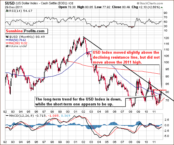
Our first chart this week is the very long-term USD Index chart. Little has changed since last week’s Premium Update when we wrote: “We would like to stress that the dollar has not truly broken above the declining long-term resistance line, and it has not moved above the 2011 high. Consequently, one should not be overly bullish on the USD Index just yet.“
The index is still below the early 2011 highs and we do not view the breakout above the long-term resistance line as being verified. A move to the downside appears to be quite likely in the coming weeks.
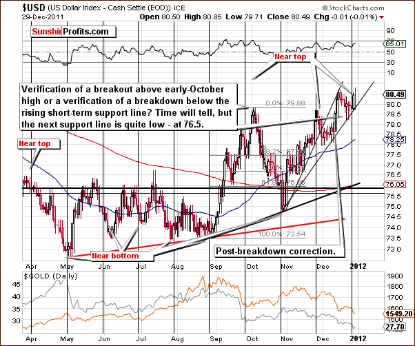
In the short-term USD Index chart this week, not much changed. The index level initially moved lower and then moved back up to the level of its previous high. The index is now at a cyclical turning point, and this increases the probability that declines will be seen here fairly soon. With the next support line more than 4% below the level of Thursday’s close, the coming decline could be significant.
Summing up, the situation in the USD Index is more bearish than not. The breakout above the declining long-term resistance line may be seen at some point, but until it is seen and verified, this situation here will not turn to bullish.
General Stock Market
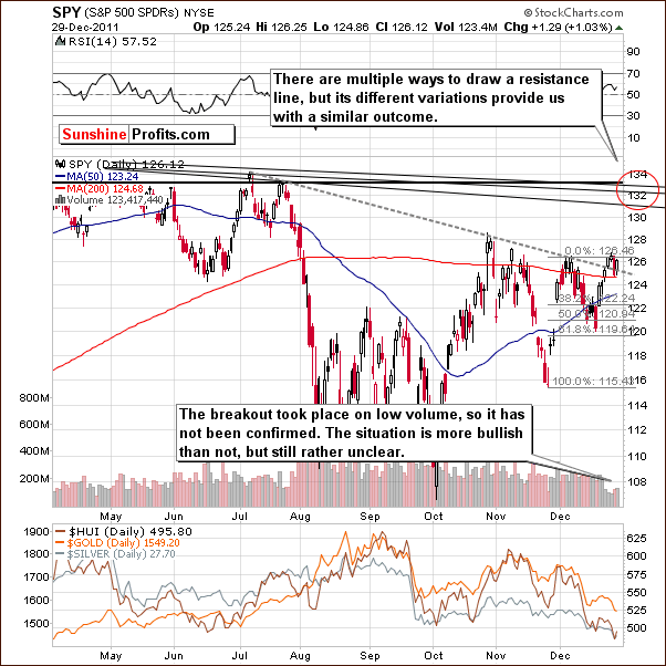
On the SPY ETF chart, we saw a move to the upside early in the week, followed by a correction and another move higher. Volume levels have been quite low, however, so it’s unclear whether the recent breakout is confirmed or not. In terms of price, it is confirmed, but in terms of volume, the situation is quite cloudy. At this point, it does not seem very probable that stocks will rally immediately. It is a bit more likely than not however.
Summing up, the outlook for stocks is slightly bullish, but it may take some time for any significant rally to begin. This is likely a result of the recent holiday period and the low trading volume levels as well as the uncertainty in many markets around the world.
Correlation Matrix
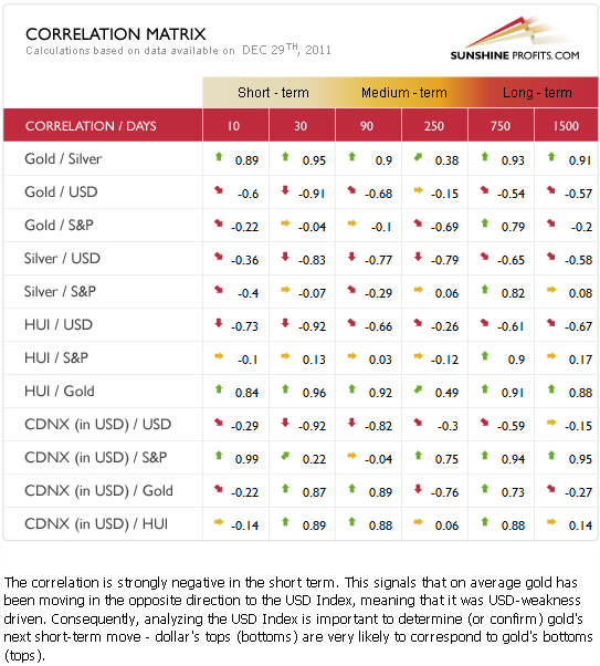
The Correlation Matrixis a tool which we have developed to analyze the influence in the coming weeks of the currency markets and the general stock market upon the precious metals sector. Much of what we stated in last week’s Premium Update still holds true today.
Gold is negatively correlated with the USD Index in the short and medium term. The coefficients are very low and thus significantly negative. With the outlook rather bearish for the dollar at this time and its correlation significantly negative with gold, the implications are somewhat bullish for gold and the entire precious metal sector.
The situation with the general stock market is unclear at this time and therefore somewhat uncertain for the gold and silver mining stocks. It seems however, that since the currency markets have a bigger impact upon the precious metals, the entire sector, including the gold and silver mining stocks are likely to rally if the USD Index declines significantly.
Currently, there is not a clear link between the general stock market and the precious metals sector. The strong negative correlation between the USD Index and gold, silver, and gold and silver mining stocks is still very much in place. The implications here are rather bullish overall for the precious metals sector.
Gold
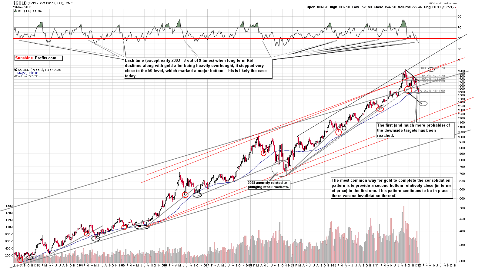
This week, we begin our gold section with a look at the very long-term chart (please click the above chart to enlarge). Very little has changed since last week’s Premium Update when we stated that gold quite often consolidates in a way similar to what we've seen in the past months. We're not in uncharted waters – we're seeing a quite common pattern in play.
In the same update, we went on to say that the fact is that similar “breakdowns” have been (in all cases seen on the chart) followed by the final bottom of the consolidation (not too far below the line that is has broken), which was in turn was followed by a strong rally. In these cases, lower prices were never seen thereafter. Consequently, from both fundamental and technical perspectives, gold remains in a bull market, and what we're seeing right now may be the best buying opportunity that we'll see in the coming years.
The pattern has not been invalidated and a move to the level of previous lows is quite normal behavior during a period of major correction. At this time, the situation truly does not appear to be bearish. Gold’s price is still above the September lows and no breakdown has been seen. Although prices did try to move below this level on Thursday, the attempt was unsuccessful. It did not hold, and gold reversed in intra-day trading and closed the day just above the $1,540 level.
We have adjusted our upper target levels due to the significance of the current consolidation pattern. It is no longer viewed as a continuation of the 2011 rally – that rally ended and we’re likely to see a new one start, which means that it’s probably going to move up less sharply than it would be the case if rally simply continued right away without a lengthy consolidation. Looking back to 2006 and 2010, we see that after a post rally consolidation period completes, prices move steadily but not sharply higher. This steady move to the upside seems to be the most likely pattern ahead for gold prices.
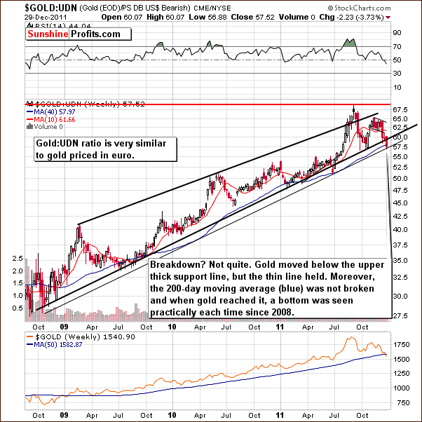
In this week’s long-term chart of gold from a non-USD perspective, at first glance we may suspect a possible breakdown. A closer look however shows us that index levels, which have moved below the rising thick support line in our chart, stopped at the thin support line created by intra-day lows. The 200-day or 40-week moving average has not been broken and when reached in the past, has coincided with a local bottom every time since 2008. The index is currently at a key support level, which has not been broken.
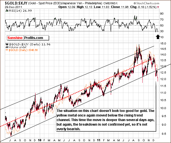
Looking at gold in terms of the Japanese yen, we see that the index has moved below the rising trend channel. Although this move was sharp, it has not yet been confirmed. The first breakdown was recently invalided as index moved back into the trading channel.
This second attempt could turn out to be similar to trading patterns seen in October when the index reached the support level and then reversed and moved up quickly. At this time, the chart is neither bullish nor overly bearish. With the RSI level in the buy range, the situation in this chart is somewhat mixed when analyzing this chart alone.
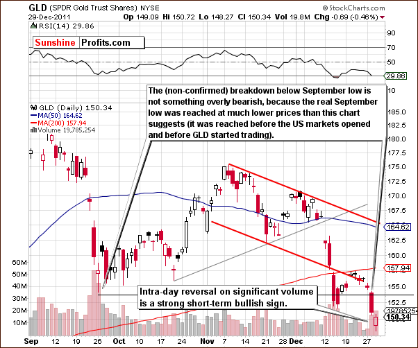
In this week’s short-term GLD ETF chart, we first note the significant volume levels of the past two days. Price levels have reversed intra-day on significant volume and this is a short-term bullish signal. The bottom may very well be in.
Summing up, the situation for gold is not as bad as it seems at first glance. The most important long-term pattern is still in place. Gold is at the level of previous lows which, based on past performance, indicates that a local bottom is likely imminent. This is most similar to a situation seen in 2006. At that time, a small double bottom was seen at the end of the decline and close to the 200-day moving average. Lower prices were not seen again. The analysis volume provides us with a confirmation of the above.
Silver
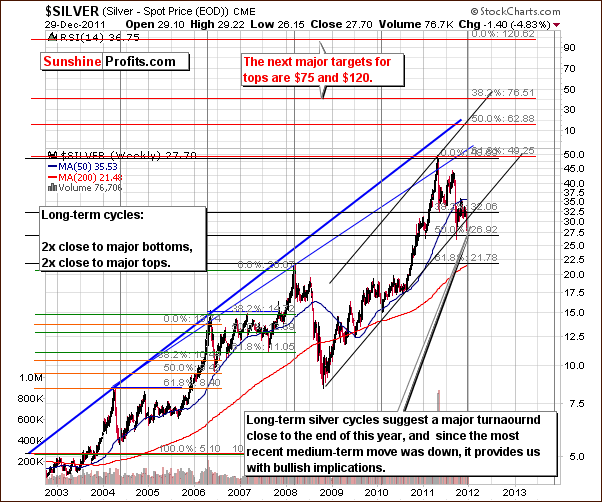
Looking at the very long-term chart for silver, recall what we said in Thursday’s Market Alert.
The most common way for gold to complete the consolidation pattern is to provide a second bottom relatively close (in terms of price) to the first one. This and the very long-term cycles seen in silver are currently the most important technical factors.
Silver is currently at a major long-term cyclical turning point. Silver is also at the 50% Fibonacci retracement level and the indicators from this chart point to a likely major bottom with a rally to follow. We have included this chart to keep everything in its proper perspective this week.
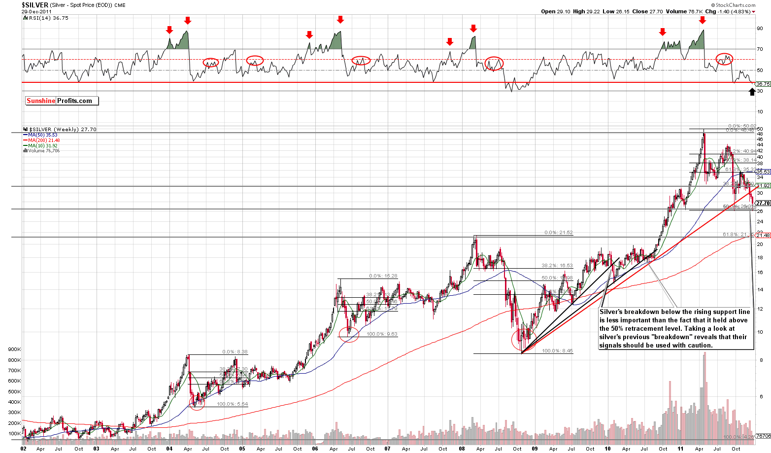
In this very long term chart for silver (please click the above chart to enlarge), we see a buy signal from the RSI level. Silver’s price has moved below the rising support line but we are not overly concerned at this point. Silver’s previous breakdowns below analogous (smaller) lines were followed by a rally. Consequently, the Fibonacci retracement level support is a more important factor than the move below the rising (red) support line.
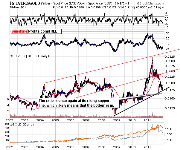
In the silver to gold ratio chart, the important point here is that it may very well have reached a bottom. The ratio between silver and gold right now is at an important support line. Based on similar bottoms in the past, it is unlikely that a breakdown will be seen at this time.
Moreover, taking a look at the ROC indicator (just above the ratio) reveals that the situation is quite similar to what we’ve seen in late 2008. Since that time, the ratio has never been as oversold on a medium-term basis as it is right now.
Summing up, silver continues to have a bullish outlook at this time. The three charts we have discussed here all support this sentiment, and with a key support line in play, the upside potential here seems to far outweigh the downside.
Gold and Silver Mining Stocks
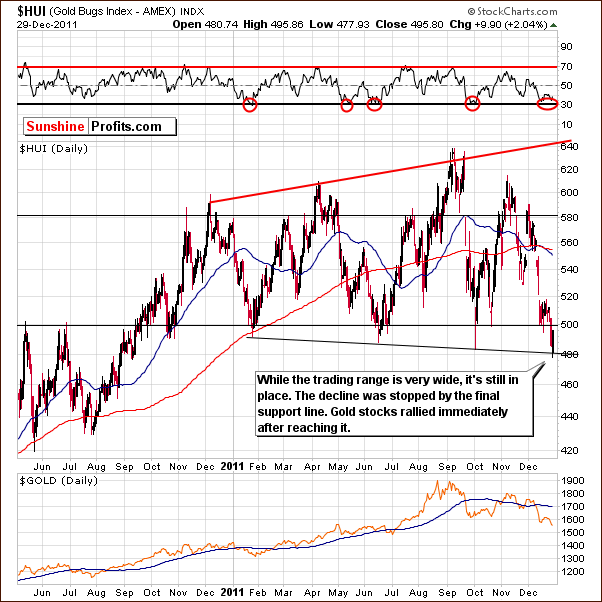
In this week’s long-term HUI Index chart, we see that the lower support line has been touched, and the index level bounced immediately. Gold stocks actually rallied without a corresponding rally in gold (gold rallied on an intraday basis but it closed the day below previous day’s closing price). In fact, on Thursday, gold declined slightly while gold stocks moved up 2%. This is a common occurrence in the confirmation process of a local bottom and indicates that higher prices are likely to follow. RSI levels confirm the situation as currently being oversold. This further confirms the bullish sentiment.
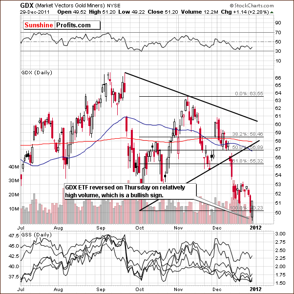
In the short-term GDX chart this week, we see that a reversal took place on Thursday on relatively high volume. This is likely an indication that a bullish day may be ahead. It also increases the odds for a period of rally to carry through the next week.
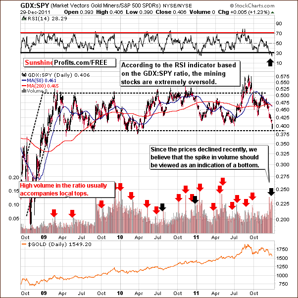
In the GDX:SPY ratio chart, we see how mining stocks’ performance compares to other stocks. This week the chart shows us that the mining stocks are more oversold than we have seen for many years. Based on the current ratio levels, the oversold situation, and the significant volume levels seen of late, the ratio is likely to move higher, and the same goes to the precious metals sector
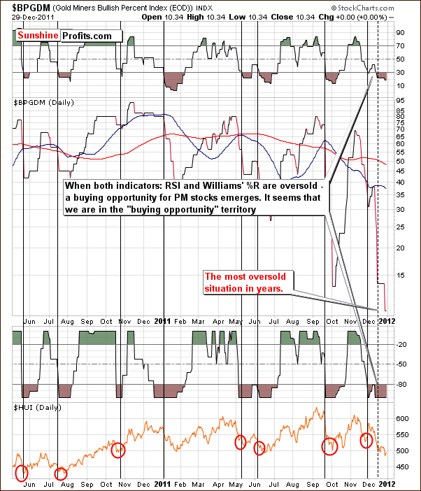
The Gold Miners Bullish Percent Index chart once again is indicating a buying opportunity. The index is at an extremely low level and is the most oversold that it has been in years. It’s a clear signal that there is “a lot of blood on the street.” This, of course, is a Warren Buffett expression and translates to mean “be greedy when others are fearful.” The time to buy appears to be at hand.
Summing up, the mining stocks overall have performed quite negatively during the past week. Analysis of the charts however indicates that there are signs of a rally and the rally is likely to begin soon. Numerous signals this week are indicating that buying in at this time could very well be profitable.
Letters from Subscribers
Q: Looking at the 300 day GLD chart, it seems 1350 may come soon. This level has not been broken since 2008. What do you think of this chart?
A: The 300-day moving average is very similar to the 250-day (50-week) one, which you will find on the very long-term gold chart (blue line). It is indeed a bullish factor right now.
Q: Can you comment on these two articles I have been reading, especially in light of your recent comments regarding gold giving a buy signal?
Article 1
Article 2
A: Unfortunately, the first link doesn't provide the reasoning behind the predictions, so there's nothing that we can comment on.
The second link features an analysis of several phenomena including the recent gold moves. The price of gold (in USD) is compared to the bond:USD ratio and there is visible similarity between them. This looks intriguing at first glance, but after taking a second look it becomes clear that the similarity is caused by the fact that both gold and bonds are being compared to the same asset - the US dollar. Gold is priced in USD and bond prices are being divided by USD, so whatever USD does, it impacts both lines (gold and the ratio) in the opposite way. Technically, if you created 100 ratios and all had the USD Index in the denominator, the charts of the ratios would be similar because of the link to the USD Index.
So, this analysis is mostly a unique way to approach the link between gold and the USD Index - something that we cover on a regular basis.
Another point the author makes is that technically the next rally point for gold would likely occur just after the 50-day e.m.a. crosses down through the 200-day which means that if gold takes out the lows it will be a few weeks - at least - before it would make sense to look at gold from the long side.
We don't think that it's a good idea to wait for the 50-day exponential moving average to move below the 200-day before going long. Looking at the past 10 years, there was only one time when that happened and that was in early September 2008, which was not particularly useful. Please note that 2008 was unique because of the plunging stock market and we don't have the same phenomenon right now. Consequently, waiting for this signal is not advised.
Q: Just read that Soros (see below) has said the gold market is on the brink of a bear market.
Do you agree?
Article
A: No. Gold may be on a brink of a more severe correction (if it moves much below the September low), but that’s not the most likely outcome from here – a rally is. Gold is not likely to end its bull market just because a correction is smaller or bigger – it will end when the fundamental factors change, and that is not the case right now.
We would like to take this opportunity to comment on this essay in detail, because its title suggests that it’s bearish for gold, while in reality – it’s not.
It could be the case that the authors of this article rather used the title "Soros Sees Gold Prices on Brink of Bear Market" to attract more readers than to get you closer to the very meaning of this story… It becomes apparent after splitting this article into single facts. Let’s take a look:
- Soros called gold "the ultimate asset bubble" two years ago (and bought it anyway later on)
- Focusing on the title alone – if gold was on the brink of a bear market, then it means that it’s still in the bull market (otherwise the title would say that it’s in the bear market, on the brink thereof)
- Paulson and Mindich sold bullion earlier this year (which doesn’t have bearish implications right now, as gold is a few hundred dollars lower right now)
- Speculators in New York futures are the least bullish (.MMGCNET) in 31 months (contrarian bullish sign)
- Prices declined 19 percent from a record close of $1,900.23 on Sept. 5, or 1 percentage point away from a bear market (depends on how you call a bear market – we believe that the bull market will be in place as long as fundamentals are, and 1% price move won’t change that)
- Some people will get out of gold... (and some will remain – nothing new here)
- Gold is poised to complete its 11th consecutive annual gain, the longest winning streak in at least nine decades... (statistical fact, with no direct implications)
- The median estimate in a Bloomberg survey of 44 traders and analysts is for prices to rally as much as 40 percent to $2,140 an ounce in 2012. (not overly high nor overly low – neither bearish nor bullish fact)
- Others bought more metal, taking holdings in exchange-traded products to an all-time high two weeks ago (investment demand is strong, which is bullish)
- Bullion's 7.6 percent gain in 2011 means it's on track to beat stocks, bonds and the dollar for a second straight year. (confirmation of the existence of the bull market)
- "It's done its job this year of protecting investors," said Michael Cuggino, 48, who helps manage about $15 billion of assets, including $3 billion in gold (reason for owning gold)
- (…) the long-term investors will remain in the market (so the price is not likely to drop far as this group is not likely to sell)
Now it seems that this article provide us with more bullish than bearish facts.
Summary
The situation in the USD Index is more bearish than not. With the closest support line more than 4% below the current index level trading range, a move to the downside may be quite significant. The outlook for the general stock market, however, is more bullish than not. Overall, the implications for the precious metals sector are bullish based on the outlook for the currency and general stock markets.
The factors discussed in Thursday’s Market Alert are important and must be taken into account. These are the self-similar pattern for gold and the long-term silver cycles. The bullish implication for the precious metals is supplemented by the bullish short-term signal from the gold stocks which rallied on Thursday on significant volume while gold was declining. The intraday reversal in gold prices on significant volume is, however, a bullish sign for the yellow metal. Prices are likely to rally very soon if not immediately. From a medium-term perspective, although a rapid move to the upside seems unlikely, a slow steady move (like in 2006 or 2010) to higher price levels appears to be a good possibility.
We continue to believe that betting on higher precious metals prices is a good idea. The GDX:SPY ratio and the Bullish Gold Miners Percent Index both indicate the most oversold situations in years. Quoting Warren Buffett, “there appears to be blood on the street.” With so many fearful of the precious metals market, the time to reap some profits could very well be at hand. One of Warren Buffett’s investment rules is “to buy when others are fearful.” Being long appears to be justified based on this point of view.
This completes this week’s Premium Update. Our next Premium Update is scheduled for Friday, January 6, 2012.
Thank you for using the Premium Service. Have a profitable week and a happy and prosperous New Year!
Przemyslaw Radomski

