
Why anyone would rather stuff their Christmas stockings with fiat currency than with physical gold is beyond understanding. To us “dash for cash” seems rash.
There has certainly been very little Christmas cheer for gold bulls recently. The beating is tough, but it’s not the first time we’ve experienced it, nor is it likely to be the last in a secular bull market that has still has years to run. Gold takes four steps forward and then three back. We just have to stay in the game.
We have said it before: corrections are inevitable as death and taxes in a bull market since markets never go up in a straight line. By the time gold put in its most recent high on August 22 after its parabolic rise during August, it had logged a stunning 44% appreciation in calendar year 2011. And even after its recent fall, gold is still 22% higher than it was on its 2011 low, which took place on January 27. Without a doubt, gold had a white-knuckle year, starting at $1,412 an ounce, hitting a low right out of the gate of $1,314.
The past few months have been unkind to the yellow metal, to say the least. Gold tanked 13% in September and 8% in just three days last week as a strong dollar hammered prices. But still, we would much rather have gold jingling in our pockets this season than to be exposed in the stock market or worse, hold depreciating cash.
As we said in the mid-week update this Wednesday, it’s time to take advantage of the Holiday Season gift of cheap physical gold and silver. We wrote:
From both the fundamental and technical perspectives, gold remains in a bull market, and what we're seeing right now may be the best buying opportunity that we'll see in the following years.
Stress in the financial markets has not stimulated safe-haven gold buying but instead has weakened the euro and indirectly helped drag gold lower. Last week, gold futures climbed 1.3 percent on Friday, but still posted a 6.9 percent loss for the week, making it the biggest decline for gold in three months. Some were quick to pounce and declare the “end” of the bull market in gold, but many investors, including us, disagree. We are seeing end-of-the-year squaring of the books and sales of precious metals to lock in profits. Also investors are reducing positions to lower margin costs as the price falls. There is also the issue of protective stops triggering sales as support levels break down. These are all short term reasons for lower prices. The long term fundamentals for gold are still in place. The global debt deleveraging remains a work in progress. We see very little good news coming out of Europe and the situation is unlikely to improve in the short to medium term. The European Central Bank’s solutions will only buy time; the debt issues will not go away. The U.S. economy remains lackluster and additional deterioration in Europe will make things worse. We would not be surprised to see further quantitative easing, or QE3, in early 2012, which would be bullish for gold.
Keep in mind that last August the Fed promised to keep interest rates at zero for the next two years which made gold shoot up 15% in a couple of weeks and which continue to be bullish for gold. Exports of gold from Hong Kong to China rose 51% in October to 85.7 tons, news that is certainly encouraging. China’s appetite for gold seems insatiable when you consider that China is the world’s largest gold producer and not much of that gold ever leaves the country.
If you’re looking for a last minute stocking stuffer take a look at a book called “The Great Stagnation” by Tyler Cowen of George Mason University whose theme is laid out in its subtitle: “How America ate all the low-hanging fruit of modern history, got sick and will (eventually) feel better.”
The interesting aspect of this book is Prof Cowen’s explanation on how the US got into its predicament.
“The American economy has enjoyed ... low-hanging fruit since at least the 17th century, whether it be free land, ... immigrant labor, or powerful new technologies. Yet during the last 40 years, that low-hanging fruit started disappearing, and we started pretending it was still there. We have failed to recognize that we are at a technological plateau and the trees are more bare than we would like to think. That’s it. That is what has gone wrong.”
Sustained economic growth requires new ideas and unfortunately, rates of invention and innovation have slowed. The high point, according to Cowen, was the late 19th and early 20th centuries, which produced: modern chemicals and so artificial fertilizers; electricity and so the electric motor, light, refrigerator, vacuum cleaner, air conditioner, radio, phonograph and television; the internal combustion engine and so the automobile; the airplane; pharmaceuticals; and mass production. These are inventions that transformed lives and caused paradigm shifts.
“Today, in contrast”, argues Cowen, “apart from the seemingly magical Internet, life in broad material terms isn’t so different from what it was in 1953.”
He concludes that “politics is very difficult in an America without much low-hanging fruit”. Also he says in explaining the financial crisis that “we thought we were richer than we were.” Americans have made demands, both collectively and individually, that they could not afford, borrowing too much and resisting both higher taxes and lower spending.
Here is a gold related story to bring some holiday cheer. An anonymous donor is helping make the season a little brighter for The Salvation Army by dropping gold coins, this time a Krugerrand , into the collection kettle. This marks the 13th year a Krugerrand has helped boost the Salvation Army’s Red Kettle campaign.
Let's begin this week's technical part with the analysis of currencies. We will start with the euro chart (charts courtesy by http://stockcharts.com.)
Euro - USD Indices
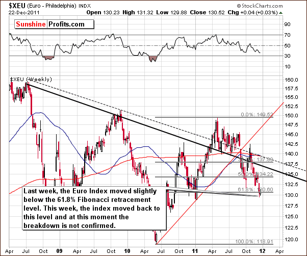
We begin this week with a look at the long-term Euro Index chart. In last week’s Premium Update, we discussed the importance of the last support level currently in play, the 61.8 % Fibonacci retracement level.
We stated that “we see that the index moved lower this week past the level of the previous low and slightly below the 61.8% Fibonacci retracement level. Since the week has not closed, the latter is not yet a clear and confirmed move, but the situation is clearly more bearish than last week. The uncertainty in Europe is undoubtedly contributing to the lack of clear focus here.”
The breakdown has still not been verified. The index moved back above this support level and is now right at it. This means that the outlook is considerably less bearish than when it was below its final retracement level. If the index rallies and the breakdown is indeed invalidated, a significant move to the upside could very well follow.
At this time, it seems that the odds favor a rally in the Euro Index. The situation has improved in Europe and although it is still not good, it is better. The outlook for the euro therefore has improved, and the very negative publicity which has been handed out by the popular media outlets is no longer current.
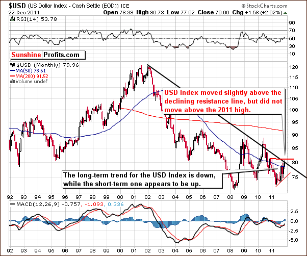
In the very long-term USD Index chart, the situation remains very much the same as we discussed in our mid-week Premium Update. On Tuesday, our commentary stated: “We would like to stress that the dollar has not truly broken above the declining long-term resistance line, and it has not moved above the 2011 high. Consequently, one should not be overly bullish on the USD Index just yet.”
These points are still valid and up-to-date at this time.
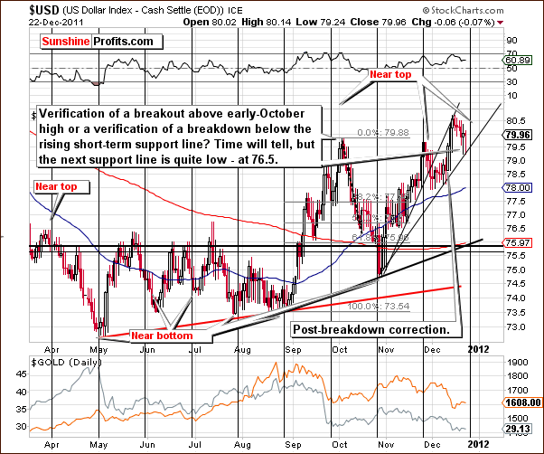
The short-term USD Index chart shows us that we are coming upon a cyclical turning point here. This suggests that perhaps a sharp decline is just around the corner. Two important points worth noting are seen in this week’s chart. First the index is currently above the level of the October high but below the early 2011 high. Secondly, it is currently below a rising support line (the upper one) which it previously broke.
Since the index is currently between two important highs from the current year, the situation is quite mixed. The index is below the rising resistance line and the cyclical turning point is just around the corner, so the overall picture is somewhat bearish.
Summing up, the outlook for the dollar is rather bearish at this time.
General Stock Market
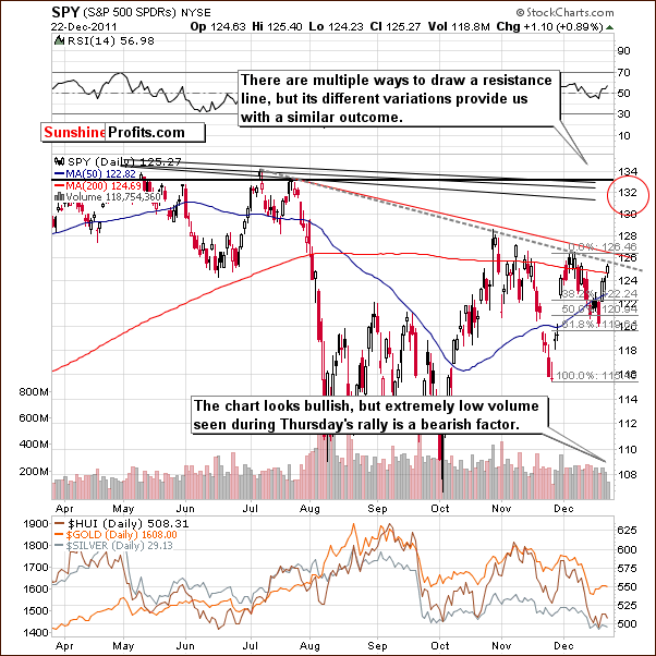
In the short-term SPY ETF, things appear quite bullish from a price perspective. There does appear however to be one area of concern which causes us to pull back a bit. Volume levels have been extremely low and similar patterns in the past have been followed by periods of significant decline for stocks. Gold and the precious metals however did not necessarily decline when this price action was seen in the general stock market (July/August decline). At this point, it is simply something to be aware of.
Summing up, the situation in the general stock market is currently mixed. Price actions of late have been very bullish, however, analysis of volume levels indicate the possibility that all may not be so positive.
Correlation Matrix
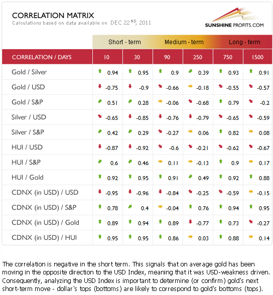
The Correlation Matrixis a tool which we have developed to analyze the influence in the coming weeks of the currency markets and the general stock market upon the precious metals sector. Gold is negatively correlated with the USD Index in the short and medium term. The coefficients are very low and thus significantly negative. With the outlook quite rather bearish for the dollar at this time and its correlation significantly negative with gold, the implications are somewhat bullish for gold and the entire precious metal sector.
The situation with the general stock market is unclear at this time and therefore somewhat uncertain for the gold and silver mining stocks. It seems however, that since the currency markets have a bigger impact upon the precious metals, the entire sector, including the gold and silver mining stocks are likely to rally if the USD Index declines significantly.
Gold
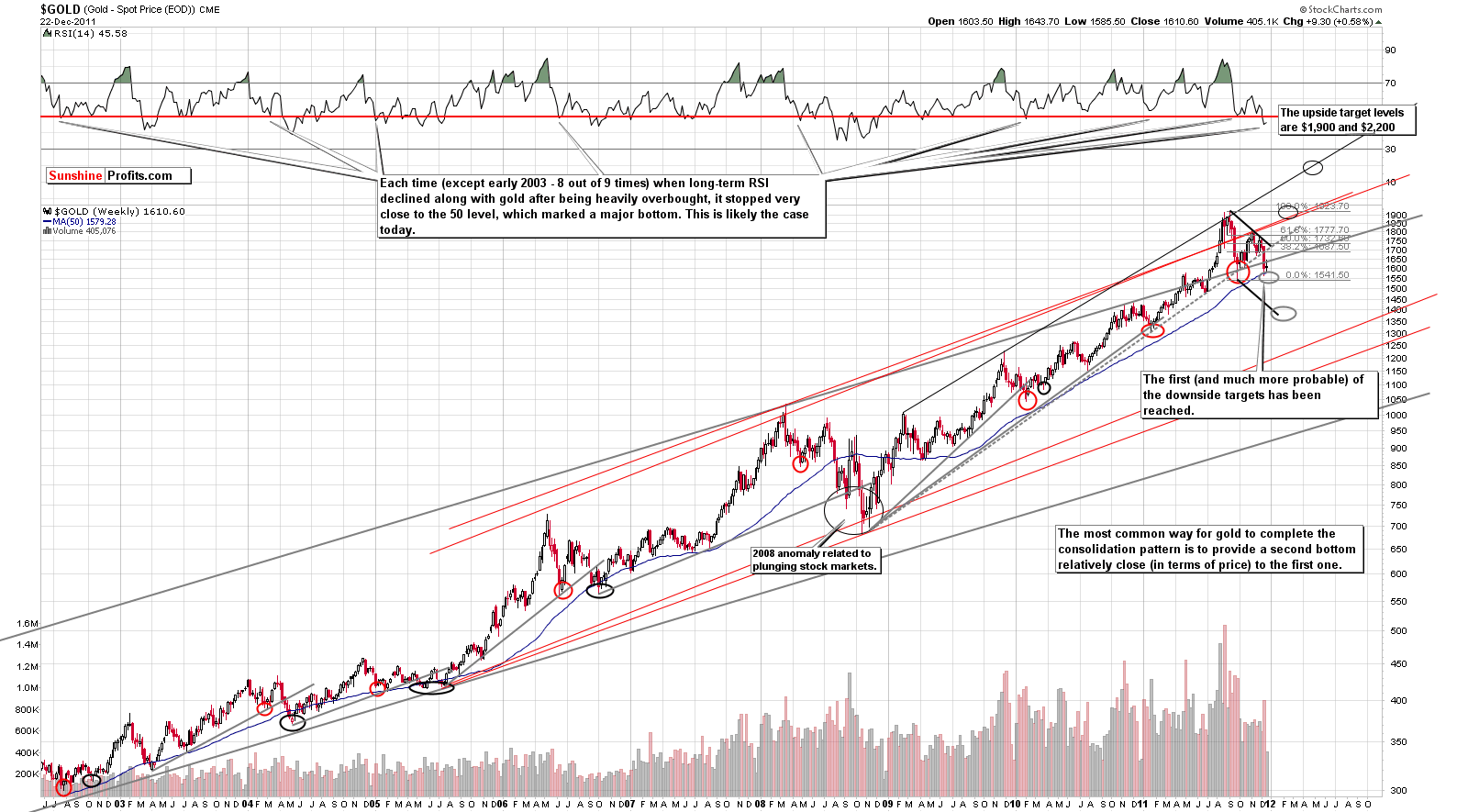
This week, we begin our gold section with a look at the very long-term chart (please click the above chart to enlarge). Very little has changed since our mid-week Premium Update on Tuesday when we stated the following:
Much has been written recently about gold's breakdown below the rising support line. Some analysts talk about gold's bull market being over because of that. The above chart should provide you with enough proof to deny this theory. First of all, technical analysis is not something that can determine if a bull market is to continue or not. Yes, it is very useful when identifying tops, bottoms and likely price paths, but when it comes to analyzing the very long-term tendencies, we need to consider the fundamental and macroeconomic facts. Were any of the world's economic and political issues resolved recently? No, Europe just bought some time, and nothing else changed. Nothing changed regarding US debt situation, trade and currency “tensions” with China, etc. The fundamental reasons that are responsible for this bull market's existence are still in place.
But, is the technical picture for gold really bearish? No, it's not, and the above chart has been created to prove it. One of the reasons is described right on the chart - gold quite often consolidates in a way similar to what we've seen in the past months. We're not in uncharted waters – we're seeing a quite common pattern in play. However, the most important point – something that deals directly with the breakdown mentioned in previous paragraph - is not described on the chart at all.
The key action that one should take before applying any trading technique is to check if it at least worked in the past. At this moment, you might want to take a few seconds and check the bearish gold analyses that you've read recently which include charts that cover the 10-year or at least a 5-year time frame. Anyway, this is not the first time that we're seeing a breakdown below a rising medium-term support line. We have marked the current support with a gray, dotted line. Other gray lines represent analogous lines in the past – ones that were viewed as key support some time ago. Please take a few moments to examine them and to check what followed the previous “breakdowns”.
What followed was not a plunge that erased the whole bull market. It was not a prolonged consolidation either. The fact is that similar “breakdowns” have been (in all cases seen on the chart) followed by the final bottom of the consolidation (not to far below the line that is has broken), which was in turn was followed by a strong rally. In these cases, lower prices were never seen thereafter.
Consequently, from both fundamental and technical perspectives, gold remains in a bull market, and what we're seeing right now may be the best buying opportunity that we'll see in the coming years.
If the above chart doesn't convince you, there's more. Let's see how gold performs relative to corporate bonds.
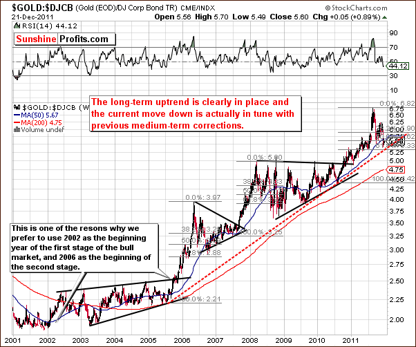
We now look at the ratio chart of gold’s price and Dow Jones Corporate Bonds. Quoting from mid-week Premium Update once again:
In the above chart, we compare the size of the current decline to the previous ones. Again, the recent move down is still in tune with previous price patterns. Please note that the ratio declined about 61.8% of its previous rally – just like in 2006. Moreover, the price is now slightly below the 50-week moving average – just like in 2006. The similarity between these two time-frames is quite striking indeed – please take one more look at the previous chart and compare the shapes of the 2006 and 2011 declines. The implications are clearly bullish.
Little has changed since Tuesday and the situation is still very much in tune with the comments made at that time and quoted above. The recent price action of this ratio clearly appears to be a mid-term correction, nothing more, nothing less.
In this week’s long-term chart of gold from a non-USD perspective, a move slightly below the lower border of the long-term trend channel quickly stopped, and the support line appears to have held. The trend clearly appears to be up at this time, and higher prices seem likely in the coming weeks.
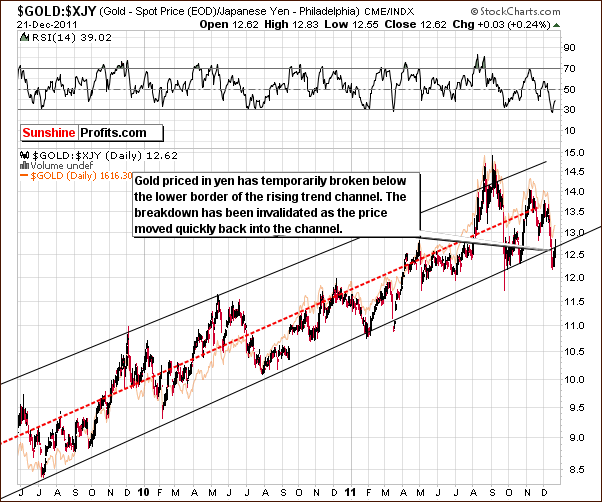
Looking at gold in terms of the Japanese yen, a temporary breakdown below the lower border of the rising trend channel is seen. Such a move is generally regarded as a bearish signal, but in this chart, such patterns in the past have been followed quickly by periods of rising prices.
This can be seen on two occasions earlier this year. Breakdowns below the trading channel were quickly invalidated and a similar situation appears to be at hand once again. The outlook is more bullish than not and furthermore, the RSI suggests that a major bottom is in as well. Unless a decline in the index level is seen immediately, the environment here clearly appears to be bullish for gold prices.
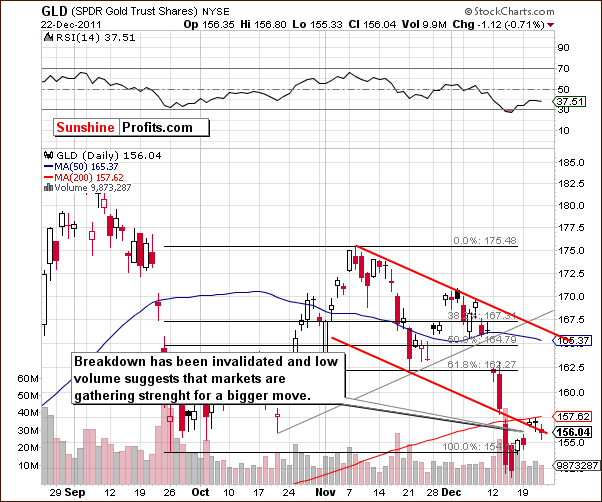
In this week’s short-term GLD ETF chart, prices have moved back into the declining trend channel. The breakdown has been invalidated and the situation is no longer clearly bearish. Price levels, having moved up, are no longer below the level of the September lows and this is a bullish sign – breakdown below previous lows has been invalided. Higher prices appear likely. Low volume levels point to the possibility that we are seeing the markets gather strength for a bigger move to the upside or downside, with the former being more probable.
Summing up, the situation in the gold market now appears to be somewhat “under control” from the gold bulls’ perspective. Although recent declines have been sharp, multiple signs suggest that the local bottom is in and higher gold prices are now expected.
Silver
In this very long term chart for silver (please click the above chart to enlarge), our commentary in our mid-week Premium Update is still current and accurate:
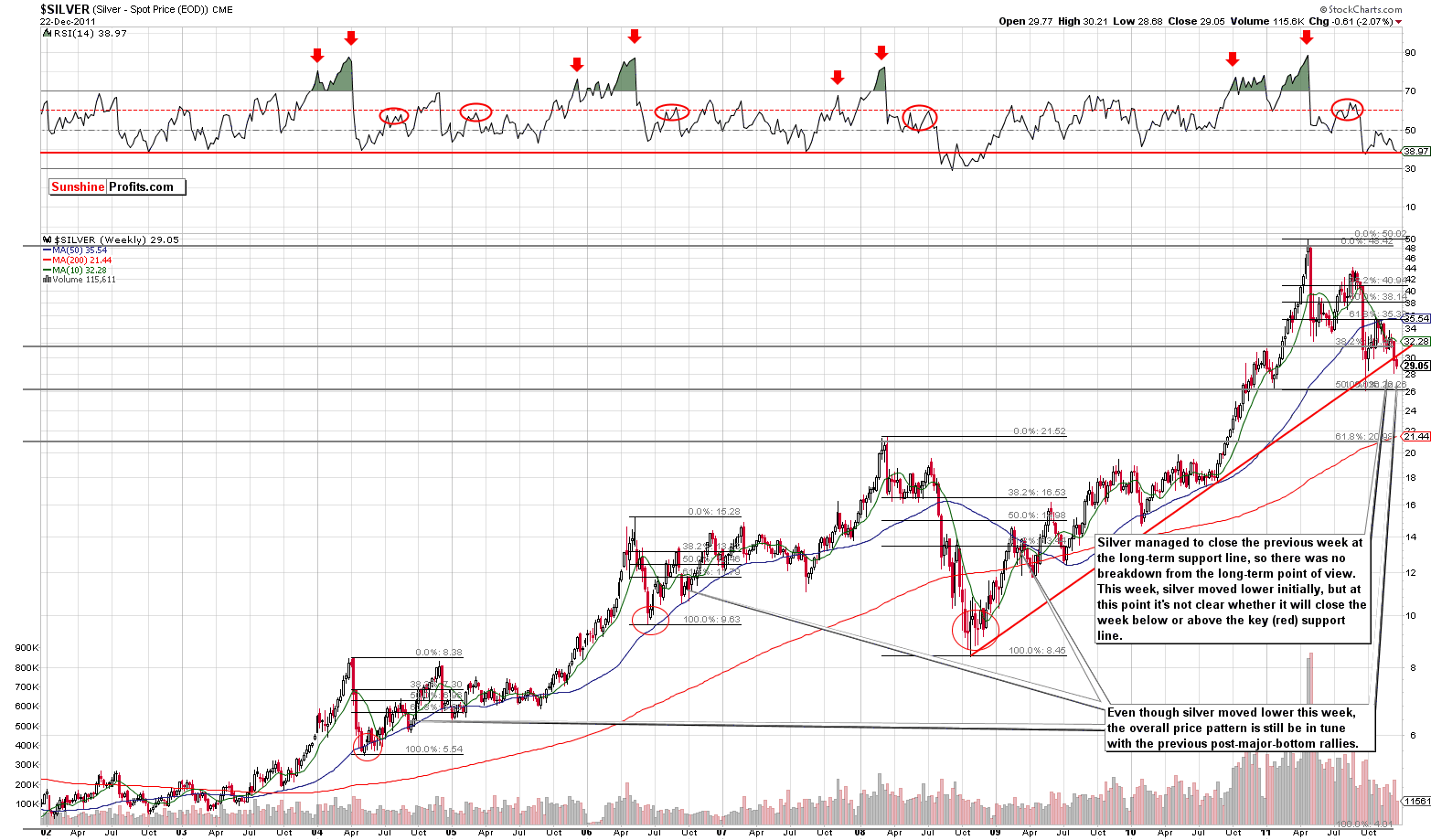
This chart doesn't provide us with a bearish picture either. While it is certainly true that silver moved below the rising long-term support line (red) last week, it managed to pull back and close the week right at it. Therefore, no true breakdown has been seen. Silver initially moved lower this week, but unless silver closes the week below the red support line seen on the chart above, the situation will remain bullish.
Please keep in mind that silver is right at its long-term cyclical turning point which – combined with the above-mentioned factors – suggests a rally.
Looking at another very long-term chart from a somewhat different perspective, we see that silver is close to its cyclical turning point which comes about every two years or so. This has been a very reliable indicator in the past and appears to suggest that we are likely at or near a local bottom.
Another way to look at it is that we could see a significant plunge after silver breaks decisively below the rising support line. That’s not the most likely outcome, though.
If silver’s price breaks down from here, this will be a very bad development indeed. It does seem more likely, however, that the next move will be to the upside and that the current cyclical turning point will correspond to a major bottom.
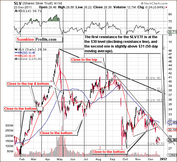
In the short-term SLV ETF chart, we see that a period of consolidation has taken place following a mid-December local bottom. Two resistances lines need to be surpassed before the situation can accurately be described as clearly bullish. Don’t get us wrong, the bottom appears to be in, but once silver breaks above these levels, we will have a confirmation. Once, the 50-day moving average is taken out, silver will be poised to move much higher.
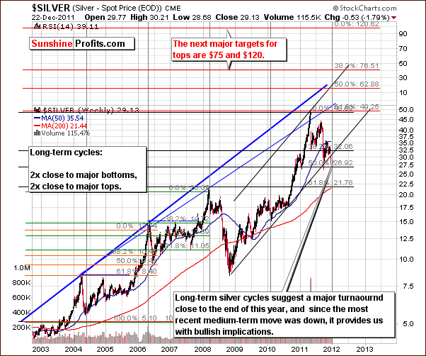
Please note that silver’s price is now slightly above the half-way point of the price level it reached last May and that the correction took more than 6 months. It appears that the damage has already been done based on the length and size of the decline. Consequently, the correction is likely over or close to being over.
We have received several questions from subscribers regarding the formation of a possible head-and-shoulders pattern (left shoulder in April/May and head in July-September). While this pattern appears to be partially formed, it has not been completed and our analysis this week indicates that the pattern will likely not complete. Volume levels have not increased much during the current decline and volume levels on upswings have not been particularly low. Moreover, the “left shoulder” is higher than to “head”. Indications are that the head-and-shoulders pattern will likely not be completed.
Summing up, silver is now at a very important point from a long-term perspective. Whichever way its price moves from here will be the beginning of a significant price move. It appears at this time that the probable medium-term move is to the upside.
Gold and Silver Mining Stocks
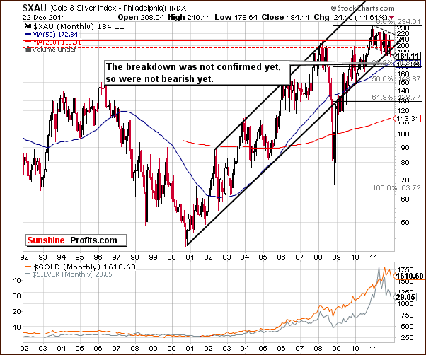
In this week’s very-long term XAU gold and silver miners’ index chart, we can see that the breakdown below the lower border of the rising trend channel has not been confirmed. The situation is therefore not bearish. Prices moved below the support line and then quickly back above it, so we are not overly concerned at this point.
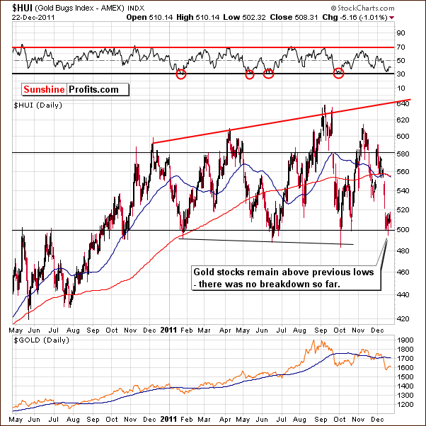
In this week’s long-term HUI Index chart, the support line based on previous lows has held and the index did not close below the 500 level. It appears that the bottom is in and since the HUI Index did not close below the level of previous bottoms, the recent price action is not seen as a breakdown. A better description would be a “several days long local bottom”. So, even if one would view the move in the XAU Index as a breakdown, then it would not be overly significant because there was no confirmation from HUI.
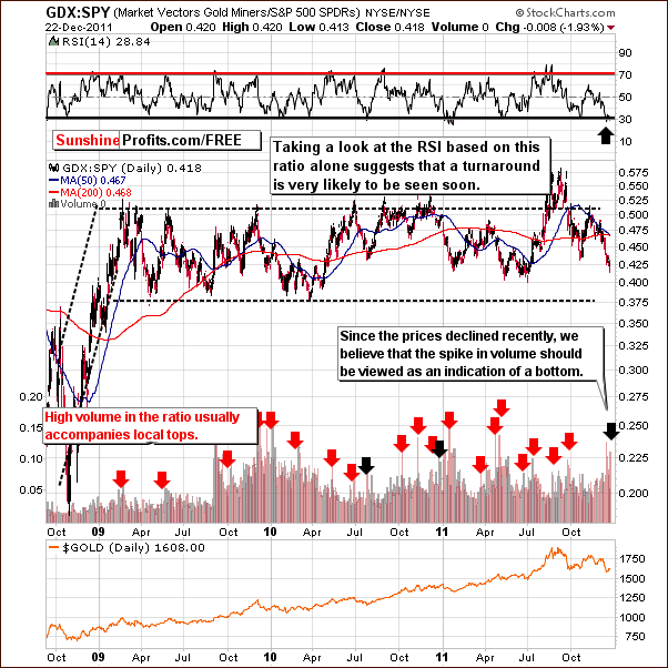
In the GDX:SPY ratio chart, we’ve recently seen a spike in volume. Please note that while it’s not possible to provide volume level for a ratio, it is possible to calculate a ratio of volumes. This chart, features the ratio not only between prices but also between two volume levels, the GDX and the SPY. When the former is significantly high, and the latter small, this normally corresponds to local top as the ratio value would be high. At this time, we have a buy signal based on RSI levels here. In addition, when the ratio moves lower with a spike in volume, this has coincided with local bottoms in the past.
Consequently, the above chart provides us with bullish implications for the precious metals sector.
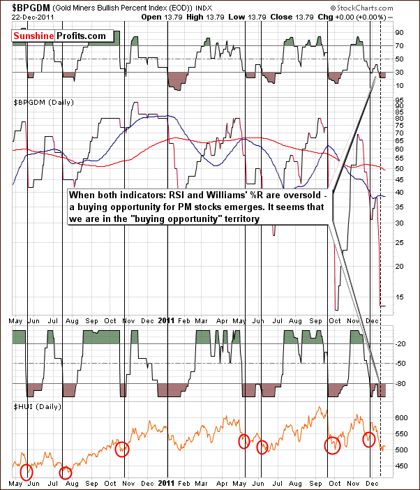
The Gold Miners Bullish Percent Index chart has indicated a buying opportunity for several days now. This buying opportunity is still in place as of today.
Summing up, the XAU Index appears to have broken to the downside, but this move has not been confirmed by the HUI Index and also by the size of the decline in the XAU Index. Both: the GDX:SPY ratio and the Gold Miners Bullish Percent Index are bullish. The overall picture appears bullish.
Sunshine Profits Indicators
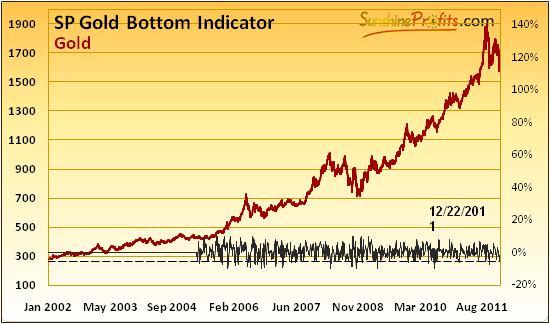
The SP Gold Bottom Indicator was included in our mid-week Premium Update and we have republished our comments regarding this tool below:
While it's not clearly visible on the above chart (please go to the Premium Charts section and click on it for more detailed view), the indicator moved below its signal (dotted) line. This means that we are at the major, long-term buying opportunity.
The four previous times when we've seen a buy signal (signal line crosses the horizontal dashed line at the bottom of the chart) from this indicator are: 9/27/2011 (the previous major bottom, followed by a $150 rally), 8/26/2011 (right after an important bottom, after which prices rallied over $200), 6/29/2011 (close to $1,500, a few days before a major bottom) and 1/24/2011 (below $1,350, a few days before a major bottom).
On top of that, we have just seen a signal (in fact a few identical signals) from our SP Gold Stock Extreme Indicator.
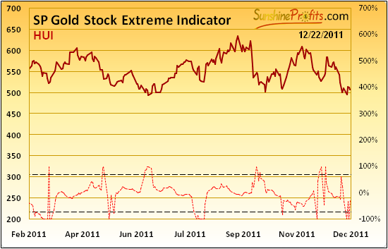
Here is the second indicator chart which we included in our mid-week Premium Update on Tuesday. Our commentary from then follows:
The indicator moved below the lower dashed line, so we have a buy signal.
While the move above the upper dashed line meant a local bottom in 100% of cases since 2008, a move below the lower dashed line did not have the same effect in some cases. In the Nov 2010 - today timeframe when the indicator moved below the lower dashed line, declines followed in most cases. The situation would become clearly bullish if we would see a quick move above the upper dashed line in the coming days – however this is a confirmation that we don't have right now.
Letters from Subscribers
Q: What a great and timely analysis. My only concern was your quote about gold moving higher soon to $1750 "before moving much lower"... Do you mean gold is due a shot tem rise of $150 dollars prior to plumbing new depths (ie 1500 US)?
A: Thank you for your kind words, we appreciate it. There are no certainties in any market, only more or less likely outcomes. A move higher at this point is more probable than continuation of the slide. Whether or not gold will move higher after reaching $1,750 is a different matter - but yes, at this point it seems likely that this level will be surpassed - we don't want to give a clear number on that, until we see in which way gold rallies. Some of the things that we will be monitoring are other markets like silver, mining stocks and volume.
Q: We've been asked to comment on the following piece of analysis.
A: In short, author's point is that rising gold inflows to the GLD ETF compared with declining gold prices create a bearish divergence, as they suggest that too many people are in the market and that all it can do is to fall.
Generally, we disagree. The above-mentioned psychological mechanism works quite well when determining important tops. However, the key point is that it works only when one takes the "unsophisticated investor" into account. When pros are buying that's not necessarily a bearish sign. So, the question is if GLD ETF is a proxy for gold that is exceptionally often used by the investment public and not by institutional / sophisticated investors? It's not. Consequently, we don't think that comparing price with inflows provides us with clear picture regarding investor sentiment. In our view, if you'd want to choose one part of the precious metals sector that represents individual investors and not institutions, we'd take a look at juniors (in which many institutions simply cannot invest), not the biggest of the ETFs.
Q: People who bought gold precisely as protection from a euro problem got slammed. Perceptions have changed. There was panic selling of gold coins by the man on the street. Even traders have been severely rattled by this. How do you feel about this aspect?
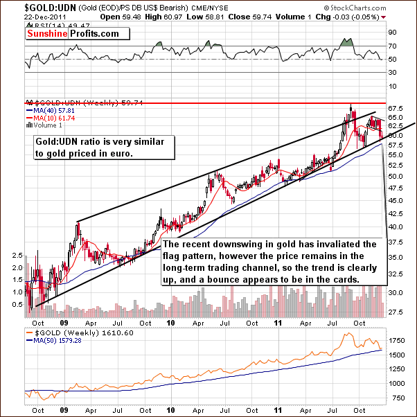
A: The question is if perceptions have indeed changed - was the move lower different from the previous moves lower? Gold in euro did move lower, but the move stopped at the support line (the gold:UDN chart featured earlier is very similar to the gold in euro chart). The shape of the slide was similar to what we've seen in the past as well. In our view, the current move lower is still similar to what was seen before and doesn't necessarily imply that the long-term trend is any different than it was weeks or months ago.
Q: Why do you not use only the $BPGDM for buy and sell signals? Today after this update GDX:SPY has hit a low. What is the signal that one needs to observe (volume spike - as per your red arrows) and is it better to wait for a positive move the next day as confirmation. Is this indicator reliable enough to provide a final low is in signal?
A: We believe that using just one of the indicators (be that $BPGDM or GDX:SPY ratio) is risky. Not that they are not reliable - some (like our SP Gold Stock Extreme indicator) are very reliable. The point is that you can never tell when they stop working. At some point certain psychological mechanisms that are behind each indicators shape might change. The reason could be that new investors enter the market or that the index that you were analyzing changes by itself (it becomes based on other companies). That's why we prefer using a whole set of them. As far as confirmation is concerned, a move up on strong volume is a confirmation of a coming rally. However, we would view signals (same direction) from other indicators or techniques as confirmations as well, so if we have those, then one doesn't usually need to wait for a confirmation from the price itself.
Summary
The situation in the USD Index is more bearish than not. The Euro Index outlook is somewhat brighter and a rally in the coming weeks is quite possible. The situation in the general stock market is mixed at this time with contradictory signals from price and volume making the situation somewhat unclear.
Based on the currency and stock markets, the outlook for precious metals overall is rather bullish. It appears that the recent price action for gold and silver could very well have formed a major bottom. The metals appear poised to rally and will likely see higher prices as we approach and enter the new year. The same can be said for the gold and silver mining stocks.
Our thoughts on the probabilities of specific market moves were included in our mid-week Premium Update and are worth repeating here.
The probability of gold moving higher from here (to $1,750) before a big move lower (below $1,550) is seen appears now to be about 70%. A move down to $1,400 or so seems fairly remote with an estimated 10% likelihood at this time. Note that precious metals may move to $1,550 once again, before the rally materializes (and it will not automatically invalidate the above calculations).
The implications for long-term investors point to a fully invested position being appropriate at this time. For short-term speculators, long positions currently appear to be a good way to approach the market.
We do remain somewhat cautious as we watch daily market moves during these critical times. There are a number of support lines, which we expect to hold, but a slide to the downside could occur if any of these support lines fail. It is simply something that should be monitored as we close out 2011. Unexpected changes could influence the outlook for short-term and long-term (!) holdings. We will continue to keep you informed on all significant matters.
This completes this week’s Premium Update. Our next Premium Update is scheduled for Friday, December 30, 2011.
Thank you. Have a profitable week, a pleasant holiday, and a great weekend!
Przemyslaw Radomski

