
Conventional wisdom has it that there are three safe haven currencies—the Swiss Franc, the Japanese Yen and the U.S. dollar. But perceptions are changing. The US dollar is no longer the default shelter. Instead, the Swiss franc and the Japanese yen have been the hideaways in a financial storm along with history’s longest used currency—gold. But both the Swiss and Japanese governments are desperately trying to curtail their currencies appreciation and to curb the inflow of investments by selling their currencies into the market and creating an oversupply which will lower prices. They have both cut interest rates to zero. A strong currency makes it difficult to export your country’s goods.
It’s easy to understand why investors have perceived the Swiss franc as a safe haven. Switzerland boasts a strong economy which is not plagued by high national debt and budget deficits. With its conservative Swiss banking monetary policy, it has not resorted to money printing schemes with names like “quantitative easing.” The Swiss franc reached milestone parity with the dollar in 2011 and since then has appreciated by an additional 20%. The franc is up 5.41% against the euro this year and almost 14% against the dollar.
However, on Tuesday, the Swiss franc plunged dramatically versus the euro and other major rivals after the Swiss National Bank took the extraordinary step of setting a floor for the euro/Swiss franc exchange rate at 1.20 francs and vowed to buy “unlimited quantities” of euros to defend it.
Needless to say, this gave gold a boost. It reached a record of $1,923.70 an ounce in trading Tuesday of contracts for December delivery, before retreating below $1,900. The price of oil has fallen because of the global slowdown, eliminating another place where investors might be tempted to stash cash. The SNB's move was widely viewed as positive for gold because the metal will gain even more popularity as a safe-haven investment of choice.
For the past 14 months the franc has experienced a parabolic rise as financial instability beset many of its neighbors as well as the US. The move by the SNB puts the central bank in direct conflict with a strong desire by market participants to buy safe-haven assets. Since there is a good chance that the eurozone crisis will only get worse, the Swiss intervention could prove to be very costly to the SNB. The move underscores the particular challenges facing Switzerland at a time of global economic uncertainty.
This is not the first time the Swiss central bank has resorted to such a strategy to contain the franc. It used a similar strategy in the late 1970s to weaken the currency against the Deutschmark mark. The central bank’s new target commits it to buying euros and selling francs any time the euro falls below 1.20 francs. That amounts to setting a floor for the euro or a ceiling for the franc.
Japan’s situation is different. It has severe debt problems which for some reason are overlooked by investors. Japan is still a productive economy with high personal savings and exposure to booming China. The Yen has risen 6.63% against the dollar so far this year.
The central banks of both Switzerland and Japan can take action to lower the value of their currencies. But gold is not controlled by any central bank. New gold comes into the market at a rate of about 2% a year. Unlike fiat currencies it can’t be printed at will. Gold’s scarcity is dictated by nature rather than by politicians. The dollar has a debt burden alongside it that gold does not. So, with Japan massively intervening in the currency market and the Swiss curbing the safe-haven status of the Swiss franc this week, the only safe haven currency that remains standing is gold (that is except silver and platinum).
Marketwatch did a quick reader poll asking what is the best safe haven asset in light of the Swiss intervention to weaken the franc? Gold was far away the big winner with 62% of the readers choosing it. Silver was the next runner up with 13.3%. The Yen got only 3.4% and oil 10%.
Labor Day 2011 arrived this year following a dismal Jobs Report on Friday that caused gold to gain $47.70 an ounce, or 2.6%. Many people in America did not have to grumble about having to wake up early Tuesday and go back to work after a long week end of barbeque and holiday sales. They have no jobs to go back to. They are part of the 14 million unemployed a number equivalent to the population of Illinois, Wyoming and Vermont. America has lost the jobs that created the engine of prosperity that made the U.S. the world’s leading economy.
Last Friday was the gold’s biggest one-day advance since early August. Silver also rocketed, rising $1.54, or 3.7%, to $43.02 an ounce. The government’s report that the economy created no net new jobs last monthstoked fears that recession is becoming a self-fulfilling prophecy and that quantitative easing is right around the corner.
In a make or break speech, President Obama is expected to address a joint session of Congress this evening on job creation on the same day that a bipartisan “supercommittee” meets for the first time to identify $1.5 trillion in deficit savings over the next decade.
Obama must find a way to reestablish control of the public debate about why his administration’s policies are the right ones to pursue to put the country on healthy economic footing.
We ran into an interesting essay in the Financial Times Monday by Kishore Mahbubani, a retired Singaporean diplomat:
Dictators are falling. Democracies are failing. A curious coincidence? Or is it, perhaps, a sign that something fundamental has changed in the grain of human history. I believe so. How do dictators survive? They tell lies. Muammar Gaddafi was one of the biggest liars of all time. He claimed that his people loved him. He also controlled the flow of information to his people to prevent any alternative narrative taking hold. Then the simple cellphone enabled people to connect. The truth spread widely to drown out all the lies that the colonel broadcast over the airwaves. So why are democracies failing at the same time? The simple answer: democracies have also been telling lies.
It is hoped that Obama will find the courage to tell the American people the truth that recovery is not just around the corner and that sacrifice and pain will be needed if there is hope to get out of the mess.
We recently wrote about the 40-year anniversary of the “Nixon Shock,” the closing of the gold window in 1971. We ran into a fine, five-page in depth piece about it in BusinessWeek Magazine. You can read it here.
We’ll begin this week's technical part with the analysis of the previous bull market in the precious metals. The goal is to see how the current bull market compares with the previous one. After all, since history rhymes, looking at the analogy should provide us with clues as to what can happen next. In particular, we will be able to estimate if we’re currently on a verge of the final parabolic upswing and if this bull market is likely to end soon.
Gold & Silver Bull Market – Big Picture Analysis
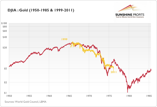
The above chart presents the DJIA:Gold ratio in two time spans: 1950-85 (red line) and 1999-2011 (golden line). The 1999-2011 has been superimposed on the older data. The chart points to the fact that in the period between 1965 and 1975 the ratio had been falling roughly in the same way it did between 1999 and 2011. We live in a globalized world, so looking at gold’s price relative to stocks might be more appropriate for long-term tendencies than a look at the gold price itself, simply because the major shift in investor’s sentiment happens when investors prefer gold to the most popular investment class – stocks.
The methodology here is, therefore, to compare the decline in the DJIA:Gold ratio around the 70’s bull market and compare it to the decline seen in the more recent years. Things to look at include the size of the decline, the time it took before the decline ended and the overall shape of the downswing.
As far as the size of the decline is concerned – in both: time and range – the slide seems far from being over – which means that the bull market in the precious metals is likely to continue. The analysis of shape confirms that both bull markets are indeed similar. However, the most interesting implication is based on the late 1974 rally in the ratio.
As we see that 1974 and 1975 marked a significant trend reversal, we might expect a similar move to happen in the near future. This would imply a significant correction in the precious metals sector and possible rallies in the general stock market before the precious metals sector regains its strength and continues moving up.
Clearly, this is not the time to stop paying attention to warning signs about a possible decline in the precious metals. Let’s take a look at the gold chart.
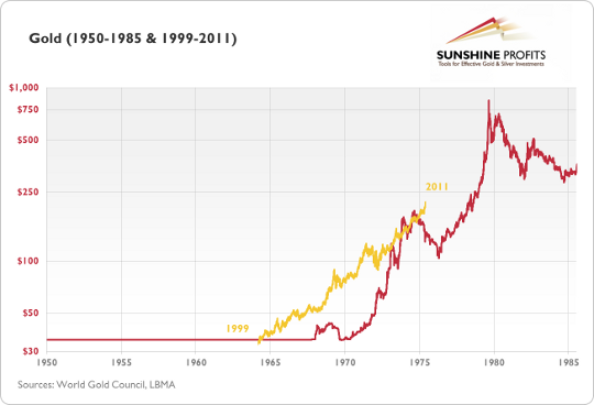
In the chart above, you see the price path of gold in the years 1999-2011 (golden line) superimposed over gold’s price path between 1950 and 1985 (red line). The vertical axis represents the older data while the values of the recent data have been rescaled to properly reflect the corresponding price changes. After a short comparison you might notice that today gold seems to be in a similar situation to where it was in 1975. This would suggest that we are in for a significant correction in the precious metals sector before the bull market resumes. It would also imply that any correction seen in the following month would not end the current bull.
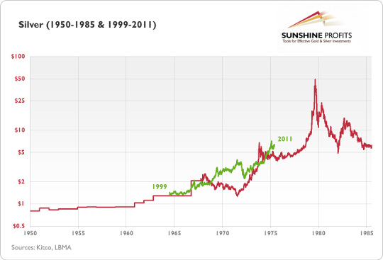
The above chart is similar to the previous one, except for the fact that it presents silver, not gold. Once again, the current bull (green line) has been superimposed over the price path between 1950 and 1985. Even though the price paths here are less similar than in previous cases, they still point to the fact that the silver rally might be followed by a substantial short-term correction or at least by a sideway trend. Just as in the previous cases, this should not be perceived as the end of the current bull.
Summing up, there will be a time gold and silver move straight up without any corrections, but analysis of the previous bull market suggests that this moment is still years from today. Moreover, this is not the time to stop paying attention to signals indicating a significant correction around the corner. Finally, this is not the time to stop trading the precious metals market (in general).
Having said that, let’s move to the currency section (charts courtesy by http://stockcharts.com.)
Euro - USD Indices
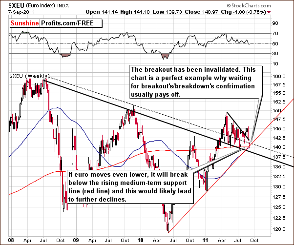
We begin with a look at the long-term Euro Index chart. The index moved sharply lower this week, and it is now below the declining resistance line once again. The index has not yet moved below the rising (red) support line, however, and it’s important to note that such a move could really open the door to significant declines towards the 135 or even 130 level. This week’s developments will likely have positive implications for the dollar.
This is a perfect example of why it is so important to wait for confirmations and verifications before making important investment or speculative moves with one’s capital. In this case, the breakout above the rising resistance line seen last week was invalidated.
Without following the general rule of waiting for such important prerequisites (confirmation or verification) in the case of both breakouts and breakdowns, being on the wrong side of a trade at the beginning of a big move becomes far more likely and can also be far more costly!
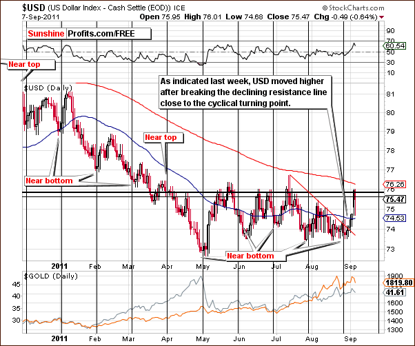
In the short-term USD Index chart, we saw the index break above the declining resistance line last week. In last week’s Premium Update, we mentioned that this short-term move could in fact create a breakout from the long-term perspective as well.
This would become a bullish signal if this move ignites a move above the long-term resistance line which in turn would likely ignite a rally from a long-term perspective. This could bring the USD Index levels up to as high as 78-80 or even higher. Such a move would likely have negative implications for the precious metals sector.
Although the index is only a bit more than 1% higher than a week ago (as of Thursday’s close), the upside potential now is much greater than it has been for some time simply because the dollar is in fact above the previously-mentioned long-term resistance line. Please take a look below for details.
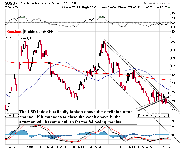
Here, in the long-term USD Index chart, we can see that the index has move above the declining trend channel and this is a very important development. If it stays above this channel for the rest of the week, the index will likely continue to do so for some time. It appears more likely than not, say 60/40 that this will be the case and the rally will therefore continue. Upside target levels in the 78 to 80 range will seem quite realistic if the rally holds.
Summing up, the situation in the USD Index is more bullish this week and quite the opposite is true for the Euro Index. The latter declined sharply and invalidated its breakout this week and this greatly contributed to the positive moves of the dollar. The implications for precious metals are bearish unless the currency moves we saw this week turn out to be short-lived.
If the dollar moves higher and the euro lower for the medium term, the influence is likely to be very visible throughout the precious metals sector. It appears that the key signal to watch for this week is whether the USD Index can remain above its declining trend channel. This would serve as a first confirmation of the breakout and would greatly increase the probability of lower precious metals’ prices in the weeks ahead. If USD declines, but doesn’t get below 74 level, the situation will remain bullish.
General Stock Market
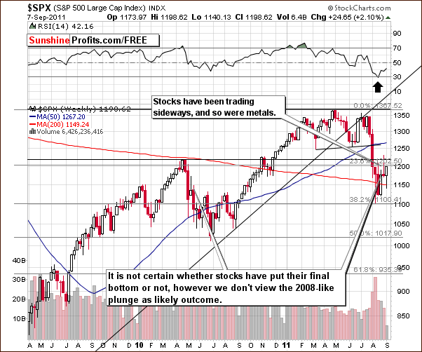
In the long-term S&P 500 Index chart, this week basically saw sideways trading patterns. The comments we made last week are still up-to-date and the question about whether the final bottom is in remains open. Through Thursday, the intra-week highs and the intra-week lows have been higher, so it appears possible that the period of decline could be over. This seems to be more likely than not and a plunge similar to what was seen in 2008 appears far less likely now. Overall, this outlook for the general stock market has generally bearish implications for precious metals.
Summing up, higher stock prices are slightly more likely to be seen in the weeks ahead based on this week’s analysis of the S&P chart. This is a slightly bearish development for gold, silver and gold and silver mining stocks.
Correlation Matrix
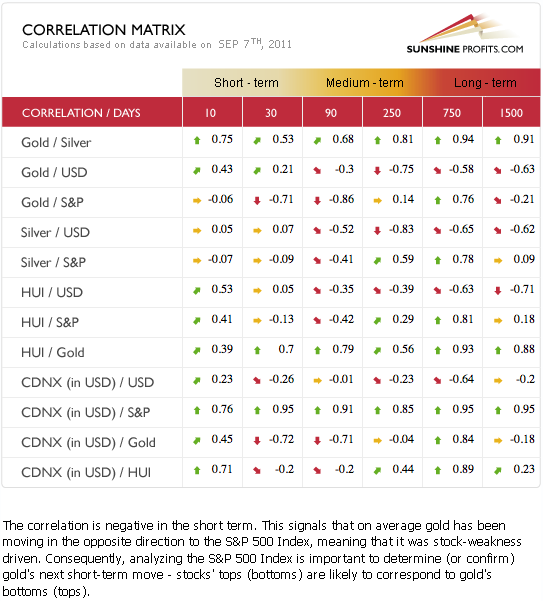
In this week’s Correlation Matrix, we continue to see a strong negative correlation between gold and the general stock market in the 30-day column. The negative correlation is also seen between gold and the USD Index but in the medium term. This week’s Correlation Matrix is nearly identical to what we published last week as the relationship between markets has changed very little.
Quoting from last week’s Premium Update:
Based on the Correlation Matrix and the current situation in stocks and currencies, the overall outlook for precious metals is more bearish than not at this time.
Gold
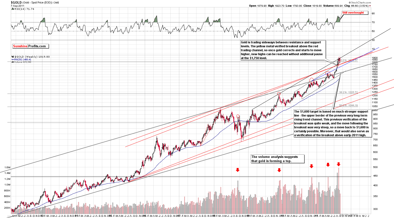
We begin this week’s gold section with a look at the very long-term chart (please click the above chart to enlarge),Gold has been trading sideways for the most part this week moving back and forth between an important final resistance line and its previous trading channel. A confirmed move above this resistance line could lead to much higher gold prices, but a consolidation has been going on for some time and RSI levels remain overbought. Our downside target level of $1,600 is therefore still valid as are the sell signals from our analysis of volume levels.
In this week’s long-term chart for gold from a non-USD perspective, another move has been seen above a key resistance line. The index then moved back to the resistance line which is created by the highs of 2009 and 2010. This could be a verification of the breakout but may still turn out to be a fake-out. The situation remains mixed and quite tense and it seems best right now to wait on the sidelines for things to clear up a bit. RSI levels remains overbought as well.
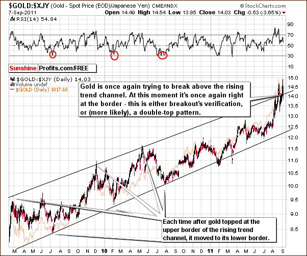
Looking at gold from the perspective of the Japanese yen, we see the likely formation of a double top. The index level is currently right at the upper border of the trading channel and the apparent second top is a bit higher than the first. Similar patterns have been seen in the past and have often been followed by a sharp move to the downside shortly thereafter.
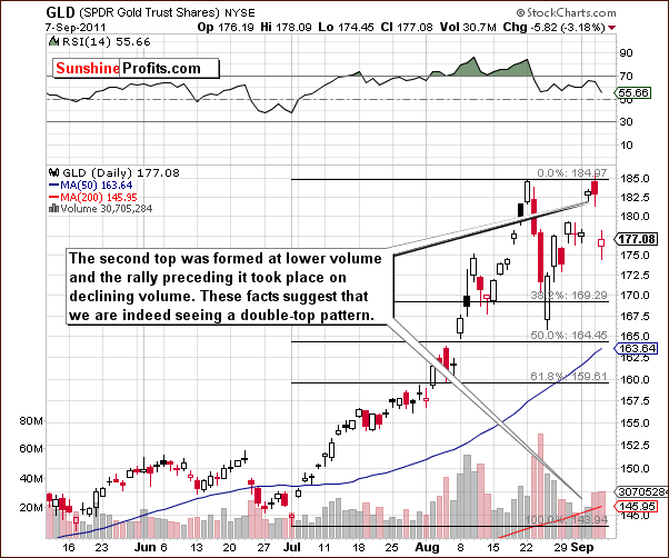
The short-term GLD ETF chart is perhaps the most interesting chart of all this week (well, maybe except for the mining stock charts). We are seeing that volume levels are confirming the double top pattern as the first top was seen on significant volume and was followed by decline on high volume as well. The second top had considerably less volume and this is generally a bearish phenomenon which is likely to be followed by a downturn.
Summing up, the situation is mixed based on the non-USD charts and the bearish implications of the GLD ETF short-term chart. The seasonal tendencies of gold are bullish in September and this creates a very mixed situation at present. Although this statement may seem somewhat disappointing to Gold and Silver Traders, we feel it is our obligation to honestly report the situation exactly as we see it each week.
Silver
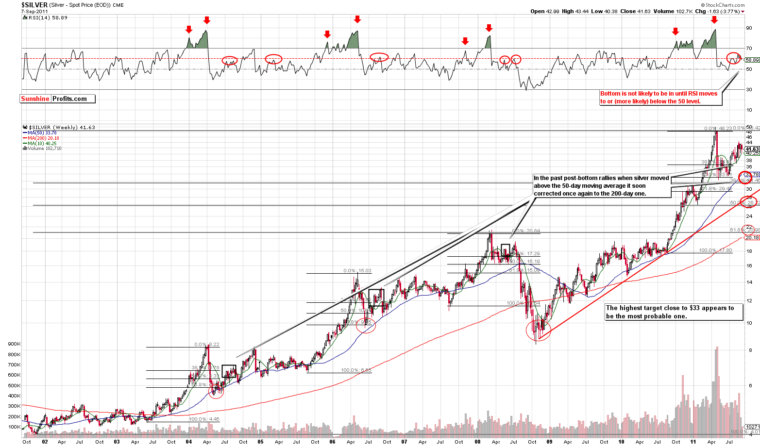
In this week’s long term chart for silver (please click the above chart to enlarge), virtually nothing of profound significance happened this week. Silver’s price moved back and forth throughout the week and its RSI level continued to move in tune with previous trends. The suggestion is clearly pointing to eventual price declines based on previous retracements. The next bottom is likely to be close to the (blue line) 50-day moving average, probably in the $33 to $34 range.
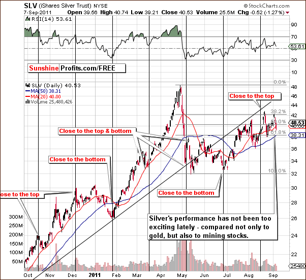
In the short-term SLV ETF chart this week, we see that a local top did indeed form close to the most recent cyclical turning point. Silver has definitely been underperforming gold and gold mining stocks lately. Its price is well below its May high whereas gold and gold mining stocks are above theirs.
Summing up, the short-term chart ensures that our approach to long-term holdings in silver was the right one and it seems that having one half of one’s silver holdings out of the market is a good approach at this time.
Platinum
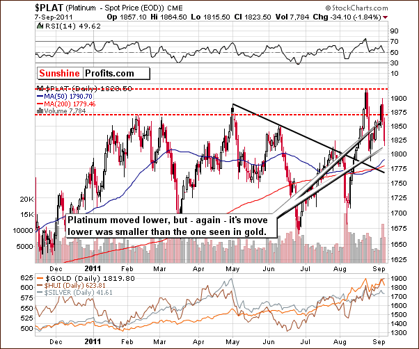
In this week’s short-term platinum chart, we see that prices declined this week much as was seen in the case of gold. However, the decline here was smaller and platinum’s price remains above that of gold. Although the difference right now is not huge, it looks as if platinum is likely to be considerably more expensive in the coming months. This is consistent with what we have seen in previous analyses.
Gold and Silver Mining Stocks
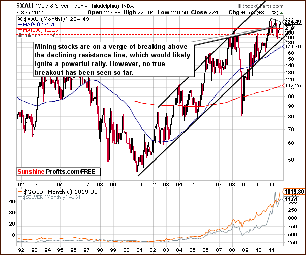
The mining stocks section continues to be the most interesting part of the precious metals sector. In this week’s very long-term XAU Gold and Silver Index chart, we once again see continued attempts for prices to move above the recent consolidation pattern. The index level is right at the upper border of this trading pattern today but a breakout is yet to be seen.
Ideally, the three mining stock indices should confirm each other but this is definitely not the case today. When the gold and silver mining stocks finally make a move, it will likely be sometime before it completely matures.
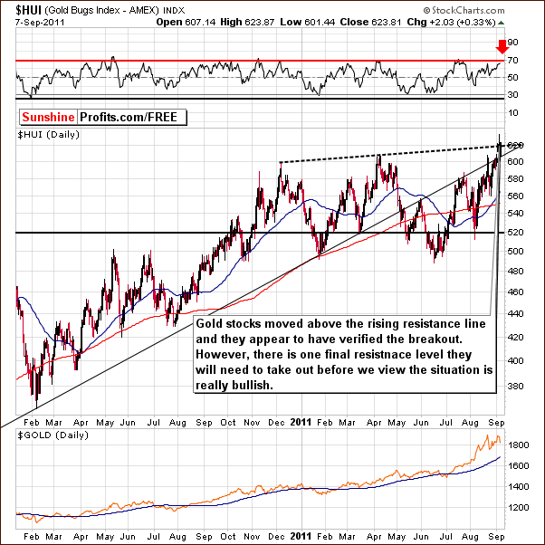
In this week’s HUI Index chart, we see that gold stocks have moved to new highs above the long-term rising resistance line. The breakout above this line created by previous major tops has not yet been confirmed however and with the RSI level at 70, a correction could still be just around the corner.
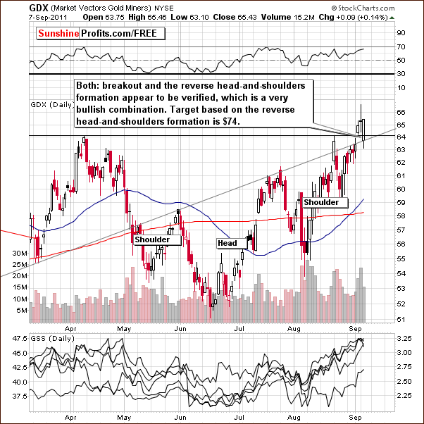
In this week’s short-term GDX ETF chart, we see a breakout above previous highs. The bullish reverse head-and-shoulders pattern has completed and the move to the upside was verified on Thursday. The signals from this chart are clearly bullish this week.
Now with the XAU Index below its previous highs, the HUI Index above its previous highs and strong bullish signals here, a bit of confusion is understandable. We will address this with one additional chart to bring everything into a clearer perspective this week.
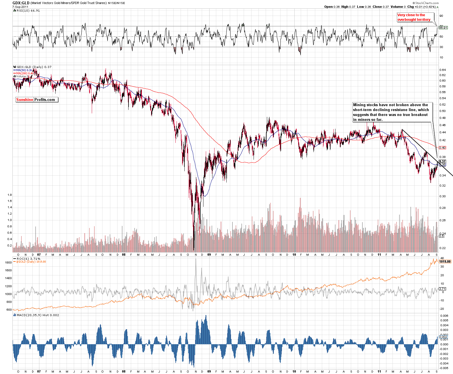
The GDX:GLD ratio chart (please click to enlarge) is a tool which can be quite useful when the gold and silver mining stock charts yield conflicting or confusing signals. Here we can see how the gold mining stocks have performed recently in comparison to the price moves of gold.
The ratio has been declining in recent months and is presently right at its declining resistance line. No breakout has been seen in the ratio and the RSI level is in the local top range. The implication here is that the GDX ETF could very well invalidate its breakout. In short, the situation is simply not as bullish as it first appears based on a quick analysis of the short-term chart.
Summing up, the situation remains quite exciting and the next move will likely be significant. It is too early at this time to say that the breakout is in and confirmed. We are still awaiting a confirmation before suggesting that opening speculative positions may be a good idea. Conversely, an invalidation of the breakout could make short positions attractive. We will continue to watch developments in the days ahead and report to you accordingly.
Letters from Subscribers
Q: Appreciate that you say if you see Yahoo finance comment on gold then it’s a sell signal and if going long is a good idea.
A: Generally, when gold becomes very popular in the media and is literally making headlines, it serves as a sell signal. However, before making transactions one should also take a look at other factors. At this point for example, the situation in the gold mining stocks is very important factor that could push gold higher even despite gold's popularity. That's why we keep track of many relevant markets instead of focusing on gold itself. Yes - it is much more time-consuming - but in the end it pays off in the form of more detailed analysis which, in turn, leads to better investment decisions.
Q: The FSG ETF is an ideal way to get leverage out of Gold bull and SP100 bear. Do your correlation indices on a graph reveal any buying opportunities for this?
A: The FSG ETF is a quite complex derivative instrument. In fact, it's a bet on the difference in the rate of return of other different derivatives (gold futures and S&P futures). That's why we don't recommend it as a proxy for long-term investments. However, when trading - especially day-trading - is concerned, the ETF provides interesting properties. This ETF is likely to outperform other gold ETFs (and may even outperform the leveraged ones) as long as gold remains strongly negatively correlated with the general stock market and the yellow metal moves higher. At this moment gold is negatively correlated with stocks, so this ETF moves significantly. However, if one decides to use it, it will be particularly important to track gold's correlation with stocks and to move to other gold trading vehicles once it wanes.
Q: Please comment on the following: Observers expect that, in analogy to an earlier paper of the European Commission, the current plan will propose a tax on banks of 0.1% on stocks and bonds and 0.01% on derivatives. This could raise between €30bn and (if currencies were included) more than €50bn per year.
A: This question refers to the Tobin Tax, suggested by Nobel Laureate economist James Tobin, originally defined as a tax on all spot conversions of one currency into another. The tax is intended to put a penalty on short-term financial round-trip excursions into another currency. If the tax on financial transactions is imposed, it will likely have a negative influence on most assets, including stocks, gold and silver, simply because a large part of this market is of paper nature (futures, options) and tax would discourage ownership of the latter.Still, we don't think that this tax will be imposed. Quoting from the source:
Implementation would require the unanimous approval of all 27 EU member states to become law, not only of the 17 eurozone countries. So far, the British, Dutch and Swedish governments signaled to oppose the plan while Austria and some others announced support.
In view of the above requirement, we view its implementation as highly unlikely.
Summary
In the past month, gold has rallied strongly and some investors may wonder if the third phase of the precious metals bull market is underway. Is it likely that the precious metals will go nowhere but up? Well, we must at this point say that this does not at all appear to be the case. It seems quite likely that a consolidation, perhaps a significant one, will be seen before the final rally begins.
While it is true that September is normally a strong month for precious metals, we may in fact see different trends this year. Such was the case during this past summer. Historical trends were not followed in the past few months as far as general moves are concerned, so perhaps it seems that the same may hold true for the fall. We base this on the recent breakout seen in the USD Index, the double-top pattern seen in the short-term GLD ETF chart, signal coming from the long-term volume analysis and other factors.
There is not much to tell with respect to silver which has been underperforming the other precious metals. It still seems that being partially out of long-term positions is a good idea. The risk-reward ratio simply does not support a fully-invested long-term position at this time.
The most interesting area of the precious metals sector has been the gold and silver mining stocks. Gold stocks have moved above previous highs, but a true breakout has yet to be seen. This is a very much preferred development before engaging long positions. We just saw a perfect example of the importance of verifications in this week’s Euro Index price action, which was dramatically different from last week’s price moves.
There do not seem to be any major strategic moves for long-term investors or short-term traders, which appear warranted at this time. The long-term outlook has not changed and the short-term view is too cloudy at this time. We will continue to watch the situation and if it changes in the days, we will inform you accordingly.
Our next Premium Update is scheduled for Friday, September 16, 2011.
This completes this week's Premium Update.
Thank you for using the Premium Service. Have a great weekend and profitable week!
Przemyslaw Radomski

