- Euro & USD Indices
- General Stock Market
- Correlation Matrix
- Gold
- Silver
- Platinum
- Mining Stocks
- Junior Mining Stocks Ranking
- Letters from Subscribers
- Gold and the oil production in the U.S.
- Performance of the greenback
- Gold in India
- Are gold prices stuck? Inflation and money supply
- Junior miners, exploration companies, MEAOF
- $1 trillion coin effect on precious metals
- Will the Dow and the U.S. Dollar collapse bring down the Indian Sensex?
- Will commodity stocks rally this year?
- Summary
The most expensive coin to date is a 1933 Double Eagle gold coin minted during the Great Depression and sold at auction for $7.9 million. But that’s a mere pittance compared to a single platinum coin “worth” $1 trillion. It started as a joke, but serious journalists, economists and politicians are actually discussing the minting of such a coin as a way to sidestep congressional infighting and averting the looming debt ceiling crisis.
The rather ludicrous idea is to use an obscure commemorative-coin law as a loophole to mint one platinum coin, arbitrarily give it a face value of $1 trillion and deposit it at the Federal Reserve. This is all perfectly legal and would give the government breathing space. It is besides the point that $1 trillion dollars worth of platinum at current prices would be around 9 times the amount of platinum ever mined throughout history. This “magical” coin would be nothing more than a fictitious bookkeeping entry. Believe it or not, the idea has actually gained traction.
In his latest blog, Nobel Prize-winner Paul Krugman wrote that although the idea of the coin is silly, it is no more ridiculous than the behavior of US lawmakers, which he described as “equally silly but both vile and disastrous.”
It’s easy to make sententious remarks to the effect that we shouldn't look for gimmicks; we should sit down like serious people and deal with our problems realistically. That may sound reasonable — if you've been living in a cave for the past four years. Given the realities of our political situation, and in particular the mixture of ruthlessness and craziness that now characterizes House Republicans, it’s just ridiculous — far more ridiculous than the notion of the coin, Krugman wrote.
Krugman isn't a lone voice – there are currently more than 5000 signatures on a White House petition to mint the coin. The petition states:
“While this may seem like an unnecessarily extreme measure, it is no more absurd than playing political football with the US - and global - economy at stake.”
The issue has gained more urgency at the publishing of a new analysis which says that the U.S. government may default on its debt as soon as Feb. 15, half a month earlier than widely expected. The analysis, by the Bipartisan Policy Center, says that the government will be unable to pay all its bills starting sometime between Feb.15 and March 1.
Will a default be seen – highly unlikely – The Powers That Be have printing presses and can use them to create something to pay the debts with. Inflation is easier to deal with politically so we think that it will be this road that the US and the rest of the world will take in the coming months.
A bit of debt ceiling history
A debt-ceiling limit has been in effect since 1917 when the US Congress passed the Second Liberty Bond Act which allowed the executive branch to issue bonds and take on other debt without congressional approval, as long as the total debt fell under the statutory debt ceiling. Raising the debt ceiling does not give license to the government to spend extra money. It is only to pay obligations that have already been approved by Congress when it passed the annual budget. Every President since Harry Truman has added to the national debt which has been raised 74 times since March 1962, including 18 times under Ronald Reagan, eight times under Bill Clinton, seven times under George W. Bush and so far, three times under Barack Obama.
It looks like Obama will not give in to Republican blackmail.
“What he will not do — as he has made clear — is negotiate with Congress over Congress’s sole responsibility to pay the bills that Congress has already incurred,” White House press secretary Jay Carney said early this week. “Nobody forced Congress to rack up the bills that it incurred. And it is an abdication of responsibility to say that we’re going to let the country default and cause global economic calamity simply because we’re not getting what we want in terms of our ideological agenda.”
Putting the silly idea of the platinum coin aside, one can only cringe at the thought of what will happen if the debt ceiling is not raised and the U.S. government stops paying some or all of its bills. U.S. government debt is considered the safest investment in the world, a “benchmark” all other sorts of debt. Trillions of dollars in derivatives and other financial products are based on the interest rate that the federal government pays when borrowing. A spike in the Treasury rate would mean a spike in credit card rates and mortgage rates and other financial derivatives. The damage to the economy would be catastrophic.
Although it is one in a trillion odds that the U.S. Treasury will resort to the coin scheme, one can only imagine how bond traders around the world will react when they hear the U.S. government is paying its debts with such a coin created through a loophole in the law. The risk of lending money to the U.S. will go higher. Of course, as of right now, the Federal Reserve is buying the vast majority of U.S. government debt.
Will Moody's Research join Standard &Poor in downgrading the Treasury debt of the United States as happened last summer during the debt ceiling political showdown between Democrats and Republicans. Remember what happened to gold then?
Just before the last debt ceiling crisis in 2011, gold bottomed at about $1480 in May 2011. It then rose to $1540 in June, declined to $1480 in July, and started climbing fast after that, possibly partly due to the debt ceiling debate (naturally, there were technical=emotional reasons that drove gold higher at that time). In August, gold had reached a high of $1,889. Will history repeat itself?
It is estimated that the last debt-ceiling fight cost the U.S. $19 billion in higher borrowing costs over the next decade. If the U.S. defaults on its payments the costs could be astronomical.
Peter Schiff wrote in his most recent letter:
Markets are now driven by stimulus, not fundamentals, and the stimulus is firmly at the wheel...We are now – and will remain – a debt-fueled economy for as long as the rest of the world permits this to continue. But this is no way to create real, sustainable economic growth. On the contrary, it will simply permit the growth of government, the depletion of economic vitality, and ultimately the collapse of the U.S. dollar.
Speaking of coins, the U.S. Mint began accepting orders this week from authorized purchasers for 2013-dated American Silver Eagle bullion coins in what turned out to be the highest one-day sales total in the history of the program. Also, we saw a report this week that gold imports by China from Hong Kong almost doubled in November from a month earlier.
To see how gold and other precious metals will perform in the short term, let's begin this week's technical part with the analysis of the Euro Index (charts courtesy by http://stockcharts.com.)
Euro & USD Indices
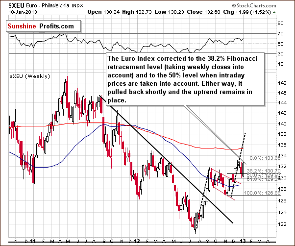
We begin this week with a look at the long-term Euro Index chart. We saw a sharp rally this week as the declines of late 2012 have been erased and the index is back to levels not seen since December. With the correction behind us, it now seems that higher values are likely as a short-term uptrend is in place.
The most recent declines stopped at two Fibonacci retracement levels. The first was the 38.2% level based on weekly closing prices and the second the 50% level based on intra-day lows. The Fibonacci retracement levels once again have shown their value as a useful technical tool.
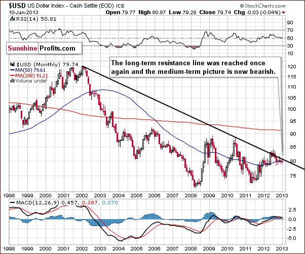
Once again we begin the analysis of the USD Index with the long-term chart since it gives us a bigger perspective. With the situation bullish for the euro, it seems that a bearish outlook here would be no surprise. This is very much the case as the index level is (or more precisely – just was) right at the declining resistance line today. No breakout has been seen and a recent attempt to move above this line was invalidated. The outlook here is clearly bearish at this time; the resistance line appears strong enough to hold a possible short-term rally in check.
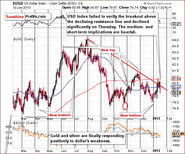
In this week’s short-term USD Index chart, we have similar implications to what was seen from the long-term perspective. The index dropped significantly on Thursday after an unsuccessful attempt to break out above the declining resistance line based on tops seen last year in July and November. The invalidation is a bearish factor and likely a major contributor to Thursday’s decline. It seems that additional moves to the downside are ahead along with additional rally in the Euro Index.
An encouraging development this week was that the precious metals rallied when the USD Index declined, seemingly a step towards return to normalcy, that is, negative correlations between the dollar and the metals. We would like to see more of this, however, before stating that this bullish development is once again in place.
Summing up, the outlook for the euro is bullish for the short term but bearish for the USD Index for both the short and medium term. The implications from the currency markets this week are bullish for the precious metals sector overall.
General Stock Market
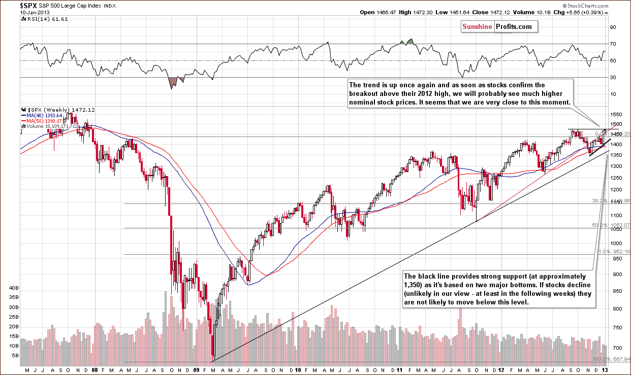
In the long-term S&P 500 Index chart this week, we did not see a breakout above the 2012 high intra-day price level. The situation can still not be described as “definitely bullish” but rather a bit more bullish than not since the trend remains up at this time.
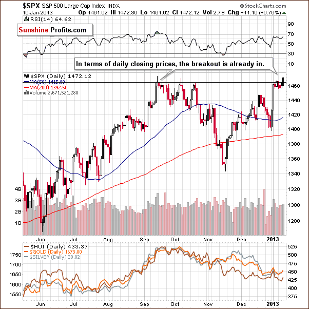
In the short-term S&P 500 Index chart, more details about this week’s price action can be seen. A daily close above the 2012 highest closing price day was seen so, in a way, there has been a breakout. Two more additional closes above this level are needed, of course, in order to confirm the breakout. All-in-all, the situation is more bullish than not here.
Summing up, in general the outlook for stocks is bullish but the indicators are not clearly bullish unless two more days of closes above the 2012 highs are seen. At this time, it’s safe to say that the outlook is more bullish than not overall.
Gold & Silver Correlations
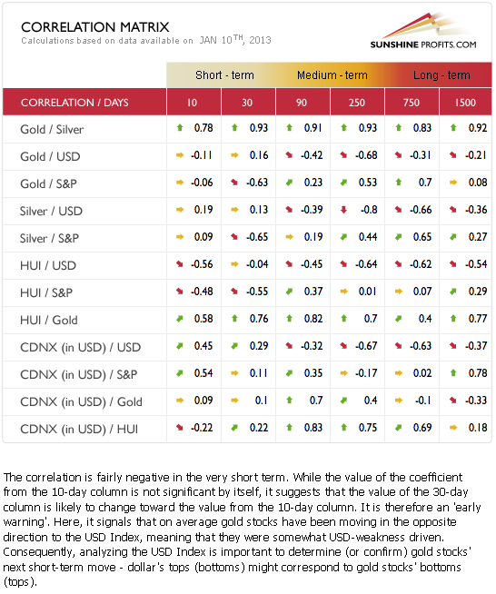
The Correlation Matrix is a tool which we have developed to analyze the impact of the currency markets and the general stock market upon the precious metals sector (namely: gold & silver correlations). On Thursday, we saw something that contributed to a possible move back to the normal correlations. It is too early to say, however, that the negative correlation between gold, silver and the mining stocks and the USD Index is definitely back. What’s normal? Negative correlation between metals and the dollar and positive one between metals and stocks – just like you can see in the medium term columns. Why should you care? Because without this correlation in place, lower values of USD Index may not translate into higher values of precious metals – this is what we've been seeing for a few weeks now.
We prefer to see a few more days of declines in the dollar and higher prices for precious metals before saying that the worst is over with respect to the upside down correlations. While it is more likely than not that lower values for the dollar will coincide with higher precious metals prices, this is not yet something we would describe as “highly likely”.
Gold
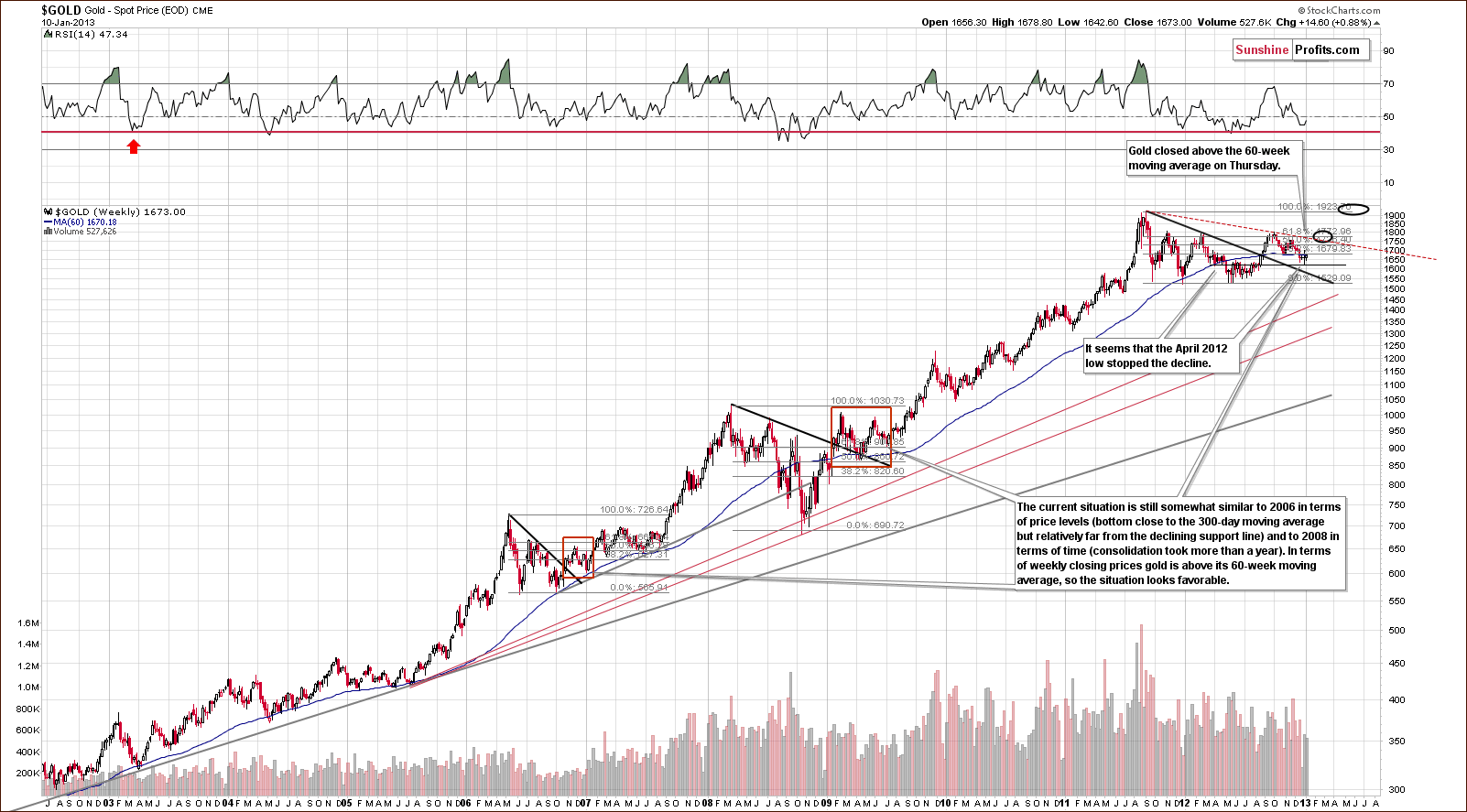
In gold’s very long-term chart, we see that prices have moved above the 60-week moving average. The bottom appears to have formed at the level of the April 2012 low. An ABC zigzag correction pattern is in place now and is similar to what was seen at the beginning of 2009 and also in late 2009-2010 (and on multiple other occasions). It seems quite likely at this time that gold’s correction has completed.
That’s not a new information, but it’s worth repeating as it’s so important – gold has been correcting for about 1.5 year now, which makes one of the longest or the longest (depending on the exact definition) consolidation since the beginning of this bull market. Consolidations are necessary to cool down the optimism and shake “weak hands” out of the market. With analysts and banks lowering their gold price targets for the coming years, it seems that the “necessary sentiment damage” has already been done and that gold can now continue its upward path – in tune with its fundamental factors.
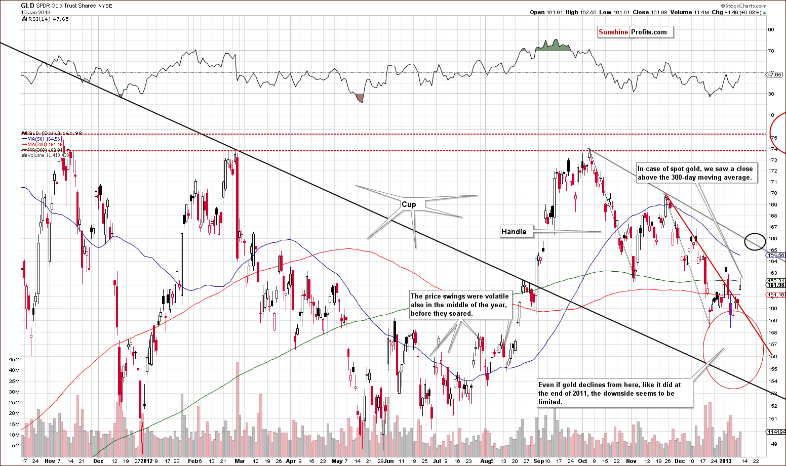
A look at this week’s medium-term GLD ETF chart, zooming in a bit allows us to see that the zigzag pattern (two parallel dashed lines) is perfectly symmetrical. It also allows us to see that our final target area was reached. The blue vertical line in our chart illustrates the decline seen before the GLD ETF started trading last Friday.
Consequently, the upswing that we saw this week has really started slightly above the $158 level, so the rally is quite visible. Gold moved above its short-term declining resistance line and the GLD ETF closed slightly below the 300-day moving average. The important thing here is that the spot gold price closed above its 300-day moving average. These slight differences between the GLD ETF and spot gold are quite normal and it’s important to note that spot gold prices are much more important regarding price details (after all, the GLD ETF is a proxy or “derivative” based on gold, not gold itself), so overall this picture is bullish.
It seems likely that the GLD ETF will consolidate a bit when it reaches $166 level or so. The huge cup-and-handle pattern is now being completed and a major rally could very well begin quite soon.
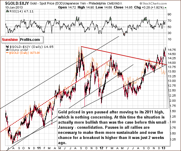
In this week’s chart of gold from the Japanese yen perspective, we see that Thursday’s close was above the 2011 high. This breakout has not yet been confirmed, however, and some consolidation is now possible. This will likely be followed by a continuation in the rally and gold priced in yen seems ready to move much higher in the coming weeks.
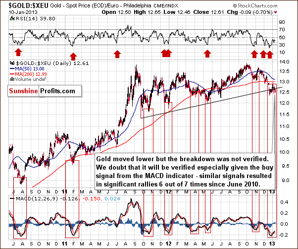
In the chart of gold from the perspective of the euro, we commented about the buy signal of the MACD in Monday’s Market Alert.
As far as gold from the euro perspective is concerned (the one that we emphasized as crucial) we saw no true breakdown on Friday even though gold moved temporarily below the rising support line before the markets opened in the US. Interestingly, the MACD indicator based on the $gold:$xeu ratio (gold priced in euros) flashed a buy signal while being heavily oversold, and 6 out of 7 times we saw this signal in the last 3 years (Aug 2010, Feb 2011, Oct 2011, Jan 2012, Apr 2012, May 2012, November 2012), substantial rallies followed - also from the USD perspective (spot gold).
Long-term buy signals are outlined in the chart with red rectangles, and these signals flashed when the MACD moved above its signal line after being oversold. Six of these seven times shown were followed by periods of much higher prices. (Last April saw only a small rally and was not the final bottom.) All others corresponded to a bottom in gold priced in the euro and many other currencies – including the US dollar.
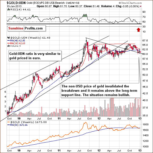
In this week’s chart of gold from the non-USD perspective, the average of all other perspectives (other than the regular – USD one), the non-USD price of gold is visibly above the declining resistance line. Higher values appear to be very much in the cards. At this time, we are highly likely at a major buying opportunity when examining gold viewed from all currency perspectives.
Summing up, the bottom has likely been reached for gold and the situation remains bullish for the weeks ahead.
Silver
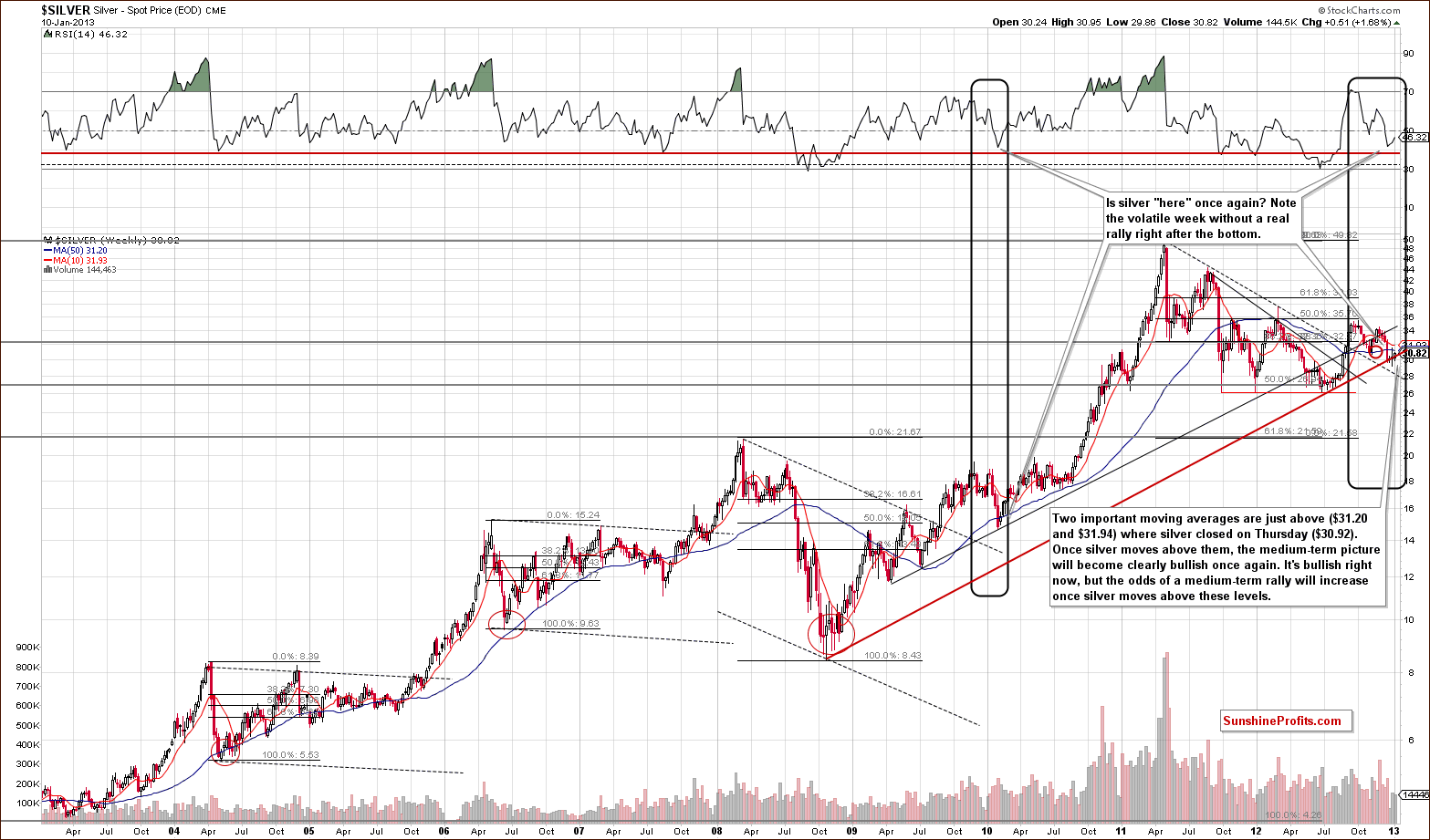
We begin our silver section with a look at the white metal’s very long-term chart. We see that silver’s price is above a major long-term support line, and this makes for a bullish picture overall. It is only a bit more bullish than not, however, because silver’s price is below two important moving averages, the 10-week and 50-week. If silver just moves a bit higher (above these moving averages), then it is quite likely to rally much more in the weeks which follow, and this is something that we expect to see.
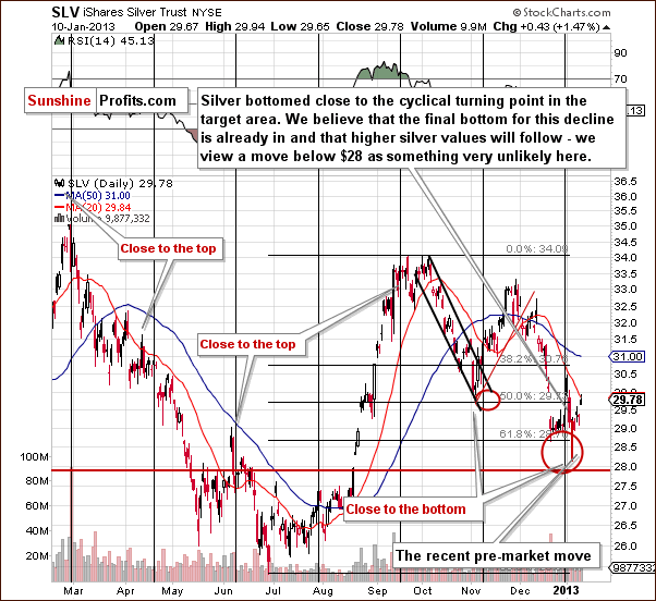
In the short-term SLV ETF chart, we are able to see that if we take the recent pre-market decline in silver into account, it’s clear that a powerful rally in the price of the white metal was already seen on Friday and this week. We can also see that the breakdown below the lowest Fibonacci retracement level was invalidated. The short-term picture for silver is bullish. The bottom seems to have been reached very close to the cyclical turning point. Breakout above 20- and 50-day moving averages will further confirm the bullish case.
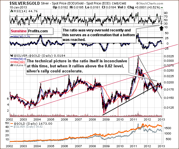
Turning to a look at the very long-term silver to gold ratio chart, we see that the ratio has consolidated for a few months, and, with a rising resistance line and declining support line, the situation is inconclusive. If the RSI is taken into account however, it seems likely that a local bottom was seen recently, and a bet on silver’s outperformance in the coming weeks seems to be a good idea today.
Summing up, the bullish situation in the gold market combined with the situation in the silver to gold ratio chart indicates a bullish outlook for the white metal. The short-term SLV ETF confirms this. The long-term outlook is a bit more bullish than not, and our view is that long positions in silver are justified at this time.
Platinum
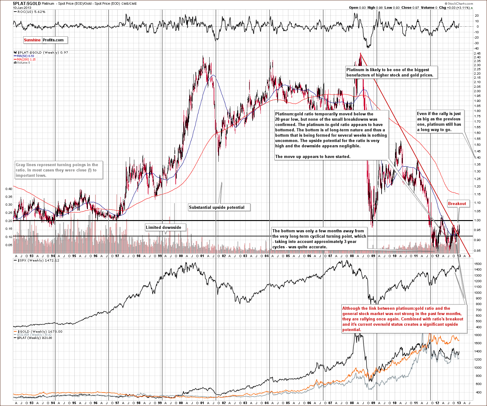
We now take a look at the platinum to gold ratio chart. An important event was seen recently as the ratio broke out above the very long-term resistance line. This is visible here and it seems that a rally back to the values seen in previous years will likely be seen once again. We realize that this is a very broad target; however, if you consider the trading range during the previous 20 years, you will see that this means a significant upside from today’s values.
For over a year now, the ratio has held below the 1.0 level meaning that platinum was cheaper than gold. This is not something that is often seen. We expect this situation to reverse in the months ahead and are quite bullish on platinum. The long-term cyclical turning point has once again worked out very well, closely aligned with a major bottom.
Please note that platinum is currently part of our suggested precious metals portfolio (and that’s been the case for several months now).
Mining Stocks
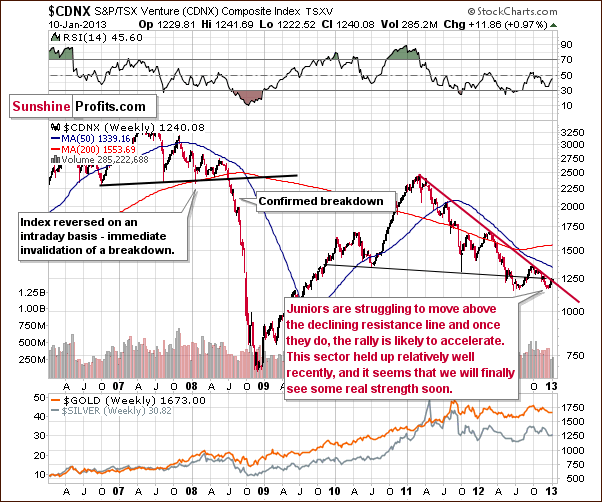
In the Toronto Stock Exchange Venture Index (which is a proxy for the junior miners as so many of them are included in it), we still see no breakout in this long-term perspective. With the bullish picture in place for stocks and gold, it is likely that a breakout will be seen soon, however. Once seen and confirmed, a real rally could begin for the juniors. They have been consolidating for many months, two years in fact, or even five years when considering the 2007 top. Once the breakout is seen, a significant rally is quite possible here.
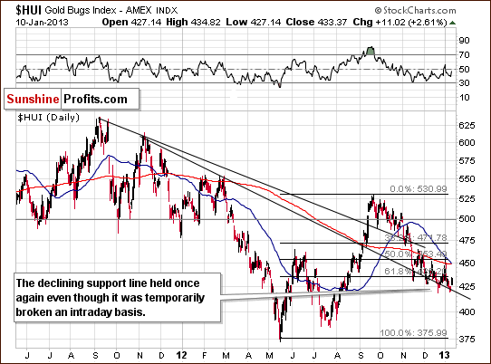
In the HUI Index medium-term chart, we don't see any important details so far. A small breakdown below a support level was invalidated and the outlook here is still bullish for the medium term in our view.
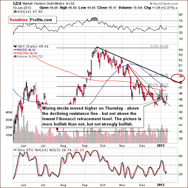
In the GDX ETF (the senior miners) short-term chart, details are more visible. A breakout has been seen once again and volume levels were not low. This could translate into a bigger rally with consolidation likely around the $49 level. A quick look at this chart may be somewhat discouraging as three similar attempts to rally significantly in recent weeks failed. The miners did not decline heavily after small declines were seen, however. All-in-all, it was merely a period of prolonged consolidation, and this now may be over based on developments in the currency and gold markets.
Summing up, the situation for mining stocks still appears favorable even though they have not done much in recent weeks.
Junior Mining Stocks Ranking
As stated in the Gold & Silver Portfolio report, the list of top juniors will be updated approximately every 4 weeks, usually at the beginning of the month. As mentioned above, the situation in the junior sector currently looks favorable as the upside potential is huge compared to the limited downside. Let’s see which juniors are particularly likely to provide you with high profits in the coming months.
As a reminder, in our view, one of the most important considerations when choosing junior mining stocks is their performance relative to the rest of the sector and also their strength during a decline and the subsequent bounce. For juniors, we can’t apply as sophisticated algorithms as with senior gold stock rankings and silver stock rankings because the market is too small in each junior’s case and the small price moves may not properly reflect the stocks’ true value. It is for this same reason that junior mining stock prices can be manipulated more easily (diversify to lower the risk of being affected!). And it is also why we don’t analyze individual juniors from the technical perspective on a regular basis.
See the results of our latest research on juniors in the tables below:
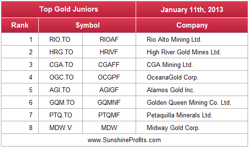
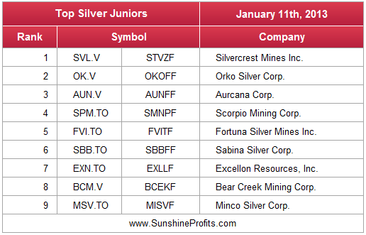
There have been only a few changes since last month’s rankings and all of them are made in the silver juniors ranking. Some gold juniors simply switched places. Impact Silver Corp. (IPT.V / ISVLF) and US Silver and Gold Inc. (USA.TO / USGIF) were replaced by Minco Silver Corp. (MSV.TO / MISVF). The latter is already rallying perhaps leading other stocks higher.
Please keep in mind that we updated the dataset for calculations 3 months ago and companies that we had featured in the previous months are still in the ranking. This implies that the fundamentals behind companies are most likely solid as they consistently perform well. This does not refer to each company individually because they all have their ups and downs, but to all of them at the same time – they seem to average out each other’s downs and ups and at the same time provide good profit potential – which is exactly what we strive for when constructing a juniors portfolio.
Letters from Subscribers
Q: What is your view on this article?
A: Quoting from this article to summarize:
The US may not produce enough oil to surpass Saudi in oil production but the fact that the more oil the US produces reduces their dependence on imported oil shifts the balance of power from one part of the world to the other. It is better to be prepared for this shift than ignore it completely.
We have already focused on gold and the oil production in North Dakota in our Premium Update from December 21, 2012. Today, we’ll extend our analysis to two other factors: energy security and the relationship between the oil boom in the U.S. and the dollar.
In 2008 technological developments made it possible to access the oil at acceptable cost from previously known fields in the Bakken Formation, in North Dakota, U.S. Since then, there have been extraordinary developments in oil production in this area which contributed to an improvement in the state’s economic situation. As of November 2012 it was the state with lowest unemployment rate in the U.S. (3.1%). At the same time, the increased production from North Dakota contributed to a general rise in oil exports from the U.S. The chart below presents U.S. oil imports minus exports, which will be called “net imports.”
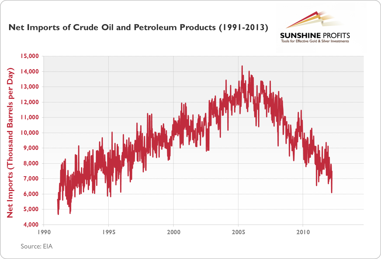
Lower values of net imports indicate that the gap between imports and exports is relatively low and that the U.S. may be less dependent on outside sources of crude oil. As you can see, since 2005/6 the gap has been shrinking, and is currently at the 1995 level. This is partially thanks to the oil boom in the Bakken Formation, particularly in the period after 2008. The rise in U.S. oil exports is displayed on the next chart.
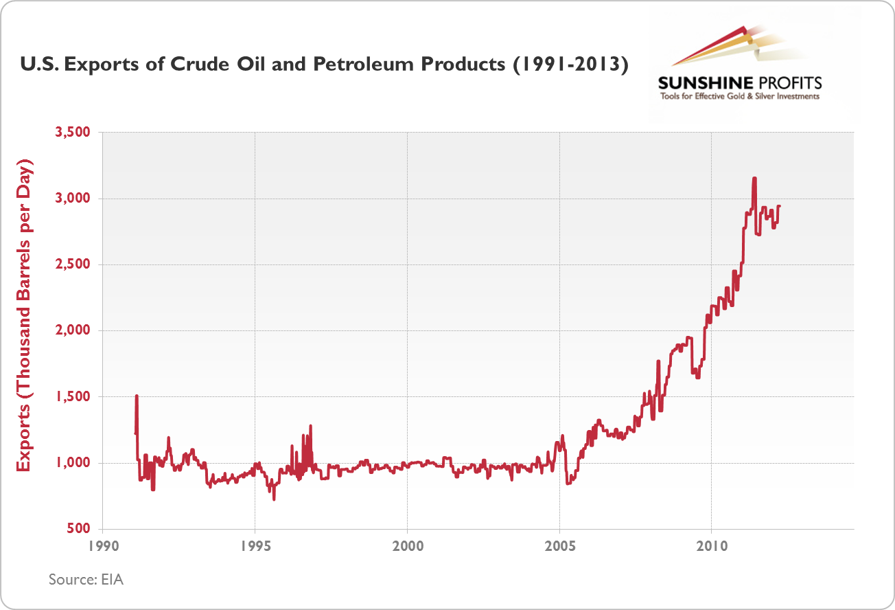
It is clear that between 1991 and 2004 U.S. oil exports oscillated around a level just below 1 million barrels per day (with several exceptions). The situation changed in 2005 and a steady climb in exports began. In 2012 the level of exports mostly stayed below 3 million barrels per day which is 3 times the average amount from the 1991-2004 period.
On the other hand, exports are still much lower than imports, which are approximately 10 million barrels per day. And the U.S. is still far behind the oil giants, Saudi Arabia and Russia, which in 2011 exported more than 11 million and more than 10 million barrels per day, respectively. It seems that while the U.S. has been improving its energy security, it is still dependent on outside sources of oil.
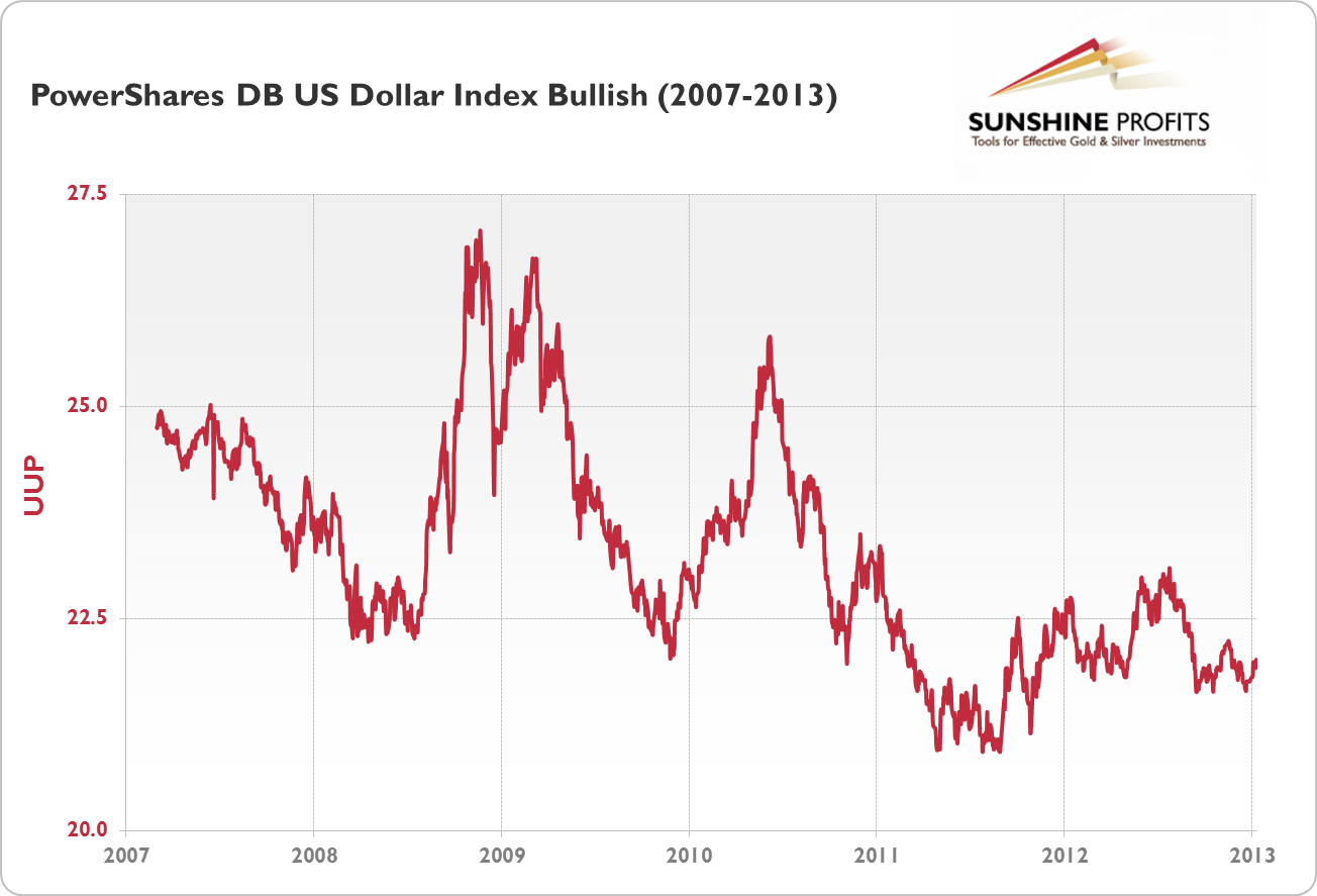
The next big question is about the influence of the increased oil supply on the U.S. dollar. In our reply to the question about gold and oil in North Dakota, we showed that the estimated oil reserves coming from the Bakken Formation will not be able to pay off U.S. debt. On the other hand, the increase in oil exports may have a positive impact on the dollar which would naturally be bearish for precious metals priced in the USD. But the question is whether the increased oil production has had such an impact on the dollar. To analyze that, let’s turn to the chart below.
This chart shows the PowerShares DB U.S. Dollar Index (UUP) which is a proxy for the performance of the greenback. In theory, the dollar should gain strength with the expansion in oil production. However, as we see, since 2007 the dollar has actually been in a downtrend. So, in the period where oil production in North Dakota grew dramatically, not only did the dollar not appreciate, but it actually lost value.
Another factor is that even if the increased supply of oil keeps inflation pressures low on one end, we might see them rise on another, since moderate inflation would effectively help the Fed reduce the debt burden it has amassed so far.
Based on all these points, we would suggest that yes, the increased energy independence of the U.S. (but not independence as such) may have a positive impact on the dollar but this is neither the only nor the decisive factor to be considered.
If you are particularly interested in oil, just click to read our commentary on some lesser-known details on the relationship between gold and oil, or take a look at our report on gold, silver and oil.
Q: What is your view on this article [the article is somewhat related to our gold and India report]?
A: We agree that the essay is interesting, and if you have a few extra minutes, we encourage you (our subscribers) to read it, and the author makes a strong case for gold investment. However, we don't agree with all the points that the author is making. We don't think that one should necessarily expect lower prices when GDP increases and we do think that lower interest rates will have at least some positive effect on the economy in the short- and medium term. Solving the structural problems are key to long-term growth - yes, however, we think that viewing interest rates as irrelevant is not appropriate.
Q: There is a view that gold prices are "stuck". There is no official inflationary pressure and so instead, there is downward pressure on gold prices as gold investors/ traders look elsewhere for better yield. But simultaneously, interest rates may start rising before inflation starts really kicking in (via central bank sterilization of balance sheet expansion, and/or credit market pressures as credit risk appreciates in an over-leveraged, easy money environment). Many are lowering their forecast for gold prices in 2013/2014. How do you see this from your perspective?
A: Actually, we think that there is an official inflationary pressure. The money supply is expanding rapidly and this, according to some definitions, is inflation. Inflation is the increase in the prices of goods that is caused by the increase in the money supply. You can read more about this in our interview with Douglas French. Aside from that, when people are uncertain about the economy, they might not spend as much as they could and this could postpone the inflationary effect.
We don't think that interest rates will rise before inflation kicks in. The higher unemployment that would result is never welcomed by voters and thus interest rates will be kept low for as long as possible. With so much leverage in the world today and the derivative "time bomb" as Warren Buffet called it, higher interest rates mean "systemic risk". "Systemic risk" is a nice way of saying that the risk is that the financial system as we know it will cease to exist. It's not something that investors are concerned with on a daily basis, but it is something that one should prepare for in the long run and something that The Powers That Be should keep in mind. Do they? Each time the fiat currency system was introduced throughout history, it failed. Is this time really different or have we simply not reached the final point? (You do have at least some money invested in physical gold and silver, right?) Higher interest rates followed gold higher in the past, and if they were to cause a collapse in the financial system, the real value of precious metals would soar.
If rates increase because people become more optimistic and once again start spending too much, it would also be after an increase in the general level of prices - again, bullish for gold.
How do we see gold in 2013 and 2014? We're bullish. Right now we are after a huge, lengthy, consolidation, fundamental factors behind us, and the long-term uptrend is in place. If anything changes, you will be informed via Premium Updates and Market Alerts.
Q: Dear Mr. Radomsky, thank you for your great updates. I have been investing in exploration companies and I have lost a lot of money. When will they turn around, if ever? If now is not the right time to investin exploration companies, when will that time come? Can you give any opinion about individual exploration companies? I have numerous shares of MEAOF. Finally, do you have any exploration companies you couldrecommend? Thank you very much.
A: We featured the analysis of the junior sector in general in the Mining Stocks section and we provided our top junior rankings above along with a short explanation of our approach. So we believe that most of your questions have already been answered. As far as MEAOF (or MTO.V - Metanor Resources, Inc.) is concerned, this company has been in a downtrend relative to other juniors (for instance relative to the TSX Venture Index) for many years. We have not thoroughly analyzed this company's properties, financial statements along with corresponding documents (and footnotes, etc.), so we can't say that this company is or is not a good investment. Based on our methodology and approach - being diversified among many juniors that appear to be outperforming the sector - this company does not look that favorable in this light.
Q: This may be the strangest question SP has ever received. Since the White House has openly been asked what it thinks aboutminting a $1 trillion coin to circumvent the debt ceiling , it's timefor SP to comment on what effect such a coin option would have onprecious metals.
A: For reference, this is where the idea is described. Generally, this option is highly unlikely in our view, but if adopted, we would obviously have very strong demand for platinum, which would likely at least partly translate into higher demand for the rest of the precious metals sector. With platinum at a price much higher than today, more people could see gold and silver as very cheap at today's prices and thus bid their prices higher. All in all, this would be bullish for precious metal prices. Platinum is performing strongly right now, but we doubt that a $1 trillion coin will happen.
Q: I have several questions:
1. What mining stock companies are listed in India?
2.Approximately when do you think the Dow and the dollar will collapse? Will the collapse cause contagion and bring down the Indian Sensex?
3.What about commodity stocks – will they rally this year?
4. How can I buy gold in India?
Thanks and regards
A: We will provide more detailed reply to the 1 and 4 questions later (probably in next week’s update) and here’s the reply to the remaining points:
As to when the dollar and stock markets would collapse, the right question is “will they collapse?” And if they would, nobody knows when. We have highlighted that in one of our previous replies to a question about when the dollar would crash. Precisely because it is impossible to say with any certainty when the greenback would collapse, we suggest holding part of your assets in physical gold and silver almost at all times. We have discussed that in detail in our essay on the gold and silver portfolio.
Now, if the collapse were to happen, then it definitely would not be contained to the U.S. Because nowadays speculative capital can flow in and out of a country in a matter of seconds, the potential crisis would spread all over the globe just as the 2008 meltdown did, only in a potentially more consequential way. So, in the case of a global meltdown, the Sensex would be hit hard. Conversely, in such an environment, precious metals would have enormous upside potential, if not immediately (as was the case in 2008), then after a relatively short period in which people adjust to a whole new situation.
As to the question of whether commodities could rally this year, they could, and we base this opinion on the fact that precious metals have been consolidating for quite a while now. On January 4, 2013 in our Premium Update, we wrote the following:
The situation remains bullish for the medium term (…). This is based on similarities with 2009 and late 2006-early 2007. Gold consolidated after breaking out above triangle patterns in both cases.
If this is the case, we could see gold appreciate more decisively in 2013.
Summary
In the currency markets, the outlook is clearly bearish for the USD Index in both the short and medium term. The Euro Index has rallied recently and this appears likely to continue. In the general stock market, the outlook is a bit more bullish than not for the short and medium term. If the recent breakout above the level of the 2012 high is confirmed however, the outlook for stocks will become much more bullish.
The implications from the currency and stock markets are bullish for the precious metals sector. The price action seen in the metals this week also has been bullish with gold’s price now above the 300-day moving average. Another noteworthy factor is the oversold situation in the silver to gold ratio and silver having just bottomed close to its cyclical turning point.
Several markets are at or close to important resistance levels including silver, the S&P 500 and the Toronto Stock Exchange Venture Index (juniors). A bit more strength in these markets on a short-term basis could have much more bullish implications for the medium term.
Trading – PR: Long positions in gold, silver, and mining stocks
Trading – SP Indicators: Long position in mining stocks (please note that unless we get another buy signal from SP Indicators on Friday, we will suggest closing half of the long position in miners)
Long-term investments: Remain in the market with your precious metals holdings
| Portfolio's Part | Position | Stop-loss / Expiry Date |
|---|---|---|
| Trading: Mining stocks | Long | $43 GDX (half) / Jan 11, 2013 (half) |
| Trading: Gold | Long (half) | $1,629 |
| Trading: Silver | Long (half) | $28.94 |
| Long-term investments | Long | - |
This completes this week’s Premium Update. Our next Premium Update is scheduled for January 18, 2013. We will continue to send out Market Alerts on a daily basis at least until the end of January, 2013 and we will send additional Market Alerts whenever appropriate.
Thank you.
Sincerely,
Przemyslaw Radomski, CFA

