- Euro & USD Indices
- General Stock Market
- Crude Oil
- Correlation Matrix
- Gold
- Silver
- Mining Stocks
- Letters from Subscribers
- Stop-loss - based on intraday or daily closing prices
- Ranking gold/silver stocks and using the Option Calculator
- Correlation Matrix - how it works
- Precious metals equities
- Summary
The first six months of 2013 were not the best time to be the owner of a gold mine, or for that matter, the owner of gold mine stocks. According to Bloomberg's list of the Best and Worst Investments of the first half of 2013, the worst U.S. Large-Cap Stock has been Newmont Mining Corp. which plunged 35.5 percent in the first half of the year alongside the price of gold, down 23.5 percent as of July 11. Gold was not the worst Commodity of 2013's first half – in fact the worst was silver, which has dropped 34 percent year-to-date. The best commodity so far this year is oil, up 14 percent through July 11.
So what were the best investments according to Bloomberg?
The best of all worlds is to be an electric-car lover who also owns an oil well. The best U.S. Large-Cap Stock is Tesla Motors, a company with huge vision for electric vehicles but no profits until this year. It's up 217 percent through the end of June and shot up another 12 percent in the first week of July. The best international stock is recovering from one of the worst disasters in recent memory. The Tokyo Electric Power Company, or Tepco, the operator of the Fukushima atomic power station destroyed in Japan's 2011 earthquake, is up 149 percent in the first half of the year. Now, it wants to restart one of the plants idled after the tragedy. The worst international stock so far this year is Spanish bank Bankia SA, down 88 percent. The bank has the dubious distinction of also being the worst international stock of 2012, when it was pummeled by Spain's real estate collapse. Last year Apple, was one of the best investments, up 31 percent but is down 20 percent this year.
One of the flashpoints for the steep, scary gold sell off in April was the news that Cyprus might sell its gold reserves to pay down its debt. This turned April into a cruel month indeed as the metal drop more than 15% over two trading days. It was a total overreaction to a nonevent since Cyprus holds only 13.9 tons of gold bullion, which is only 0.045% of global gold holdings. But traders worried that such a move would set a precedent. Since April, investors have turned to the stock market chasing higher returns. Despite its gains this past week, gold is still down about 24% since the beginning of the year. It is now in a correction in the midst of, what in our view, is a long-term bull market that started a little over a decade ago and still has years of life ahead.
This week Cyprus said a sale of its gold reserves was not the only option under consideration and that other alternatives were on the table. Last week the Cypriot president said he hoped there would never be a need for the island to sell its gold reserves and the issue was not being discussed by the government as it was a responsibility of the central bank.
Even in the worst-case scenario, if a gold sell-off by Cyprus were to open the doors to other debt-strapped European countries such as Greece, Ireland, Portugal and Spain, they don’t have huge gold reserves to begin with and it is unlikely that they would all sell at the same time. Their total gold holdings amount to a mere 782 tons, or 2.5% of total gold holdings. So let’s keep things in proportion.
Those doing the major selling of gold ETFs were hedge funds and other institutional investors who inadvertently provided an ample supply of gold to meet the surge in demand for physical gold by Asian investors and central banks. And as we have written before, that gold went from weak hands to strong hands who will want to keep the gold long term, even for generations. Those hedge funds managers have most probably sold all that they wanted to sell. But when they change direction and want to buy back into gold, they may find it difficult to rebuild their gold ETF holdings without bidding gold prices higher.
Chinese buyers are already paying as much as $40 an ounce an ounce premium above the London benchmark price to buy gold. One can see the implications of this in another indicator. The cost of borrowing gold has recently risen to the highest level in recent years as the bullion market adjusts to a new era in which the weight of gold demand is shifting from West to East.
The niche gold lending market, we’re talking mostly a few big banks and central banks, has been calm in recent years as investors have built up large holdings and lent them out on the market, keeping rates depressed.
But as investors have turned sellers, there is a squeeze on the availability of gold in the lending market which in turn triggered a sharp rise in gold leasing rates. (This is the implied interest rate for lending gold in the market in exchange for dollars.) The one-month gold leasing rate has risen from 0.12 per cent two weeks ago to 0.3 per cent last Tuesday, the highest since early 2009. Although leasing rates have rallied sharply in recent days, they still remain significantly below the peaks of previous eras. In 2008, for example, the one-month leasing rates rose as high as 2.7 per cent while in 1999 they reached a whopping 9.9 per cent, according to London Bullion Market Association data.
In addition, expectations of rising US interest rates if the Federal Reserve tapers its QE program have made banks less willing to lend gold. Finally, some medium-sized gold miners have started hedging their future production, which has the same effect on the market as borrowing gold.
To see what is in store for precious metals this week, let’s begin this week's technical part with the analysis of the US Dollar Index. We will start with the very long-term chart (charts courtesy by http://stockcharts.com.)
USD and Euro Indices
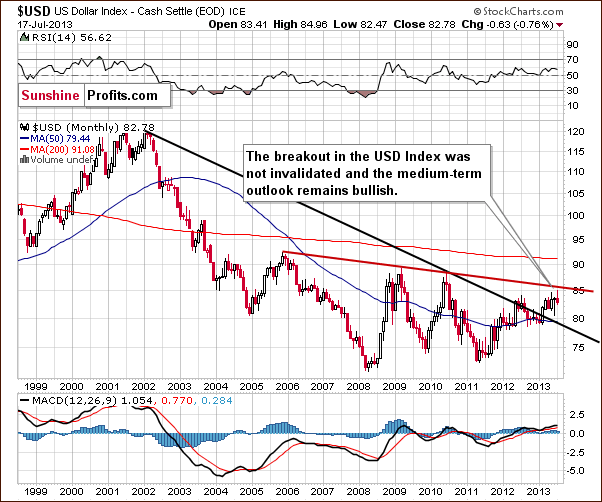
The situation in the long-term chart hasn't changed. The breakout above the declining support/resistance line (currently close to 79) was still not invalidated. The situation remains bullish.
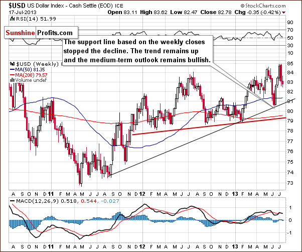
On the weekly USD Index chart we see that the recent declines didn’t take the index below 82, so the medium-term uptrend is not threatened. The reason is that the medium-term support line was not broken – it was not even reached. From this perspective, the situation remains bullish and we can expect the dollar to strengthen further in the coming weeks.
Now, let’s check if the short-time outlook is also bullish.
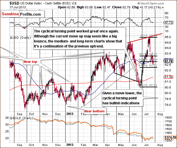
From the short-term perspective, we clearly see that the USD Index dropped once again in recent days, but it hasn't declined below the 61.8% Fibonacci retracement level based on the June - July rally. This means that a move up is still likely to follow. Despite Wednesday’s intra-day decline to 82.47, the dollar increased after Ben Bernanke's testimony. It seems that we could see another rally in the USD Index soon, especially when we factor in the cyclical turning point which is just around the corner (next week).
As we mentioned above, the U.S. dollar increased on Wednesday, which may be the beginning of another rally. In this case, if the buyers manage to push the USD Index higher, we might see an increase to the June top or even to the rising resistance line based on the May high and June peak before another pause is seen. Taking a look at the long-term charts, however, we see that the next significant resistance is currently close to 86 (86.4) – the declining red line.
Now let’s move on to the analysis of the Euro Index.
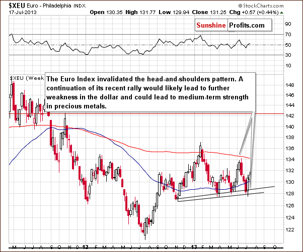
Last week, the euro invalidated the bearish head-and-shoulders pattern. An invalidation of a bearish signal is a bullish signal on its own, and in the past week, the European currency continued its rally. This led to further weakness in the dollar and also to short-term strength in precious metals and mining stocks.
Summing up, from the short-term perspective, last week’s decline seems to be a counter-trend bounce which means that we could see another rally soon. Taking a look at medium- and long-term charts, both outlooks for the dollar remain bullish. This is a bearish piece of information for metals and miners. Although gold stopped underperforming strongly relative to the U.S. dollar, it seems that this is not a permanent change, but rather a temporary phenomenon.
General Stock Market
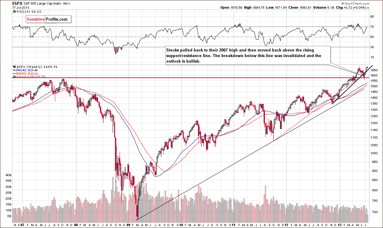
On the above long-term S&P 500 chart, we see that the situation hasn't changed much. Last week saw prices close above the rising support line, which means that the breakout above this line was somewhat confirmed. In recent days, stocks moved up once again and overall stayed above the May top. At this moment, the breakout is still not invalidated. From this perspective, it seems that the recent decline was likely nothing more than another correction and the outlook continues to be bullish.
We would prefer to see 2 more weekly closes before saying that another upswing is very probable. It is likely at this time but not to any great extent.
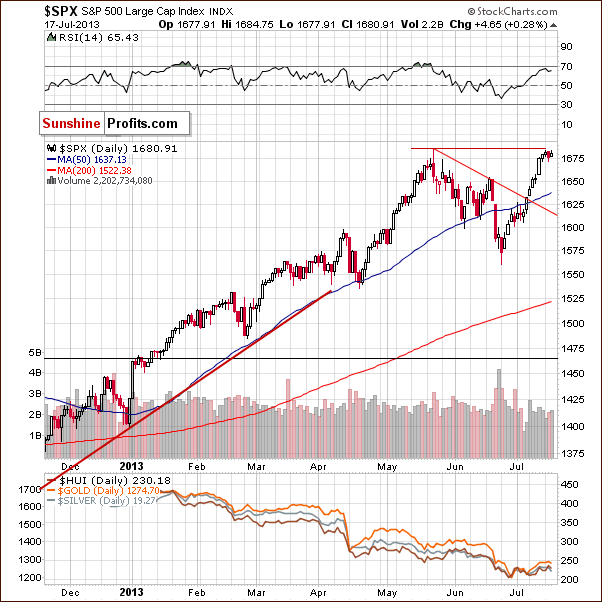
During the past week, the S&P 500 Index has continued its rally as expected. Although prices climbed up to the area of the May 22 high, we didn’t see a breakout above this top yet if we take into account intraday highs (we do if we take the weekly closing prices into account, as mentioned in the previous paragraphs). Therefore, the situation is still quite uncertain for the short-term.
After all, if we see a sideways move here, we might see a cup-and-handle pattern develop. In this case, declines from mid-May until now could be the cup and the potential consolidation would be the handle. According to theory, this is a bullish continuation pattern.
We turn now to the financial sector, which in the past used to lead the rest of the general stock market.
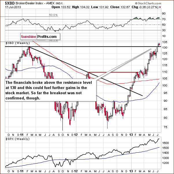
As we wrote in our last Premium Update:
(...) financials broke above the resistance level at 130. This could fuel further gains in the stock market.
On the above Broker-Dealer index chart, we see that last week‘s breakout is still not invalidated. The situation improved a bit (it’s closer to being verified), and the outlook is a bit more bullish.
Summing up, the situation for stocks in the medium term is still quite bullish although it’s a bit uncertain in the short term. It seems that we could see further gains in the stock market, but then again, a consolidation could be seen first. If you’re interested in short-term commentary on the stock market, please note that we have started publishing such in our Articles section.
Crude Oil
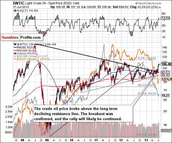
On the above chart we see that the price of crude oil is still above the broken long-term declining resistance line. In other words, the breakout is even more confirmed than a week ago.
However, the situation is overbought on a short term basis (the RSI indicator is above 70) and it may result in a consolidation / correction. In recent days, we saw that the yellow metal’s price actually moved higher along with crude oil‘s (last week we wrote that we could see such action). From this point of view, a small decline in crude oil prices might trigger further declines in gold which – unlike crude oil - is in a medium-term downtrend.
If you want to keep up with the latest developments on the crude oil market, you’ll find our articles on this market (usually 2 articles per week) in our Articles section.
Gold and Silver Correlations
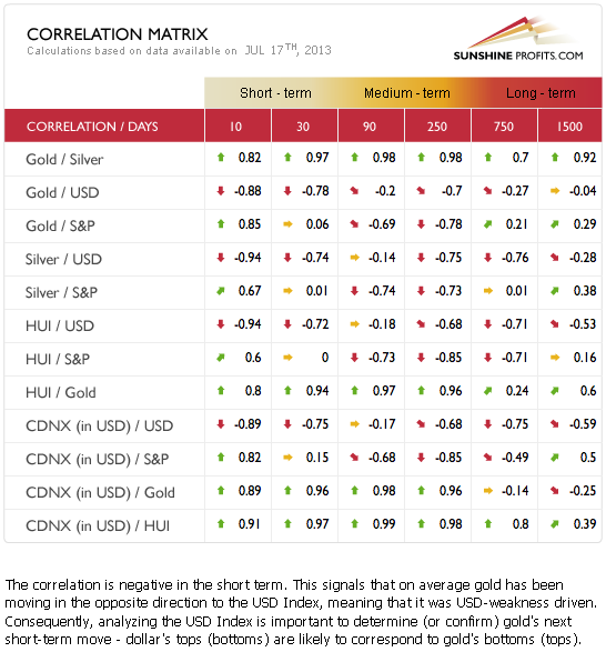
The Correlation Matrix is a tool, which we have developed to analyze the impact of the currency markets and the general stock market upon the precious metals sector, (namely: gold correlations and silver correlations). The short-term correlation between the metals and the USD Index are negative at this time and has been very weak recently. Gold started to respond to the dollar’s price moves (up when the dollar declined and down when the dollar rose) but we feel that was just a temporary phenomenon and the metals will likely to continue to underperform; a trend, which has been in place for some time now.
All-in-all, with a bullish outlook for the dollar and whether or not the negative correlations between the metals and the dollar or gold’s underperformance continues, the overall implications for the precious metals are bearish.
Gold
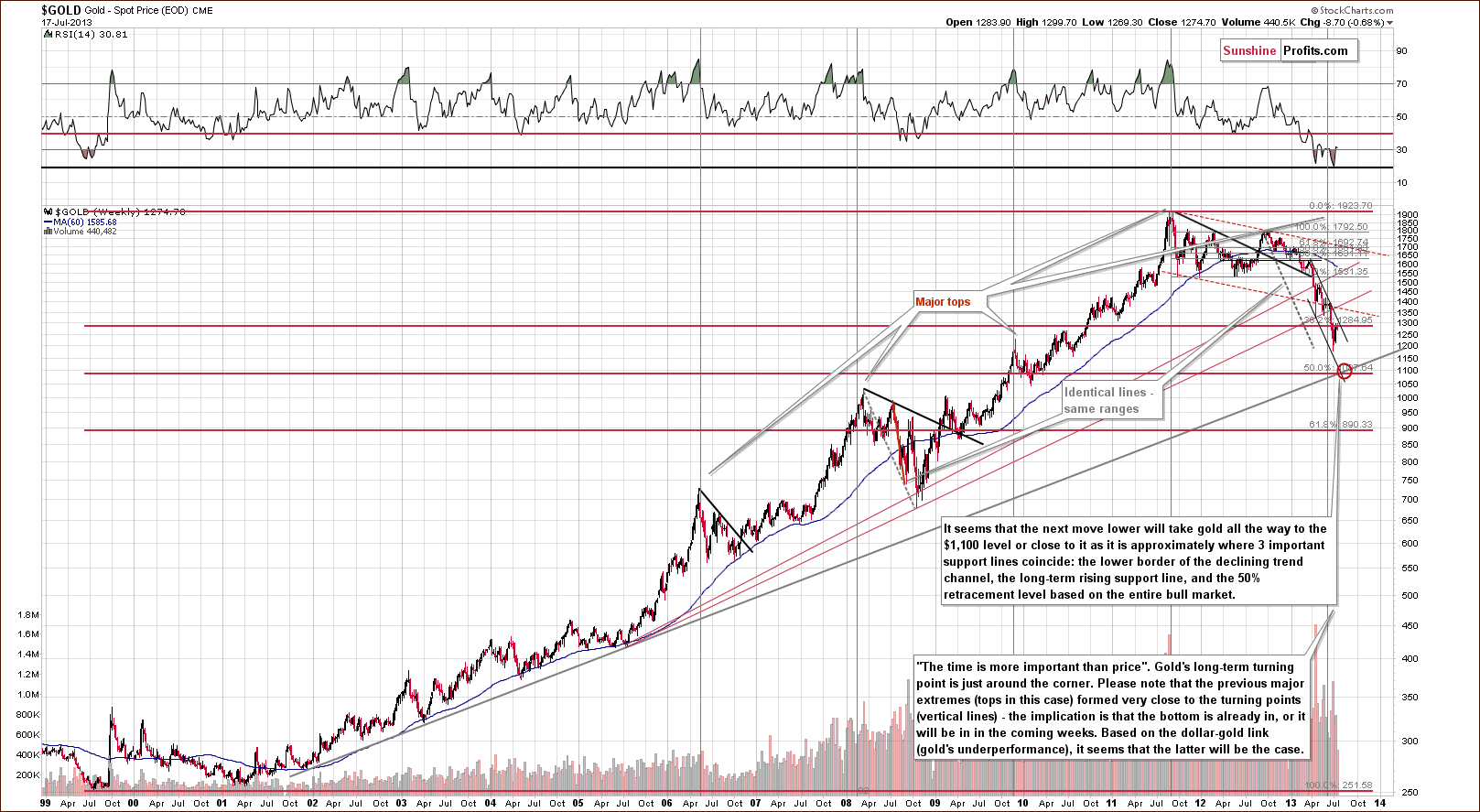
In this week’s very long-term gold chart, we saw a move lower once again on Wednesday. Gold attempted to move above the Fibonacci retracement level close to $1,285 and then invalidated this move, so the indications are therefore bearish. Overall, apart from this attempted breakout, not much changed with respect to price from the long-term perspective.
As far as time is concerned, we see another week going by without major price declines, but the declining trend channel is now at lower levels. If another move to the downside is seen, it will likely not go to the lower border of the declining trend channel, pull back in a big way, and decline again to the final bottom. It seems more likely that one significant move to our target area close to $1,100 will be seen as was the case in early April and in June. Such a move will probably mark the final bottom for this decline.
Our target area is created by 3 important support lines/levels: the long-term rising support line, the 50% Fibonacci retracement level and the lower border of the declining trend channel. This chart remains bearish for gold, and it seems that one more big decline is in the cards.
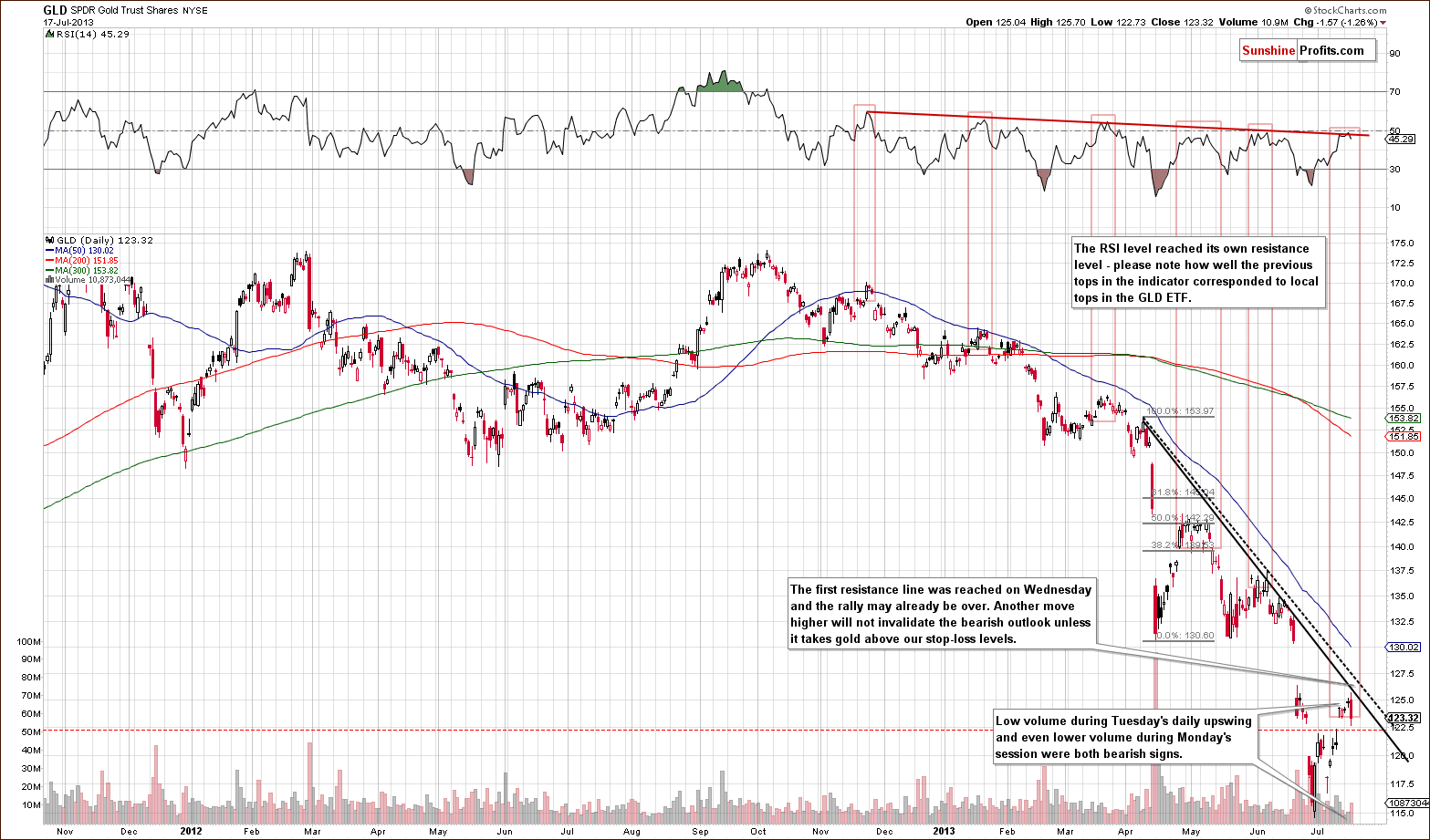
In this week’s short-term GLD ETF chart, we have a few things to comment on. First, gold moved intra-day to the resistance line we created by daily closing prices. This is not a final short-term support level but it could be enough to stop the rally.
While volume levels were not huge during Wednesday’s decline, they were bigger than what we saw on Tuesday, when small moves to the upside were seen, and on Monday. Overall, the analysis of volume points to a bearish outlook. Another factor, which is also bearish, is the decline in RSI levels. The RSI used to decline from lower highs, which correspond to local tops in gold’s price. It is now reaching its declining resistance line and it seems that the local top will be formed shortly or is already in. This also has bearish implications for the short term although some very short-term strength could be seen. It seems unlikely that gold’s price will move much higher before declining significantly once again.
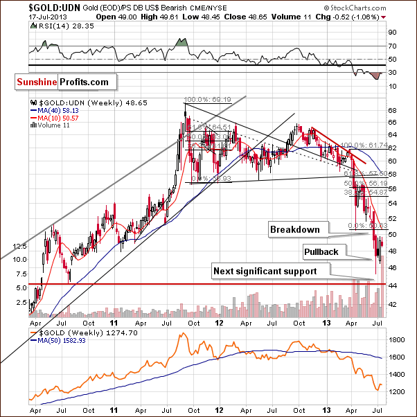
Gold viewed from the non-USD perspective shows very little change this week, nothing more than small declines. The downtrend continues here and previous week’s move to the upside seems to have been simply a small correction within a bigger decline.
Summing up, the outlook for gold remains bearish. Since no significant decline has been seen recently, the next move lower will probably be the one to take gold to its final bottom. We do not expect the pattern of small decline, big pullback, and additional declines to be seen from here, but instead a greater decline, similar to what we say in April and June. Our downside target level remains at the level of three important support lines close to $1,100.
Silver
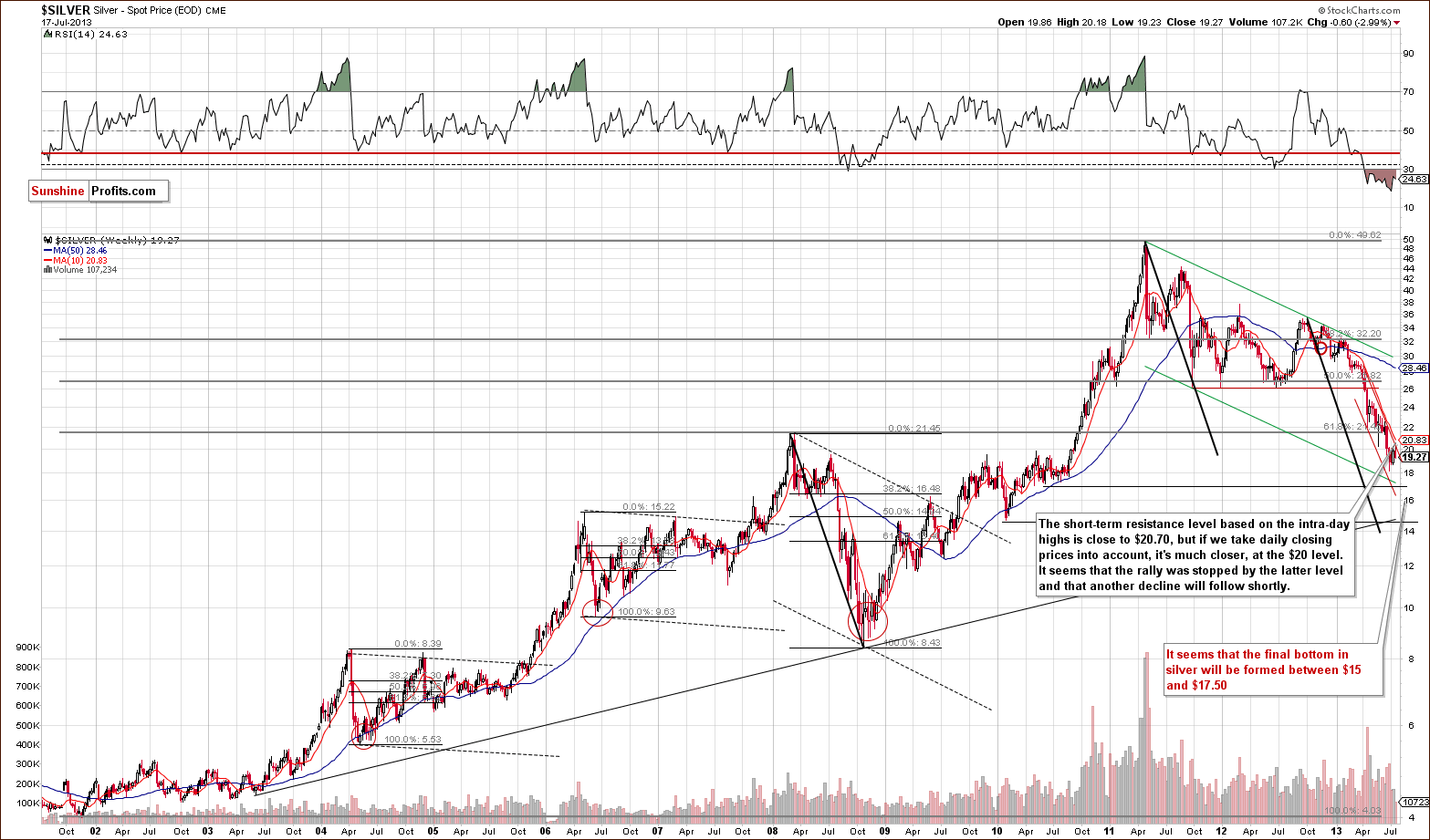
In this week’s very long-term silver chart, we see that silver’s price stopped at the upper border of the declining trend channel and then moved lower. Simply put, the trend and outlook remain bearish here. It seems that the final bottom has not yet formed.
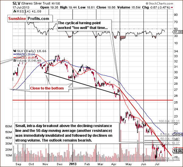
In this week’s medium-term silver chart, we saw a temporary intra-day breakout early in the session on Wednesday. This was immediately invalidated and followed by a downswing with the white metal closing to the intra-day low and forming a candlestick. The invalidation and candlestick are bearish for the short term. Recent declines have been seen on relatively large volume, levels much greater than on days when prices rise, another bearish signal. The small rally was seen before the cyclical turning point so the ensuing declines are likely underway.
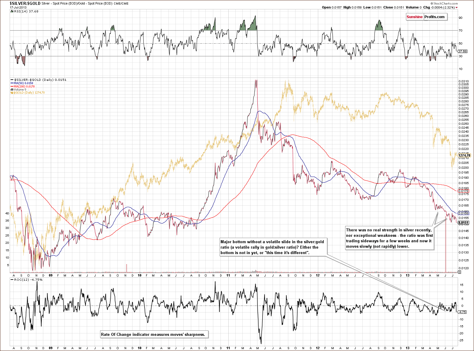
In the silver to gold ratio chart, there was basically no change this week and no bottom has formed. Comments made in last week’s Premium Update remain up-to-date and are repeated below.
In the silver to gold ratio chart, we still see no signal of a bottom. Silver is likely to sharply underperform gold very close to the bottom based on historical data. We have not seen signs of such action this week, so it seems that the final bottom is still ahead of us.
Summing up, the situation in silver confirms the outlook for gold, that is, the signals are pretty much bearish at this time.
Gold and Silver Mining Stocks
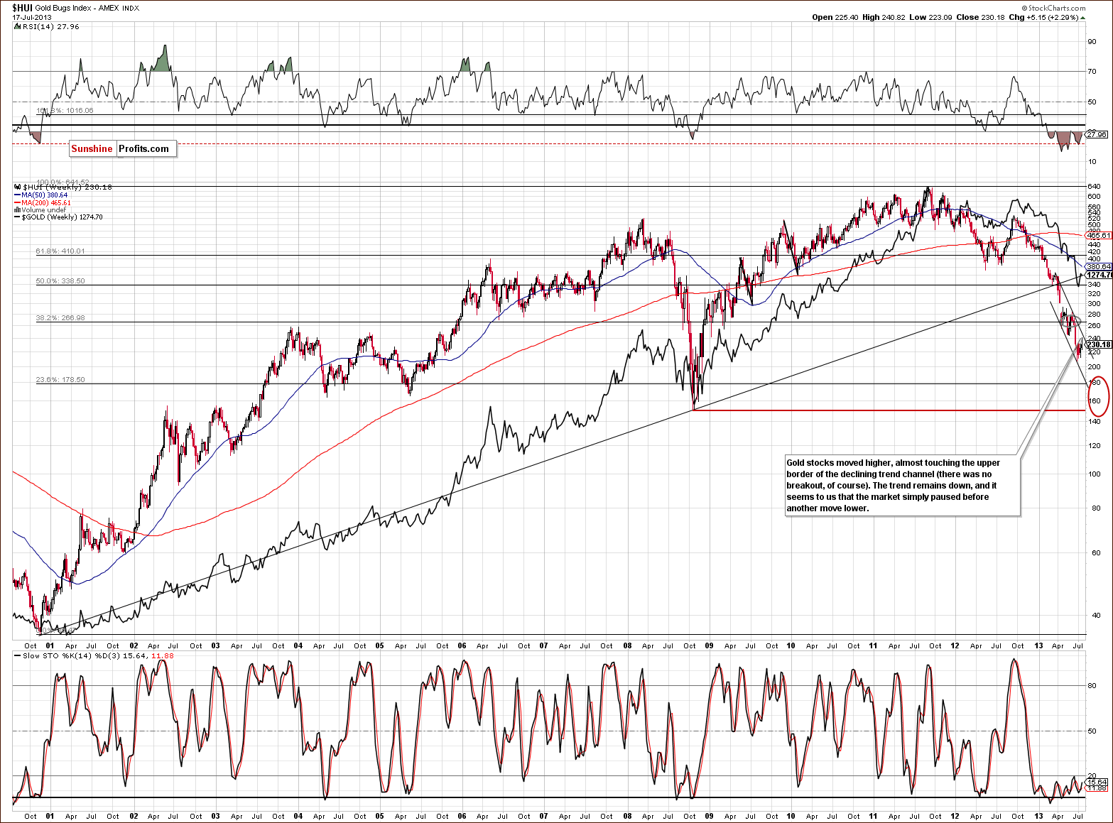
In this week’s very long-term HUI index chart (a proxy for the gold stocks) we see that miners finally moved close to the upper border of the declining trend channel. Soon after that, miners declined once again (in happened yesterday) and could be that the correction to the upside is already behind us. The trend remains down, and another decline is likely before the final bottom is formed.
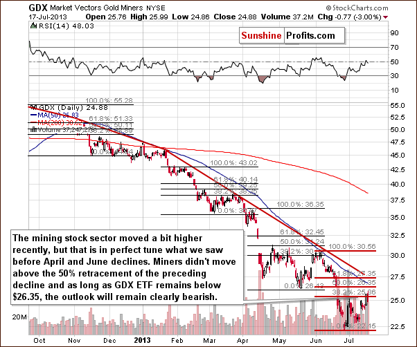
In this week’s medium-term GDX ETF chart, we continue to see an analogy to the previous price patterns. The corrective ABC or zig-zag price pattern was previously followed by a period of declines. On each occasion, the GDX ETF did not move to the 50% Fibonacci retracement level. It declined after getting to or slightly above the 38.2% level. This same type of move was seen on Wednesday, and prices then declined. They seem ready to decline once again.
Furthermore, the volume levels on Wednesday being significant on a move to the downside suggest that it may be the start of bigger declines. The RSI level is close to 50, a level previously seen when the miners formed a local top.
In the past, sharp declines were not seen immediately after local tops. Moderate moves to the downside were seen initially and then – after a few days of moderate declines – we saw a period of accelerated declines.
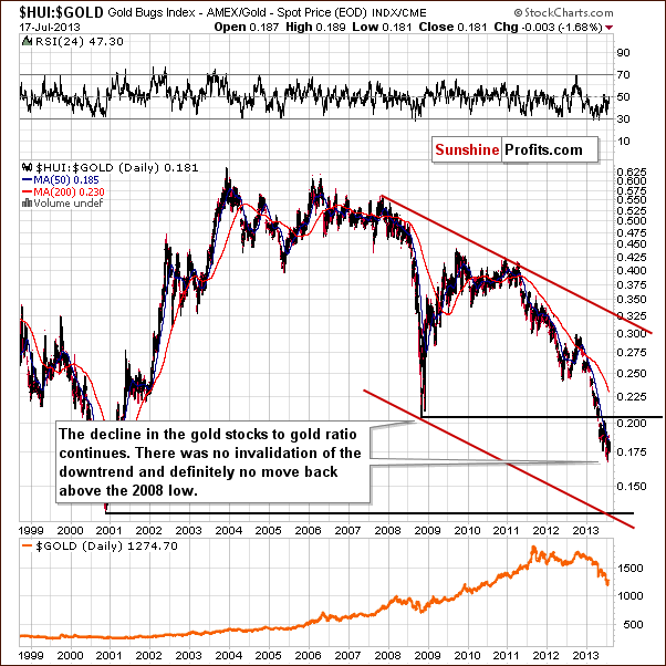
In the gold stocks to gold ratio chart, there was no real improvement in the situation this week, and this was discussed in Wednesday’s Market Alert.
The HUI-to-gold ratio moved higher yesterday, but this move was not visible from the long-term perspective. That was just a blip on the radar screen, just like when miners rallied relative to gold in the previous months. The HUI:gold ratio remains below its resistance level in the form of the 50-day moving average. Gold stocks moved higher relative to gold yesterday, but in our view it's too early to say that the trend changed. So far everything is in tune with the previous patterns, which were followed by strong declines.
There was no invalidation of the downtrend here and it was barely visible from the long-term perspective. This is also the case today with the ratio below the 50-day moving average, a level which has served as approximate resistance for the past month or so. The implications remain bearish.
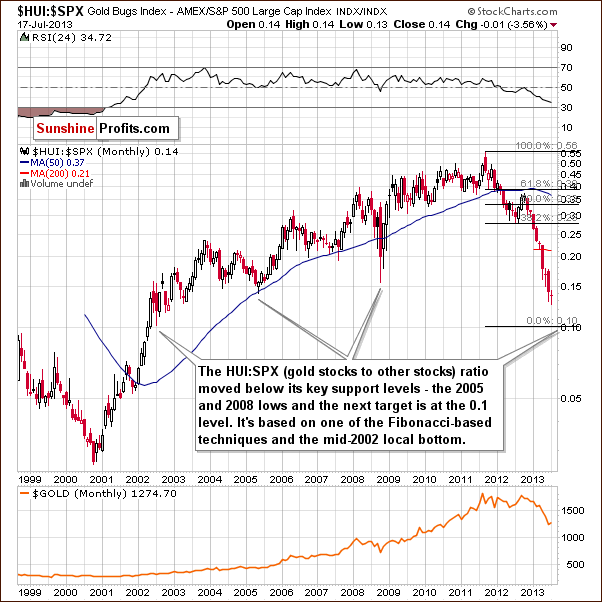
We are including the very long-term gold stocks to other stocks ratio chart in reply to a request from one of our subscribers. We have seen a breakdown below the important support level created by the bottoms of 2005 and 2008. The ratio has been clearly below this level for several weeks now so the breakdown is confirmed.
The next support line is all the way down at the 0.1 level so it seems that further significant declines are likely before the final bottom is reached here. This target level is created by (applying Fibonacci techniques) extrapolating previous declines by Fibonacci transformation of the Phi (1.618) #. It coincides with the local bottom seen in the middle of 2002. This chart confirms what we’ve seen in other charts: the bottom is not in yet, another big drop is likely ahead, but the majority of the declines are probably behind us.
Summing up, the situation for mining stocks is analogous to that of gold and silver and the outlook remains bearish.
On a side note, speaking of mining stocks, you may recall that in the previous Premium Update we wrote that our upcoming tool will provide buy/sell signals also for individual mining stocks and we provided one of the current readings – for ABX. There was a buy signal on July 10 (after multiple sell signals in the previous weeks), but when we presented the chart there was an approximation of the future price path – the outlook was that the price will move bit higher – close to $16 and then start to decline. That’s almost precisely what happened. This tool should be available shortly, stay tuned.
Letters from Subscribers
Q: Are your stop losses intraday or only good on a daily closing basis?
A: Our stop-losses are good on an intraday basis. In other words, if prices move above them for just a second then they would be triggered.
Q: I do not see how to rank EXK on your stock analyzer. Could you send me directions? I also am baffled by options calculator. Do you have a video that shows how to use this?
A: EXK - Endeavour Silver Corp. is in the second tool, the one dedicated to silver stocks - the Silver StockPicker (not the Golden StockPicker, which is dedicated to gold stocks).
The Option Calculator works in the following way: you first enter information about the option which price you want to see for a different price of the underlying asset and then you get the projected price of the option – you can read it directly from the chart. It's usually a good idea to enter the price of the underlying asset and then move your cursor around that price on the chart anyway to see how much the option price will change for a few cents’ move in the underlying asset.
Yes, there is a video in which we show how to use this tool. You will find it in the along with some other videos. Here's the direct link.
Q: Just a comment after 2 weeks as a subscriber. Your analysis hinges ongold-USD yet your correlation matrix - if I read it right - showsnegative in all time frames. Charles Hugh Smith's blog recently ran a 5yr chart that screamed little correlation too. Major dollar peaks didn't match with gold lowsand vice versa. Just saying...
A: The Correlation Matrix has 6 columns - two for each "term" in general. The 10-day and 30-day columns represent short-term correlation (something that changes quite often), then there are medium-term columns 90-day and 250-day ones that describe the medium-term relationship (that have been negative for some time now), and finally, there are long-term correlation coefficients that are quite close to 0.
Beginning with the last number, this means that in the long run there's much more to the gold market than the USD Index. That's not surprising. The supply - demand situation that drives the market in the long run is connected with multiple factors (say, emerging market demand), not just the USD Index. So, again, the fact that you don't see much on the 5-year chart is not surprising and basically doesn't prove anything - except perhaps if one wants to find a way in which correlations don't work - one will find it. Finding one way in which something doesn't work well (say, ice skates are not good for running on a regular terrain) doesn't imply that it's useless when applied correctly (just watch any hockey game for some evidence).
In the short term there have been multiple times when knowing the proper way to look at the gold-USD link provided us with valuable information. Just look at the short-term USD Index chart from today's Update (the last of the USD charts featured earlier) and focus on the cyclical turning points. Note how the turning points in the USD translated into actionable indications for the metals market - the short-term correlation used to work quite well in the recent past. We featured a few other examples in our Correlation Matrix video.
Finally, we are not really focusing on the correlations themselves now, as we have an interesting situation in which gold reacts to dollar's rallies but not to dollar's declines (it has been reacting to dollar's declines recently, but it seems rather to me a temporary phenomenon so far). The implications remain bearish whether we apply this kind of approach or if we focus on the negative correlation in the short run.
Q: You've been fairly bullish on US general equities. Do you still think it is better to keep your powder dry for a PM equity bottom? At what point technically would you toss inthe towel for PM equities?
A: Yes, we think that it's better to buy precious metals equities (or more precisely, to have some now and then to buy some more as we temporarily move even lower) than other stocks that are currently popular. We view them as extremely oversold and with good fundamental prospects (we think that gold will move higher in the coming years) which creates a great long-term buying opportunity. To be clear - we think that they will become even more oversold shortly.
Tossing in the towel for PM equities - we plan to buy gold stocks when HUI moves to 155 with a stop-loss at 137. The latter can be viewed as the point at which we would toss in the towel for the sector, but only to some extent, because we would then start looking for another entry point, at even lower prices. There is no technical level that would make us resign from the precious metals / mining stocks - we would have to see change in the fundamental situation.
Summary
The USD Index corrected almost to the final 61.8% Fibonacci retracement level but now seems to have started to move higher once again. This is in tune with the medium and long-term trends and also with its cyclical turning point. The implications are bearish for the precious metals whether the traditional negative correlation is seen or gold’s under-performance continues. Either way, the outlook is bearish for gold, silver and mining stocks in the short term (for the next few weeks, the outlook is a bit unclear in terms of the next few days).
Similarly, the situation in the general stock market is a bit unclear in the short term but bullish in the medium term. If two more weekly closes are seen above the May weekly high, the outlook here will become significantly more bullish.
Because we have not seen any real moves to the downside in gold’s price recently, it seems unlikely that the previously-expected pattern of decline, big pullback, and decline will be seen. Gold’s next move to the downside will probably take it to its final bottom close to $1,100 (not necessarily in a one-day drop, but quite likely without a major correction meanwhile). The situation in silver and mining stocks is also bearish, and their respective charts confirm this outlook.
Trading – PR: Short positions (half) in gold, silver and mining stocks. We suggest placing buy orders for the speculative long positions in gold and silver for gold at $1,105 and silver at $15.20 (and closing the short position at that time - if these levels are reached). The analogous level for the HUI Index is 155. If gold moves to $1,105 but other market don’t move to their targets – we suggest closing short positions in gold, silver and mining stocks and going long these sectors anyway. If silver or HUI reaches the target but gold doesn’t, we suggest closing all above-mentioned short positions, but going long only the market that reached its target. In this case you will likely hear from us shortly, but you know what’s our take even before that happens.
Trading – SP Indicators: No positions: SP Indicators suggest long positions but the new self-similarity-based tool suggests short ones for the precious metals sector and we think that overall they cancel each other out.
Long-term investments: Half position in gold, silver, platinum and mining stocks. As far as long-term mining stock selection is concerned, we suggest using our tools before making purchases: the Golden StockPicker and the Silver StockPicker
| Portfolio's Part | Position | Stop-loss / Expiry Date |
|---|---|---|
| Trading: Mining stocks | Short | 246 (HUI), $26.55 (GDX) / - |
| Trading: Gold | Short | $1,340 / - |
| Trading: Silver | Short | $20.90 / - |
| Long-term investments: Gold | Long - half | - |
| Long-term investments: Silver | Long - half | - |
| Long-term investments: Platinum | Long - half | - |
| Long-term investments: Mining Stocks | Long - half | - |
This completes this week’s Premium Update. Our next Premium Update is scheduled for Wednesday, July 24, 2013 (two days ahead of our regular schedule)
Thank you for using the Premium Service. Have a profitable week and a great weekend.
Sincerely,
Przemyslaw Radomski, CFA


