- Euro & USD Indices
- General Stock Market
- Copper
- Palladium
- Crude Oil
- Correlation Matrix
- Gold
- Silver
- Mining Stocks
- Possible Scenarios
- Summary
As always, there are many ways in which the situation can develop and in today’s Update (and in the current Market Overview report) we will focus on what is probably the most important factor that will to a great extent determine what will happen in the coming months, not just in the precious metals market, but also in bonds, stocks and real estate markets.
Yes, you guessed correctly – we are going to discuss the Fed’s possible actions and the probable effects on the markets. Will we actually see any form of tapering or will we just hear about it? If so how will remarks made by the Fed impact actual events? As you know, very often what Bernanke or someone other Fed official says can ignite large price moves. So, for the analysis to be complete, we should focus not only on what happens but also on how it is announced.
In the following part of the Update we will discuss what’s likely to happen if the Fed does indeed taper the QE program.
Based on the possible combinations we created eight scenarios and we discuss how each of the markets (gold, stocks, bonds, real estate) could perform in each of them. We also explain which are the most and least likely. If they play out in the future you will already know what to expect in the following weeks/months.
The involvement of the Fed in buying assets makes it the most important player in the financial market. Over 3.5 trillion dollars amount to 23% of the American GDP (compare that to “savings”, which are almost two times less than that!). There are “rumors” about the Federal Reserve System’s possible “stepping back” from its policy of quantitative easing. The “rumors” came from Bernanke’s speech, and were slightly present in Fed’s “minutes” from 30th-31st of July (the minutes were published on the 21st of August. They register discussions that take place during Federal Open Market Committee meetings).
The so-called “tapering” of the Fed would mean a significant slowdown of the programs (which lead to an increase in the assets holdings). Many observers argued that “tapering” is supposed to start before the end of 2013; September being the likely candidate. The minutes do not confirm this, at least not strongly. We can read that “almost all Committee members agreed that a change in the purchase program was not yet appropriate”. There was only one mildly dissenting voice about some improvement in the labor market as a reason for the Committee to offer an explicit statement about asset purchase reduction in the “near future”. Few members responded that “patience” is needed in order to carefully “evaluate” the economic data. Few others responded that the plan was already articulated (although not very strongly) that the programs will be reduced.
In conclusion the Fed decided to keep the programs floating: they buy 40 billion dollars of Mortgage Backed Securities and 45 billion dollars of Treasuries each month in order to bid the prices of both (and keep the returns low). Moreover, the interest rate is supposed to stay at current low level of 0.25% percent as long as the unemployment rate stays below 6.5%, and the official inflation rate is not half percentage higher than the main policy goal of 2%.
What are the possible scenarios for the Fed? Most importantly the so-called tapering can be significant, negligible, or nonexistent. It can be started because of optimism about the state of affairs, or pessimism because of ineffectiveness of the tools. It can also be done at different times. Moreover the Fed can offer different communications about the program.
We can think of various options.
First scenario: The Fed continues the programs and communicates to the public that not much has changed.
Second scenario: The Fed continues the program and communicates to the people that the program is becoming reduced, because things are going great (economy is improving, unemployment is lower etc.).
Third scenario: The Fed continues the program and communicates to the people that the program is becoming reduced, because of possible threats (e.g. inflation).
Fourth scenario: The Fed freezes the program and communicates to the people that things are going good.
Fifth scenario: The Fed freezes the program and communicates to the people that things are not very good (risk associated with the program are higher than benefits).
Sixth scenario: The Fed decides to reduce its holdings, and communicates that things are going great.
Seventh: The Fed reduces the holdings, and communicates it’s because things are not going well.
In the eighth scenario the Fed will not change anything, but at the same time will think of something “special”, perhaps some other tools. It can start some other programs instead of existing ones.
In today’s Update we will feature one of these scenarios in greater detail. Namely, we will discuss what would likely happen if the Fed froze the program and went into “stand by” mode because of positive news. That’s what corresponds to scenario #4 from the above list.
| Fed program | Fed communication | Probable outcome for gold in the medium run | Influence on real estate | Influence on stocks | Influence on Treasuries | Probability |
|---|---|---|---|---|---|---|
| Freeze | Freeze, because of positives | Likely to be lower | Upward pressure | Upward pressure | Upward pressure | Probable |
In scenarios four and five the Fed is moving to the stand by position. It freezes its balance sheet, decides to step back from continuous buying of securities, both governmental and mortgage. The communication in this case is the most important factor. In the fourth scenario the program is tapered, and the argument is made that the reason for this is that the economy has improved. The information is: the dollar system is in a better condition. Gold would probably go down under that scenario since it would lose parts of its appeal associated with its anti-dollar nature. The rest three markets would probably react positively, especially Treasuries and the stock market.
It is also the case with real estate, but much less so. If the Fed stopped buying more mortgage securities, then leaving them in the market should lead to a downward pressure, right? True, but we have to accept that there are some small positive movements in the real estate. Probably not that definite, and we should still see a lot of things happening in the market. Nevertheless our decision to put an “upward pressure” comes from the fact that the Fed slowed down in the recent time in buying of commercial assets (at least if one compares the actions to the previous plans).
Therefore there is some paradox in the above table. We see more chances that real estate should grow under the freezing scenario than under the continuation scenario. Why? Simply put, if the Fed officially slows down its operations and communicates the case because of positives, then it may be a sign that there is some life in the real estate market (plus stand by means that government is ready to help at any time if things get worse). Whereas with the continuation program, an additional buying scenario, it will probably mean that there is much less life in the real estate, and the Fed is trying to continue a hopeless fight against market forces.
Summing up, what would likely happen if the Fed does indeed taper the QE program? Gold would likely suffer in the medium term, but other markets would likely thrive (even though no one can rule out a short-term upswing). If you are interested in reading our analysis of the remaining 7 scenarios (including the most probable ones), and staying prepared almost no matter what the Fed does, we invite you to sign up and read yesterday’s Market Overview report.
Having said that, let’s take a look at the technical side of the market. Most of what we wrote in our last Premium Update is still very much up-to-date today, so we will provide you with the updated version of charts and add several descriptions where we think it is appropriate (mostly in the cases of silver and palladium).
More importantly, we will provide you with possible scenarios that can be seen in the coming days along with our preferred ways of reacting should they occur - you will find them right before the Summary section. Let’s move to charts (charts courtesy by http://stockcharts.com).
USD and Euro Indices
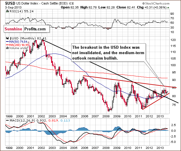
The situation in the long-term chart hasn’t changed much recently.
As we wrote in our last Premium Update:
The breakout above the declining support/resistance line (currently close to 79) was still not invalidated. From this perspective, the situation remains bullish.
Now, let’s examine the weekly chart.
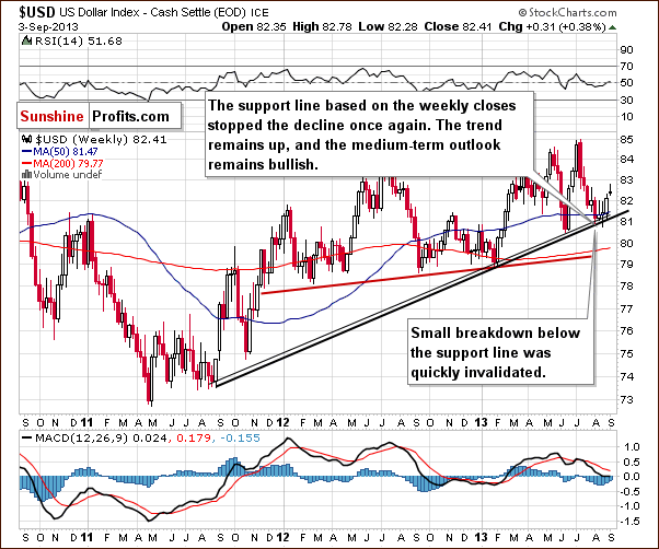
Despite the fact that the USD Index declined once again in the past week, the medium-term support line was not breached. Although we saw a small move below the upper support line, even this small breakdown was quickly invalidated, which is a bullish signal. These positive circumstances encouraged buyers to act and the dollar came back above the 82 level.
From this perspective, the medium-term uptrend is not threatened, and the situation remains bullish. Therefore, we can expect the dollar to strengthen further in the coming weeks. Looking at the above chart, it seems that the USD Index has started its rally and that this rally will be fueling declines in the precious metals market.
Now, let’s check on the short-term outlook.
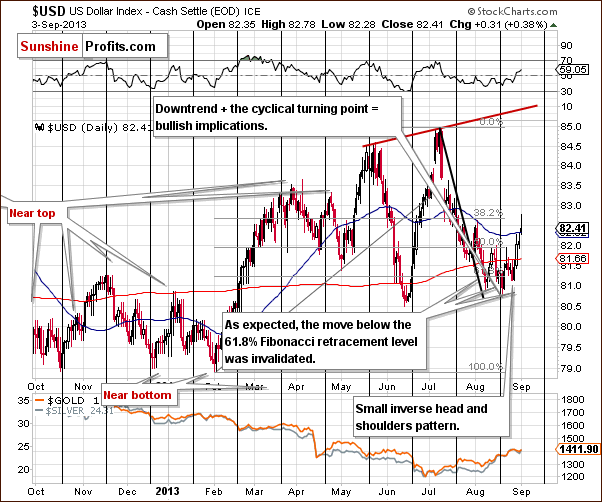
From this perspective, we see that the recent decline once again took the USD Index below the 61.8% Fibonacci retracement level based on the entire February – July rally.
Despite this decline, buyers managed to push the USD Index higher, and the short-term breakdown below the Fibonacci retracement level was invalidated.
When we take a closer look at the weekly chart, we see a small inverse head and shoulders pattern underway (based on three August lows). As you see on the above chart, the U.S. currency has moved higher in recent days and broken above the 82 level, which means that this bullish formation is confirmed.
Additionally, when we factor in the cyclical turning point (which we see after a monthly decline), the outlook here looks very bullish. In fact, it seems that the USD Index started to move higher right at the turning point.
Let’s now take a look at the Euro Index.
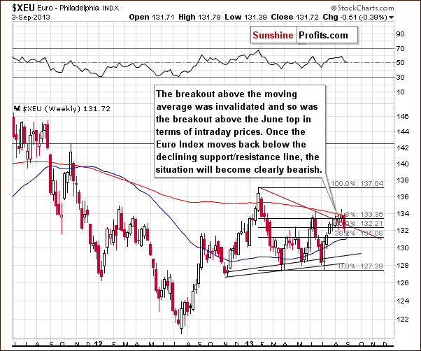
On the above chart, we see that the Euro Index attempted to move above the 200-week moving average in the past week, but this attempt failed for a second time, and the breakout was invalidated.
Looking at the above chart, we clearly see that the European currency dropped below the 61.8% Fibonacci retracement level based on the January - July decline. At this time, we also see an invalidation of the breakout above the declining support/resistance line based on the January and June highs, which is also a bearish factor.
Summing up, the outlook for the USD Index has just become more bullish because of the inverse head-and-shoulders pattern and because of the invalidation of the breakout in the case of the Euro Index. The implications for the precious metals sector are bearish for the medium term.
General Stock Market
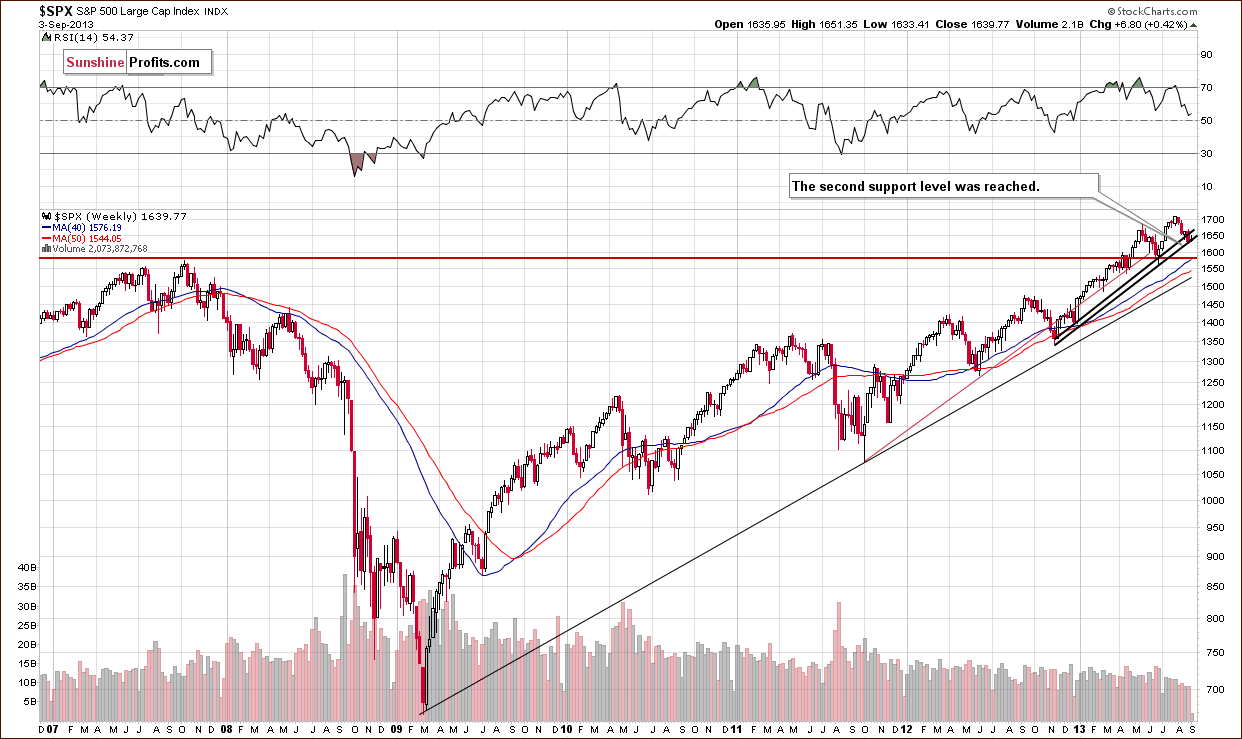
On this week‘s long-term S&P 500 chart, we see that the situation hasn’t changed much from a week ago.
In our previous Premium Update we wrote:
The correction is still shallow from the long-term perspective, and the S&P 500 Index reached the rising support line based on the November 2012 January 2013 lows (in terms of weekly closing prices).
Please note that there is another rising support line based on the November 2012 -January 2013 lows (on an intraday basis), which may stop a correction even if the current support doesn’t hold. Therefore, the downside seems limited.
As you see on the above chart, we witnessed this type of price action in the past week. Technically, the outlook for the S&P 500 index hasn’t changed. It remains bullish.
Before we examine the Broker-Dealer Index chart to see what the financial sector is doing, let’s take a look at the DIA ETF chart, which is another proxy for the general stock market.
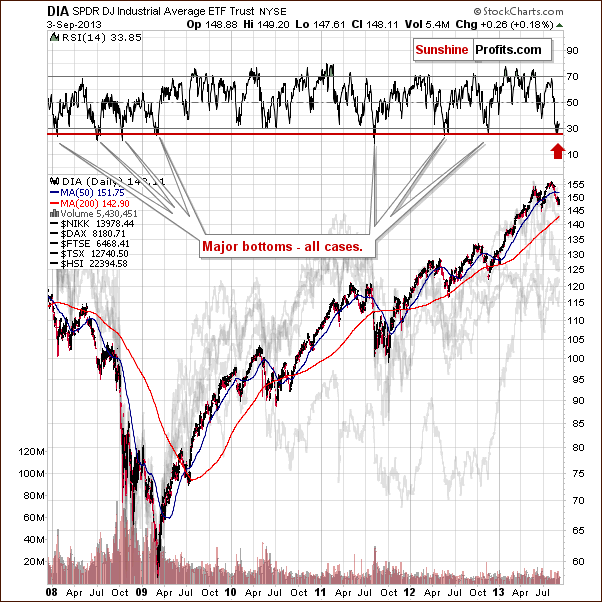
Quoting from our previous Premium Update:
(…) the DIA ETF moved lower, and the RSI based on it moved below 30 - almost to the 26 level. Since the beginning of 2008, there have been exactly 7 cases when we saw something similar. In 4 of them, this meant that an important bottom had just been formed. In the remaining 3 cases, a major bottom was formed in a short time anyway.
Although we didn’t see this signal have an impact in the past week, it is still in play and can lead to a bigger correction or – more probable – a new up-leg. It seems that the bottom might already be in.
We turn now to the financial sector, which in the past used to lead the rest of the general stock market, to see whether the above is confirmed or invalidated.
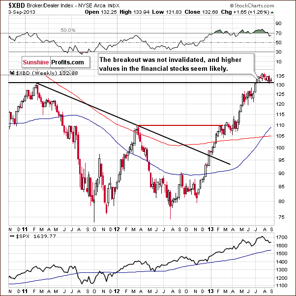
It is confirmed. On the above chart, we see that there was another downward move which took the financials to the previously broken resistance level of 130. Despite this fact, the financials still remain above the 130 level, which also corresponds to the 2011 top.
The breakout above the level of 130 has not been invalidated, and this confirms that nothing has changed. We can still expect further growth in the financial sector and the general stock market.
Summing up, the outlook for general stock market is very bullish in the medium term and also bullish in the short term.
Copper
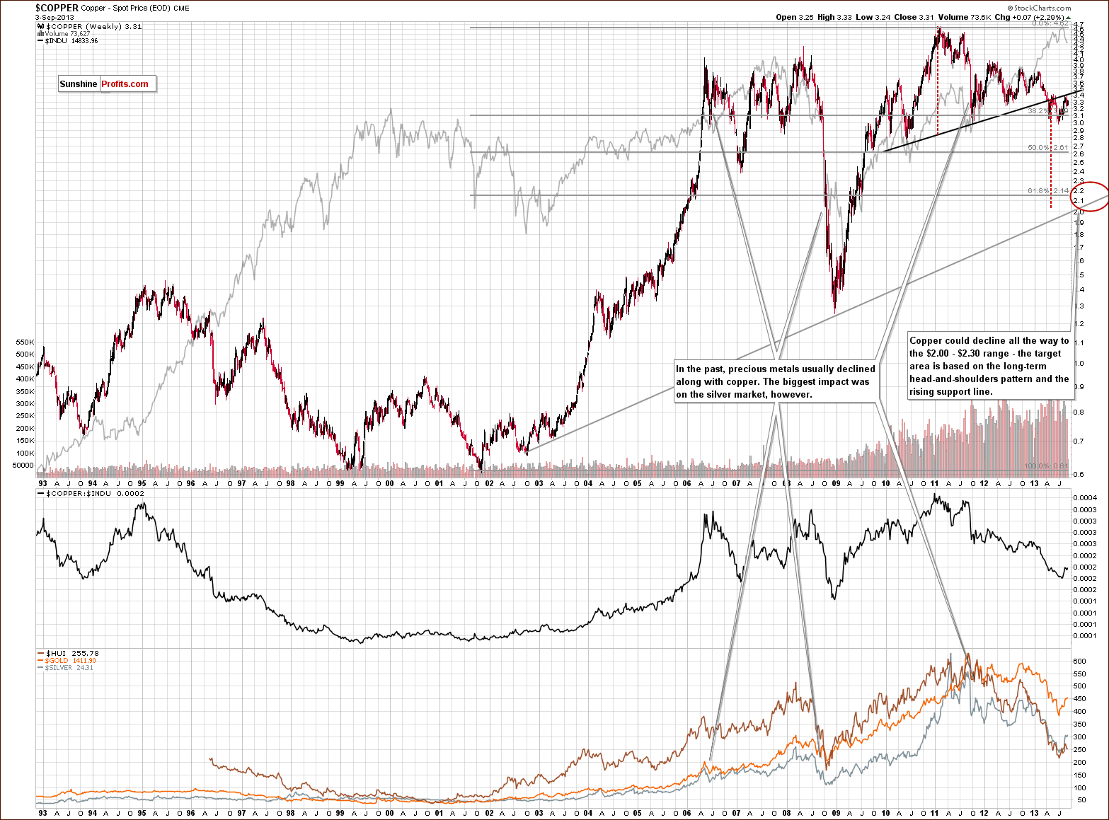
On the above chart, we see that there was another short-term correction in the past few days. This upward move took copper to the neck level of the bearish head-and-shoulders pattern once again; however, there was no breakout above it, and the price of copper declined shortly after this neck level was reached. What this means is that nothing has changed as far as the bearish implications of this pattern are concerned.
From this point of view, it was just another correction, which did not invalidate the previous large head-and-shoulders pattern or its implications.
Consequently, the medium-term outlook for copper remains bearish.
Palladium
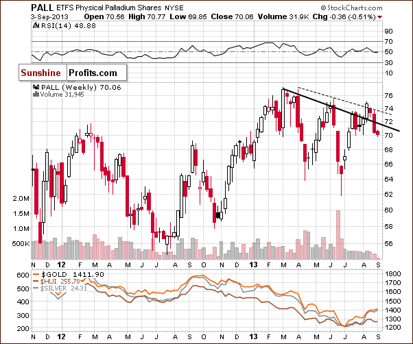
On the above chart, we see that palladium moved above its upper resistance line (marked with a dashed line on the chart) in the first half of August. However, the improvement didn’t last long, and palladium moved back below this resistance line in the following week.
Last week we saw further deterioration as the price of palladium dropped below the declining resistance line based on the 2013 top and the May peak (in terms of weekly closing prices).
From this point of view, we have an invalidation of two breakouts, which is a bearish signal. This is likely to result in further declines, and the implications for the rest of the precious metals sector are therefore bearish as well.
Crude Oil
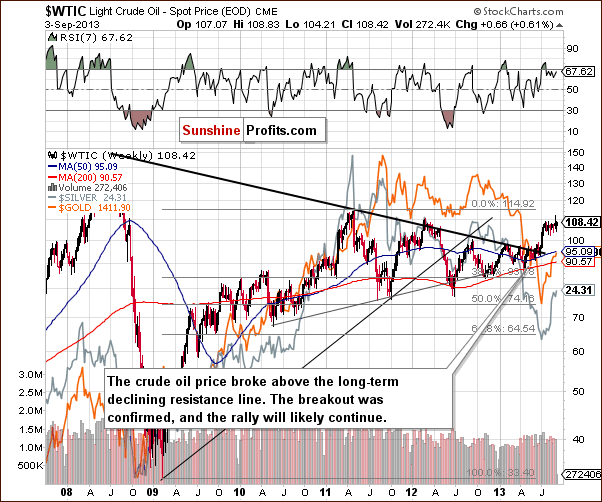
On this weekly chart, we see that the oil bulls managed to push the price of crude oil higher, and it reached over $110 per barrel. By doing so, oil broke above the March 2012 top, but this breakout was not confirmed.
When we take a closer look at the above chart, we see that there is a strong resistance level based on the May 2011 top, which may encourage oil bears to go short. However, even if the sellers trigger a correction, a downward move to the previously-broken long-term declining resistance line will not disrupt the trend of general long-term increases.
From this perspective the medium-term outlook is bullish, but the short-term outlook is unclear.
If you want more details about the current oil market situation, we invite you to read our Oil Update (it’s free at this time; these updates will become a premium product in a few weeks – similar to the current Premium Updates, but focusing on crude oil).
Gold & Silver Correlations
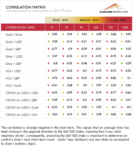
The Correlation Matrix is a tool which we have developed to analyze the impact of the currency markets and the general stock market upon the precious metals sector (namely: gold correlations and silver correlations).
Basically, the situation in the stock market and the USD Index hasn’t changed as far as the outlook is concerned. There also have been no changes in the values of coefficients since we commented on them previously in last week’s Premium Update. Therefore, the implications that these markets are likely to have on precious metals remain in place and unchanged.
The recent strength in gold relative to the dollar seemed to be a very short-term phenomenon lasting only through last week, and we didn’t see a continuation this week. The coefficients based on the previous 30 trading days are still negative. The medium-term coefficients are also negative; however, the 90-day column has a very small, negative value.
The reason for the 90-day column value being so insignificant is that gold underperformed the USD Index for quite a long time; therefore, the implications are bearish anyway.
Generally, the above provides us with a bearish outlook for the precious metals sector because of the medium-term outlook for the USD Index, which is bullish. Since the USD Index just invalidated a small breakdown below the strong support line, its downside seems very limited.
What’s very interesting is that the correlation between silver and the stock market is strongly negative. It’s negative in the short and medium term. This is so interesting because theoretically, silver used to be positively correlated with the stock market most of the time, which you can see in the very long-term, 1500-day column because of silver’s industrial uses. With the bullish outlook for the stock market suggesting higher values, it seems that the outlook for silver is quite negative in short and medium term.
It seems that we will need to see silver moving higher regardless of what the stock market is doing before we can say that another huge up leg is in the cards for the white metal.
Interestingly, silver moved to its previous highs just as stocks moved back to their recent lows on Tuesday. As odd as it may sound, it seems that the lack of a rally in the stock market so far might be the thing that was preventing silver from declining.
Gold
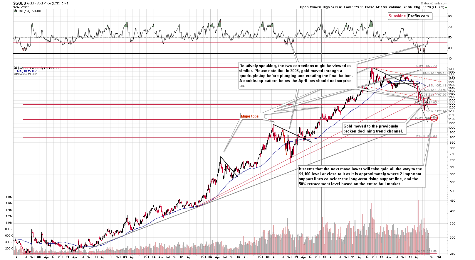
On the long-term gold chart, we see that the yellow metal climbed once again and reached the previously-broken rising support/resistance line based on the July 2005 low and the October 2008 bottom (on an intraday basis). At this point, it’s worth noting that this area is strengthened by the 38.2% Fibonacci retracement level based on the September 2012 - June 2013 decline. Although gold broke above this resistance zone in the past few days, the breakout was invalidated recently, and the yellow metal dropped below $1,400 an ounce. On Tuesday we saw another attempt to move above the resistance levels, but gold fell short of even reaching them.
Taking the above-mentioned into account and combining it with the current situation in the USD Index, it seems that gold will not move much above its present level before declining once again.
From this perspective, the medium-term downtrend remains in place.
Let’s now take a look at the medium-term picture to see more details.
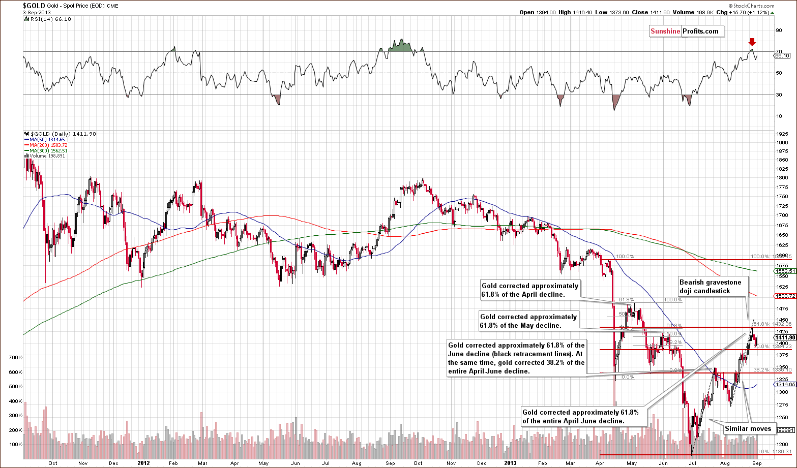
On the above chart, we see that gold continued its rally in the past week and reached the 61.8% Fibonacci retracement level based on the entire April-June decline. Although the price of gold managed to break above its June top, this breakout was quickly invalidated.
Additionally, when we factor in the Fibonacci price projections, we see that the recent rally from the August 7 low to the August top is similar to the upward move seen in July. If history repeats itself, we will see a downward move – similar to the July-August decline.
From this point of view, it seems that the strong resistance range based on the June top and the 61.8% Fibonacci retracement level may keep the rally in check, as it further strengthens the resistance created by the rising long-term line marked in red on the previous (long-term) chart.
This week gold moved a little higher, but not above previous high and not above the medium-term resistance levels, so this move really doesn’t change anything.
With a bullish outlook in place for the USD Index, it doesn’t seem likely that gold will have enough strength to move above the previously mentioned resistance levels.
Now let’s take a look at the chart featuring gold’s price from the non-USD perspective.
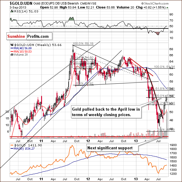
On the above chart, we clearly see that gold continued its rally in the past week and reached the level of the April bottom (in terms of weekly closing prices).
It’s worth mentioning that this resistance level also intersects with the 50% Fibonacci retracement level, which gives us a strong resistance zone. Although we saw a small move above it last week, this breakout was not confirmed, and the downtrend remains in place from this point of view. Gold made another attempt on Tuesday, but no breakout was seen.
Last month we saw a breakout above the declining resistance line, and a rally followed. However, at this time, it seems that what was supposed to happen based on the breakout has already happened, so it no longer appears to have bullish implications going forward.
From this perspective, the situation is mixed with a bearish bias at the moment.
Let’s examine gold from another perspective – gold priced in British pounds.
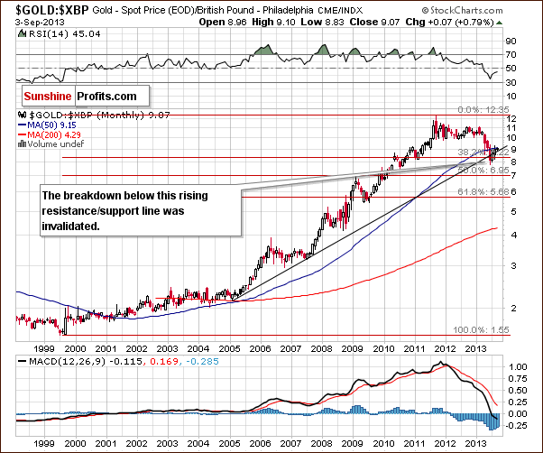
Looking at gold’s price from the British pound perspective, we see that it moved above the rising resistance line once again. Technically, the breakdown below this line and the 38.2% Fibonacci retracement level was invalidated. Please note that the breakout above the 50-month moving average has not yet been invalidated.
Taking the above-mentioned into account, the outlook here has turned to bullish.
Let’s now take a look at gold priced in euros.
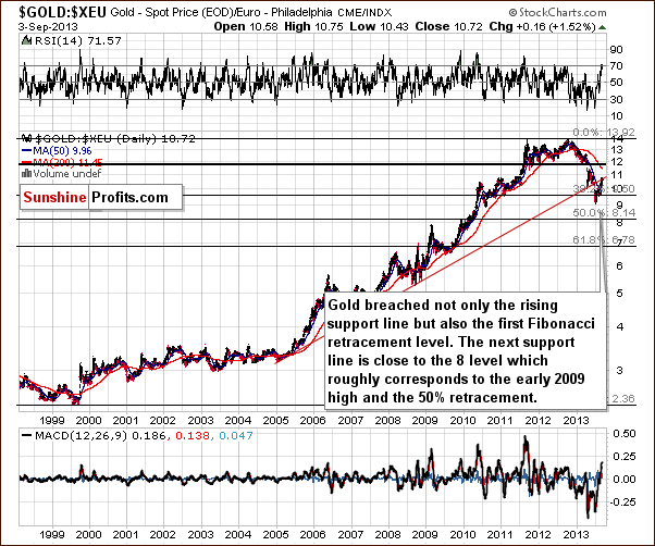
On the above chart, we see that the situation hasn’t changed much. Although gold priced in euros moved above the rising support/resistance line (marked with red) temporarily, the breakout was invalidated. Therefore, the implications are still bearish based on this chart.
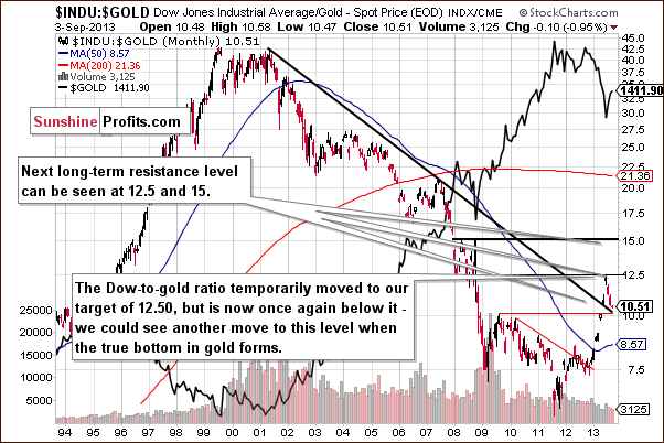
In the above monthly chart, we see that the ratio moved temporarily to our target of 12.50 in June, but this situation didn’t last long. In the following months, the ratio has declined and moved very close to its previously-broken long-term declining support/resistance line.
Please note that the above-mentioned, declining support/resistance line approximately intersects with the August 2009 top at the current levels. Therefore, this strong support could trigger a rally to 12.5 or even to the 15 level.
This week, the ratio moved slightly lower, very close to the declining support line without breaking it.
From this point of view, it seems that if we see the ratio move to the 12.5 – 15 range, the true bottom in gold will then have formed or at least be close at hand.
Summing up, the medium-term outlook for gold remains bearish despite a recent show of strength. One bullish chart – the one featuring gold priced in the British pound – is not enough to invalidate the bearish implications from all the other ones.
Tuesday’s strength doesn’t change anything in the overall outlook here.
Silver
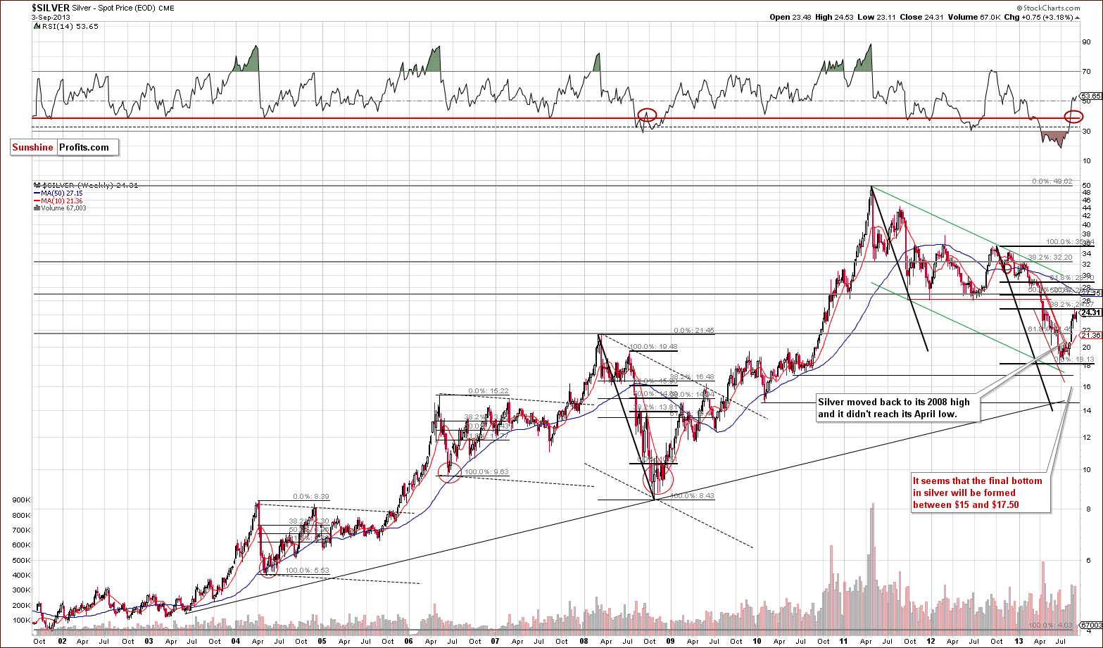
In our previous Premium Update we wrote:
(...) silver might climb higher as the analogy to the 2008 decline suggests a 38.2% pullback, (...)
When we take a look at the above chart, we clearly see that history has repeated itself once again, and silver reached the 32.8% Fibonacci retracement level. Taking this into account, it seems that this could be the resistance level that keeps the rally in check.
Additionally, please note that back in 2008, silver corrected to the local high that was created after the first sharp decline. We can say the same about the most recent decline and the subsequent correction. In this case, silver moved to the local top which followed the April plunge.
Please note that we saw significant intra-week and intra-day volatility before silver plunged in October 2008. It seems that we are seeing something similar right now – silver moved close to its recent highs on Tuesday.
It is visible even more clearly on the short-term chart, so let’s move to it right now.
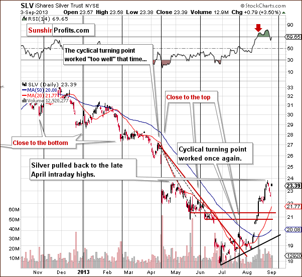
In Monday’s Market Alert we wrote:
Silver moved sharply lower in the final days of the previous week, as we expected it to, but it has also moved up by $0.60 today, even though gold has declined $4, which makes the silver market particularly difficult to trade (it's difficult to place reasonable stop-loss orders given this kind of intra-day volatility).
Taking the above into account, as far as the silver market is concerned, we will wait for an additional confirmation that the top is in before going short.
Actually, the above chart provides us with a bearish confirmation in the form of relatively low volume during Tuesday’s significant daily rally, however we would like to see a more visible sign before going short silver.
Before summarizing this week’s Premium Update, let’s take a look at the long-term turning points in silver – with so much volatility on a short-term basis, long-term charts are particularly useful, as they help to keep things in perspective.
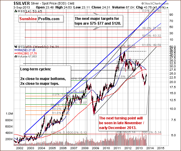
Quoting from our last Premium Update:
There were two major bottoms and two major tops in the case of this major, long-term cycle. As you can see on the above chart, the next cyclical turning point will be seen in late November or early December this year. This may be where the next major bottom in silver materializes.
Of course, this could be a local top, and we could see further rally from where we are today, but taking into account other charts (and the negative correlation of silver with the stock market), it seems that the trend is still down, and we will likely see a final bottom close to these dates.
Since the entire precious metal sector tends to move together during major price swings, the above has bearish implications for gold and mining stocks in the medium term.
Gold and Silver Mining Stocks
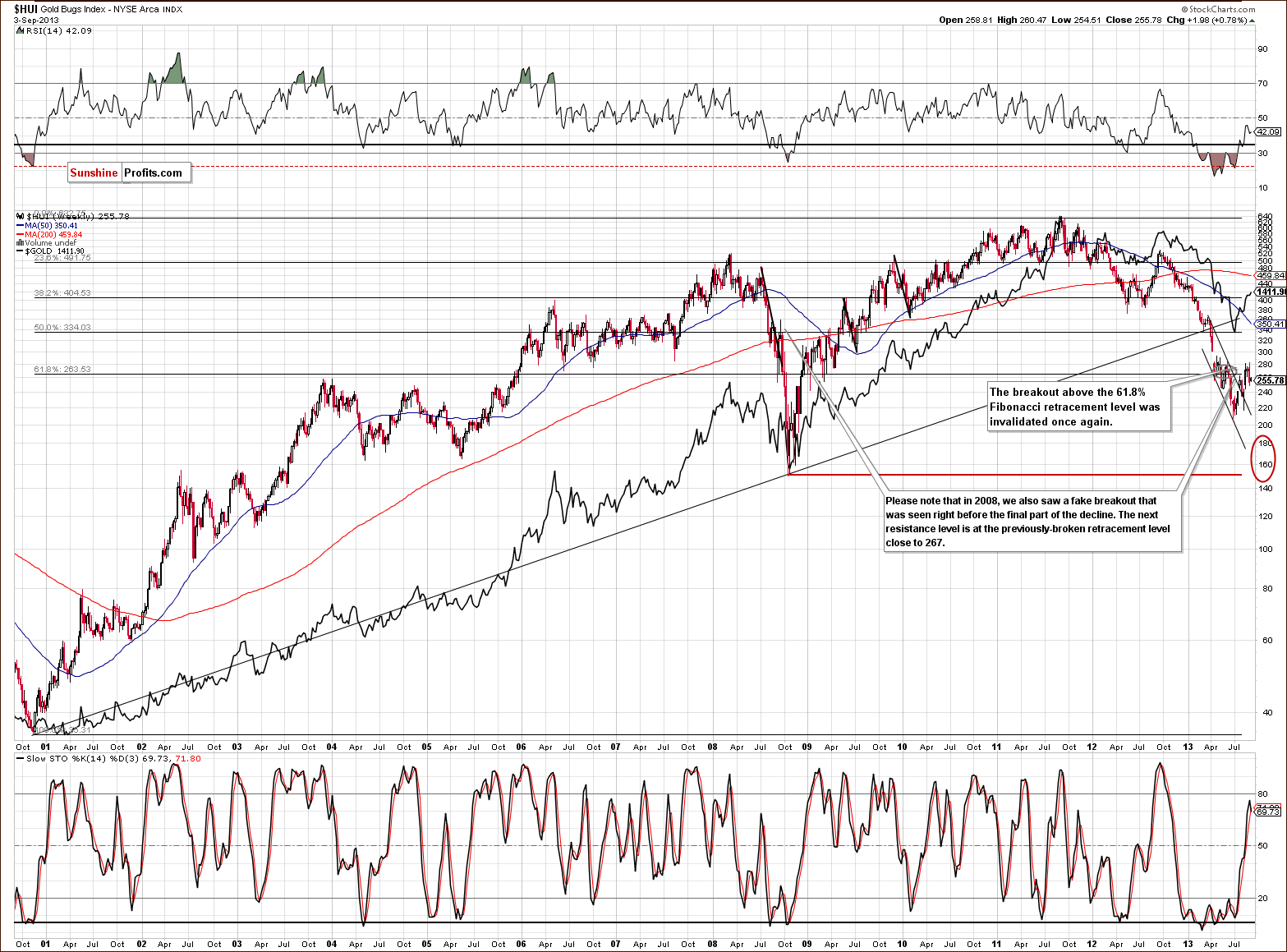
In this week’s very long-term HUI index chart (a proxy for the gold stocks), the situation hasn’t changed much. As you read in last week‘s Premium Update, in the past weeks and months, we saw several unsuccessful attempts to move above the 61.8% Fibonacci retracement level based on the entire bull market.
Last Wednesday, we had another small move above this level, but just like the previous attempts, this one also failed. The mining stocks returned to below the 61.8% retracement level (at approximately 267), and the breakout above this resistance level was invalidated once again.
The implications are therefore bearish once again, and the trend remains down, even though we saw a breakout above the declining trend channel earlier this month.
Even though gold and silver moved higher on Tuesday, the HUI Index almost didn’t move – it seems as if the buying power dried up several days ago.
Now that we know the situation in the HUI index, let’s move to the XAU Index, which is another proxy for the precious metals mining stocks.
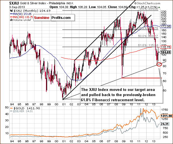
On the above XAU Index chart, we see that our previous target area (marked with a red ellipse) was reached in June. The strong rising support line based on the 2000 and the 2008 bottoms seems to have encouraged buyers to act, and we can see that the mining stocks pulled back to the previously-broken 61.8% Fibonacci retracement level in the months since – without a move above it.
As you can see on the above chart, this resistance level slowed further growth, and mining stocks declined in recent days. From this perspective, it seems that the next move lower will take the XAU Index to the bottom of the previous corrective move. However, if it is broken, the next downside target for the sellers will be around the 2008 low or even below it.
Now, let’s move on to the gold stocks to gold ratio.
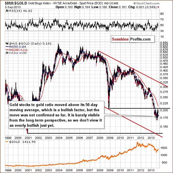
On the above chart, we see that last week there was a verification of the breakdown below the 2008 low. Although, the ratio reached its 2008 low, it slipped below it once again in the days which followed. Earlier this week, we saw a significant decline which took the ratio to the 0.180 level. With this move, the gold stocks: gold ratio dropped below the 50-day moving average, which now serves as resistance.
From this point of view, the trend remains down, and the recent rally was nothing more than a verification of a major breakdown. The above picture remains bearish.
Please note that the ratio declined once again on Tuesday due to the miner’s lack of rally despite a visibly higher move in gold and silver prices.
Summing up, the outlook for the mining stocks remains bearish, and the trend is still down despite last week’s show of strength. The long-term tendencies seem to be the most important at this time, even for short-term price moves. The breakdown below the April low was invalidated, and the move above the 61.8% Fibonacci retracement failed once again. The long-term trend in the gold stocks to gold ratio remains down, and a major breakdown seems to have just been verified.
Possible Scenarios
Long-term investment capital
We promised to provide you with details as to how we would react do different ways in which the situation on the precious metals market could develop. We considered multiple breakouts / breakdowns in gold, silver and mining stocks (separately and at the same time) and – as far as long-term capital is concerned – we ultimately decided not to trust the rally in gold and silver until it’s confirmed by mining stocks. Ultimately, the sharp correction in 2008 that was followed by the final plunge was even bigger than what we’ve seen so far. Looking at gold alone, looking at silver alone, or looking at gold and silver together didn’t help to detect the true bottom, nor did they help do detect when the move up was a fake one.
Looking at the HUI to gold ratio from the long-term perspective would have helped however. Yes, there were corrections in this ratio too, but they didn’t seriously invalidate the declining trend. At this time we have a decline that is not as sharp as it was in 2008, so the same moving averages might not work. Fortunately, we have a very important resistance level that can help us estimate whether the trend has indeed changed or not – the 2008 bottom in the ratio.
Consequently, as far as the long-term investment capital is concerned, we have the following suggestion:
Get fully back in the precious metals market (gold, silver, platinum and mining stocks) if the HUI: gold ratio moves back above the 0.21 level and stays there for 3 consecutive trading days. This is slightly above the 2008 low, which should help to prevent you from making changes with the main part of your capital due to short-term price noise. At the same time, this should ensure that these changes are made when and if it becomes probable that the situation has really changed.
If the precious metals sector declines and gold moves below $1,110, if silver moves below $16, if the HUI Index moves below 165, or if the HUI: gold ratio moves below 0.135, we also suggest getting fully back into the precious metals market (gold, silver, platinum, and mining stocks).
Unless any of the above happens, we suggest remaining in the market with half of your long-term investment capital.
Speculative capital
1. If either gold or miners move above their stop-loss levels – close the entire speculative short position (in gold and mining stocks and in silver if you had opened one before that time).
2. If silver declines below $21.20 and stays there long enough to make it very probable that it will close there (for instance it will be at $21.20 15 minutes before the end of the session), we suggest opening a speculative short position in silver (half of the regular position).
3. If gold moves below $1,110, if silver moves below $16, if the HUI Index moves below 165, or if the HUI: gold ratio moves below 0.135, we suggest closing the speculative short positions in the entire precious metals sector. We also suggest automatically going long with the part of the precious metals sector that triggered this move. If this happens to be the HUI: gold ratio, we suggest going long on mining stocks.
Unless any of the above happens, we suggest keeping the speculative positions intact.
Summary
At first sight, a lot changed on Tuesday, but taking a closer look and comparing yesterday’s price action to the previously reached price levels, historical patterns (with the emphasis on the 2008 decline which is most similar to what we’ve been seeing recently), and the long-term trends (like the major breakdown in the HUI: gold ratio and its verification) makes us think that nothing really changed.
Silver’s sharp move up seems encouraging initially, but it’s something that we saw before the final plunge in 2008 as well – it’s not an invalidation of the similarity, nor a breakout by itself. Miners’ performance – or more precisely – lack of performance – is much more important in our view.
All in all, it seems that the rally that we have seen in previous weeks was just a correction within a much greater decline and that the metals will move much lower in the coming weeks.
Trading – PR: Short position in gold and mining stocks (extra position).
Trading – SP Indicators: No positions: SP Indicators suggest long positions, but the new self-similarity-based tool suggests short ones for the precious metals sector. We think that overall they cancel each other out.
Long-term investments: A half position in gold, silver, platinum and mining stocks. As far as long-term mining stock selection is concerned, we suggest using our tools before making purchases: the Golden StockPicker and the Silver StockPicker
| Portfolio's Part | Position | Stop-loss / Expiry Date |
|---|---|---|
| Trading: Mining stocks | Short - full | 289 (HUI), $32.6 (GDX) / - |
| Trading: Gold | Short - half | $1,439 / - |
| Trading: Silver | No positions | - |
| Long-term investments: Gold | Long - half | - |
| Long-term investments: Silver | Long - half | - |
| Long-term investments: Platinum | Long - half | - |
| Long-term investments: Mining Stocks | Long - half | - |
This completes this week’s Premium Update. Our next Premium Update is scheduled for Friday, Sep 20, 2013. We will continue to send out Market Alerts on a daily basis (except for when Premium Updates are posted and during the period between Sep 5 and Sep 13) at least until the end of September, 2013 and we will send additional Market Alerts whenever appropriate.
As a reminder, we just published the September Market Overview with detailed analysis of 8 possible scenarios that can happen to various markets (gold, stocks, bonds, real estate) based on what the Fed does regarding the QE program and how it is announced. We’re particularly happy with this issue – it covers a lot of material, it’s rich in implications that are presented in an easy-to-use table, it’s useful and very timely given the Fedspeak in the recent weeks. All in all it’s a great, fundamental extension of today’s Premium Update. You can sign up here.
Thank you.
Sincerely,
Przemyslaw Radomski, CFA


