
If we take a look at Greece it becomes difficult to understand why such a small economy is causing such a big headache. Are the global markets overreacting? Is Greece, and now Portugal, just an excuse to let off steam in what are highly strung financial markets?
We don't think so. There are some very good reasons why investors and economists are closely monitoring the Greek crisis. There was real worry that other weak European economies would be the next dominoes to fall. If you recall, Europe's sudden debt crisis triggered by the downgrading of Greek sovereign debt late last year led to a swift sell-off of the euro and an 8% surge in the dollar in the space of only six weeks.
Already this Wednesday, the euro hit an 11-month low and shares on Wall Street declined after Portugal's debt was downgraded by Fitch Ratings. The downgrade reflected the fact that the Portuguese government's 2009 budget deficit ultimately swelled to 9.3 percent of gross domestic product, well above the expected 6.5 percent. Portugal, a country of about 11 million people, had a gross domestic product last year of $232.2 billion, making it the world's 50th largest economy. Its banking sector dodged the financial crisis better than some of its neighbors, but public finances have suffered.
Portugal announced an austerity package this month that included reducing government spending, raising taxes on high-earners and capping wage growth in the public sector. Worries about the United Kingdom, Portugal, Italy, Ireland, and Spain in addition to Greece have pushed up long-term interest rates in those countries and put the common European currency along with the British pound under pressure.
If we take a look back to about six years ago, when Greece hosted the Olympics, it presented a façade that hid the truth. The Greek government spent billions of Euros upgrading infrastructure and Greece looked like a modern, developed western European economy. Membership in the European market and the Olympic Games enabled Greece to hide the chronic disease eating away at its economy: an over-inflated public sector, corrupt bureaucracy, widespread tax evasion, a huge public debt and a business sector that was rapidly losing its competitive edge. The financial crisis of 2008 exposed Greece's real face, this despite the fact that Greece didn't partake in the real estate and subprime fiascos, as did Great Britain, Spain or Ireland.
The global recession highlighted the weak Greek financial structure and its national public debt became the largest in Europe. It didn't help that the former Greek government "hid the truth" from its citizens, the European Union and the community of global investors. The Greek budget deficit for 2009, which was presented as 5%-6% of Gross National Product, in fact turned out to be double that figure -- $12.7.
If you compare Greece's economy to another small economy, that of Israel, you see that about five years ago the national debt as compared to the G.D.P. was about the same. But two years earlier the Israeli government took drastic steps to cut expenses and handle the ticking time bomb of pension expenditures. Greece took an opposite approach. Israel, which is stuck in the Middle East, surrounded by enemies and with the highest defense budget in the world, last week sold bonds in the European market at an interest rate of 4.7%, just 1.5% above that of Germany. Greece, which is a member of the European market, was forced to pay interest rates of more than 6% in early March.
Membership in the European Union means that member nations cannot devalue their currency and reduce interest rates at a time of crisis (we don't want to get into details as to whether it's right or wrong from the long-term point of view in this essay). Take a look at Great Britain, which is much larger and stronger than Greece. Great Britain has much more economic flexibility by virtue of the fact that it is not a member of the European Union. However, its economy is also in bad shape. There are those who claim that in a year or two Britain's situation will not be much better than some of the weaker European economies.
So, the conclusion is that the Greek crisis is not really a Greek crisis at all. If Greece and its European allies don't find a solution that will calm down the financial markets, it could ignite the biggest crisis of them all, one that has not gotten too much attention so far, but one that is the most pernicious-sovereign default.
The Greek problem is a small example of far bigger troubles up ahead. The difficulties in finding an accepted solution and the large gaps in the economic competitiveness of the various European countries raise questions as to the feasibility of the European Union. In fact, it's the whole global village that is at risk. This time it may not be just wars between labor unions and the tax payers as in Greece, or battles between bankers and the tax payers, as in Britain, or fighting words about currency valuation between titans such as the U.S. and China. This time the epicenter of the quake could be governments themselves, the ones that bailed out the banks the last time around. Anyone with their eyes wide open can see the root causes of Europe's sovereign debt crisis are already present in the United States.
So far investors have been playing a game of musical chairs with the various fiat currencies. They jump from one to the other, depending on the news of the day. While it may take decades, it seems that in the end, the only currency that will be left standing when the music stops, will be gold and silver, as it was the case throughout the centuries. When the rush and tumble to acquire a position in the metals begins, gold and silver are likely to move to the stratosphere. There is a reason why they call gold and silver precious. There is not a lot of it around. When tons of fiat money suddenly will try to enter the tiny gold market and the super-tiny silver market, the move in both metals will be one for the history books. All the fundamental, long-term reasons for the future rise in gold and silver prices remain in place. There are inflationary U.S. monetary and fiscal policies with record printing of new money and record government deficits. All these presage inflation.
Next, we have an inherently unstable European currency. There is expanding investor interest in gold in China and India and elsewhere, as well as new vehicles, such as ETF's that make gold and silver more readily accessible to millions of investors (still it's not our favorite form of holding metals, as stated in the Key Principles section). Add to that rising central bank and sovereign gold accumulation. The clincher is declining world gold mine production even in the face of sharply rising prices.
Moving on to the technical part of this week's update (charts courtesy by http://stockcharts.com), let's begin with the U.S. Dollar, as it seems that its sharp rally is the biggest story this week.
USD Index
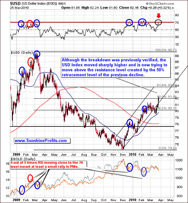
In the previous Premium Update we mentioned that we saw the USD index break below the up trending channel line. This move was confirmed with 3 consecutive closes below the lower channel trend line, so the next significant move in the index is likely to be down.
Well, by definition from time to time the unlikely has to occur, and this is what we've seen this week, as the USD index rallied dramatically higher. This week the USD index pierced the lower border of the previous trading channel and once again moved inside of it. However, there is still a lot of evidence that this rally is not going to last because the latest upswing is knocking up against resistance at the Fibonacci 50 percent retracement level of the previous (2009 Mar - Dec) decline. Key Fibonacci levels have historically been reliable in identifying key support and resistance, especially on the U.S. Dollar market.
In addition, the Relative Strength Index (RSI) is right at the 70 level and looking at when this was the case in the past 4 out of 5 times at least a small rally took place in the precious metals market. Therefore, the long-term USD Index chart suggests higher PM prices. Let's take a look at the short-term chart for more detailed view.
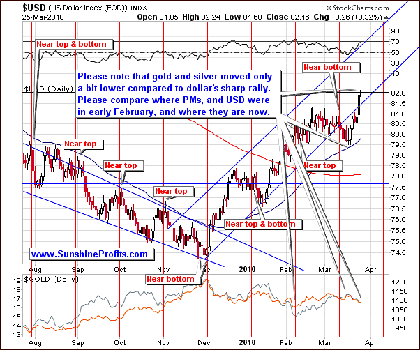
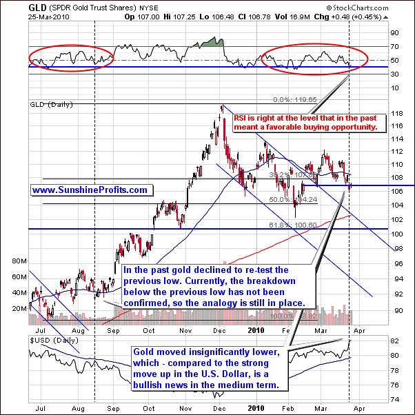
What is even more visible on the short-term chart than it was the case with the long-term one is the way PMs reacted to the recent strength in the U.S. Dollar. Please note that even though the USD index had a significant rally, Gold and Silver were basically unharmed as they moved down just slightly. We realize that the very recent downswing in PMs might have appeared dramatic on a day-to-day basis; it is much less so when one takes compares it to the analogous move in the U.S. Dollar. This certainly bodes well for the possibility of higher prices in the precious metals going forward.
Summing up, despite this week's price appreciation in the USD Index, we are still not bullish on this market. Given the historical significance of the RSI being at 70 and the fact that the USD Index has just touched the 50% retracement of the previous rally leads us to anticipate that the recent USD Index rally will stall out and retrace. In addition, a rally for PM stocks is looking more and more probable.
General Stock Market
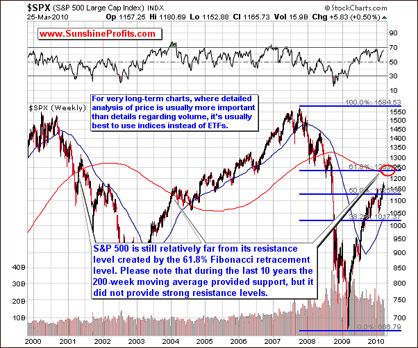
We would like to begin this part of the update with a very-long-term chart of the S&P 500 Index. One of the e-mails that we received this week included the information that the SPY ETF is right at its 200-week moving average, which - as it was stated in the message - is likely cause the main stock indices to decline. We would like to comment on that issue, because it allows us to explain how confirmations and non-confirmations work.
Before we start, please keep in mind that when doing detailed analysis of price action the very-long-term charts it is better to use the indices and ETFs based on them. The reason is that in the very long run, the value of the ETF may not properly represent the index - the small differences in movement between S&P 500 and the SPY ETF don't matter much on a day-to-day basis, but if they accumulate, they then can distort the technical picture of the market. So, which one should you follow? Naturally, the decision is up to you, but we prefer analyzing the index itself than using its derivative (the ETF), if the latter doesn't provide us with additional information - for instance while analyzing smaller time-frames the analysis of volume is very important. So, since the underlying index doesn't confirm the signal, its strength is limited.
Therefore, when taking a look on the S&P 500 index we see that its value is currently visibly below its 200-week moving average. Moreover, even if that wasn't the case (and we were at the 200-week moving average), it would still not provide us with much information. The above chart points out that over the last 10 years the 200-week moving average used to provide support but did not provide strong resistance. This phenomenon is in fact visible also on the SPY ETF chart.
Another interesting thing is the way the value of the S&P 500 shaped in 2004 - please note that it broken through the 200-week moving average without a pause, and then stopped around the 2002 high. After this took place the S&P 500 found support at the 200-week moving average. Should that be the case also today, we might see further strength in the main stock indices followed by some kind of consolidation once it moves above the area marked with red ellipse.
In addition, the above chart shows that at current levels there is a lot of room before it hits its resistance level identified by the 61.8% Fibonacci retracement level. Naturally, it might be the case, that stocks move above this level and then verify it as support. Either way, this implies that a significant decline is not very likely at this point and the general market could rally further.
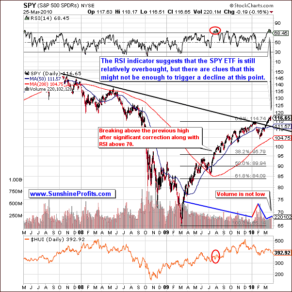
Looking at the long-term chart for the Spiders ETF (SPY) the RSI indicator suggests that it is now relatively overbought. However, past price behavior shows that the current RSI level is not enough to prompt a breakdown. Please note that except for the very recent decline, there was just one time during the post-2009-bottom rally when we've seen a significant two-staged correction that took SPY ETF below its 50-day moving average and that was the case in June/July 2009.
After that particular decline the general stock market rallied strongly (as it was the case recently), which caused the RSI indicator to move above the 70 level (again, as was the case very recently). Please note that this fact alone did not cause stocks to plunge. Instead, they moved higher after consolidating for some time. How did PMs performed since that time? They rallied strongly.
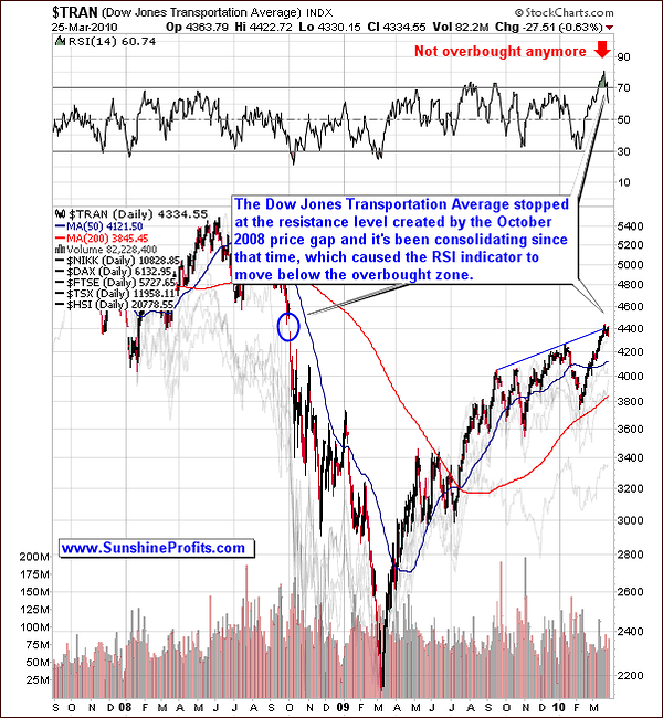
In the previous Premium Update we mentioned that The Dow Jones Transportation Average index ($TRAN) was extremely overbought, but the above chart shows it congesting at the resistance level created by the October 2008 price gap, which consequently caused the RSI not to be overbought anymore. This indicates that the next move does not need to be lower.
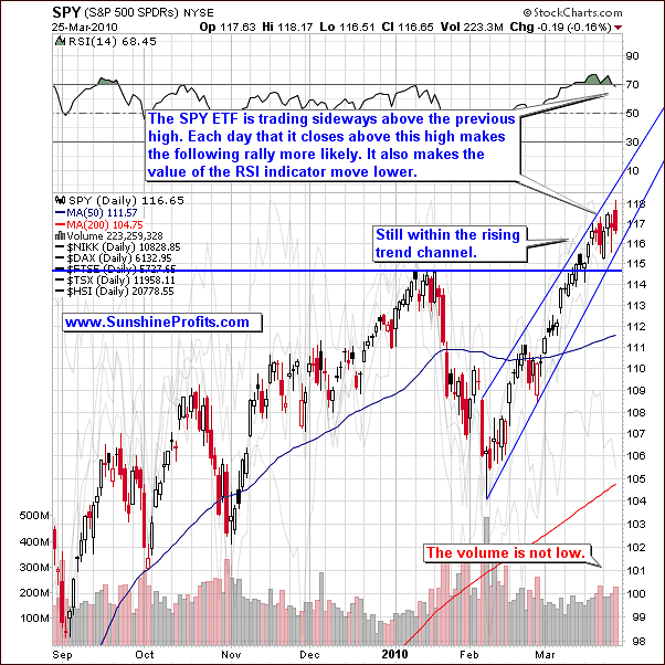
The short-term SPY chart also shows that it is currently staying within a strong up trending channel on healthy volume levels. This technical evidence implies that the decline is much less probable than it was a week ago.
Summing up, based on past price behavior on the long-term chart and the patterns forming on shorter-term charts we have a situation where the probability of the rally continuing is relatively high. This analysis is further being confirmed by strong volume and to be able to continue to operate within a strong up trending channel. Even if the general stock market moves below the trading channel as it continues to trade sideways, it will still not provide us with a sell signal, if it manages to stay above the recent high.
Correlations
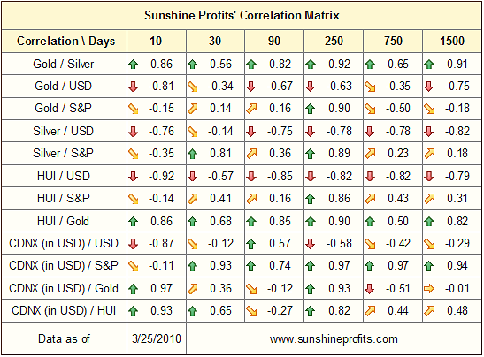
The main thing to notice on the correlation matrix this week is how we are starting to return to the highly negative correlation between the U.S. Dollar and the precious metals. Look over the last 10 trading days how that the Gold/USD, Silver/USD and HUI/USD are all starting to increasingly get more negative.
Additionally, please take a look at the 30-day column and the values of correlation coefficients between Gold and USD Index / S&P 500. What is particularly interesting is the fact that for the first time since many weeks the correlation between gold and USD Index is stronger than with the general stock market. Moreover, that is also the case with the HUI Index.
When we commented on the correlation matrix last week, we wrote the following:
These values are nothing to call home about per se, but once you compare them with the values from the previous week we see that they have all declined, suggesting that perhaps we won't have to wait too long for the return of the strong negative correlation between PMs and the USD Index.
This week, we see stronger evidence of the return of the negative correlation between gold and USD Index, which (as mentioned two weeks ago) is one of the things that would indicate that the PM market is ready to move higher.
Summing up, we see more sings of the return of the negative correlation trend between the precious metals and the U.S. Dollar, which is bullish for PMs and PM stocks.
Gold
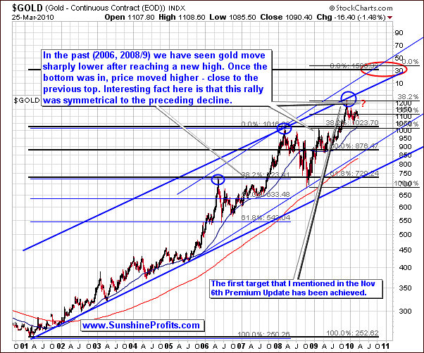
In the previous Premium Update we featured two very-long-term silver charts, which generated a lot of positive feedback, and we were asked to provide a similar analysis for the gold market. Consequently, let's begin with the analysis of the very-long-term gold chart in order to find out more about the next move that gold is likely to take.
Let's focus on what happened after 2006, as that is more or less when the second stage of the bull market in the precious metals began. The maximum range of the correction was the previous high, and this level (more or less) has been achieved in February, so we might assume that the main bottom is in. The second thing is that it has to take at least a few months before the bottom is in - should that not be the case, one might expect a double-bottom as it was the case in 2006. Again, the gold declined for more than a month and it wasn't just a one-stage decline like in 2006.
Based on these assumptions, let's see how gold price performed after the bottom was reached. What we see is that gold price used to move higher and then top out near the previous high - it didn't break into new highs immediately, but it launched a significant (definitely tradable) rally. Moreover, the shape of the upswing reflected the preceding downswing. Should that be the case also today, we might see gold move quickly higher toward the $1,200 in a similar way to the way it declined in December 2009.
Let's take a look at the shorter time frames for details.
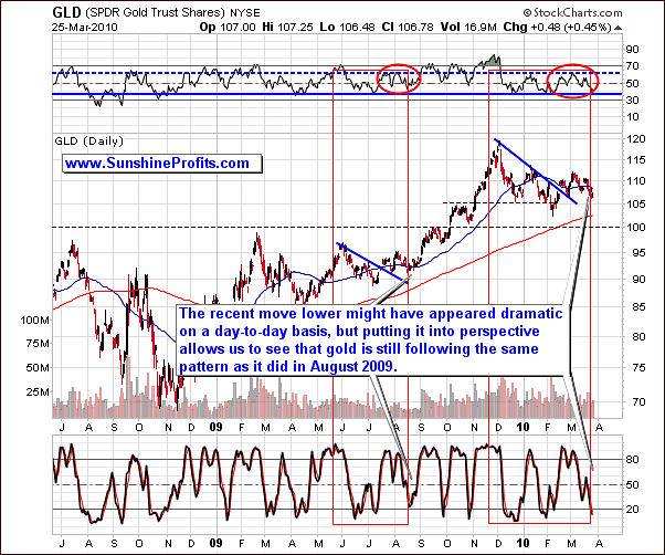
Little has changed this week in comparison to last week's Gold analysis. This might seem a bit strange at first given that the recent moves lower might have appeared bearish when one observes the gold market on a daily basis. However, from a broader perspective it is still in the same pattern as Gold was in August of 2009 before beginning a rally.
Using the Gold Trust ETF (GLD), which is a proxy for the Gold market, the current stochastic level of around 20 and the RSI around 70 are also similar to the August 2009 pattern. In the past we have also came back to re-test the previous low, which has not taken place, further confirming our bullish analysis.
I realize one might perceive the last 6-week action as a bearish head-and-shoulders formation, but before opening short positions, please note that the August 2009 action was also similar to this pattern, and Gold managed to rally very strongly soon after that. Moreover - based on yesterday's closing price - the formation is not completed, as prices failed to move decisively below the late-February bottom. What's even more interesting, at the moment of writing these words, the value of the GLD ETF has just moved decisively above that low, which - if GLD manages to close above it - serves as a strong bullish signal.
Another piece of evidence that can be used for the bulls is that even with the big move in the U.S. Dollar this past week caused Gold to move only insignificantly lower. This relative non-divergence is pointing to a medium term rally.
Summing up, the bullish analysis in Gold is definitely still intact given the strikingly similar pattern in place back in August of 2009 where we had some consolidation followed by a significant rally.
Silver
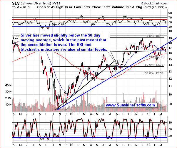
Much like the Gold market the Silver market's long-term and short-term charts are confirming the same things. In the case of the Silver market it is retracing back to the 50-day moving average, which in the past (August 2009) has indicated the consolidation pattern is coming to an end. Please note that in both cases the previous move lower began after a double-top, which serves as a confirmation that silver is still following the August 2009 pattern.
Historically the 50-day moving average has served as good support in this market. Factor in the rising short-term support line and you can see how we are in position to see at least a short-term rally.
Another similarity to the past rally formation is the RSI level, which is in the middle of the trading range as well as the current stochastic level both of which indicating we are generally in a buying zone. This is not a traditional way to interpret these indicators, but based on our experience one should fine-tune the parameters, and even the way of using each indicator so that it fits a particular situation on a particular market. In case of silver, and the similarity between today, and August 2009, what we see today is a bullish confirmation.
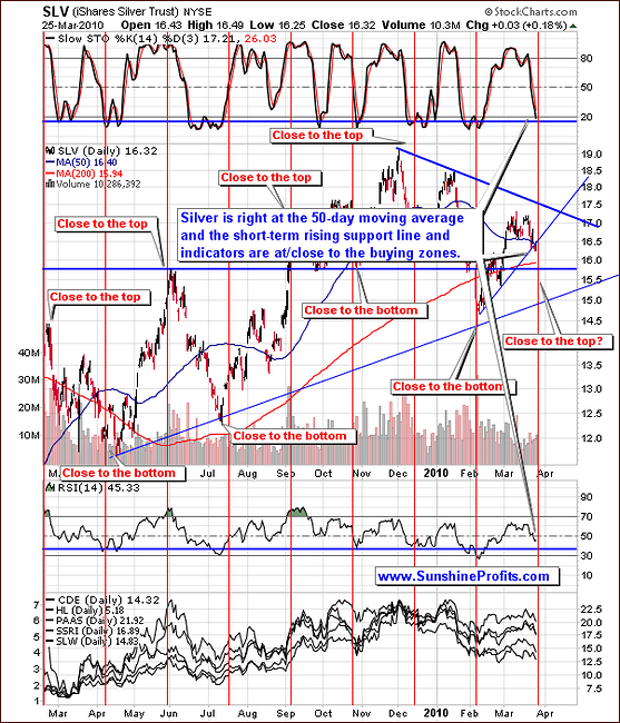
Summing up, a short-term bullish move could be in the works bolstered by past pattern similarities such as making a double top and then retracing back to the 50-day moving average. In addition, you have support in an up trending channel line with favorable oscillator readings (i.e. RSI, Stochastic). We will need to confirm this bullish outlook by watching for a turn up in prices on strong volume.
Precious Metals Stocks
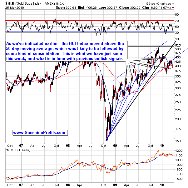
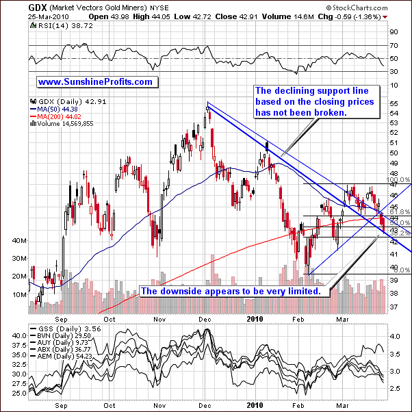
For the most part this week PM stocks moved significantly lower, this can be disconcerting to investors. However, looking at the long-term chart the bullish scenario is still alive and well. For example, the HUI Index has moved above the 50-day moving average this week. Based on the analogy to the previous bottoms this is a bullish signal. Moreover, the RSI indicator on the HUI chart has now touched the thin blue line, which used to mark bottoms during consolidations.
Moving on to the shorter-term chart please notice that this week that we drew in a second support line. Generally, there are many ways that support/resistance levels can be drawn, but base on our experience in this market, the most important ones are the one drawn from extremes (in this case daily highs - thin blue line) and the one based on the closing prices (thick blue line). While we don't put all of these lines on each chart (it would make them hard to read), we do take them into account while preparing updates/alerts.
Looking at the chart the support line is holding support as it intersects with key Fibonacci support levels, the lowest one being very close to where GDX closed on Thursday. Therefore, the chart suggests that any downside that might come is relatively small compared to big upside that could be realized on a rally.
Summing up,with the long-term chart continuing to be bullish and the RSI levels right at past bullish levels we remain optimistic that PM stocks will indeed rise again and that the consolidation might be over. In addition, we have a situation where the risk to the downside is much lower than the potential reward that could be realized on the upside.
Precious Metals Stocks' Performance Relative to Other Stocks
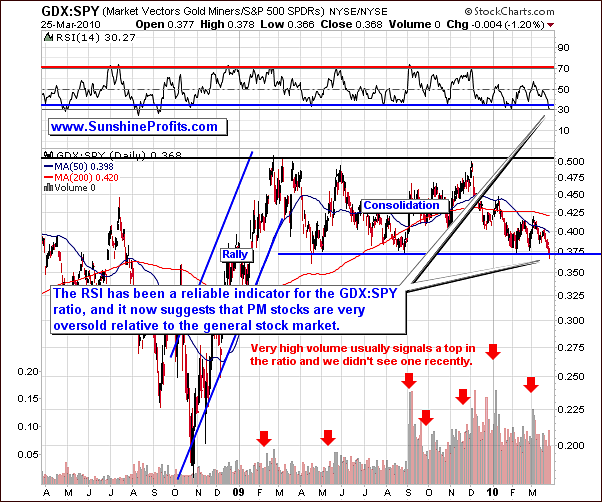
The featured GDX:SPY ratio is the way to measure if PM stocks outperform the general stock market or vice-versa. In this case we see that PM stocks have been lagging, and that it seems that the end of this stagnation is near, as the ratio moved to the lower border of its multi-month trading range. Additionally, please note that accompanying RSI indicator moved below the horizontal blue line - to the 30 level, which marked bottoms in the past.
Summing up, the PM stocks are much oversold relative to the general stock market, and it seems that this situation is going to change very soon, and we will see higher values of PMs along with PM stocks.
Sunshine Profits Unique Indicators
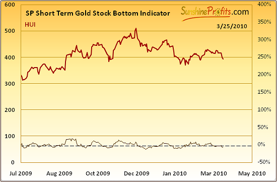
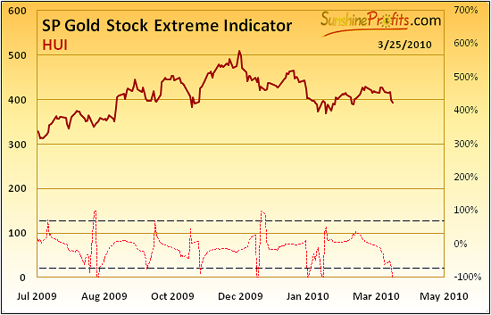
In the latest Market Alert, we mentioned that we have just seen a buy signal from the SP Short Term Gold Stock Bottom indicator, and we were very close to get one from the SP Gold Stock Extreme Indicator. In fact thas is what followed.
As a reminder, the first indicator provides buy signals then it falls below the dashed horizontal line and starts to rise once again, and the second one provides an "extreme" reading whenever it crosses any dashed line in any direction. The SP Short Term Gold Stock Bottom indicator is often early in providing buy signals, so it is usually best to keep the initial position small until the bottom is confirmed - which is one of the reasons why we suggest opening only a small speculative position in this week's Alert.
Please note that both indicators are currently below their respective dashed lines, which means that they will provide us with another buy/extreme signal relatively soon. This is also in tune with the latest alert - we wrote that this [the rally] may not take place right away, as it was the case in August, but the odds currently favor a move up.
Summary
Much has changed on the precious metals market since we posted the previous Premium Update. Back then we've summarized that the precious metals market appears to be ready to move lower (along with the general stock market) relatively soon, and based on today's (Friday) action it seems that the second part of the correction has just started. That was the case and we've sent out a Market Alert indicating that we may be ready to move higher, which may not take place right away. Consequently, we've seen gold move insignificantly lower on a daily basis, but it managed to move back up, so the question remains - what's next?
General stock market appears to be consolidating after breaking above the previous high, and the USD Index moved to its resistance level after having rallied strongly. This rally caused gold to move lower, but its decline was relatively small. This is bullish for PMs in two ways. Firstly, it means that gold is once again becoming negatively correlated with the USD Index, which in the past meant that PMs are ready to move higher. Secondly, it suggests that the gold market is strong, as it has held up relatively well.
Going forward, the main theme from this Premium Update is to look for the PMs and PM stocks to start moving higher. It seems that the best approach right now is to wait for the confirmation that the bottom is in, and then it might be a good idea to add to one's long positions in the PM sector.
Again, should anything change regarding the PM sector, we will send out a Market Alert. If we don't send one, it means that points made in this report are up-to-date.
This completes this week's Premium Update.
Thank you for using the Premium Service. Have a great weekend and profitable week!
Sincerely,
Przemyslaw Radomski

