
Silver moved considerably higher on Friday and in the early hours on Monday, so the question is if anything really changed.
In the past updates we have used the RSI and Fibonacci retracement levels to estimate how similar the current move up is to the previous patterns and in which part of the pattern we currently are. This time, however, we would like to feature a more direct approach – let’s take a look at the price directly. While Fibonacci retracements are relative tools, the RSI is not – in other words, it will show similar results only for patterns that are similar in size. However, the current rally was much bigger than the previous ones, so in addition to the RSI analogy mentioned in the recent updates, we would like to provide you with a different view on the similarity between previous rallies and the current one.
We will compare current moves in silver to 3 situations from the past – each preceded by a major rally in the white metal.
Please take a look at the following 3 charts (courtesy of http://stockcharts.com) for details. The sizes of the previous rallies have been altered so that the major rallies match. Let’s begin with the most distant rally.
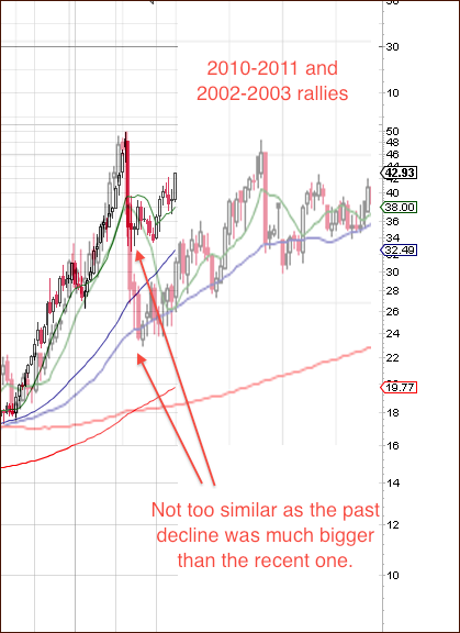
The first rally is not really similar – but we decided to include it to follow our methodology with the “to the letter” approach. The decline in 2003 was much sharper than the 2011 one, so the price analogy is not too visible. Consequently, the following pattern doesn’t provide us with much information other than the 50-week moving average had been reached before the decline was truly over.
Let’s take a look at more recent comparison.
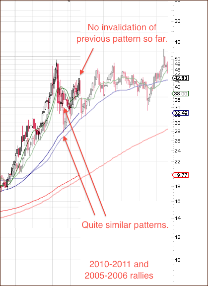
On the above chart we see that both price patterns are much more similar than the ones seen on the previous chart. The post-top decline and consecutive bounce took place more or less at the same time. The most interesting part of this chart is the “what’s next” part. If the high similarity remains in place, then we are on the verge of a sharp move lower. When compared to silver’s 2006 performance, the most recent 2-day upswing doesn’t look bullish at all.
Here’s the final – and most recent – chart for today.
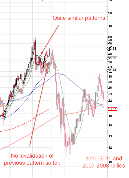
In case of the 2008 decline, we once again see significant similarity between the two patterns. In 2008, the corrective rally had started a few weeks later than it was the case this time, but it stopped more or less at the level where silver is now. Additionally, taking the initial lag into account (accounting for the fact that silver rallied earlier this time), we could expect the top to be formed earlier as well.
Summing up, the situation in silver looks very favorable from the very short-term perspective, but taking a broader view allows us to see that the situation is much more risky than it appears at first sight. Consequently, we continue to believe that a correction in silver is still likely to be seen in the following days/weeks.
We will continue to monitor this situation for more precise signals and report to you accordingly. It seems that the following days may tell us much and allow for a clearer and more complete analysis of the precious metals markets and especially the general stock market. Again, you will be notified via Market Alerts as soon as anything changes.
Our next Premium Update is scheduled for Friday, August 26, 2011.
Thank you
Sincerely,
Przemyslaw Radomski

