Briefly: in our opinion, full (250% of the regular size of the position) speculative short position in gold, silver, and mining stocks is justified from the risk/reward perspective at the moment of publishing this Alert.
Gold is turning vigorously lower. And not only gold at that. Red, red, everywhere in precious metals you look. The silent scream we wrote about yesterday brought serious repercussions. In today’s alert, we devote extraordinary attention to the short-term picture throughout the PMs complex and how it affects the long-term charts and the 2012-2013 – now link in gold. Ladies and gentlemen, better take your seats. Well worth the long read.
Yesterday’s Alert was quick and timely as it was important to keep you informed as gold and silver approached their resistance levels. Today, both metals are moving lower in the pre-market trading- silver erased more than 48 hours of gains and gold more than 24 hours of gains. Consequently, it’s not imperative to deliver today’s analysis during the intraday moves, and we will use this opportunity to catch up with discussion of more long-term oriented signals. But not only that. Today’s Alert is going to focus on three main areas:
- Short-term developments in gold, silver, and mining stocks.
- Update on long-term charts and signals
- Update on the short-term implications of the 2012-2013 – today analogy.
We’ll also share a few words on the recent Brexit-related developments.
In our subjective view, the further down the above list we go, the more interesting is the material that we will cover. The first point is most timely one, though, so we will start with it, leaving the analytical dessert for the final part of the analysis.
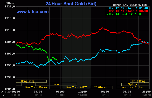
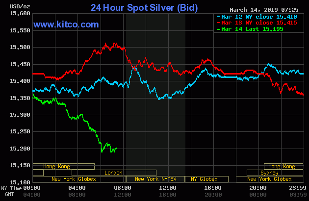
Let’s being with a look at the overnight performance. It’s important because it shows prices are already much lower than it might appear based on the daily charts.
Feeling the Pulse of Gold, Silver and USD Index
A few hours can make a lot of difference, especially for the silver price. Silver is not only below yesterday’s lows – it’s also below Tuesday’s lows. About 15 cents below them. The attempt to ignite a rally seems to have failed. In case of gold, it’s not as crystal clear, but still clear enough. The yellow precious metal moved below yesterday’s lows, invalidating the entire daily gain. It’s almost as low as it was 48 hours before. This means that the $1,310 level that we described as strong resistance, has indeed held. This adds the necessary context to the following daily charts.
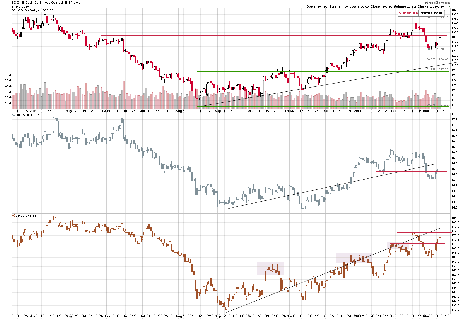
On the above chart, we see that silver reversed, that miners moved higher, but only a bit, and that gold rallied. Based on the previous intraday charts, we already know that both precious metals have already invalidated yesterday’s strength and that there was no breakout above the resistance levels.
We warned that if the USD Index declines once more before rallying, PMs might move a bit higher, but that it would likely not be anything to call home about – and it seems that is exactly what has happened.
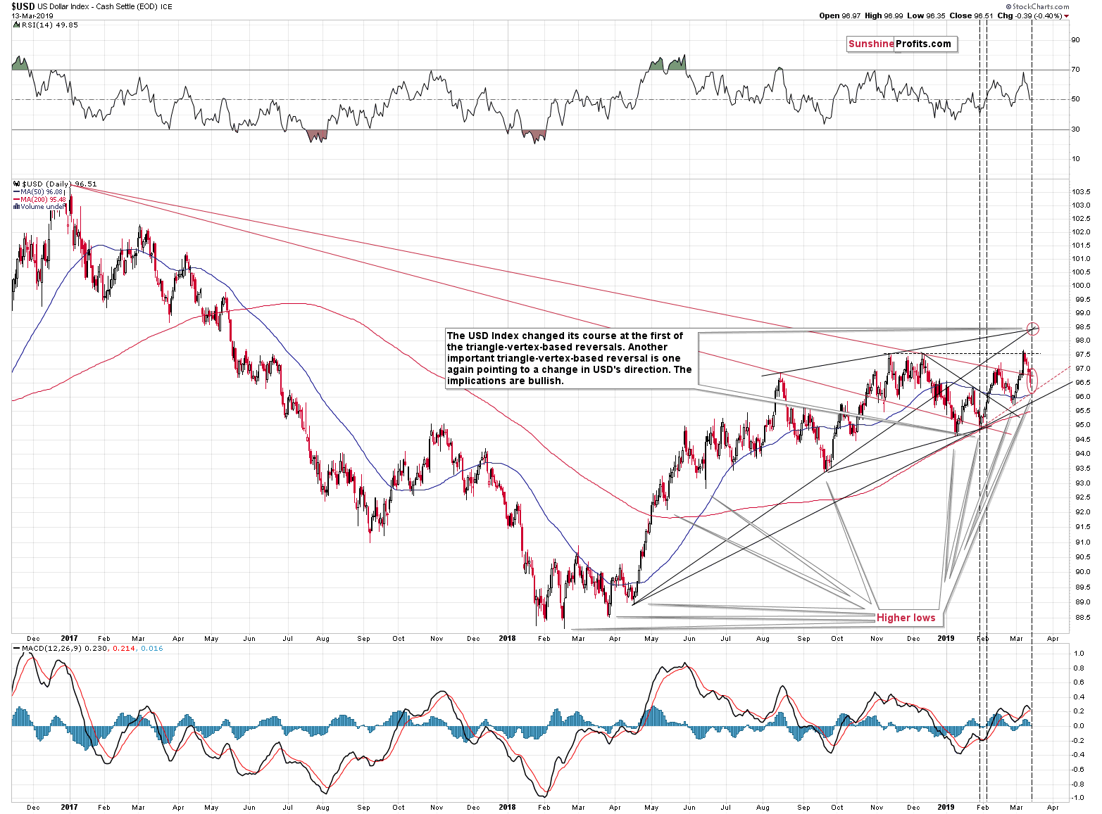
The USD Index moved to the lower one of our mid-March target areas.
What’s so special about the middle of March? Why are the targets at that time?
It’s because of the triangle-vertex-based reversal that suggested an important top or bottom in mid-March. Please note how well this technique worked previously – after the first month of the year, the USDX bottomed and moved to new yearly lows. Based on the most recent short-term decline, it seems that the next turnaround is going to be a local bottom or that the bottom has already formed.
Before moving back to the PMs, please take a look the bottoms that we saw since early 2018. For more than a year, we’ve been seeing higher lows. We also saw higher highs on average, but it’s not as clear, as it is in case of the bottoms. This is the very definition of a bull market – higher highs and higher lows.
It’s also interesting that the pace of growth of the USD Index declined after May 2018. You see, the USDX has actually… Corrected after the powerful April – May 2018 upswing. It’s not clearly visible, because it’s a running correction. This is the kind of correction where the market needs to take a breather, but it’s actually too strong to decline during this correction, so it just moves sideways. It’s characteristic of only the strongest bull markets for the sideways movement to take the price higher on average. And that’s exactly what we saw in case of the USD index.
When the USD Index breaks above the corrective pattern, it’s likely to soar and take the PMs to much lower levels. And it seems that it’s about to take place.
Moving back to the PMs, we would like to point your attention to the way silver corrected.
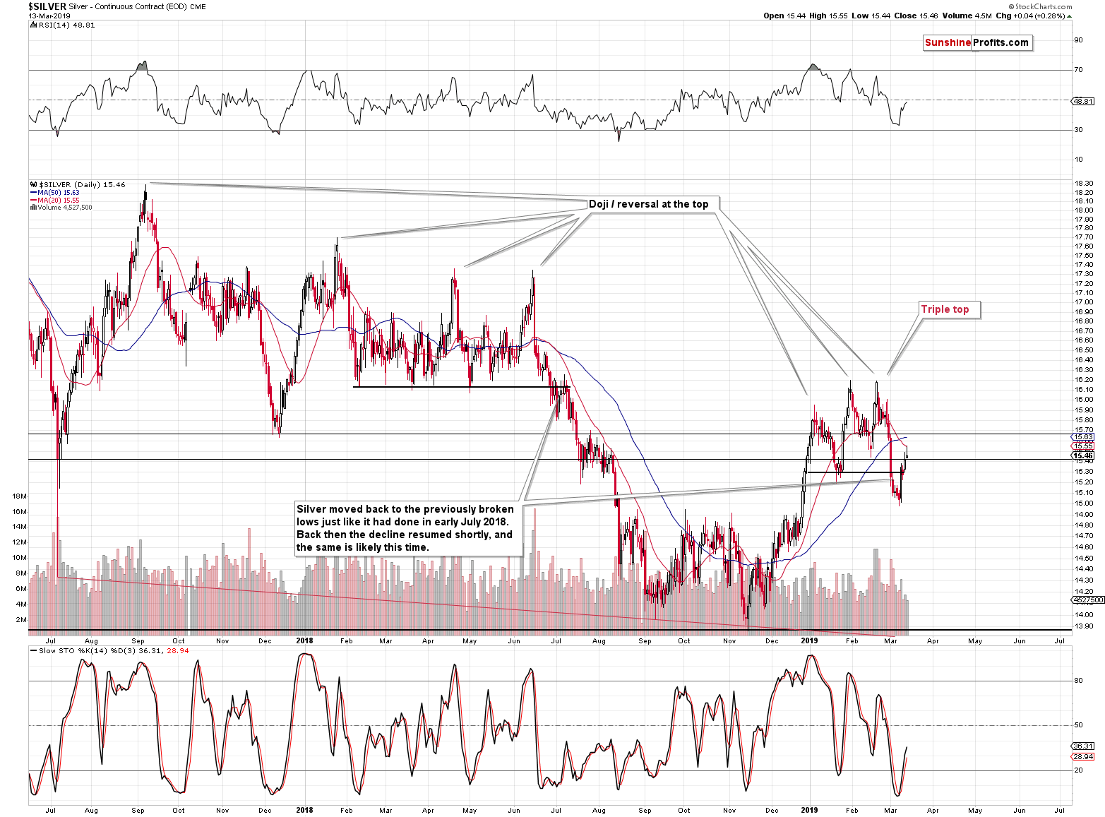
The move in the white metal is very similar to what we saw in July 2018. In particular, it’s similar to both situations: from July’s beginning, and from its final part. Silver moved back to the previous low and to the 20-day moving average (marked with red). Silver’s shooting star candlestick is also a bearish indication because that’s the way in which silver ended the early-July 2018 correction. Yesterday’s reversal was not confirmed by strong volume, which would be a concerning factor if it wasn’t for two facts:
- The early-July 2018 reversal also formed on relatively low volume
- It’s silver. Many general technical rules don’t apply to silver or they apply, but in a non-standard way (silver’s breakouts often turn into fakeouts etc.). This is what makes silver so difficult to trade for beginners.
The implications for short-term precious metals charts are bearish.
Having said that, let’s move to the long-term developments.
Long-term Update on Gold and Silver
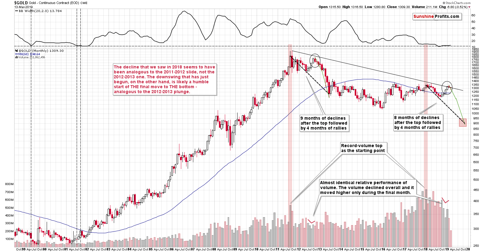
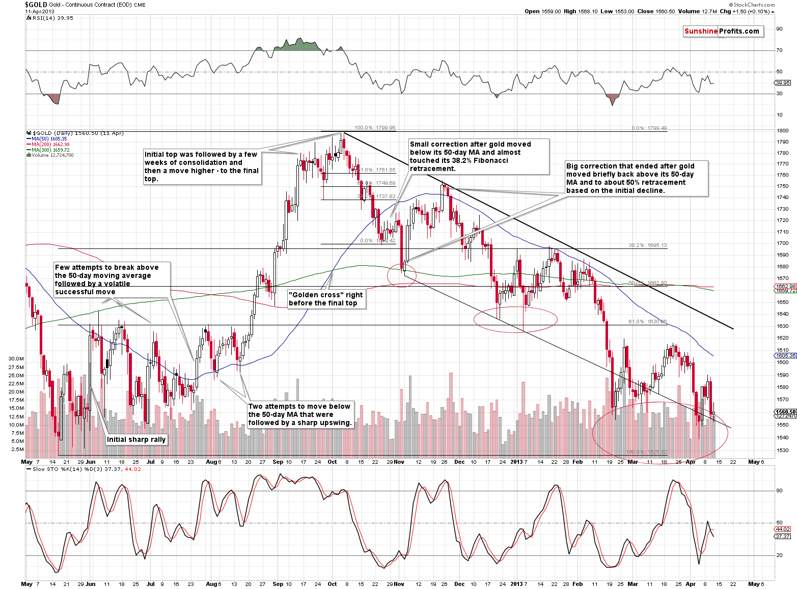
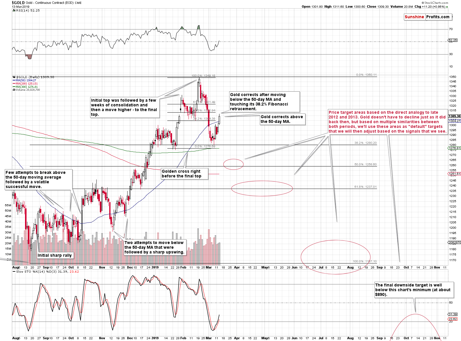
First things first – gold’s analogy to what happened in 2012 and 2013 remains up-to-date. Consequently, it seems to be worth to recall the description of the above chart. As we explained on March 4th, the analogy is striking also in silver and mining stocks, but we don’t want to quote the entire previous Alert here, so we will simply quote what we wrote about gold:
The very first few months of the 2018 were similar to the late-2012 decline, so it was natural to start the analogy with these moves. As we now see, something else fits the analogy better. The record-breaking monthly volume that we saw in 2011 and in 2018 is something that starts an analogy that is confirmed by multiple developments (and not only from gold) and the most recent upswing doesn’t invalidate it. Conversely, it fits and confirms it.
Starting with the record-breaking volume (marked with red rectangles), in 2011 we saw 9 months of declines, and in 2018 we saw 8 months of declines. In both cases, we then saw 4 months of higher prices and then a month where gold moved higher only on an intraday basis, but declined in terms of the monthly closing prices. Both tops formed not too far from the previous high, but still below it. Then gold kept declining for several months.
Quite interesting so far, isn’t it? And we’re just getting started.
The similarity is not only in price. The monthly volume readings are remarkably similar as well. When gold rallied in mid-2012, it did so on declining volume that increased in the final monthly upswing. It was exactly the same case in late 2018 and in January 2019.
What about the shape of the initial decline (late-2011 – early 2012) that was rather chaotic and volatile compared to the stable nature of the mid-2018 slide?
Looking at it with the benefit of hindsight, it’s easy to see why these moves were different. It’s the question of what preceded them. In particular, it’s the question of what kind of volatility was present overall. The former move was preceded by the parabolic upswing in gold prices and the top, while the latter was yet another (boring?) attempt to rally above $1400, which ultimately failed. The volatility that was present at and below the former was very high and the volatility that was present at and below the latter was very low. Consequently, it’s normal and natural to expect that the former decline would be volatile and chaotic, and the latter would be calm. This is normal, not something that breaks the analogy. You can check the volatility levels by looking at the upper part of the above chart – it includes the Bollinger Band width, which can be used as a reliable proxy for volatility.
The above chart shows no deviation from the above-mentioned self-similarity. Gold is down this month, but not extremely so – just like it was the case in the early part of the decline in 2012. The fact of gold moving higher in the last several days didn’t change anything. Our gold price forecast remains very bearish for the medium term.
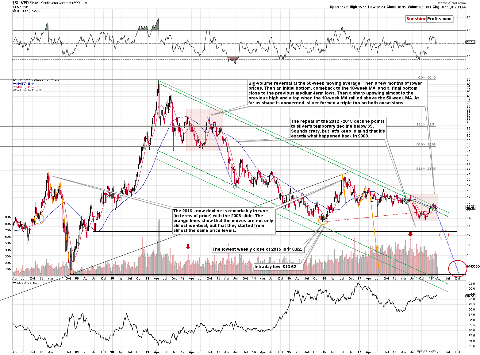
Silver’s very long-term chart also shows that nothing materially important changed even without taking into account today’s pre-market decline. Silver once again invalidated the small breakout above the long-term declining green resistance line. Also our silver price forecast remains very bearish for the medium term.
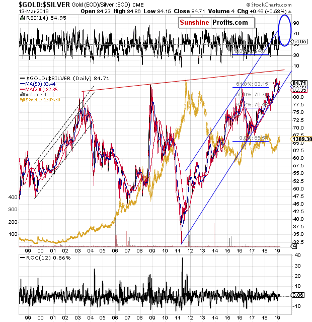
The relative performance of both markets also continues to have bearish implications. The gold to silver ratio is on the rise once again – as the brief correction after breaking above the previous highs has run its course. The true long-term resistance is at about 100 level, so the ratio still has a long way to go before this level is reached. Since this ratio generally moves inversely to gold and silver prices, both metals are likely to decline.
Please note that it’s not just the value of the ratio itself that suggests higher readings – it’s the time factor as well. In the past two decades, there was no other case when the gold to silver ratio stayed so long above the 80 level. All previous attempts were invalidated rather quickly. This time, the ratio simply pulled back, but remained strong and rallied once again after bouncing off the rising support line. The implications remain bullish for the ratio and bearish for the PM prices for the next few months.
Oh, and by the way, it may seem like our target area is too close in terms of time, but please note how sharply the ratio did soar when it was close to 80. Such sharpness is quite natural at those levels, so the above “daring” prediction is justified.
The final long-term chart that we would like to feature today is the one of the USD Index.
Long-term Update on the USD Index and the Brexit Curveball
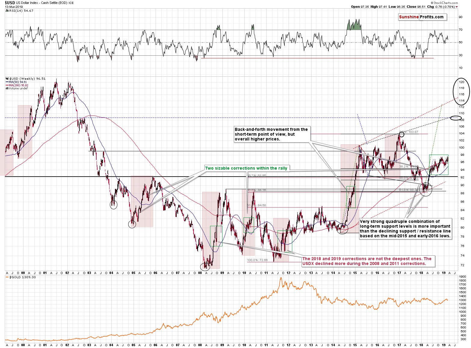
We already wrote about the running correction in the USD earlier today and the above chart shows what we saw happen during the previous big upswings. In 2010 and in 2014 (areas marked with green rectangles), we saw back and forth movement during which the USD Index still moved higher overall. These running corrections took place close to the middle of the rally, a bit closer to its start than to its end. Applying this to the current situation suggests a move much higher, above the 2017 highs – likely to the 108 level or even slightly higher, to the rising blue resistance line based on the 2015 and 2017 highs.
Of course, one may say that the USD can’t rally because of the US debt and other problems related to the US economy, but… We would like to remind you about two major things:
- The US debt situation was not much better in 2014 when the USD Index started its massive 20+ index-point rally.
- The USD Index is based on currency exchange rates and the latter are relative valuations of one currency vs. the other. Two biggest components of the USD Index are US dollar’s exchange rates with the euro and with the Japanese yen. With all the troubles related to Brexit, the EU debt, the recent dovish comments from the ECB, and Japan’s relentless money printing, it’s not a question if the situation in the US is perfect. It’s a question whether it’s better than in the Eurozone and in Japan (and to smaller extent in other countries). And it doesn’t seem that things are better in the EU and Japan than they are in the US. The logic of international money flows is that money goes there where it’s treated best – and the U.S. is still the best looking house in a bad neighborhood. And it can accommodate large international money flows due to the sheer depth of the Treasury markets. Take a look at the bond yield perspective – the Treasuries carry such yields that make them look like junk bonds when compared internationally. Or, negative interest rates anyone?
The long-term outlook for the USD Index remains bullish and the implications for the precious metals market remain bearish.
By the way, we promised to write a few words on Brexit. Many months ago, when the Brexit vote turned out to really be Brexit and not Bremain, we wrote that this doesn’t mean that the Brexit will really take place. The outcome of the vote was shocking to the authorities, which likely thought that this will simply be a formality that ends all the “let’s leave the EU” requests once and for all. And it turned out to be exactly the opposite. We wrote that the Powers That Be have a lot of aces up their sleeves and if there was one thing sure about the Brexit, it’s that it will appear that nothing bad happening happened as a result of the government. And our bet was that the Brexit will not take place at all. A lot of time has passed, a lot of discussions took place, and a lot has been done to change the views of the UK citizens. Now, the question remains, how to design everything so that it still looks like all the authorities did everything they could to be the best representatives of their voters.
And it seems they found the way. This article shows what options are being discussed. Quoting:
On the other hand, it’s hard to say what Parliament would hope to achieve with a delay. EU negotiators have made it abundantly clear there will no more concessions, whether on an Irish backstop or any of the other things Brexiteers find objectionable in May’s deal. There is no doubt the niggling hope among many that somehow Britain—having made such a botch of this initial effort—will drop the whole idea of leaving the EU, or at least put it to another plebiscite.
May even opened the door to that speculation with her comments after the negative vote, looking ahead to Thursday’s choice of an extension.“The EU will want to know why we want that extension," she said. "The house will have to answer that question: does it want to suspend Article 50, does it want a second referendum, or does it want another deal, but not this deal.”
So, we have a situation in which there is no Brexit or there is Brexit on some other terms. Terms that are not realistic, because nobody wants to agree on the same terms. The EU wants to teach the UK a lesson and show everyone else that leaving the EU is a really bad and costly idea, and the UK doesn’t want to bear Brexit’s huge cost. They just can’t “cancel” Brexit without losing face in front of the voters, so they will keep pushing different terms and disagreeing until people panic and agree to some kind of compromise…
What is the compromise? Another vote. Only that this time it will end with the “right” choice and this time the choice will never be seriously questioned, and it will be viewed as final. To be clear, there will be voices of opposition, but nobody will take them seriously. Of course, there are no guarantees that it will happen in this way, but that’s how I – PR – see it.
How could gold react to the above? Initially some volatile short-term swings, but overall gold should plunge on the Bremain scenario, just like it soared on the Brexit vote. Bremain means more stability and it means that all the UK-related political turmoil from the recent years would come to an end. The implications of the fact that a second referendum is being openly mentioned are bearish for the gold price and for the rest of the precious metals market.
Having said that, let’s discuss the third of the points that we described in the opening paragraph of today’s Alert – the update on the short-term implications of the 2012-2013 – now link.
Updating the 2012-2013 – Now Link in Gold
Based on how similar the situation is now to how it was in 2012 from both: broad and short-term perspectives, we previously created a series of target areas for gold. We wrote that these targets are just “default” values that will need to be adjusted as additional details become available.
Yesterday’s rally was one of those details. Gold moved above its 50-day moving average – something that in 2012 meant that the initial sizable corrective upswing was over – it happened in late November 2012. After this top, gold declined until reaching approximately the 61.8% Fibonacci retracement based on the previous upswing, which corresponded roughly to previous local highs. Right now, the analogous price level based on these techniques is approximately $1,240. Does it mean that gold is likely to slide there shortly? It’s quite possible.
However, it’s still possible that gold is actually repeating only the very initial part of the upswing that is about to take gold to the 50% Fibonacci retracement first – just like what we saw in early November 2012. The key difference between both rallies: the tiny late-October 2012 one and the bigger November 2012 one is the level that was reached and the sharpness of the initial decline. The initial downswing was sharper this time, which means that the initial counter-trend rally (just like the one that we saw in late October 2012) might have been also more volatile than the previous one. Therefore, the move above the 50-day gold moving average is not necessarily something that implies that the big corrective upswing is already over. That’s why we wrote that the move to $1,240 is only “quite possible”, instead of writing that it’s very likely. To be clear – it is very likely in the following several weeks regardless of the very short-term outcome, and what we’re discussing is whether we’ll see it really shortly (in a week or two) or not.
The implications are that when gold moves to $1260, it may not necessarily be the best decision to enter long positions in gold. At least not without meaningful confirmations. If the USD Index is going to break above the 2017 highs and confirm this move shortly, then gold is likely to drop significantly before we see any corrective upswing. This may mean a move to at least (!) $1,240 before we see even a weekly correction. This would almost certainly not be the end of gold’s decline, but it could be a tradable opportunity to benefit from the rebound.
At this time, we have two short-term scenarios that seem probable and they both end with gold at much lower levels, but the shape of the decline differs. It will be important to either monitor the short-term developments closely, or simply decide in advance to wait out any short-term strength while focusing on the bigger decline. As a default decision, we will stick with the trend that is most reliable (medium-term downtrend), but if we see strong bullish indications, we may enter a quick long position in the meantime.
One more thing before summarizing. Do you recall a gold chart that we featured on March 1st that had a different visual style than what we usually provide?
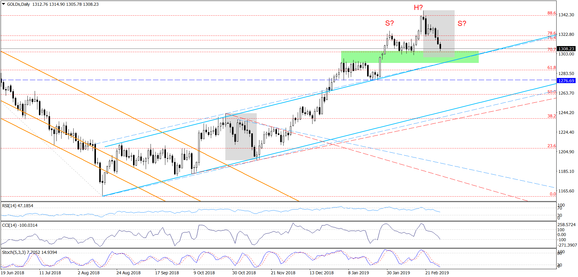
We put question marks on the above chart as what gold did might have potentially resulted in a head-and-shoulders top in gold. Gold moved below the green support area and we were right not to close the position at that time, but it turns out that the above might prove to be accurate in terms of shape and in terms of the H&S pattern in general. The right shoulder of the formation would be provided by the March upswing and the decline that seems to have started yesterday and that continues in today’s pre-market trading. Once gold confirms the breakdown below approximately $1,275, we’ll have a bearish head and shoulders pattern and the downside target would point to a decline to about $1,215. Naturally, the formation is not yet in place, so all the above is just a potential move. Still, this is yet another factor that shows it might be a good idea to keep the short position intact until strong bullish signs emerge to the contrary.
Summary
Summing up, it’s almost certain that the next big move lower has already begun and that the 2013-like slide is in its early stage. Based on the updated version of the 2013-now link, the implications are even more bearish than we had initially assumed. The downside target for gold remains intact ($890), and the corrective upswing that we just saw seems to be rather natural part of the bigger move lower – not a beginning of an important move higher. And it seems that the corrective move higher in the PMs is either over or about to be over shortly.
On an administrative note, tomorrow’s and Monday’s Gold & Silver Trading Alerts will likely be very brief due to your Editor’s travel schedule. Through today’s extensive Gold & Silver Trading Alert, we made sure that you are more than up-to-date with regard to the situation in the precious metals market. It’s unlikely that what we posted above would become invalidated, but if anything changes we will keep you – our subscribers – informed. In particular, we will let you know if there is enough bullish signals to adjust the current trading position.
To summarize:
Trading capital (supplementary part of the portfolio; our opinion): Full short position (250% of the full position) in gold, silver, and mining stocks is justified from the risk/reward perspective with the following stop-loss orders and exit profit-take price levels:
- Gold: profit-take exit price: $1,062; stop-loss: $1,357; initial target price for the DGLD ETN: $82.96; stop-loss for the DGLD ETN $39.87
- Silver: profit-take exit price: $12.32; stop-loss: $16.44; initial target price for the DSLV ETN: $47.67; stop-loss for the DSLV ETN $23.68
- Mining stocks (price levels for the GDX ETF): profit-take exit price: $13.12; stop-loss: $24.17; initial target price for the DUST ETF: $76.87; stop-loss for the DUST ETF $15.47
Note: the above is a specific preparation for a possible sudden price drop, it does not reflect the most likely outcome. You will find a more detailed explanation in our August 1st Alert. In case one wants to bet on junior mining stocks’ prices (we do not suggest doing so – we think senior mining stocks are more predictable in the case of short-term trades – if one wants to do it anyway, we provide the details), here are the stop-loss details and target prices:
- GDXJ ETF: profit-take exit price: $17.52; stop-loss: $35.67
- JDST ETF: initial target price: $143.87 stop-loss: $30.97
Long-term capital (core part of the portfolio; our opinion): No positions (in other words: cash)
Insurance capital (core part of the portfolio; our opinion): Full position
Important Details for New Subscribers
Whether you already subscribed or not, we encourage you to find out how to make the most of our alerts and read our replies to the most common alert-and-gold-trading-related-questions.
Please note that the in the trading section we describe the situation for the day that the alert is posted. In other words, it we are writing about a speculative position, it means that it is up-to-date on the day it was posted. We are also featuring the initial target prices, so that you can decide whether keeping a position on a given day is something that is in tune with your approach (some moves are too small for medium-term traders and some might appear too big for day-traders).
Plus, you might want to read why our stop-loss orders are usually relatively far from the current price.
Please note that a full position doesn’t mean using all of the capital for a given trade. You will find details on our thoughts on gold portfolio structuring in the Key Insights section on our website.
As a reminder – “initial target price” means exactly that – an “initial” one, it’s not a price level at which we suggest closing positions. If this becomes the case (like it did in the previous trade) we will refer to these levels as levels of exit orders (exactly as we’ve done previously). Stop-loss levels, however, are naturally not “initial”, but something that, in our opinion, might be entered as an order.
Since it is impossible to synchronize target prices and stop-loss levels for all the ETFs and ETNs with the main markets that we provide these levels for (gold, silver and mining stocks – the GDX ETF), the stop-loss levels and target prices for other ETNs and ETF (among other: UGLD, DGLD, USLV, DSLV, NUGT, DUST, JNUG, JDST) are provided as supplementary, and not as “final”. This means that if a stop-loss or a target level is reached for any of the “additional instruments” (DGLD for instance), but not for the “main instrument” (gold in this case), we will view positions in both gold and DGLD as still open and the stop-loss for DGLD would have to be moved lower. On the other hand, if gold moves to a stop-loss level but DGLD doesn’t, then we will view both positions (in gold and DGLD) as closed. In other words, since it’s not possible to be 100% certain that each related instrument moves to a given level when the underlying instrument does, we can’t provide levels that would be binding. The levels that we do provide are our best estimate of the levels that will correspond to the levels in the underlying assets, but it will be the underlying assets that one will need to focus on regarding the signs pointing to closing a given position or keeping it open. We might adjust the levels in the “additional instruments” without adjusting the levels in the “main instruments”, which will simply mean that we have improved our estimation of these levels, not that we changed our outlook on the markets. We are already working on a tool that would update these levels on a daily basis for the most popular ETFs, ETNs and individual mining stocks.
Our preferred ways to invest in and to trade gold along with the reasoning can be found in the how to buy gold section. Additionally, our preferred ETFs and ETNs can be found in our Gold & Silver ETF Ranking.
As a reminder, Gold & Silver Trading Alerts are posted before or on each trading day (we usually post them before the opening bell, but we don't promise doing that each day). If there's anything urgent, we will send you an additional small alert before posting the main one.
=====
Latest Free Trading Alerts:
Stocks extended their uptrend on Wednesday, as investors' sentiment remained bullish following the recent advances. The S&P 500 index was the highest since the early October yesterday. But will the rally continue despite some short-term technical overbought conditions?
S&P 500's New Medium-Term High, but Will Uptrend Continue?
=====
Thank you.
Sincerely,
Przemyslaw Radomski, CFA
Editor-in-chief, Gold & Silver Fund Manager


