- Euro & USD Indices
- General Stock Market
- Correlation Matrix
- Gold
- Silver
- Mining Stocks
- Letters from Subscribers
- Investing in gold and silver outside the US or Europe
- Gold is likely to move higher in the coming months
- Cyclical turning points explained
- Price of silver and the COT report
- Summary
Economic and political power is shifting from the West to the Rest, but the most important events of 2012 were still dominated by Europe and the Middle East. We saw the near collapse of the Greek and Spanish economies and a double-dip recession in the U.K. A critical theme in 2012 was the euro crisis. The sharpest sting was removed when Mario Draghi, president of the European Central Bank, promised to do “whatever it takes” to save the common currency. Ironically, the continent’s stock markets turned out to be good investments in 2012 with bank shares among the best performers. Overall, the Standard & Poor’s Euro 350-stock index was up 13 percent for the year, measured in euros and more than 15 percent measured in dollars.
Looking ahead to Europe in 2013, Germany will hold an election with the likely re-election of Angela Merkel. Italy will hold elections in February. If Greece is still a euro member six months from now, its troubles will continue to be a drag on the continent’s economy.Greece is expected to be the worst performer among the membership, with the OECD expecting its economy to shrink 4.5 per cent next year. The Spanish, Italian, Slovenian and Portuguese economies are also predicted to contract over the course of 2013.
It will be interesting to see how France’s new president François Hollande and German Chancellor Merkel will work together with Hollande pushing growth versus Merkel’s championship of austerity. The OECD has just issued a warning that Europe as a whole could face a “severe recession” in 2013 that would have consequences for “the rest of the world.”
In the Middle East the optimism that came with the misnamed “Arab Spring” has dissipated as spring turned into an Islamist winter. Syria's gradual and brutal disintegration will continue. It seems unlikely that President Bashar al-Assad will manage to hang on for another year and a Syrian refugee crisis of about 4 million Syrians threatens to become a catastrophe as winter sets in. The war in Syriahas already claimed 40,000 lives. What will come after Asad’s falls is anybody’s guess, but it will not be pretty; most likely accompanied by sectarian bloodshed. The victory of the Muslim Brotherhood in Egypt also unsettled those who were hoping for democracy and religious freedom in the area. The wind in the Middle East is blowing in the direction of religious fundamentalism, which, if history is any guide, is not a good sign.
Short of a diplomatic breakthrough, we could be hearing about the threat of a US or Israeli attack on Iran next summer. Mahmoud Ahmadinejad will step down after two terms when elections for the Iranian parliament will take place in June. But a new president will have no power to change Iran’s nuclear path. That is in the hands of the Ayatollah Ali Khameneiand his term is…for life. Iran continues to maintain it has every right to enrich uranium for “civilian” purposes.
In 2012 we had elections in Mexico, the Netherlands, Russia, South Korea, Taiwan and Venezuela with changes of political leadership in some of the major economies. Francois Hollande won the election in France. Japan returned the Liberal Democrats to power. China appointed a new general secretary of the Communist party. Barack Obama’s reelection represents stability in American political thinking. The U.S. will need to raise the debt ceiling early in 2013. Last year partisan shadow boxing around this issue resulted in the U.S. losing its AAA credit rating. However, things look better for the United States than for the rest of the West. The I.M.F. projects 2.3 percent growth next year, compared with 1.2 percent for Japan and 0.7 percent for the euro zone.
An ominous portent in Asia is military saber rattling between China and Japan over a group of uninhabited islands in the East China Sea. The U.S. has made it clear that the islands are covered by the US-Japan security treaty, which gives the dispute the potential of becoming a major conflagration. World wars have been started over less. On an optimistic note, the leader of North Korea, Kim Jong-eun, called in his New Year’s speech for an end to confrontation with South Korea and stressed the importance of economic development. The country “should wage an all-out struggle this year to affect a turnaround in building an economic giant and improving the people’s standard of living,” he said. This could be the harbinger of good news.
What are some of the popular economic prognosticators saying about the year ahead?
Nouriel Roubini, who predicted much of the financial crisis of 2008, expects pain across the board in 2013: “Every economy in the world is trying to push their problems to the future. (…) We start with private debt, public debt, supra-national debt–we’re kicking the can down the road and eventually this is going to come to a head in 2013.” Agreed.
Jim Rogers, who founded the Quantum Fund with George Soros, had predicted as early as last December that “2013 is going to be a mess.” Rogers attributed this to the fact the U.S. economy goes into recession every four years, and the last one happened in 2008. He said this year’s presidential ballot will push the recession forward to 2013, as President Barack Obama will be “pumping money” into the economy to get re-elected.
Peter Schiff was right when he predicted the subprime real estate bubble and said an economic crisis will strike in ’07 or ’08. Now he is saying another, even more catastrophic economic collapse, will hit the United States economy in 2013 or 2014. Forbes reported that Schiff is forecasting another economic crisis that will strike at the very heart of the U.S. economy, sweeping through the monetary system as a bond market bubble, coupled with the U.S. dollar, collapses under the weight of excessive debt. His analysis of the underlying economic problem and solution is essentially the same as it was when he predicted the 2007-2008 financial crisis. Schiff says: “We consume more than we produce and we borrow abroad, but we are never going to be able to pay them back.” Schiff says when the economic crisis hits, our money might not be safe.
Schiff cites the rising price of gold as evidence that U.S. dollar debasement, and inflation, are higher than the Fed, and consumer price data, suggest. What does Schiff suggest? The same that we do-- investing in gold. Will 2013 be really as disastrous for the US economy and the stock market? We are not so sure and we recall several times when Mr. Schiff predicted similar demise in the previous years. It’s not that we don’t agree with his main point – we are not that certain about the timing based on just technical tool (the analysis of cycles in this case).
To predict how precious metals will behave in the short run, let's begin this week's technical part with the analysis of the Euro Index. We will start with the long-term chart (charts courtesy by http://stockcharts.com.)
Before we begin – please excuse us if some parts of the update are unclear – we adjusted the update twice today before the markets opened, and at the same time we want to send it to you as soon as possible – if anything looks unclear, please keep in mind that the most important part is the summary at the end of the update. It is always checked a few extra times to make sure that it’s clear.
Euro & USD Indices
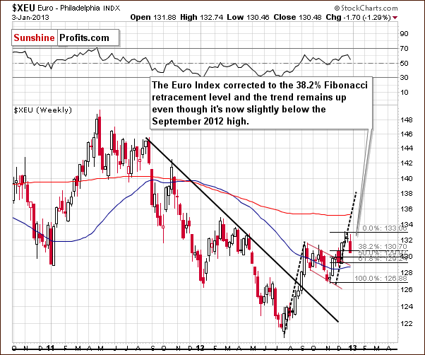
We begin this week with a look at the long-term Euro Index chart. We saw a correction on Thursday, which made the week look a bit like a bearish candlestick. There is a silver lining to the cloud, however, as it corrected only to the first Fibonacci retracement level. The suggestion here is that the trend remains up.
The short-term breakdowns below any support levels this week have not yet been confirmed as they are the result of a one-day event. So why is this important? We will see shortly in the short-term USD Index chart.
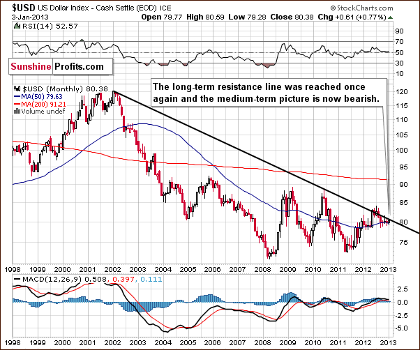
On the long-term USD chart (above) we can see that a very important resistance line is in place right now – the one that has kept rallies in check for many months. The trend is in place until it is successfully broken. Consequently, the long-term trend remains bearish.
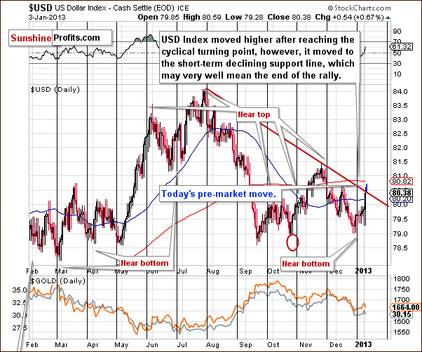
In this week’s short-term USD Index chart, we have seen a rally to the short-term resistance line, which likely means that the rally at the cyclical turning point (triggered in a technical way) could already be over. The trend here remains down and keep in mind that “the trend is your friend”. Overall, the situation remains bearish for the USD Index.
Please note that we updated the chart with a small blue line – that’s what we saw before markets opened in the US today. Gold declined early today, and the likely reason is that traders are monitoring the USD picture closely and saw a breakout. The most important thing here is that this breakout is not yet verified and at this time we doubt that it will be verified. In fact the USD Index moved lower once again right before the markets opened in the US today.
Summing up, even though a rally was seen on Thursday, it seems that the USD Index will not go much higher from where it is today. Both short-term and long-term resistance lines are currently in place. One bright spot is that we have seen a return of the negative correlation between gold prices and the USD Index. Gold declined on Thursday when the dollar rallied, though this is not really the situation we like to see. We prefer to see a bullish confirmation with gold prices moving higher as the USD Index declines.
At this time – because of the long- terms resistance line, it seems that today’s short-term breakout will be invalidated and if that takes place, gold will likely rally.
General Stock Market
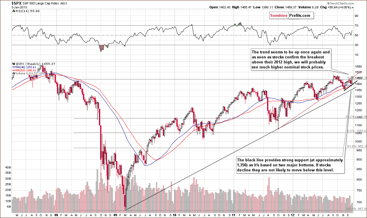
In the long-term S&P 500 Index chart, recall that we had previously commented that even if stocks moved lower, the downside appeared to be quite limited and that “the trend is your friend”. We see that stocks rallied this week, almost reaching their 2012 high, and that the uptrend remains in place. Once the 2012 high is taken out, stocks will likely move to the 2007 high and then consolidate once again. This could bring stock prices up nearly 10% from current S&P 500 levels.
Correlation Matrix
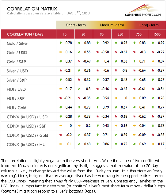
The Correlation Matrix is a tool which we have developed to analyze the impact of the currency markets and the general stock market upon the precious metals sector. In the very short-term 10-day column this week, we see that the correlations appear to be going back to normal. The Silver / USD coefficient for the last 10 days is a bit more negative than not and if this tendency remains in place, the correlations that are more important (30-day column in this case) will change as well. Simply put, the implications here this week are more bullish than not and much more bullish overall for the precious metals sector than they have been in recent weeks, because this week we see at least some signs of the return of the negative correlation between the USD Index and the precious metals market.
Gold
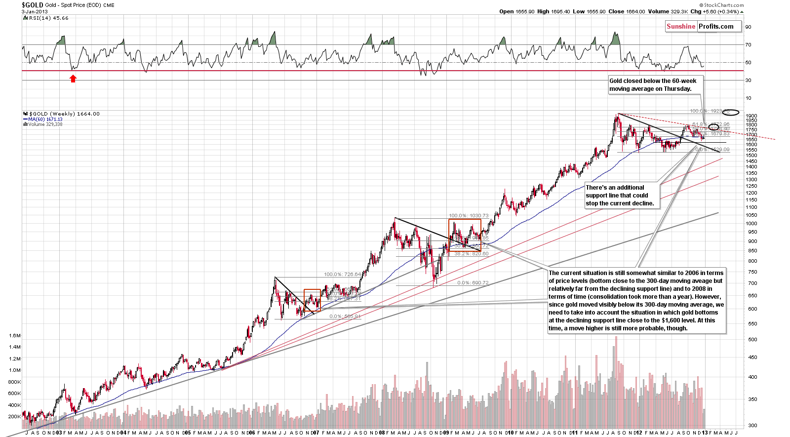
In gold’s very long-term chart, we do not see bullish implications this week. Gold’s price is no longer above the 60-week or 300-day moving average, so the situation has deteriorated this week. The situation remains bullish for the medium term, however, in spite of these developments. This is based on similarities with 2009 and late 2006-early 2007. Gold consolidated after breaking out above triangle patterns in both cases.
On this chart we can see that the next support level is at the late 2012 low – at $1,636.
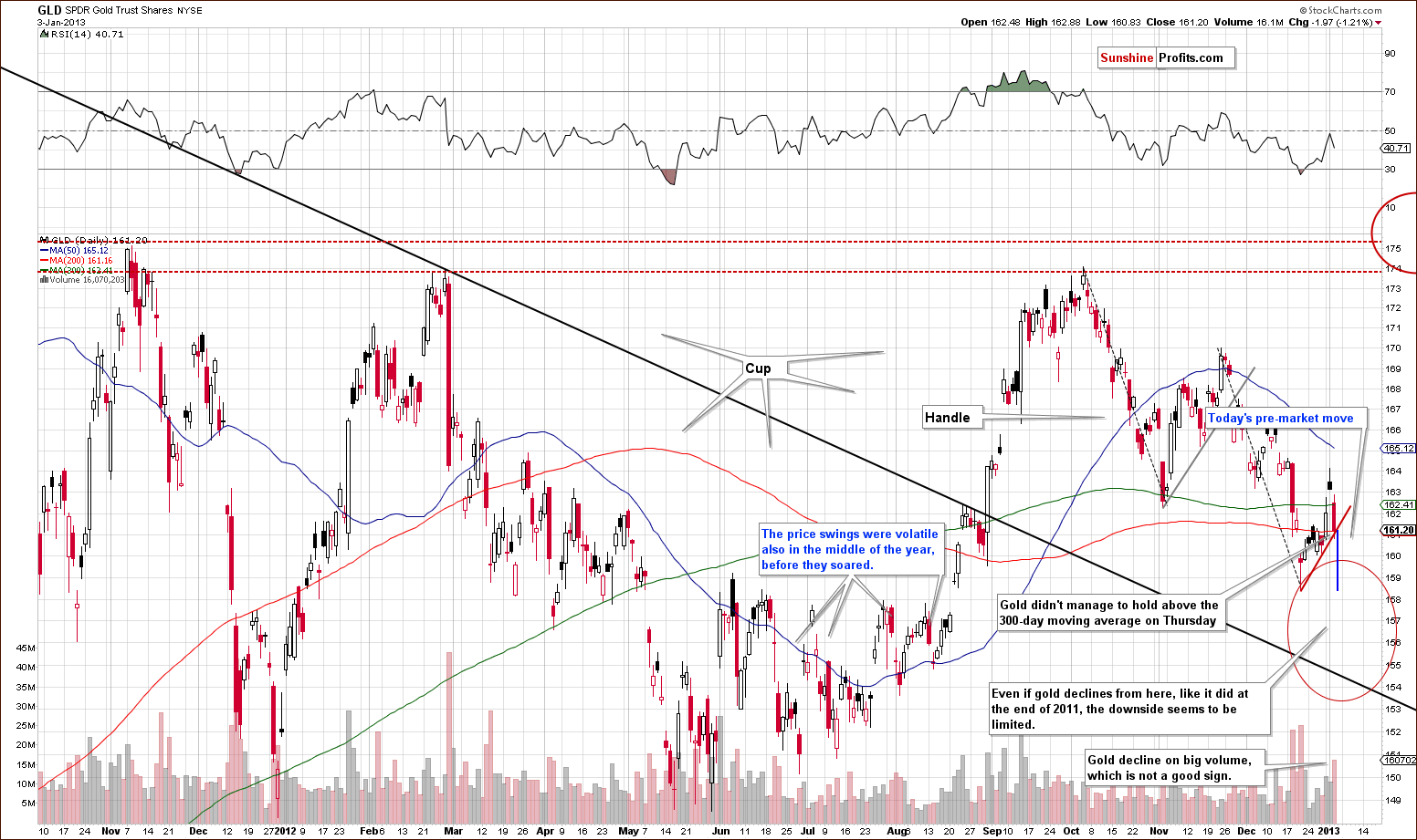
A look at this week’s medium-term GLD ETF chart, we see a decline on significant volume. It was stopped by the rising short-term support line on Thursday, but in Friday’s early trading it was decisively broken.
Today gold moved temporarily to its December 2012 low, but moved sharply back up. It is this pullback that made us suggest sticking to the long speculative position earlier today.
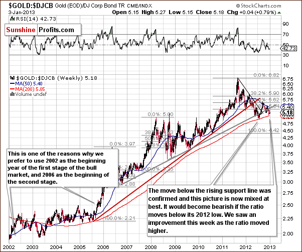
In the gold to bonds ratio chart, very little changed this week. The ratio moved a bit higher early in the week but is now just .01 above last week’s level. The implications here are basically mixed and we will get back to this interesting ratio later in this week’s Letters Section.
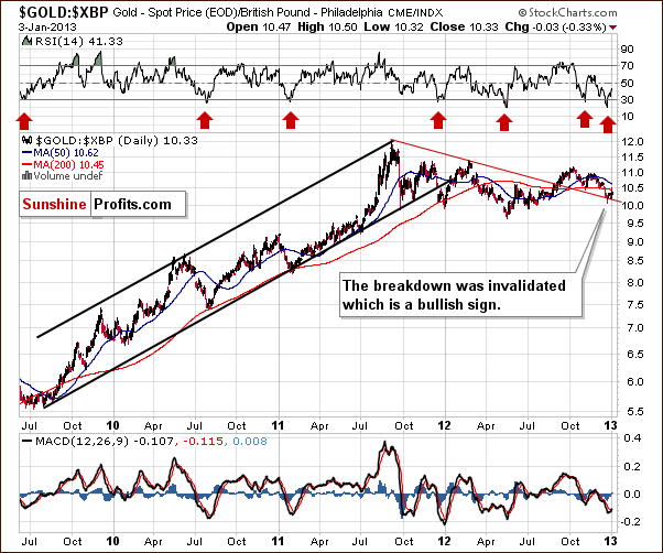
Thursday’s declines did not change a thing as far as critical support lines are concerned (based on Thursday’s closing prices). Breakdowns were invalidated in all cases and key support lines were not reached. In this week’s chart of gold from the perspective of the British pound, the previous statements hold true as they do for many other currencies this week. Gold’s price here is exactly where it was one week ago.
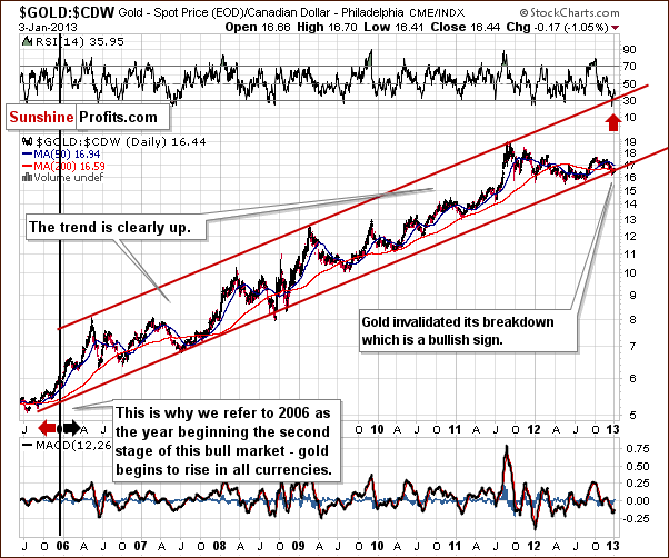
In this week’s chart of gold from the Canadian dollar perspective, the statements made in the previous section hold true as well here (again, based on Thursday’s closing prices). Gold priced in Canadian dollars declined by less than 1% (twelve cents) in the past week and the recent breakdown was invalidated.
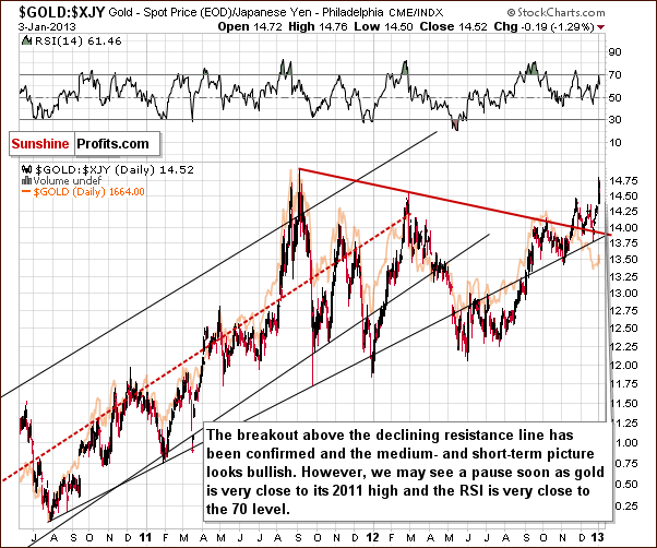
In this week’s chart of gold from the Japanese yen perspective, the situation is definitely not the same here. Gold rallied nearly to the level of its 2011 high. This was about 2.5 % above last Thursday’s close and gold priced in yen is now about 1.5% higher than a week ago.
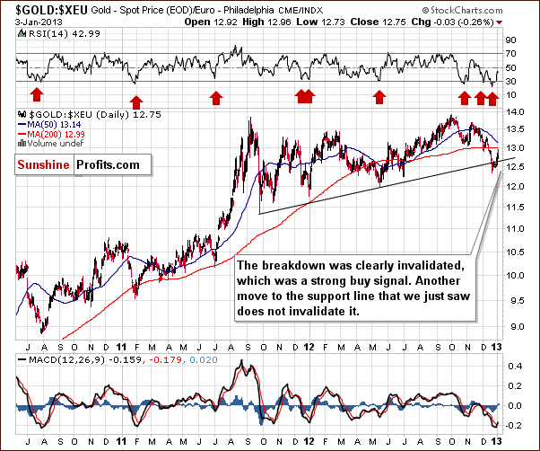
In the gold to euro ratio chart, the euro declined on Thursday. So is gold below an important support line? No, it is still above it, and Thursday’s decline did not invalidate the move above this important support-resistance line – at least not based on Thursday’s closing prices. The medium-term implications remain bullish here with Thursday’s closing price 1.5% higher than a week ago. However, if the support line is successfully broken, then this could be a beginning of an even bigger move lower.
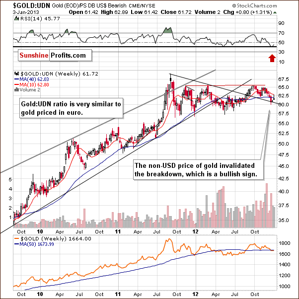
In this week’s chart of gold from the non-USD perspective, we see that the breakout above the medium-term declining resistance line has been confirmed and the breakdown invalidated. The medium-term trend remains bullish. More importantly, we see that this important ratio has some space before it moves to the declining support line, so perhaps it will not move below it today and the overall non-USD picture will remain bullish.
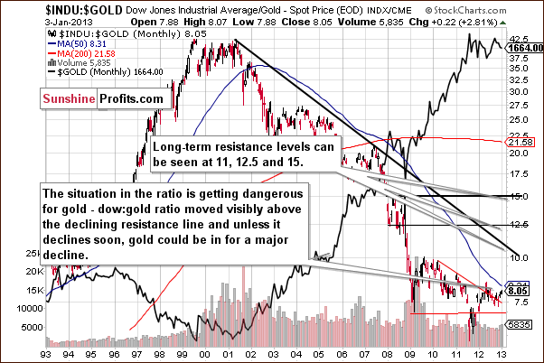
In this week’s Dow to gold ratio chart, we still have many concerns. Gold is likely to rally in the coming weeks and this will cause the ratio to dive once again. It could, in fact, move below the declining support line, but if it doesn't (we will continue to monitor this closely), much greater declines in gold’s price will be probable. This is not the case today, however, and just a possibility at this point.
Summing up, the situation had deteriorated a bit for gold from the USD perspective on Thursday, and the situation has become mixed based on Friday’s pre-market price moves. Finally, the situation improved just before the markets opened today as gold rallied erasing the majority of today’s decline.
Silver
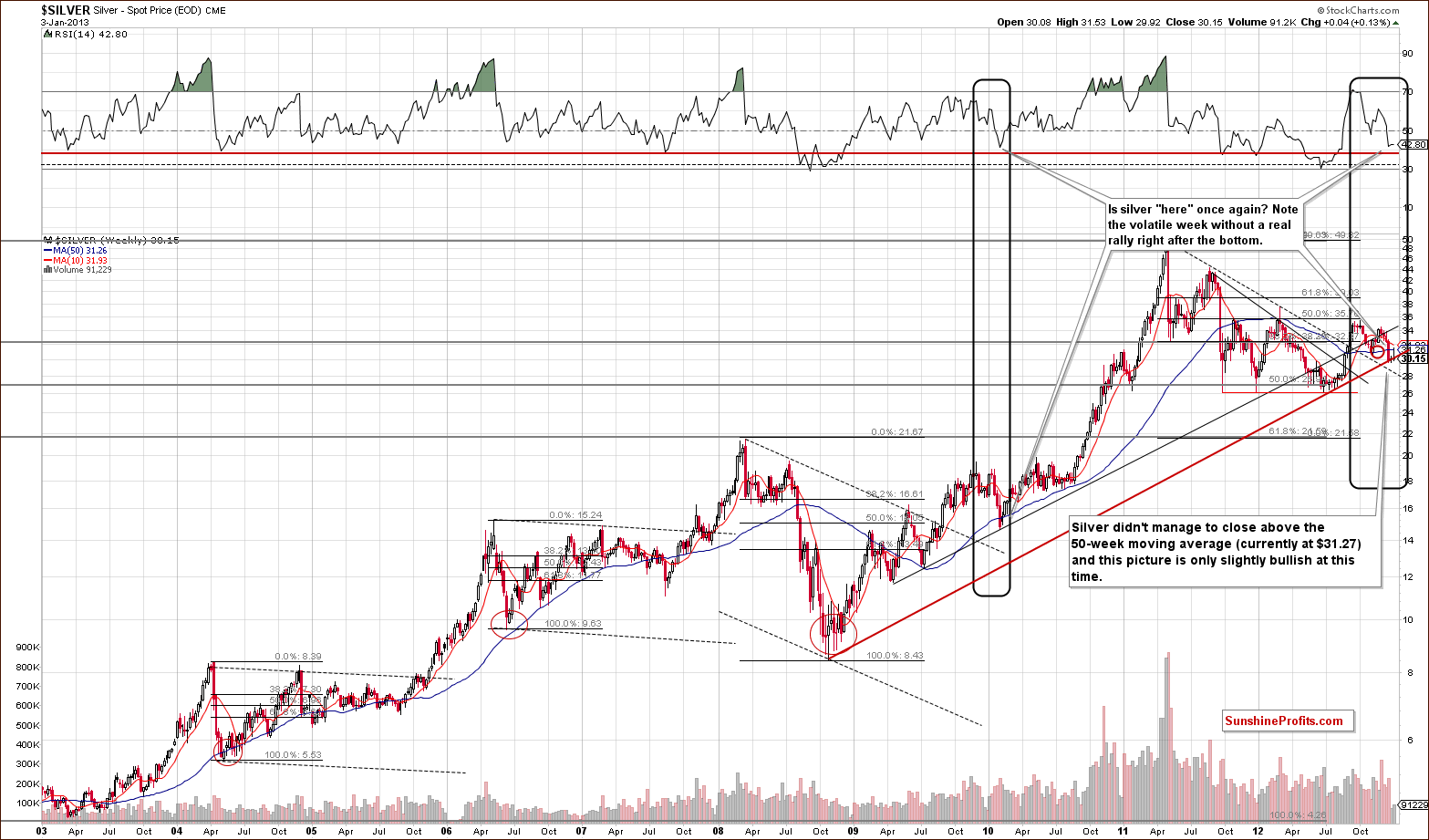
We begin our silver section with a look at the white metal’s very long-term chart. Silver generally didn’t do much this week (until today) as an early in the week rally (nearly 2.5%) was all given back on Thursday and today’s price is a penny lower than last week. On Thursday silver was still at the long-term support line similar to what was seem in early 2010. Back then, price patterns were also quite volatile immediately after the bottom was reached. Higher prices did follow over the next several months. We could be seeing the beginning of a repeat of this type of pattern right now, unless today’s decline in silver turns into a confirmed breakdown.
The support line that is currently in play is a very important one – it’s based on two important bottoms that are clearly visible from the very long-term perspective. A confirmed breakdown here would have very bearish implications – however it was not seen so far.
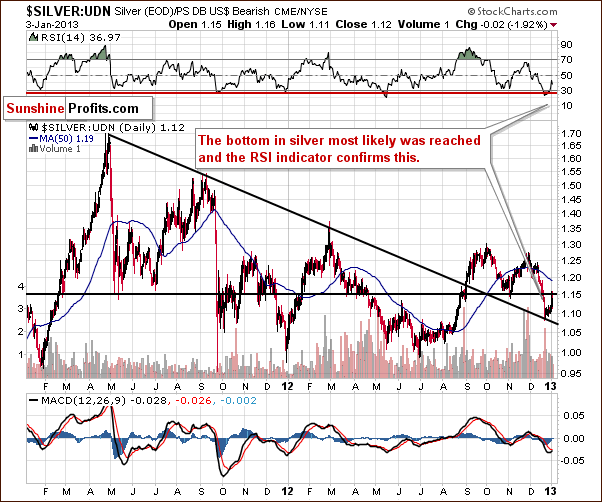
Looking now at silver’s price from a non-USD perspective, it seems that the bottom was reached here a few weeks ago. An intra-day low of 1.08 was seen on December 20 with silver not closing lower for the day from then until Thursday, an eight-day trading period. The implications here are bullish.
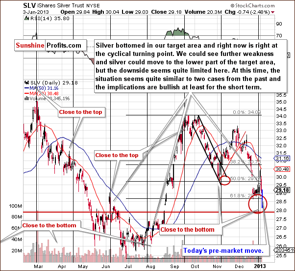
In the short-term SLV ETF chart, this week’s rally was quite spectacular, but Thursday’s and Friday’s decline was even more profound. So what could happen next? We saw similar price action around a cyclical turning point twice in 2012. In early June, this pattern was followed by a short-term pullback and another decline. In late July, a short-term pullback was also seen, followed by some consolidation and then a major rally with a $7 rise over the next two months. As we begin 2013, the latter seems more probable based on the non-USD situation in gold although the amount of increase in price is not clear at the present time.
On a side note, silver didn't move below our target area today.
Summing up, the picture for silver is still bullish for the medium-term because the breakdown below the rising long-term support line was not yet confirmed. If silver manages to move back above this level- effectively erasing Friday’s decline – then we will have another bullish signal. Right now, the picture remains bullish.
Mining Stocks
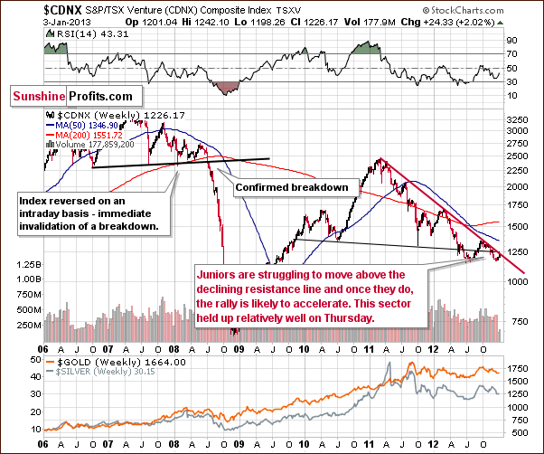
In the Toronto Stock Exchange Venture Index (which is a proxy for the junior miners as so many of them are included in it), we see that the juniors held up very well this week. From the very long-term perspective, no decline is seen at all. Once more strength is seen here, the juniors will likely break above the resistance line and then catch up with other stocks.
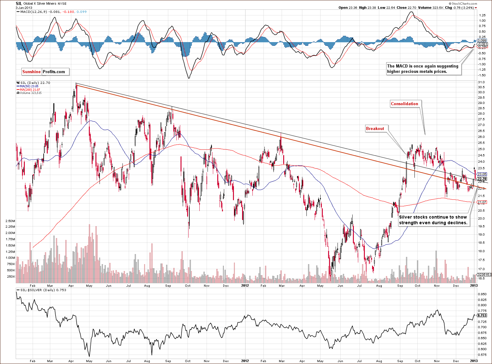
Turning now to the long-term Global X Silver Miners ETF (proxy for silver stocks) chart, strength is seen once again. They did not correct more on Thursday than they had rallied on Wednesday. As we discussed in a couple of our Market Alerts earlier this week, higher prices for the precious metals markets are suggested by the MACD.
All-in-all, the technical short term looks favorable. The silver stocks continue to show strength and we continue to favor them over gold stocks.
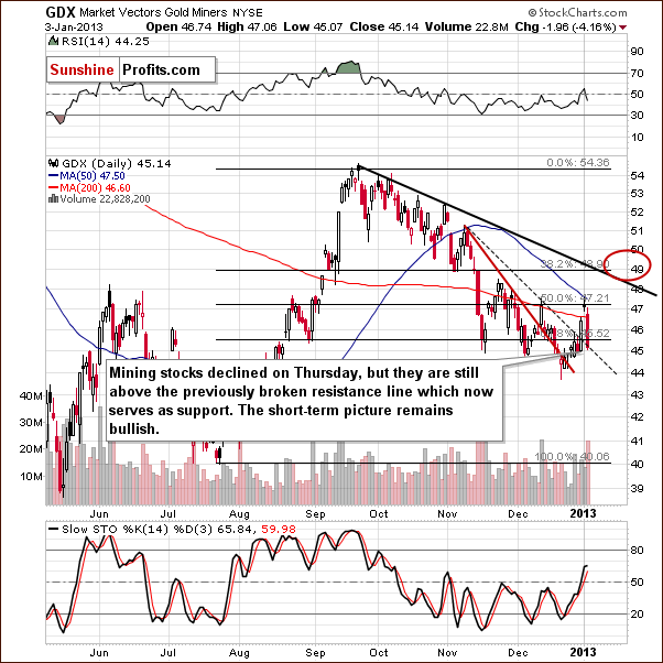
In the GDX ETF (the senior miners) short-term chart, the price declined on significant volume. Prices did not move below the previously broken resistance line, however – at least not yet. The situation was not that bearish based on Thursday’s closing prices, and it didn't really deteriorate on Friday as the miners declined only insignificantly – compared to the huge decline seen in gold before the markets opened.
Summing up, the outlook for juniors and silver stocks looks quite favorable relative to gold stocks based on Thursday’s closing prices, but as far as performance of the whole mining stock sector for the short-term is concerned, the picture is still bullish.
Letters from Subscribers
Q: What are your comments on this? The monthly gold in euros chart is looking particularly bearish: http://biiwii.com/wordpress/2012/12/19/q-whats-wrong-with-gold/
Maybe all this is telling us that gold needs to extend its correction for a considerable time to allow it to work off its oversold position in mostmonthly charts.
A: Thank you for the link. Today's update is generally a reply to the points made in this article. The author makes a good point regarding the technical analysis - there doesn't need to be any reason for a correction for it to materialize, as markets are emotional in the short run, not logical. However, in our view the picture is more bullish for the medium term than the article suggests. Actually, the situation improved greatly just a few days ago, so maybe the author is no longer bearish. We remain bullish as the breakdown below the declining support line on the gold:UDN chart (non-USD gold chart) was invalidated.
Q: Your excellent article would be further improved if you could provide charts on the rise of oil in this 1980 period of exponential rise ingold.Do you have other articles about the rise in oil? This is quite important since the Middle East may see another war erupt any minute. Thanks.
A: Good idea, we will probably include such a comparison in one of our future essays. And yes, we have something more about crude oil - there's a report on gold, silver and crude oil.
Q: As a student residing outside the US or Europe, how can I invest in precious metals?
A: Possibilities to invest in precious metals outside the US or Europe differ from country to country. But not only that. As your precious metals portfolio is likely to consist of different investment vehicles suited for long-term investments and short-term trading, you will most likely need to get access to more than just one service to have a well-structured portfolio. In our essay on gold and silver portfolio we suggest that you divide your portfolio into three parts: insurance (physical gold and silver, held almost at all times), long-term investments (also physical gold and silver, rarely sold off or hedged), and short-term speculative capital (only capital you can afford to lose, usually paper gold or paper silver).
For insurance and investment, gold bars or gold coins are the way to go. The same goes for silver bars and silver coins (the latter particularly if you have only limited capital at your disposal). We present a list of sites where you can order bullion bars or coins in our How to Buy: Gold bars and How to Buy: Bullion Coins sections. It is important to consider whether a particular site offers physical delivery to your location and what is the cost of such delivery. Various kinds of import duties can add to costs so it is always important to check applicable regulations on the import of gold and silver in the place where you currently reside. Alternatively, you can consider obtaining your physical gold and silver from local precious metal dealers. In that case, you should always use certified and respected dealers simply to avoid winding up with fake gold or silver. Once again, we would need to know which country you currently live in to provide more suggestions on obtaining physical metals.
As far as the trading part of your portfolio is concerned, you may use ETFs or ETNs to take advantage of short-term swings in gold and silver prices. Leveraged instruments like gold options or gold futures are only advisable for experienced investors. You can get access to ETFs or ETNs through a brokerage account. Quite obviously, you need to find a broker that offers access to gold and silver ETFs and ETNs. Another important factor is that different brokerage accounts have different fees.
For diversification purposes you might also want to include mining stocks in your portfolio. This can be done through a brokerage account as well. The same caveats apply as with ETFs and ETNs.
To sum up, you will probably need at least two services to properly structure your portfolio: (1) a physical bullion provider and (2) a brokerage account with access to gold and silver ETFs, ETNs and mining stocks. To give more suggestions we would need to know which country you reside in.
Q: Here's what we received from one of our subscribers recently along with a short follow-up. This is yet another technical reason for which gold is likely to move higher in the coming months:
Hey, I'm a new subscriber (basically on a trial period), and I found yourGOLD:BONDS ratio very interesting. I tried to see if I could discover a few long-term insights, and I thinkyou'll be interested in what I saw:
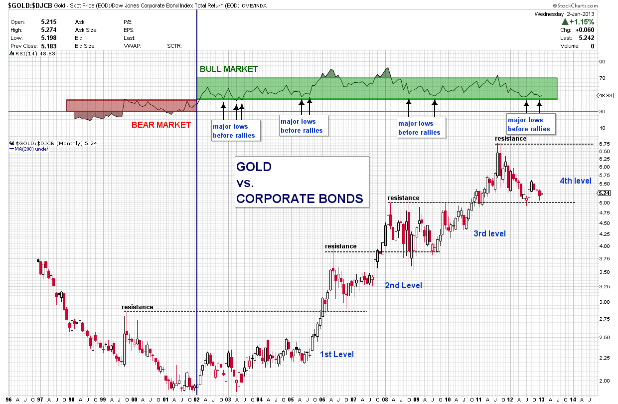
This is a monthly chart, and you can clearly see that there is a period when we are in a bear market (both in price and in the RSI), and there is avery obvious period in which we are in a bull market. In eachstage you can see clear support andresistance levels. Also, you can see that we are very close to the support, and from theRSI we can tell that a very sharp rally is probably near. What do you think?
A: We agree, this chart looks bullish and we think that your analysis makes perfect sense. Can we feature this chart in the next update? Also, please accept a month of access free of charge.
WOW.... thank you.
(offcourse you can present this chart, i would never think about it myself... to compare gold to corporate bonds)
Q: Please explain cyclical turning point. I am new and do not understand this term. Thanks.
A: The idea of the cyclical turning point is based on the notion that gold, silver and other asset price trends tend to change at fixed intervals in time. In other words, gold and silver tend to change direction every X days. An important point here is that even if you know the number of days between reversals, you don’t know the direction in which the trend will change.
So, for instance, if you know that gold’s price path changes direction every 30 days, you can identify possible future dates when the price path will change but you don’t know if the change will be to the downside or to the upside.
But nevertheless, if the price of gold actually reverses every X days, you can extract some information from this. Namely, if the price of gold is declining right before the turning point, it is possible that it will rebound and a bottom will be formed. Conversely, if the price is rising just before the cyclical turning point, it is possible that the situation will turn around, gold will go down and a local top will be formed.
This is a basic explanation of a turning point. To see a more detailed explanation with turning points shown on a chart, please check our dictionary term turning points.
Q: I am providing several charts. They show the relationship between the price of silver and the COT report. It's from Jan 2012 to end May 2012. As Commercial shorts increase (and speculator longs increase), silver price increases. When Commercials start covering their shorts (and speculators sell off their longs), silver prices decrease.
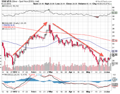
Note that in the COT report graph, the below section is Commercials, and the upper one Small and Large Speculators.
This seems a fairly consistent pattern, and might indicate manipulation of the market by the Commercials.
It might be useful for you to comment on increasing/decreasing Commercial shorts on Fridays, which is when the latest COT report comes out. Regards.
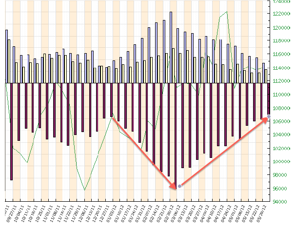
A: We have previously answered a number of questions about CoT and its analysis, and as we believe they apply in this case as well, we will quote one of our previous answers and post a chart that was originally linked to it.
In short, CoT reports act somewhat like a momentum indicator and yes, bottoms in prices often correspond to extreme readings in these reports. (…)
Generally, the (…) analysis [of CoT] stems from the chart including a Commercial Net Short)/ (Total Long) Ratio. This ratio is close to its previous lows and when it was previously similarly low, silver bottomed, so the argument is that silver is bottoming right now as well.
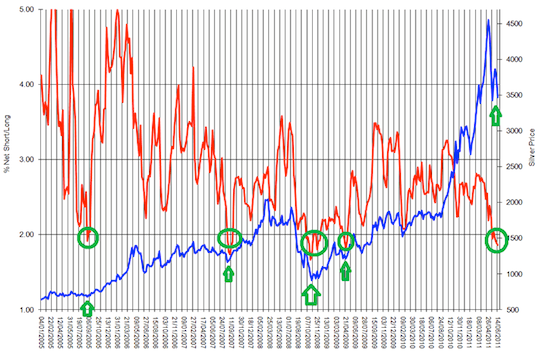
At first it looks quite convincing. However, upon second look, we see something not emphasized in the chart - that the ratio is in fact in a downtrend. It's quite obvious in terms of lower tops on average, but it is not that obvious when one takes a look at the lows.
There are 4 lows that are featured on the chart and actually only 3 of them mark major bottoms that are simultaneously the start of a bigger rally. The most recent one is just a local bottom seen after the correction from a true 2008 bottom.
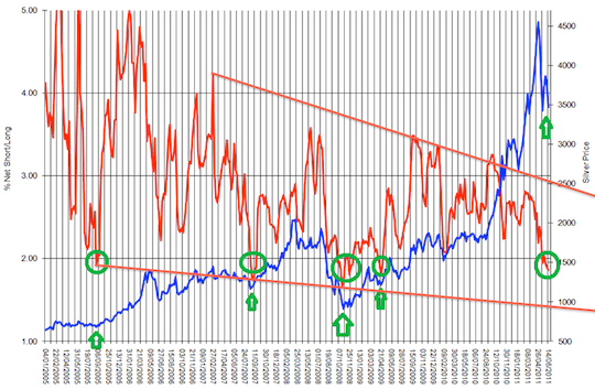
Now, if we focus on these 3 important bottoms a new pattern emerges. Namely, that the major bottoms in silver are accompanied by the ratio moving below previous lows and possibly to the lower border of the trading channel. Either way, this suggests that what we have seen so far is not yet the final bottom and that a move toward the declining support line will likely confirm that the bottom is in fact in.
Another point worth noting is that none of the major rallies (indicated by green ellipses and arrows) started soon after a previous major top and this is what the "horizontal buy level" theory would imply. However, taking a relative (here: trend) approach would allow for further declines that would take more time. This would make the next super buying opportunity in tune with the previous ones and since history rhymes this seems to be the more likely outcome.
There's one more interesting phenomenon that is connected with silver and taking a relative approach - the silver:gold ratio. Please note that we wrote about this ratio in mid-April, and soon after that ratio topped at the upper border of the rising trend channel - along with silver itself. Please note that it did not top at the previous highs, but at the resistance based on the trend channel.
Summing up, there is more than one way to analyze the (Commercial Net Short)/ (Total Long) Ratio and it seems that the relative approach is more appropriate. (…)
The above shows that the CoT is not a universal indicator for gold and silver. While there seems that some relationship may exist, caution is suggested.
Summary
The situation for gold in US dollars deteriorated this week as the price moved once again below the 300-day moving average. Gold looks bullish from other perspectives, in each currency other than the US Dollar.
The situation in the USD Index is now quite bullish for the precious metals. A rally was seen to the long and short-term resistance lines so a reversal looks very possible for the USD Index with lower values likely in the short term. It might be surprising to read that, given that USD Index moved above the above-mentioned resistance lines on Friday, however, this move is not confirmed and we doubt that it will be confirmed soon.
The previous developments have caused the situation in the precious metals markets to improve, and the general stock market situation has improved as well. So even though the gold market itself deteriorated, other markets which impact it are now creating positive implications for the yellow metal.
Fed’s “black swan” (a highly unlikely event with significant impact) announcement about the possibility of stopping the monetary stimulus is what caused gold to decline today. We seriously doubt that the Fed really meant it, however, it seems that this piece of information will manage to make those less convinced about the gold story sell their holdings and this is what we're seeing right now.
Can such events be forecasted? At this point we think that yes, it could have been forecasted, and unfortunately we missed this link. When Bernanke connected the level of interest rates to the unemployment numbers, nobody really knew why he did it. With the benefit of hindsight, we think that it was done mostly (if not only) with this announcement in mind – so that people automatically see this announcement as a clear sign that the economy is improving. And it worked – the stock futures didn't decline in pre-market trading. When the Fed announces once again that after all another few QEs won’t hurt, markets might cheer once again if they still think that everything is OK with the economy and that it will now get another boost. When we think about it now, the strategy that the Fed is pursuing is quite effective – stocks are moving higher. However, at the end of the day, all that is left are promises that cannot be kept – there’s no other way (except default) out of the gargantuan debt that the US is in, than to inflate it, and precious metals prices will reflect that sooner or later.
We initially suggested moving out of the precious metals market with the speculative capital as the decline looked like it was a beginning of something much bigger – however, the sharp turnaround will probably make a bullish hammer candlestick that is a popular way to end a decline. Silver is now more or less back above (or right at) the major support line that we described on the long-term silver chart earlier today. We also saw a move back below the resistance line in the USD Index.
All this made the situation bullish once again.
We suggest keeping long-term investment positions intact.
Trading – PR: Long positions in gold, silver and mining stocks
Trading – SP Indicators: Long position mining stocks
Long-term investments: Remain in the market with your precious metals holdings
| Portfolio's Part | Position | Stop-loss / Expiry Date |
|---|---|---|
| Trading: Mining stocks | Long | $43 GDX (half) / Jan 11, 2013 (half) |
| Trading: Gold | Long (half) | $1,629 |
| Trading: Silver | Long (half) | $28.94 |
| Long-term investments | Long | - |
This completes this week’s Premium Update. Our next Premium Update is scheduled for January 11, 2013 and it will include ranking of top gold and silver juniors – we didn't include it in today’s issue as we wanted to post / send it to you as soon as possible. We will continue to send out Market Alerts on a daily basis at least until the end of January, 2013 and we will send additional Market Alerts whenever appropriate.
Thank you.
Sincerely,
Przemyslaw Radomski, CFA


