- Euro & USD Indices
- General Stock Market
- Correlation Matrix
- Gold
- Silver
- Mining Stocks
- Letters from Subscribers
- Outstanding shares in GDX ETF
- Summary
These past few weeks it seems like paper gold is out and physical gold is in.
The fall in the price of gold has triggered a new run on physical gold that shows no sign of abating. Record amounts of money have exited ‘paper,’ i.e. futures and ETFs, and headed straight to the bank or the mint to be exchanged for coins and bullion bars, that is if one can get them. The strength of physical retail buying has taken dealers and mints around the world by surprise, leaving them scrambling to keep up with demand. The sudden surge is evidence of pent-up demand, particularly from China and India.
There seems to be a growing disconnect between paper and real gold. It’s very likely that the paper sellers didn’t foresee the rush to physical gold. Could it be the case that the physical market is lagging behind and will eventually catch up and sell off too? Let’s look at some of the evidence.
Physical Gold, an investment company, said there were waiting lists of three weeks for some coins, and four to six weeks for gold bars whereas previously all would have been available within a few days.
The US mint had to suspend sales of certain coins as buying increased. It sold an estimated 210,000 ounces of gold coins in April - almost three and half times more than the 62,000 it sold in March.
The Perth Mint worked overtime over the weekend to manufacture enough stock to meet orders, which are at levels last seen in the 2008 financial crisis (confirmation of the 2008 – now analogy).
There are reports that both Istanbul and Dubai are out of investment bars, according to Bloomberg, with wholesale and bulk buyers paying a premium of between $6 and $9 an ounce for kilo bars.
A U.S. coin shop said that sales of Krugerrand have increased 468 per cent last week as investors rush to get the precious metal at what they see as a bargain rate.
The Financial Times wrote that Asia is witnessing one of the strongest waves of physical gold buying in thirty years. ‘Buyers Scour Asia for Physical Gold’, proclaimed the headline.
Swiss refiners have run out of kilo gold bars (cost around $48,000). There is now a one-month wait for delivery.
Physical stocks of gold held at CME Group's Comex warehouses in New York have dropped to a near-five year low in a further sign that gold's price crash unleashed a frenzy of demand, according to a Reuters report.
Well…you get the point. The gold bugs are coming out of the woodwork and they want the kind of gold they can bite between their teeth. World over, private investors have taken advantage of the dip to pounce on physical gold. Keep in mind that there is some effort that goes into buying physical gold. It’s not like placing an order online for the purchase of ETF shares. Most physical gold buyers are not in it for the short term -- they plan to hold on.
At Sunshine Profits we have always advocated physical gold over the paper kind for long-term investments. If your investment time horizon is more than a year, you want to purchase the physical metal, not somebody's promise to pay you some money down the line based on the price of the metal. For short-term trades, however, ETF shares are OK. On a side, note, if you didn’t see it previously, we have two sections that should help you choose the best investment and speculative vehicle: and Gold / Silver ETF Ranking.
To see what is in store for the price of precious metals, let’s turn to the technical portion with analysis of the US Dollar Index. We will start with the very long-term chart (charts courtesy by http://stockcharts.com.)
We once again include the currency charts this week, not because they’re especially important to the precious metals, but at the request of some of our subscribers who missed seeing these charts last week.
USD and Euro Indices
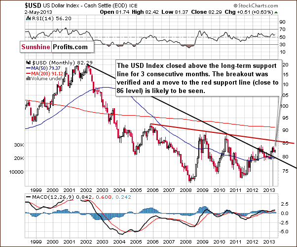
We begin this week with the very long-term USD Index chart. The index has actually confirmed a breakout above the very long-term resistance line. It has closed above it now for three consecutive months (yes, months). While a correction to the 80 level is still possible in the short term, an eventual move to the upside is now more likely than not. The closest target level seems to be slightly above 85 and although the 90 level could be in the cards as well, for now, we will focus on the first target level at this time.
The situation in the United States has not improved dramatically and the value of the dollar will have to go down eventually because of the massive amounts thereof that were created in the recent months and years. However, please remember that the USD Index is a weighted average of currency exchange rates, so if other currencies depreciate faster relative to tangible assets such as gold, the USD Index could actually rally. Another possibility is if the US situation is bad but it is worse everywhere else, the index could also rally. Anyway, the above chart suggests the USD index will move higher in the weeks ahead, though not necessarily immediately.
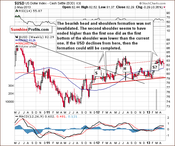
In the medium-term USD Index chart, the picture is not as clear. The bearish head-and-shoulders formation could still be completed (which would be bearish), but the index would need to move below 79 and then hold this breakdown. If it moves above 84, the bearish pattern would be clearly invalidated. Since the long-term picture is more important and carries greater weight than the medium and short-term outlooks, it is more probable that a rally will be seen, although this may not happen right away.
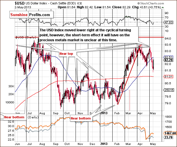
In the short-term USD Index chart, we see that the index declined immediately after the cyclical turning point. A sharp move lower has been seen over the past few days, though this did reverse on an intra-day basis on Thursday (perhaps forex traders acted on the bullish 3-month confirmation of the long-term breakout). This could in fact be a reversal, as moves to the upside appear possible now. It is, however, a bit unclear at this time. What should have happened due to the bearish impact of the cyclical turning point has probably already been seen. All-in-all, the situation is unclear for the short term.
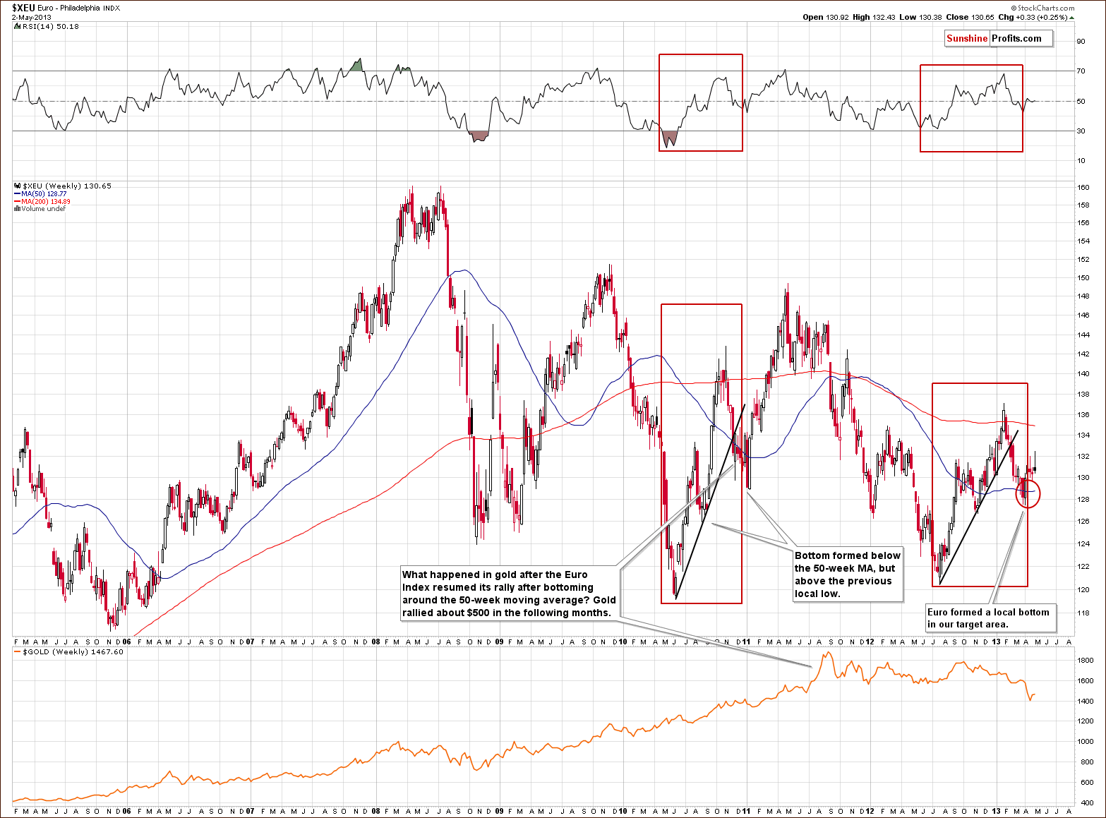
In the long-term Euro Index chart, we see that the index bottomed within our target area and then moved higher. What’s ahead for the Euro Index is a bit unclear right now. An analogy to previous patterns suggests a move to the upside here.
With respect to gold, previous similar Euro Index trading patterns (such as in late 2010) coincided with gold moving lower initially and then rallying strongly (note the decline in late 2010 and early 2011). It seems that gold could once again move lower before rallying significantly.
Summing up, the long-term outlook for the USD Index is now bullish, and this could damage the precious metals markets, at least temporarily. The very long-term correlations between the dollar and the precious metals have been pretty non-existent. A medium-term impact will likely be seen however if the USD Index rallies (expect “there was no bull market in gold, only the bear market in the dollar which just ended” and similar comments – look at the non-USD chart for proof that there was much more to gold’s rally than dollar’s decline). The metals will probably respond negatively at first, and then go along with their main secular trend, which is to the upside.
General Stock Market
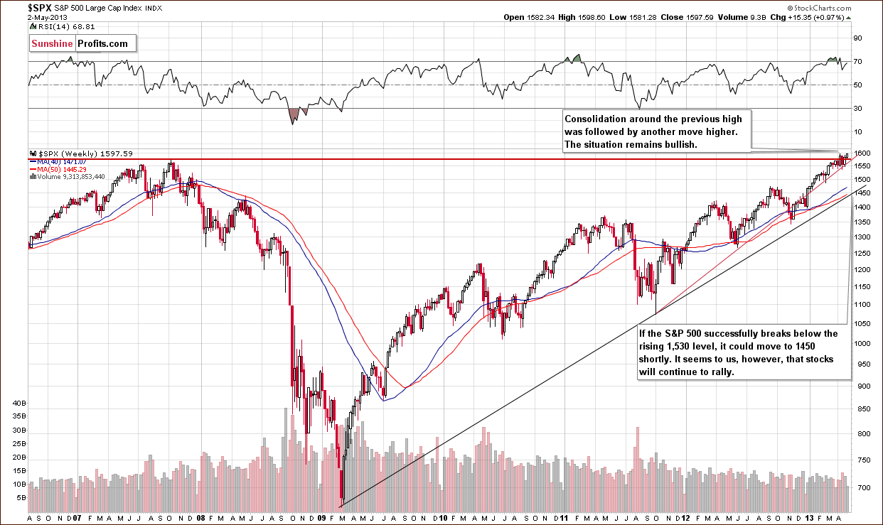
In the long-term S&P 500 Index chart we have seen some consolidation around the level of previous highs as we have mentioned in previous updates. It seems now that the expected rally, which we thought would follow the consolidation, is now underway. The RSI level had been visibly above 70 and is now right slightly below this level. It appears that stocks have taken their temporary breather and are ready to rally once again. The outlook here remains positive.
Gold and Silver Correlations
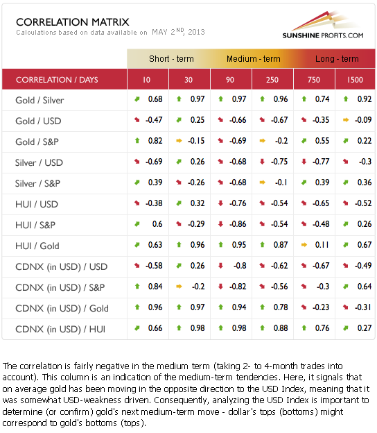
The Correlation Matrix is a tool which we have developed to analyze the impact of the currency markets and the general stock market upon the precious metals sector, (namely: gold correlations and silver correlations). The short-term impact on the precious metals by other markets has been very unclear. On a medium-term basis, the impact from the currency and stock markets is negative. The final bottom for gold, silver and the mining stocks may very well be ahead given the negative impact that the USD Index and the general stock market may have in the coming weeks. In the long run, the effect of these other markets is close to zero, and we expect the secular bull market for precious metals to continue even though the rally may not be seen right away.
Gold
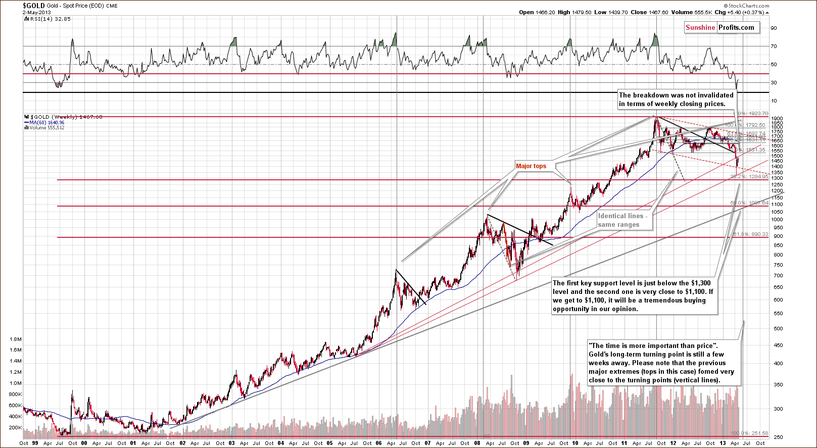
In this week’s very long-term gold chart of weekly closing prices, we see a graphical representation of what we discussed in one oflast week’s Market Alerts:
There is one more important resistance level that was just reached in case of gold. On the long-term gold chart that we've been featuring in our updates, you can see two rising red support lines. Actually, only the lower one is still support - the upper one (based on weekly closing prices) is resistance and it is the latter that was hit yesterday. Assuming that long-term trendlines based on weekly closing prices are important (they are in our view), we can view the current move higher so far as a verification of the breakdown below this level. A continuation of the rally would mean a come-back, but for now we don't see it.
The upper support line based on weekly closing prices (now providing resistance) was not invalidated. This is a bearish phenomenon which suggests that the bottom may have not yet formed.
Overall, gold has historically declined in a zig-zag sort of pattern or the bottom took form of a double-bottom and the first bottom to form was rarely the last. A pullback was usually seen with additional declines to follow. This is what we expect to see in the coming weeks, and gold’s very long-term cycle points to a final bottom being several weeks away. RSI levels based on weekly closes are no longer extremely oversold, so this makes further declines in gold quite possible.
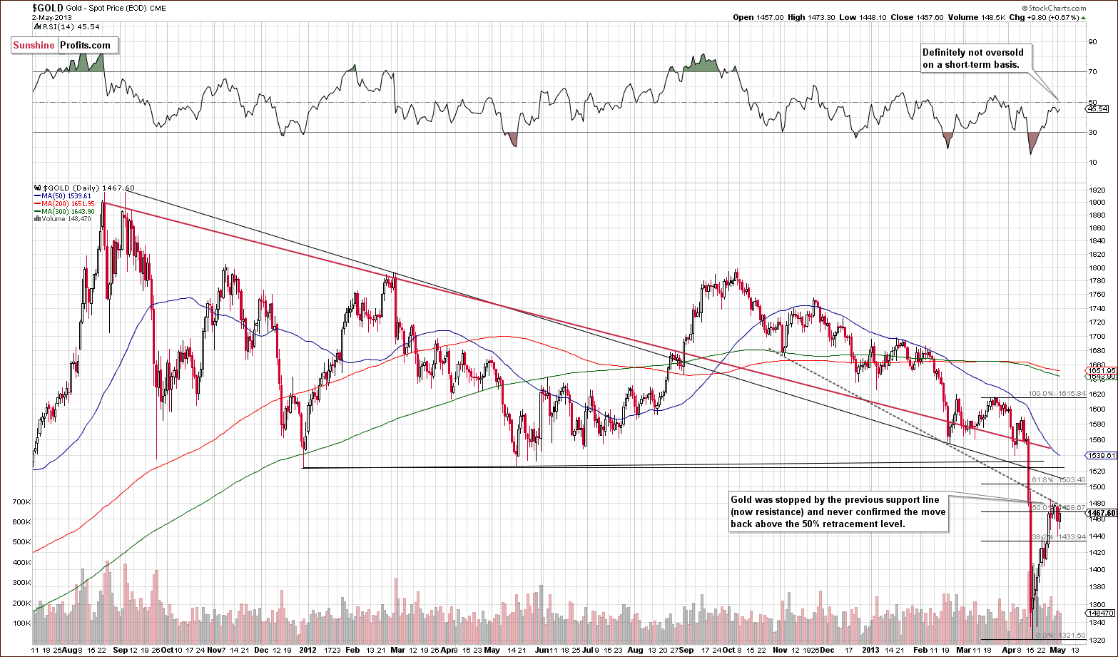
In the medium-term gold chart, a closer look shows us that gold has actually corrected to its previous support level (declining, dashed line) and verified this as resistance. At this time, it could just be a pause within a rally, but generally the main short-term trend here is down, although we have had a correction of about one half of gold’s recent decline. It seems now that the move to the downside will continue and the RSI suggests this is clearly possible. It is no longer oversold and is pretty much in mid-range levels.
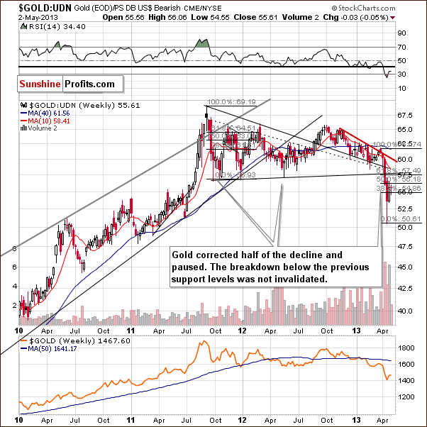
In this week’s chart of gold from the non-USD perspective, gold prices are not at the 50% retracement level but rather lower. Other than that, this chart is similar to the previous gold charts and it seems that the short-term trend here will continue to the downside.
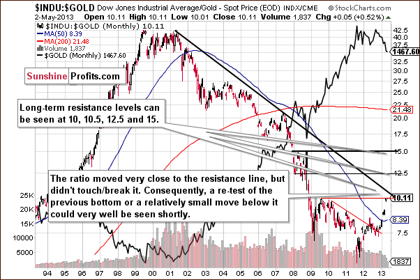
In this week’s Dow to gold ratio chart, the suggestion is that we will see lower gold prices. The reason for this is that the declining resistance line for the ratio has not been reached.
Summing up, it seems that declines in gold prices are not over yet. The bottom appears likely to be a few weeks away and this gives the market plenty of time to move lower. Gold corrected 50% of its decline and could now move lower once again. The Dow to gold ratio indicates a strong resistance line has not yet been reached. This supports the premise that gold’s final bottom is not yet in.
Silver
We will begin this week’s silver section by quoting the April 26, Market Alert as it is where we discussed the now-2008 similarity with the emphasis on time:
The most similar decline to the current one is the 2008 one. Here's how it looked:
- 2 weeks of severe declines (throughout the sector)
- 2 weeks of pullback (particularly weak in case of silver and miners; if you take a look at the sharp plunge only - gold corrected 50% thereof)
- 2 more weeks of declines
- Again 2 weeks of pullback (even more significant underperformance of silver and mining stocks)
- Approximately 4 weeks before precious metals bottomed
Currently, we are in the third bullet point from the above list. We saw a decline, followed by 2 weeks of higher prices and now we see prices moving lower – it’s just a consolidation in case of gold, but we see the decline – though modest – in silver and mining stocks.
Our point with the above analogy is that the current pullback doesn't look any different from what we saw during the 2008 plunge. At that time it was the liquidity squeeze that triggered the sell-off, but just because it's no longer the case, it doesn't mean that prices can't decline - they can based on other temporary reasons, like the recent increase in margins for gold and silver or based on the technical breakdowns below major support levels in gold, silver and mining stocks.
Are the patterns really similar?
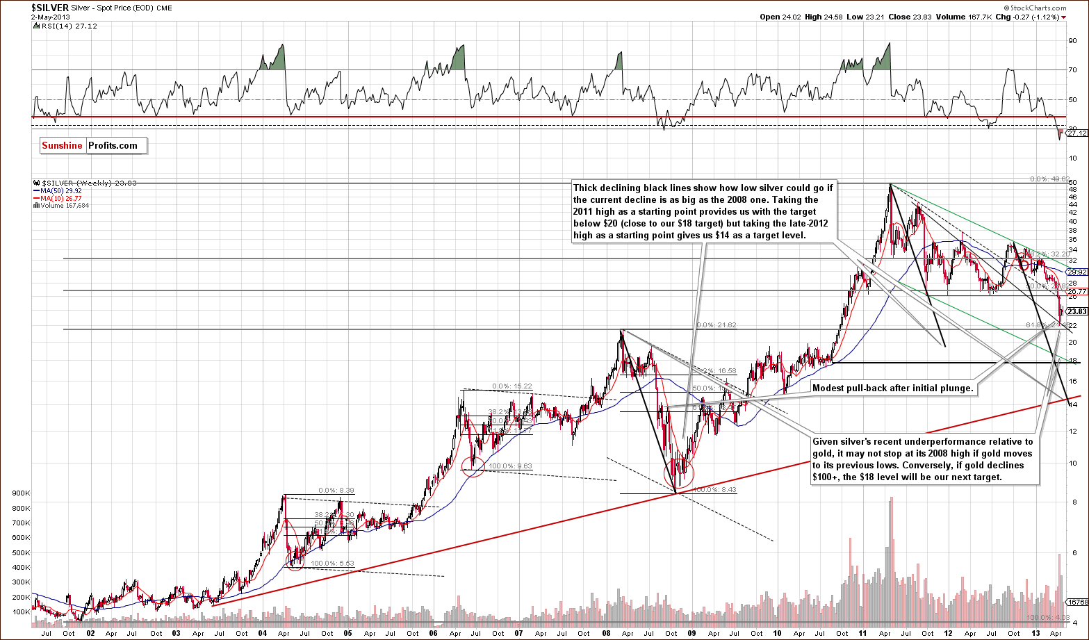
Yes, on the above chart you can see that the recent move higher looks like a small pause within the decline, quite similar to what was seen in 2008, which happened exactly in the middle of that decline. This is a bearish sign.
This week, we’ve drawn 3 analogous lines to compare the whole 2008 decline with the current one. If the declines are to be similar in terms of size, then both ways in which we analyzed them, point to lower prices. When we view the whole consolidation as one big decline (and thus take the 2011 high as the beginning of the decline), it seems that silver might need to move below the $20 level. Such a move would probably be followed by further declines to $18 or so. This is the first important support level below $20.
If we look at the late 2012 high as the beginning of silver’s current decline, then we have a target level of $14 for a final bottom. This is also confirmed by another very strong support line. In our view, however, it does not appear that a move to the $14 level is needed for the bottom to form. If it does happen, it will provide investors and speculators alike with a tremendous buying opportunity.
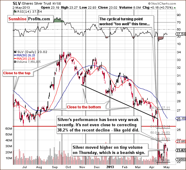
In the short-term SLV ETF chart, we see that silver declined this week in a much bigger way than gold. On Thursday, silver’s move to the upside unlike that of gold did not cancel its previous declines. The move was quite small and the low volume levels seen were a bearish sign. In short, this pairing says that the move is not the true direction in which this market is heading.
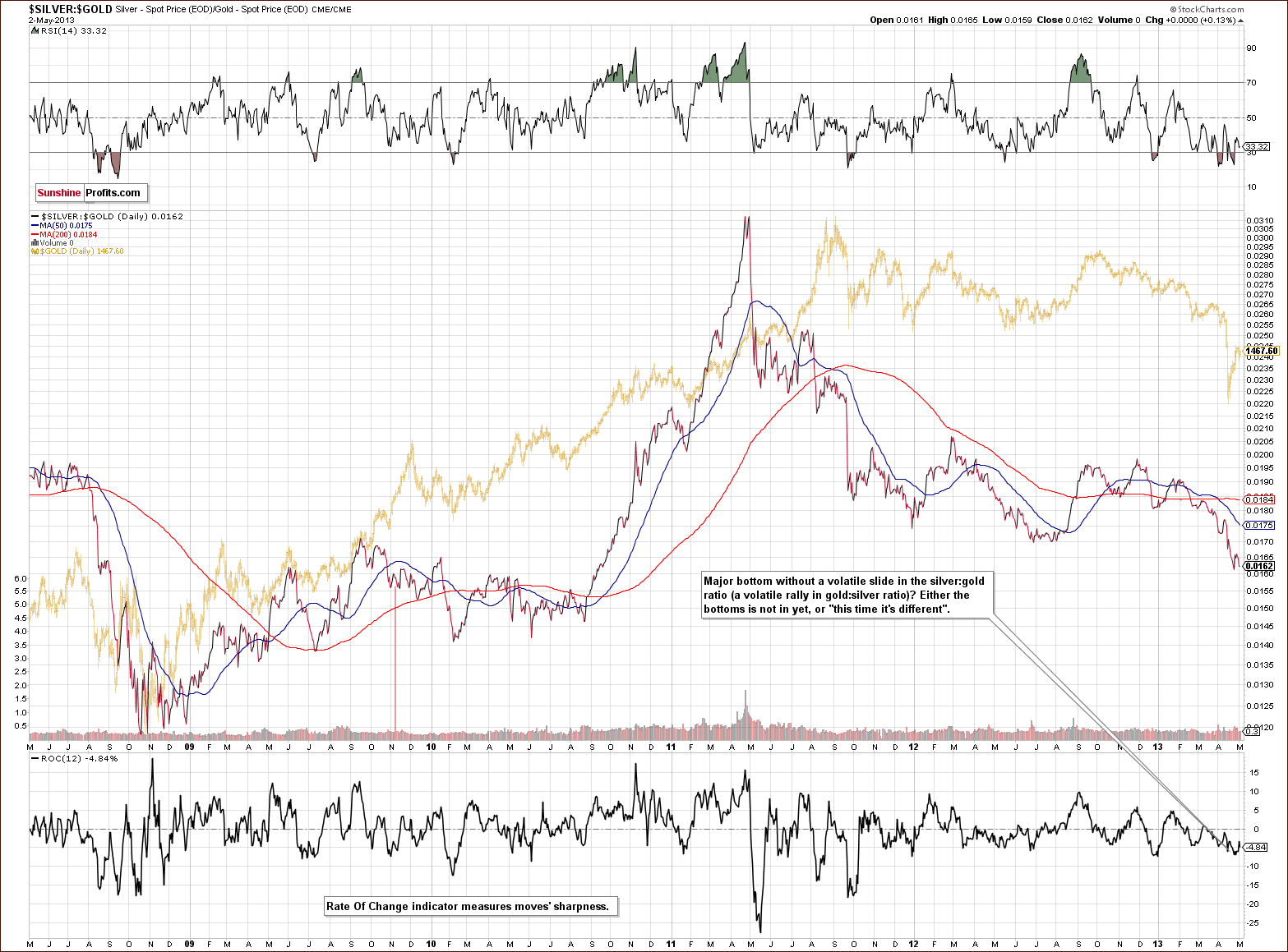
Last week we introduced this silver to gold ratio chart, and we wrote about the underperformance of silver last week not being sharp enough to cause the ratio to decline. We didn’t see it this week either, and this chart continues to have bearish implications for the precious metals sector.
Summing up, the situation in silver appears to be more bearish than gold’s. The white metal continues to show weakness on a short-term basis but not extreme enough to signal the end of the decline.
Gold and Silver Mining Stocks
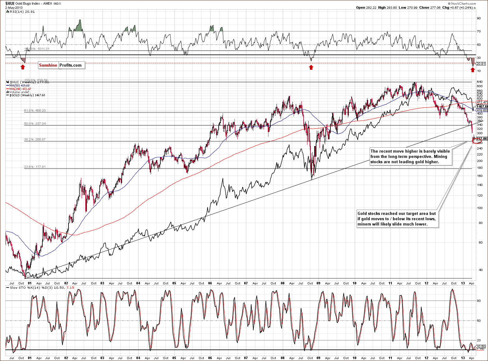
In this week’s very long-term HUI index chart, we see that the index barely moved higher in the past few days. While gold was correcting 50% of its previous decline, the gold stocks did not do anything close to that. The situation continues to be bearish here - the gold stocks are definitely not leading gold higher.
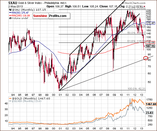
In this week’s long-term XAU index chart, we get a better picture with respect to target levels. On this chart, we can clearly see that the target level for the bottom to form for gold and silver mining stocks is around 84 or so. This is just about 20% below the gold and silver index current price level and has not been remotely approached since the declines of 2008.
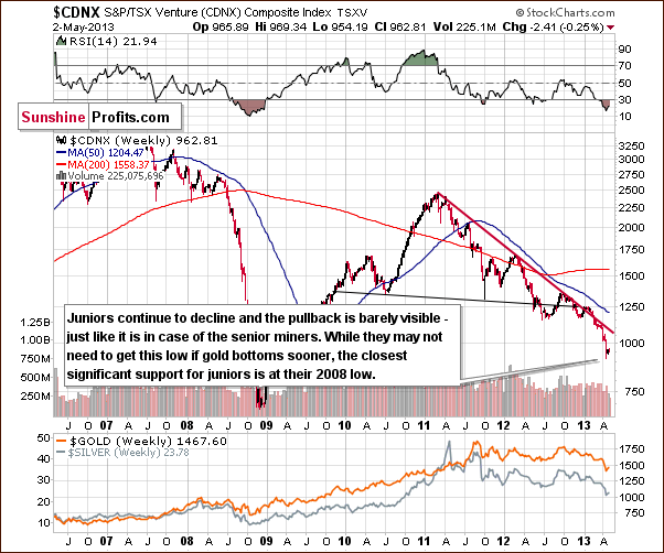
We now turn to the Toronto Stock Exchange Venture Index chart (which is a proxy for the junior miners as so many of them are included in it). A small pullback was seen here but is quite negligible, just like it is the case with other proxies for the mining stocks featured in this section this week. The bearish implications remain in place.
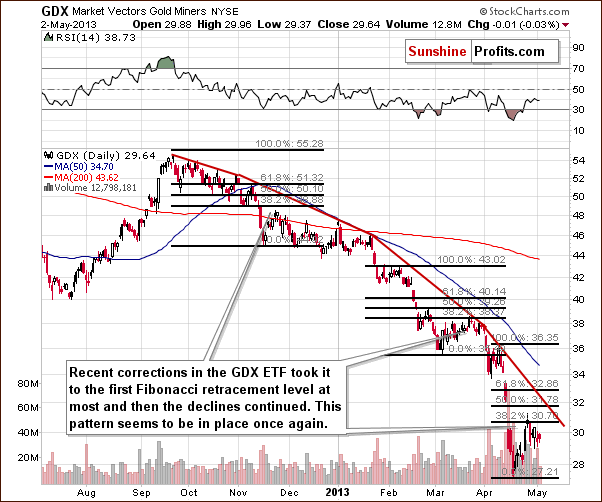
In this week’s short-term GDX ETF chart, we see that prices have been declining for many months and that each pullback took them no higher than to the 38.2% retracement.
Here’s what we wrote on April 25:
This bottom may have formed several days ago and Wednesday’s rally, which was relatively significant and accompanied by high volume, is a bullish sign. On the other hand, we did see similar price action in early March, however, and the rally was followed by a rather unimpressive move to the upside, so we remain a bit skeptical. Additionally, silver is not confirming this bullish outlook. All-in-all, this chart alone appears to be a bit more bullish than not, but we would prefer to see a breakout at least above the first Fibonacci retracement level and some strength in silver before considering getting back on the long side of the market.
If we take the early high as the beginning of the decline, then we see that miners corrected 38.2% of the preceding decline – nothing more. If we take the late March 2013 top as the beginning of the decline (like we did with gold earlier in this update), then we will not even have a rally to the 38.2% retracement. The pullback here on a short-term basis is very small relative to the pullback seen in gold. The situation here appears to be the miners leading gold lower.
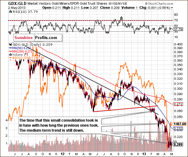
Speaking of miner’s underperformance relative to gold, let’s take a look at the GDX:GLD ratio chart. In the recent days we saw a small rally in the ratio followed by a move to the downside. The ratio has been consolidating since mid-April and this is more or less how long it took previously before the next decline began. It seems ready to move lower once again.
This chart has no bullish implications. The outlook is bearish as the decline is accelerating in relative terms. We have a logarithmic scale here so that the same ranges mean the same percent in either decline or rally. The acceleration means that the miners have been underperforming gold in both absolute and relative terms. This is a bearish sign for the whole precious metals sector.
Summing up, it seems that the mining stocks will continue to decline in the coming weeks. A bottom will likely form when the XAU reaches its target level around 84. It seems that the rest of the precious metals are in a period of decline as well.
Letters from Subscribers
Q: What is your take on this article?
A: Generally, an increase in bearish bets is something that we expect when prices are falling and this article gives us another confirmation thereof. The shares of GDX ETF were recently created to satisfy the demand for shares for lending (shorting) purposes. In other words, it's a confirmation that the trend is down. And the observation the authors correctly made - that an increase in the shares outstanding doesn't have to be a bullish factor - tells us that what might appear as a bullish sign at first sight isn't bullish at all.
Summary
The long-term situation in the USD Index has changed as the dollar has verified a breakout above its declining long-term resistance line. It has now closed above this line for three consecutive months. This could have bearish implications for gold on a medium-term basis though the medium-term USD chart does not indicate this yet.
Stocks appear to have completed their consolidation and seem ready to rally once again. The outlook for the general stock market remains very positive.
The strength in the physical market suggests that the bull market is intact and that what we’re seeing now is just a major correction within the secular bull market. It doesn't prove that precious metals can’t move even lower temporarily.
Long-term turning points for gold suggest that the bottom in the precious metals sector is few weeks away, which is in tune with what the precious metals market traditionally does at this time of the year. Generally the precious metals market used to form a local top in early May, bottom in mid-May, move higher until the end of the month and decline significantly in June.
The underperformance for silver and the mining stocks suggests that declines in the precious metals sector are not yet over. Declines in gold used to take form of zig-zag pattern. If not – double-bottoms used to be formed. Rarely is a bottom formed after an initial sharp decline.
Trading – PR: Short silver and mining stocks.
Trading – SP Indicators: No positions: SP Indicators suggest long positions but the new self-similarity-based tool suggests short ones for a part of the precious metals sector (silver) and there are mixed signals for another part (gold and mining stocks) and we think that overall they cancel each other out.
Long-term investments: No positions.
| Portfolio's Part | Position | Stop-loss / Expiry Date |
|---|---|---|
| Trading: Mining stocks | Short (half) | 305 (HUI) / - |
| Trading: Gold | No position | - / - |
| Trading: Silver | Short (half) | $25.30 / - |
| Long-term investments: Gold | No position | Buy half at $1,305 |
| Long-term investments: Silver | No position | Buy half at $18.20 |
| Long-term investments: Mining Stocks | No position | Buy half at XAU 84 |
This completes this week’s Premium Update. Our next Premium Update is scheduled for May 10, 2013; however, you – as our subscribers – will continue to receive daily Market Alerts at least until the end of May on a daily basis.
Thank you for using the Premium Service. Have a profitable week, a great weekend!
Sincerely,
Przemyslaw Radomski, CFA


