- Euro & USD Indices
- General Stock Market
- Crude Oil
- Correlation Matrix
- Gold
- Silver
- Platinum
- Mining Stocks
- Letters from Subscribers
- Long term downward bias for gold and silver?
- Massive correction ahead?
- Seasonal charts from two perspectives
- Summary
It is a case of the kettle calling the pot black. The president of China Investment Corp recently lambasted the Japanese government for its aggressive easing program that is weakening the Yen. He said Japan is aiming to boost its exports at the expense of other countries through a weaker Yen.
Sounds familiar, were did we hear this before?
Oh yes. This is exactly the allegation leveled against China Itself by the U.S. and other countries.
Chen Yulu, an adviser to the People's Bank of China, said recently that China will face inflationary pressure in the second half of the year mainly due to quantitative easing measures taken by other central banks to prop up their economies.
"The currency war situation is quite severe,” he said. “China is definitely a victim."
Bond-buying measures, known as quantitative easing, keep interest rates down prompting investors to flock to emerging markets such as China in search of better returns. This, in turn, drives up asset prices and exchange rates in the emerging markets.
In recent months, tensions between the world’s second and third largest economies are escalating. In addition to the economic saber rattling, we hear anti-Japan rhetoric in China over East China Sea islands that both countries claim.
"Treating the neighbors as your garbage bin and starting a currency war would not only be dangerous for others but eventually be bad for yourself," said a high ranking Chinese official. "I would hope that [Japan] doesn't do that as a responsible government."
The Japanese, who elected their new Prime Minister, Shinzo Abe in September 2012, say that their moves are not meant to weaken the yen, but rather to try and escape the deflation trap. When Japan's central bank signaled its intention to launch an open ended bond buying program in mid-January 2013, numerous senior central bankers warned of a possible fresh round of currency war, including officials in Russia, South Korea and Germany. The Japanese program is three times as large as that of the U.S. relative to the underlying size of the economy.
The recent dollar surge was a direct result of the Japanese yen falling. And the reason the yen is falling is because the Bank of Japan is printing money to push it lower and pump up exports. GDP in Japan came in at 4.1% for the first quarter, so it appears to be working in the short term.
Japan has been in trouble for a while now. It’s has a debt-to-GDP of over 200%. The demographics are not promising with an aging population.
The recent spotlight on Japan has taken some heat off Beijing, accused by critics worldwide of artificially holding down the value of the yuan to make China’s goods more competitive in overseas markets.
There have been rumblings of a currency war for a few years now.
The phrase “currency war” was coined by Brazilian Finance Minister Guido Mantega after the financial crisis of 2008. The idea is that highly indebted nations weaken the value of their currency by cutting interest rates down to zero and printing fiat currency in order to gain trade advantages (cheaper products to export) and to pay less debt service on their bonds. Countries compete against each other to achieve a relatively low exchange rate for their own currency. The policy can trigger retaliatory action by other countries that in turn can lead to a general decline in international trade, harming all countries.
Concerns over a currency war prompted the Group of Seven and Group of 20 economies recently to formulize what constitutes appropriate behavior by central banks in influencing currency-exchange rates.
Let’s look at some numbers. Global currency reserves have swelled from $1.9 trillion in the year 2000 to a whopping $11.2 trillion by the third quarter of 2012. But most of that gain took place in the past six years with global currency reserves doubling to the current levels from $5.6 trillion at the beginning of 2007. If that is not evidence of the global currency war then what is? We can see two different aspects. The first is undeniable evidence of aggressive money printing, but we already know that. The second, is an indication of determined stockpiling of the currencies of other countries in order to weaken your own currency.
For a widespread currency war to occur a large proportion of significant economies must wish to devalue their currencies at once. This has so far only happened during a global economic downturn.
Historically, competitive devaluation has been rare as countries have generally preferred to maintain a high value for their currency. In the 1930s, when countries abandoned the gold standard during the Great Depression, they used currency devaluations to stimulate their economies. Since this raises unemployment overseas, trading partners quickly retaliated with their own devaluations.
Under normal economic conditions countries tend to overlook a small rise in the value of their own currency. However, during a time of recession, nations can take umbrage at other countries’ devaluations.
Of course gold cannot be printed or manufactured, which is why over the long term it has kept its value as the ultimate currency. There can be no “gold war.”
Let’s begin this week's technical part with the analysis of the U.S. Dollar. Let's start with the long-term USD Index chart (charts courtesy by http://stockcharts.com).
USD and Euro Indices
Let’s start today’s analysis of the U.S. Dollar with its long-term chart.
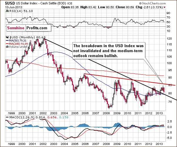
When we take a look at the above chart we can see that USD Index declined once again this week. Despite that fact, the January breakout was not invalidated. As we see, the index is still above the declining support line, and thus the medium-term outlook remains bullish.
Let’s take a look at the medium-term situation. Has it changed since last week?
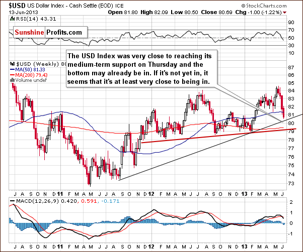
In this perspective we can see that the USD Index moved to its medium-term support line (marked with the thin black line), which is currently close to 80.4. It is very possible that this line will pause the decline, at least for a while, and it’s quite possible that it will actually stop it.
The situation remains bullish for the USD Index in the long and medium term, so let’s check to see if the short-time outlook is the same.
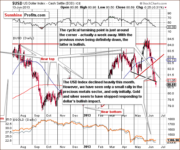
During the last several days, the USD Index declined and moved slightly below the short-term support line. There is a medium-term support line visible on the previous chart that is much more important so the above is actually not a big deal.
The most important factor on the above chart supporting the bullish case is the cyclical turning point which is very close – about a week away. It is possible that we will see its impact on the dollar next week and this can lead to a bigger pullback or – more likely – the end of the current decline. If we move back in time a bit, we will see similar situation in August and September 2012 when the cyclical turning point worked very well after a significant decline.
Additionally, please note that the RSI Indicator is now at the 30 level, which is a classic buying opportunity.
Now let’s move on to the analysis of the Euro Index.
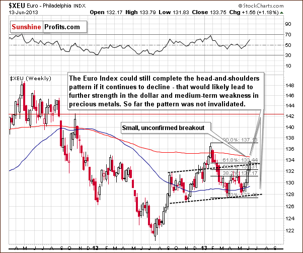
During the past week, the Euro Index has continued its rally and reached the upper dashed line (parallel to the line based on the local bottoms). To be precise, we saw a small breakout, but it was not yet confirmed. Despite this fact, the overall head-and-shoulders pattern wasn’t invalidated in our opinion – not yet. The above-mentioned line is additionally supported by a Fibonacci retracement level. This resistance zone may stop the rally (and the breakout could still be invalidated, especially given the medium-term support in the USD Index) and the head-and-shoulders pattern could still be completed if the euro declines once again. That would lead to further strength in the dollar and likely medium-term weakness in precious metals.
Summing up, the most important events in the currency market were: further decline of the dollar and the rally in the Euro Index chart which reached to the important resistance zone. Although the decline on the USD Index chart has been quite heavy, we have not seen a rally in gold and silver this week – they moved lower. The implications of this underperformance are bearish for the precious metals sector.
General Stock Market
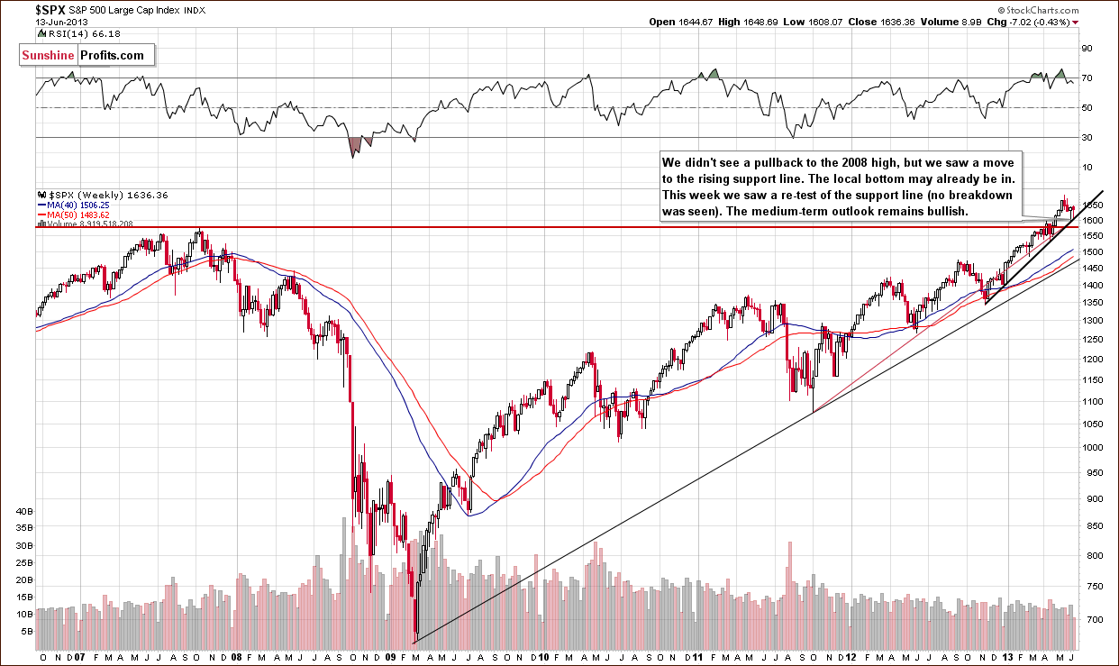
Turning now to the long-term S&P 500 Index chart, since last Friday’s Premium Update, the situation hasn’t changed much. Last week we wrote the following:
The bottom for the latest decline may be in because, although stocks did not decline to the level of the 2007 highs, price levels bounced off the intersection of two support lines. This could mean that the bottom may be in anyway.
Although we saw a re-test of the support line, the situation in the medium-term remains bullish, and the uptrend is not threatened.
We turn now to the financial sector that often has led other stocks.
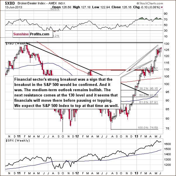
In this week’s Broker-Dealer index chart (proxy for the financial sector), we once again do not see any indications that stocks will be correcting any time soon (except for the RSI indicator that has been – with small pauses – overbought for months). The financials did not move to the next important resistance level. This eventual move will likely trigger a correction, but it will probably not be significant for the general stock market. The above index could move to the previous support level (110) and verify it as resistance.
Crude Oil
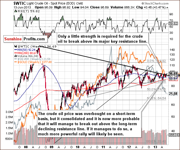
In this week’s Crude Oil price chart, we see much of the same situation as we have multiple times for more than a year after a substantial price rally. Crude oil is once again trying to breakout above the declining resistance line, which is something it has failed to do on numerous past attempts. We will wait for a successful breakout before commenting on the bullish implications which would follow.
Gold and Silver Correlations
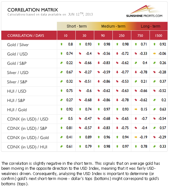
The Correlation Matrix is a tool which we have developed to analyze the impact of the currency markets and the general stock market upon the precious metals sector, (namely: gold correlations and silver correlations). So how does the situation in the currency markets and the bullish outlook for the dollar and stocks translate to the precious metals? Well, we have a particular situation this week which is unlike anything we can ever recall. For the short and medium-term, the precious metals are anti-asset (negatively correlated). Their prices move the opposite of the USD Index and the general stock market.
On a very short-term basis, however (for the past 2 weeks), their prices have actually moved in the same direction of these other markets, and this is exactly at a time when the other markets corrected. So when things go wrong in terms of impact for the metals, they follow and decline, but recently, when a rally should have been triggered, it simply was not seen. This is a very bearish combination and a strong warning sign for anyone who is long in precious metals at this time.
Gold
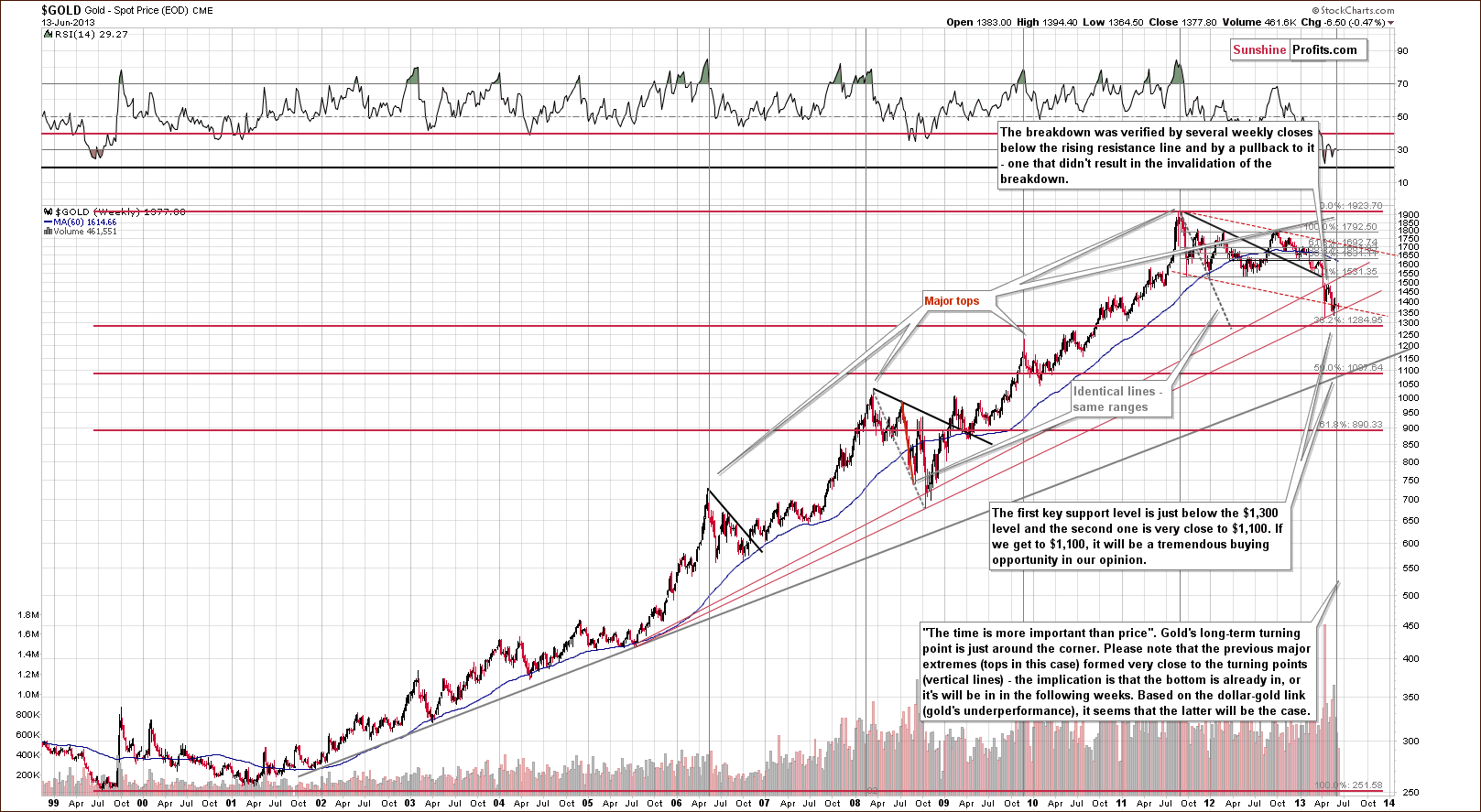
In this week’s very long-term gold chart, comments made in last week’s Premium Update remain up-to-date:
The outlook continues to be bearish and the trend remains down. Gold could still decline heavily based on the long-term cyclical turning point (…). In both 2008 and 2009, local tops formed slightly after the cyclical turning point, so it is possible that the reversal in the downtrend won’t be seen until after the cyclical turning point once again, leaving a number of days in which further declines could be seen.
We are still likely to see declines after the cyclical turning point from this long-term perspective. The turning point should work on a “near to” basis and declines will likely be seen sooner rather than later (and the bottom is likely weeks away, not months away).
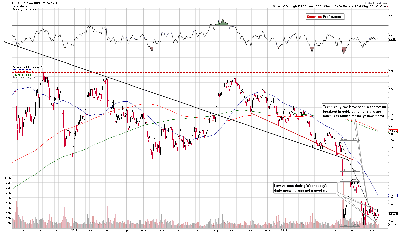
In this week’s medium-term GLD ETF chart, we actually saw a breakout, which was not visible on the long-term chart. This breakout was not invalidated, but gold moved lower after the breakout and declined on strong volume. A pullback was then seen on low volume (when the dollar declined) so the upswing was really quite weak.
This is also a very bearish combination. In our opinion, the breakout itself is less significant than the extreme underperformance of gold. RSI levels are very close to 50, which is about where they were when the declines began previously (note local tops and corresponding tops in RSI since November 2012). So even though gold is low, the RSI is not even close to overbought at this time.
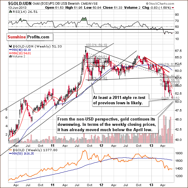
In this week’s chart of gold from the non-USD perspective, the declines continued this week, and although we did not see any breakdown in the intra-day lows, the weekly closing prices continue in a downtrend. Perhaps the most bearish factor of all is seen in our next chart.
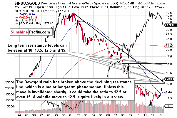
In this week’s Dow to gold ratio chart, we have another significant bearish factor. A long-term major breakout was seen here last month, which is really a bearish phenomenon. It has not been invalidated up to this day and is now in its second month above this line, so the suggestion here is that another big decline is in the cards for gold.
Summing up, the situation in gold remains bearish. Gold’s underperformance has become even more significant this week and we think thatthis makes the outlook even more bearish for the short term.
Silver
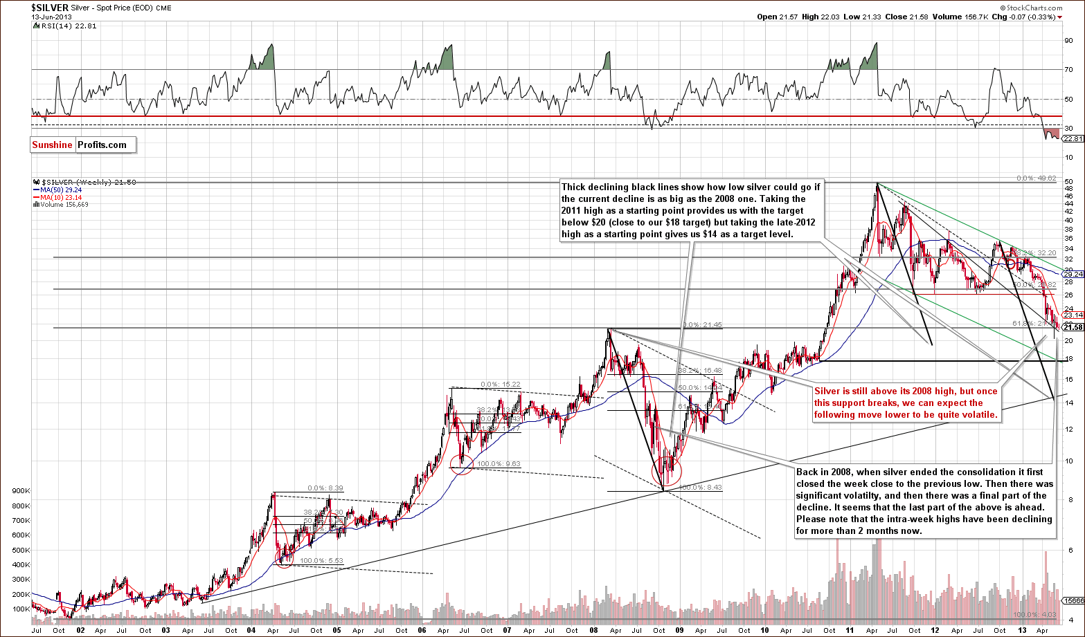
In this week’s very long-term silver chart, not much really happened as prices declined slightly, less than half of 1 percent overall. The intra-day high for the week was lower than last week once again and from this perspective, the declines clearly go on.
No confirmed move has been seen below the level of the 2008 highs, but silver’s price is only slightly above it at this time. It seems that we’ll have another sharp decline once the breakdown below this support level is seen and confirmed.
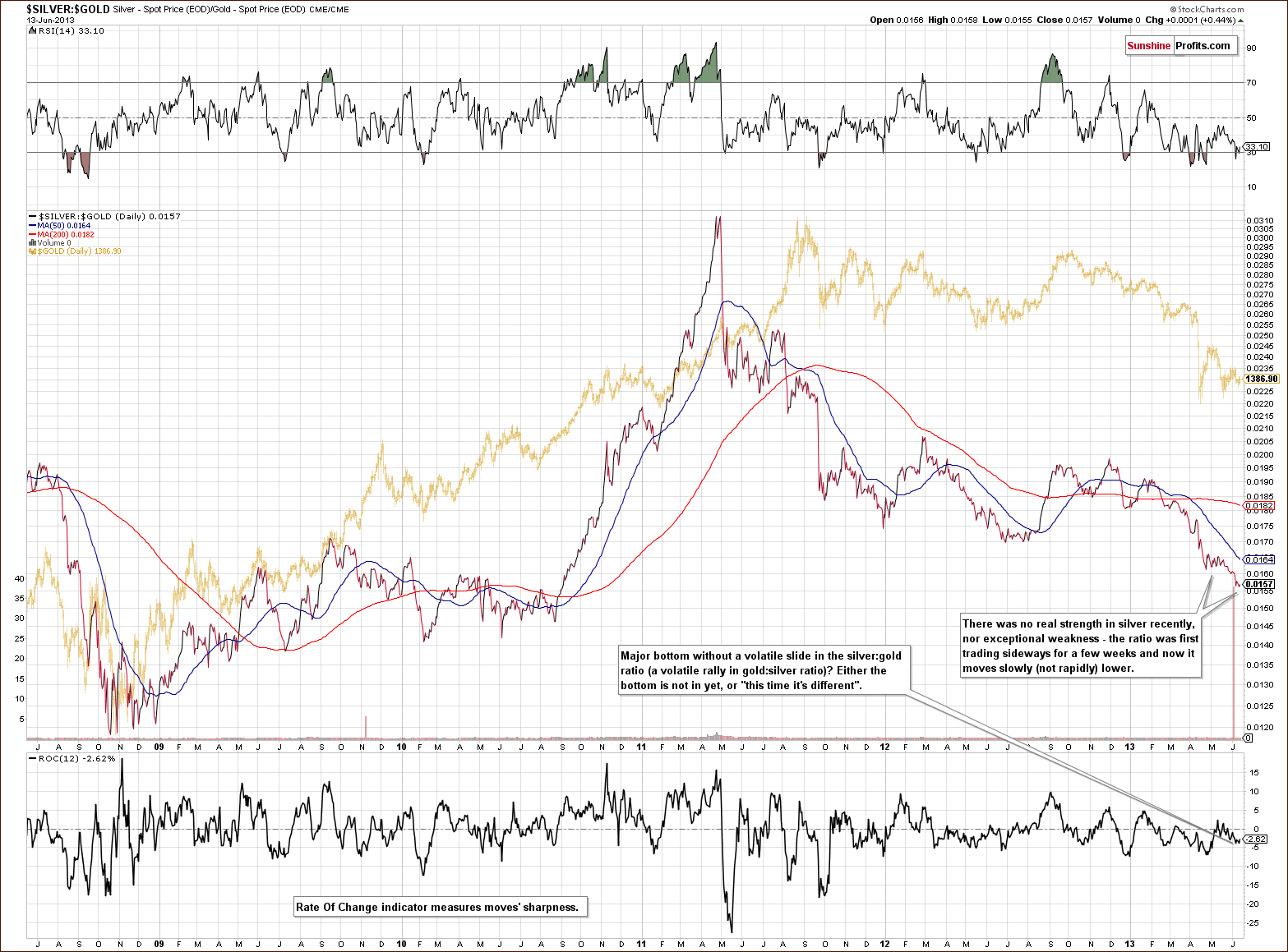
In the silver to gold ratio chart, we can get a feel for whether or not recent declines have been significant and sharp enough to indicate that silver has bottomed. This does not appear to be the case. In the silver to gold ratio, we first saw some consolidation and then another move lower. This move was not rapid, however, and the rate of change indicator (at the bottom of the chart) is definitely not indicating any real sharpness in the move.
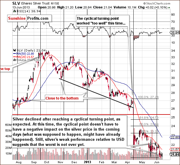
In the short-term SLV ETF chart, recall that last week we said that prices would likely move lower after the cyclical turning point. This decline has been seen as expected, so the impact of the cyclical turning point is no longer profound. This factor still has some bearish implications but it is silver’s lack of strength despite declining dollar that keeps the outlook really bearish.
The 20-day moving average, which was broken in February, has served as resistance and is now only a bit more than $0.50 above today’s price for the SLV ETF. If silver does move higher it doesn’t have far to go before encountering this strong resistance level which has held prices in check at least four times in the past three months.
Summing up, overall the situation remains bearish for silver. Although recent declines have been small, the downtrend remains in place from several perspectives and the white metal’s bottom seems to still be ahead of us.
Platinum
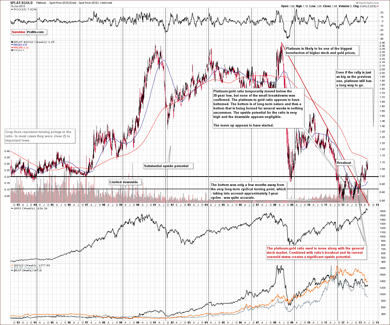
In the platinum to gold ratio chart this week, we don’t see anything to suggest that we change our approach towards platinum. While precious metals prices are likely to continue to move lower (and this means that platinum is likely to move temporarily lower too), the latter seems a bit better than gold to bet on at this time – if you want to purchase or keep them anyway. It was heavily oversold last year and is now moving back up relative to gold.
Platinum still has a long way to go to move back to its long-term average, but its price could actually move past this level. This is especially the case since the platinum to gold ratio has been significantly correlated with stocks, and the general stock market is moving higher with a positive outlook. In short, platinum is still preferred over gold at this time, but at the same time we think that both will move lower temporarily.
Gold and Silver Mining Stocks
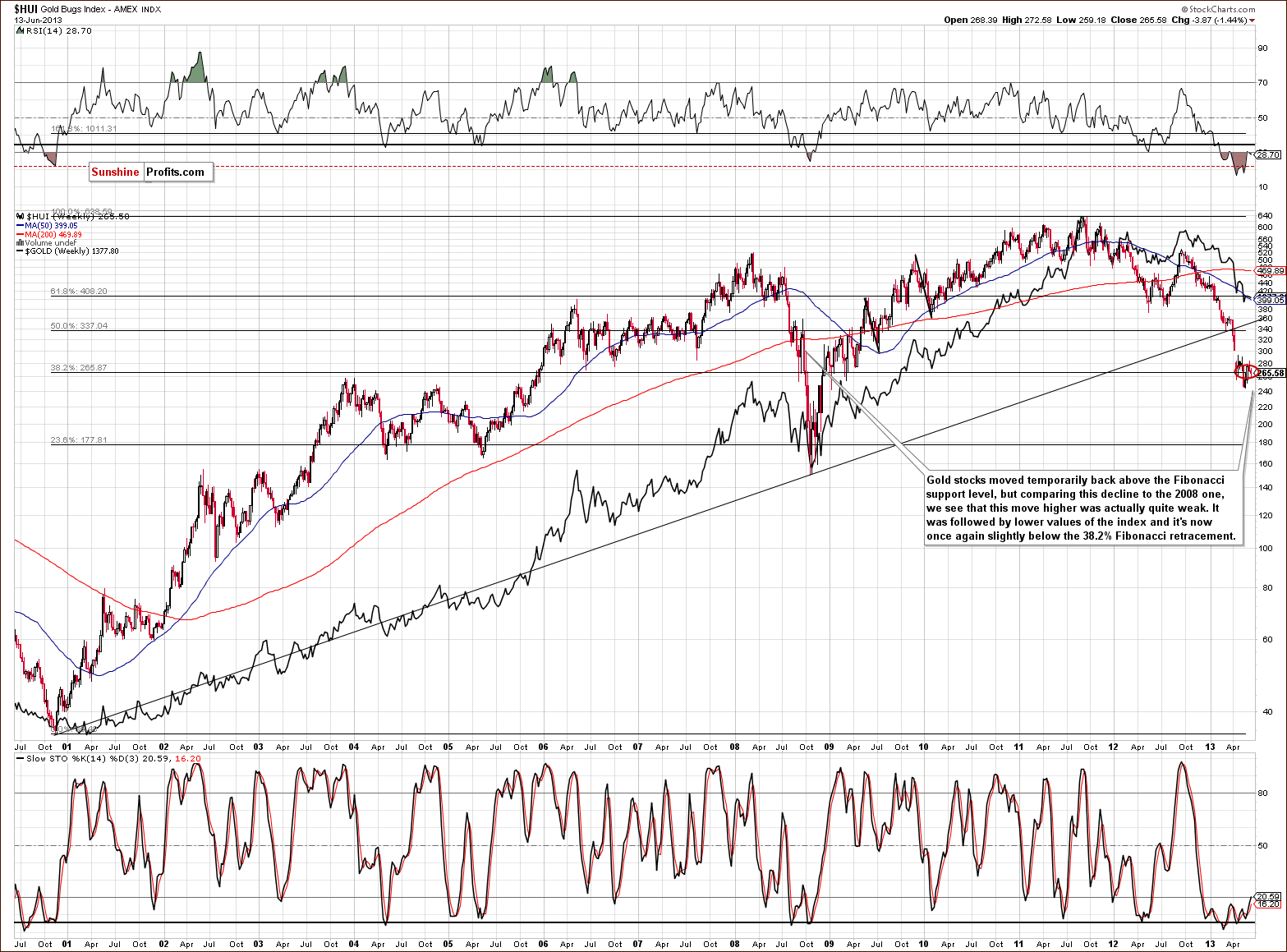
In this week’s very long-term HUI index chart, we continue to see consolidation slightly below the Fibonacci retracement level - very little has changed this week. The RSI stopped being extremely oversold for a bit and earlier this year, a similar move in the RSI (in March 2013) preceded a major plunge in gold stock prices. So it seems another decline is possible now, and even though this may be a weak analogy (it happened only once, so it’s difficult to speak of a tendency), it is bearish factor.
Prices have been consolidating and there has been no major breakout, so the trend is likely to continue here. Recall that there was some strength shown recently, and we said not to pay attention to it since it was probably a temporary phenomenon. It turned out to be just that. We will get back to this topic when discussing the GDX ETF chart, but for now let’s take a look at gold stocks underperformance to gold.
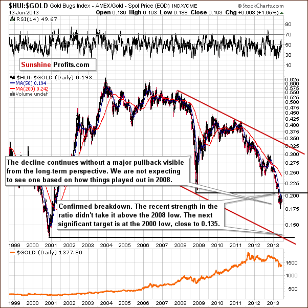
In the gold stocks to gold ratio chart, the outperformance of gold stocks to gold is not even visible from the long-term perspective. The situation remains bearish according to this chart.
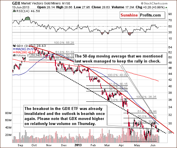
In this week’s short-term GDX ETF chart, we see more bearish implications. Prices pulled back to the broken support line which is now resistance. In other words, the breakout was invalidated this week, which changed a lot. Moreover, the move higher that followed the invalidation, was seen on low volume – indication of further weakness ahead.
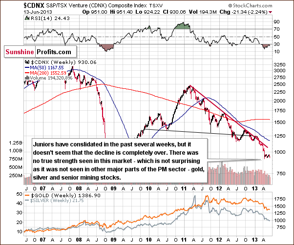
We now turn to the Toronto Stock Exchange Venture Index chart (which is a proxy for the junior miners as so many of them are included in it). In this week’s chart, we see no bullish implications but decided to include this chart since we haven’t done so in a while and thought you might be curious.
Generally, there was a consolidation following a sharp decline and we could see a continuation of the decline in the coming weeks. Taking the whole, huge head-and-shoulders pattern into consideration, it seems that the move following the breakdown below the pattern did not take prices as low as technically indicated (by the size of the head in the pattern). Further declines could therefore be seen here, and the bearish outlook is once again confirmed.
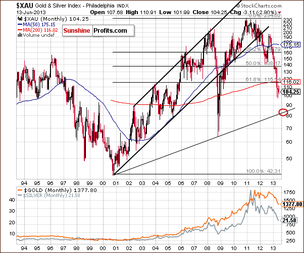
Finally, the XAU Index chart once again provides us with the clearest picture as far as target for the precious metals mining stocks is concerned. It seems that at least a local bottom will probably form slightly above the 80 level, perhaps close to 84. This target level is created from the rising support line based on the late 2000 and 2008 lows.
Summing up, the outlook for gold stocks overall remains bearish. No truly bullish signals are seen here this week.
Letters from Subscribers
Q: I've been receiving your subscriber updates for the last two months and am wondering that, if the US dollar is on a long term upward bias, wouldn't that create a long term downward bias for gold and silver? If such is true, wouldn't the PM sector be in an extended bear market such that it might not be secular but cylclical? Whereas physical demand has been documented, precious metals remain weaker. Something isn't adding up.
A: In the long run there's much more to the precious metals market than the weakness in the US Dollar. Please note the long-term correlation coefficient in our Correlation Matrix in the Gold / USD row - it's quite close to zero.
Furthermore, please note the following examples:
In April 2008 gold was trading around $900 and USD Index was close to 72. In Feb 2009, gold topped close to $1,000 while USD Index was close to 86. The most interesting point is that within this time-frame gold plunged when dollar rallied on a short-term basis, but in the end, both ended up higher.
Also, the USD Index is now more or less where it was in 2007, while gold is about twice as expensive.
Our point here is that dollar's strength will likely only harm gold in the short- and medium term. It's not something that is likely to stop the bull market. In 2008 and 2009 dollar's strength harmed gold temporarily but it moved back up with vengeance, and we think the same will be the case once again - only not right away.
Finally, metals remaining weaker despite strong physical demand is a short-term phenomenon. The physical factor is one thing that will likely make gold move higher over time. In the short run, however, markets can, and are emotional, not logical. They repeat themselves in their emotional price patterns, too, thanks to which we can apply technical tools and we at least somewhat know what to expect looking at what happened during the previous bull market. We saw a major correction in 1976 before the bull market resumed and therefore seeing one right now should not be that surprising to us.
Q: Like the diamond skull does this signify that we are due a massive correction? Soon after the skull with diamonds was publicised there was a crash.
A: We don't think that this is a meaningful sign for the gold market. There is indeed a phenomenon called "let's build the biggest / greatest / etc." that marks local tops but this is something that we can spot after a big rally, not after 2 years of consolidation and a technical breakdown. The example of the above phenomenon is easy to find on the real estate market - when it is announced that a building bigger than the previously biggest one will be created, it means that the real estate market is likely just before the top.
Q: This chart is different to yours [features a 30-year gold seasonality]. Strange that two sources will come up with a different result. Please can you comment on the validity of both.
A: That's a bit analogous to different moving averages. You can have 10-day average (focusing on short-term moves), 50-day average (medium-term moves), 200- or 250-day moving average (focusing on long-term moves), or even a 7500-day moving average, which is pretty much useless for trading.
The seasonal chart seen on that page is based on about 7500 trading days - 30 years. The True Seasonal charts that we provide in the static form from time to time and that we will provide in an interactive form are based on smaller data range - from this secular bull market only, which we think are more useful for trading purposes as the fundamental factors influencing the seasonal tendencies can, and do change over time. Additionally, the True Seasonal charts take into account the expiration of derivatives - which doesn't happen at the same time each month and can distort projections based on simple seasonal patterns.
The general trends are similar and these are the most important ones - usually nothing good happens during the summer months (there are exceptions, though) and the final months of the year are characterized by rallies. As far as short-term trading is concerned - and we may be biased as we designed the latter - we think that True Seasonal patterns are more useful.
Summary
The extreme underperformance of the precious metals relative to the dollar was even more extreme this week. Gold’s price declined this week even though the USD Index moved significantly lower. This is a very bearish indication.
Earlier this week, an invalidation of the breakout in the GDX ETF was seen and this is also a short-term bearish signal. The pullback on Thursday on low volume was also bearish. Overall, the situation in precious metals looks bad, and it seems that further declines will be seen relatively soon, as the USD Index is very close to a significant support line and the cyclical turning point is also just around the corner.
Given the very significant underperformance of gold relative to the dollar, we have decided to increase the size of our short position in the precious metals sector. This applies to gold, silver and the precious metals mining stocks. Our SP Indicator suggests higher prices but our self-similarity soon-to-be-released tool point to lower values. We have – subjectively – become even more bearish than before, and we think that increasing the size of short positions is justified at this time.
The final decision is up to you, but it seems that the risk-averse traders can keep the position intact or increase it by no more than 50% or so, and more aggressive traders could even double the size of their short bets at this time. We are leaving our stop-losses at the same levels stated previously so if this decision regarding short positions is wrong, it won’t cost anyone too much. It really does seem to be a very good opportunity for shorting.
As a reminder, the stop-loss levels for the current short positions are:
Gold: $1,428
Silver: $23.55
GDX: $31.30
HUI Index: 292
Trading – PR: Short gold, silver and mining stocks. Extra position.
Trading – SP Indicators: No positions: SP Indicators suggest long positions but the new self-similarity-based tool suggests short ones for the precious metals sector and we think that overall they cancel each other out.
Long-term investments: No positions.
| Portfolio's Part | Position | Stop-loss / Expiry Date |
|---|---|---|
| Trading: Mining stocks | Short | 292 (HUI), $31.30 (GDX) / - |
| Trading: Gold | Short | $1,428 / - |
| Trading: Silver | Short | $23.55 / - |
| Long-term investments: Gold | No position | Buy half at $1,305 |
| Long-term investments: Silver | No position | Buy half at $18.20 |
| Long-term investments: Mining Stocks | No position | Buy half at XAU 84 |
This completes this week’s Premium Update. No Premium Update will be published next week so our next Premium Update is scheduled for June 28, 2013. Market Alerts will continue to be sent daily for the coming two weeks (so you will stay informed) with the possible exception of Wednesday, June 19 (we will probably sent you alert on Wednesday as well, but we can’t guarantee it at this time).
Thank you for using the Premium Service. Have a profitable week, a great weekend!
Sincerely,
Przemyslaw Radomski, CFA


