- Euro & USD Indices
- General Stock Market
- Copper
- Correlation Matrix
- Gold
- Silver
- Palladium
- Mining Stocks
- Letters from Subscribers
- Pace of short covering
- Gold ETF holdings
- Summary
Last week, in the first part of the Premium Update we focused on the idea that gold is not an inflation hedge. Here, we develop this notion even further. If we’re talking about gold as a hedge, it is rather a system-hedge than an inflation-hedge. Since 1973, when the dollar was allowed to float, gold has confirmed this view.
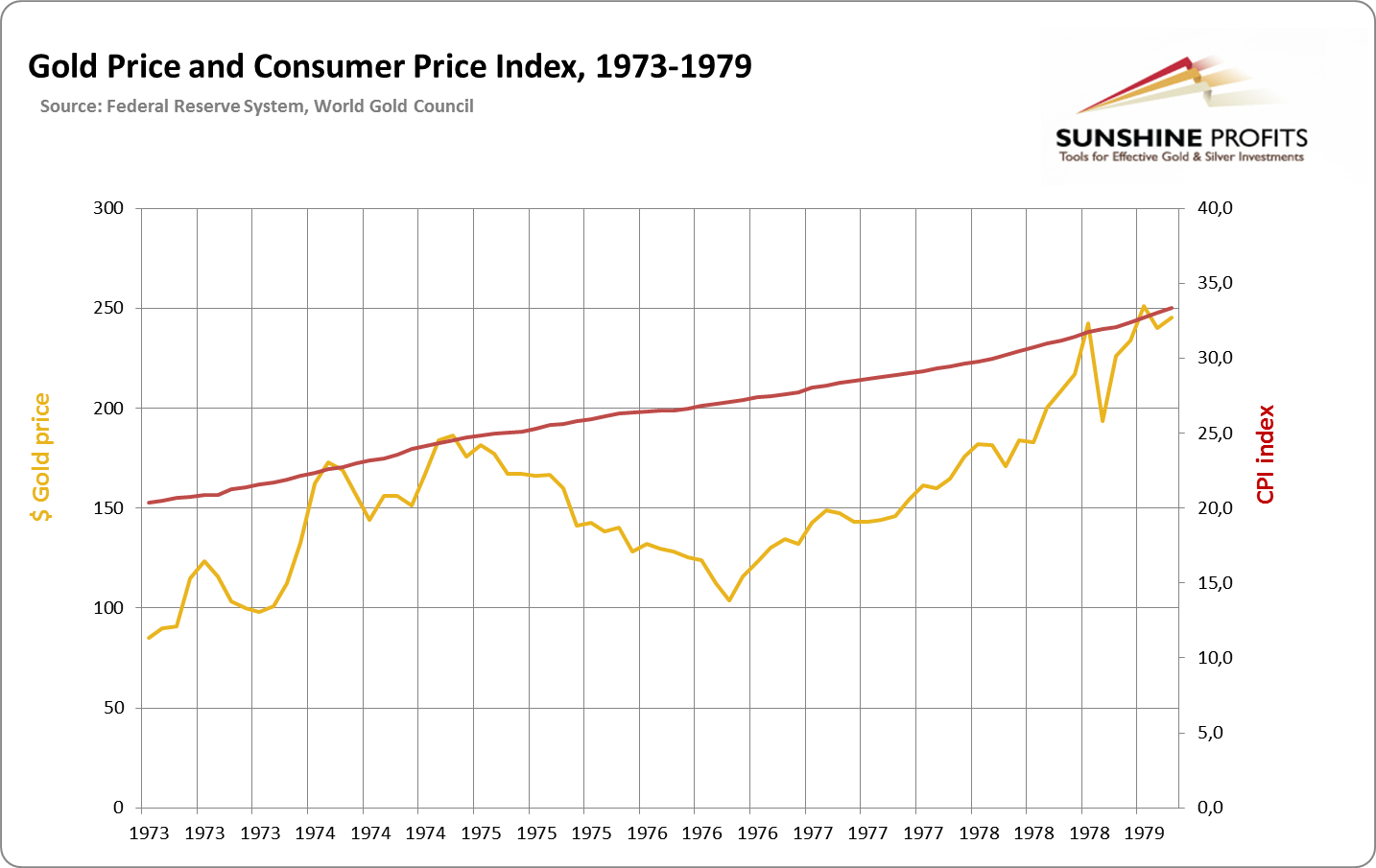
When it is wanted as a dollar alternative, the price of gold goes up. This takes place when the trust in the dollar plummets, or actually when the trust in the dollar-dominated-system plummets. Gold rose during the end of the 1970s because of expressively high inflation. But it was not only inflation that was decisive. This high inflation led to distrust in the dollar, therefore, gold became the alternative. The general trend of gold looks a lot like increasing CPI:
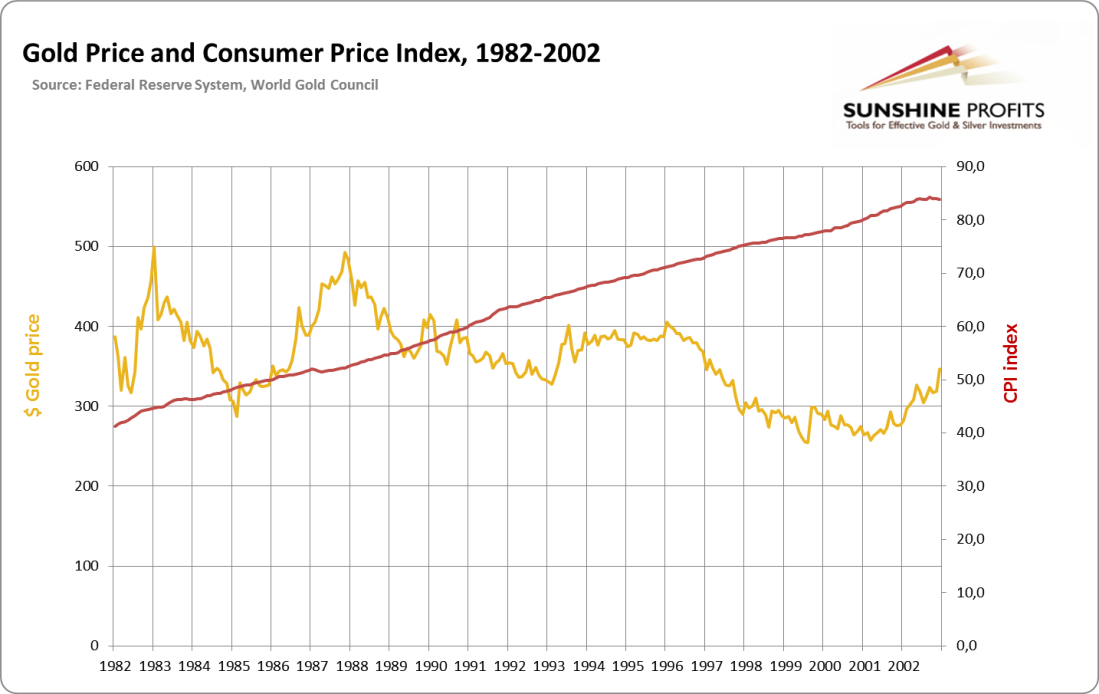
After the 1980s recession and end of the short-lived gold bubble Volcker tamed the dollar, which renew trust in it. The next 20 years were times of a noticeably strong dollar and stronger faith in this paper money. The conditions also paved the way for enormous increases in debt of the economy, which transformed the United States into the greatest debtor in the history of human civilization. During that time despite positive inflation gold was dropped as a “currency alternative”, therefore lost its value. The dollar was drained by mild inflationary forces; gold did not keep the pace and went down:
With oversupply of US dollars, the credit situation was reversed in the 21st century. Over indebtedness in the American economy has shaken the trust in the dollar-dominated system (especially due to agency debt and private debt). As Paul Samuelson called it, the “run on dollar” was triggered from 2001. This was visible in the decline of the dollar against other currencies, and also gold became a reliable alternative. The pace of inflation was overall no more impressive than it was for the previous 20 years. Yet suddenly the relation between gold and dollar had shifted, and the price of gold grew at a much higher pace than the dollar was losing value. Why? Because of the system dynamics and lowered trust in the dollar.
In any case gold is not really an inflation-hedge. It is a special investment vehicle that requires careful focus and analysis separate from only inflationary forces. Those forces no doubt affect the gold market. But not in a way many people often suggest, and in a way which may lead to misplaced investments.
The above is an excerpt from our latest Market Overview report. If you haven’t done so already, you can sign up for these reports here.
Having said that let’s move to charts (courtesy of http://stockcharts.com) and the short-term outlook for gold. As in the previous weeks, we’ll start with the USD Index.
USD and Euro Indices
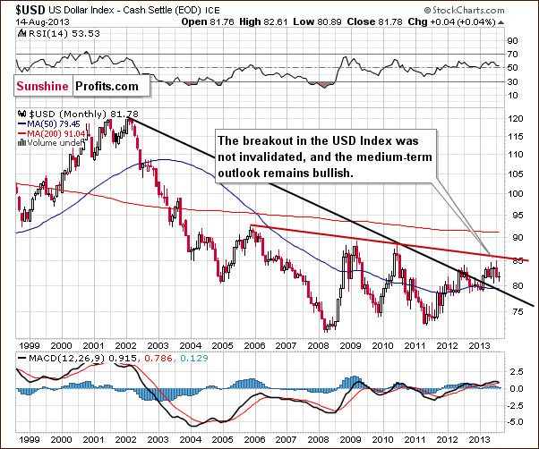
The situation in the long-term chart hasn’t changed much recently.
As we wrote in our last Premium Update:
The breakout above the declining support/resistance line (currently close to 79) was still not invalidated. From this perspective, the situation remains bullish.
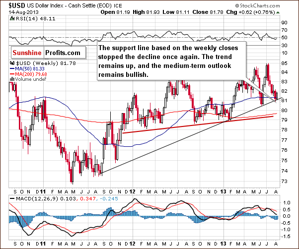
In our last Premium Update we wrote:
(…) The recent declines took the index to the medium-term support line (currently close to the 81 level). Keep in mind that this strong support line stopped the decline in June (although it was not even reached) and encouraged buyers to act, which resulted in a sharp rally in the following days.
As you see on the weekly chart, we saw a similar situation in the recent days. The dollar jumped from the medium-term support line and climbed up above the 50-week moving average, which serves as support now.
From this perspective, the medium-term uptrend is not threatened, and the situation remains bullish. Therefore we can expect the dollar to strengthen further in the coming weeks.
Now let's zoom in on our short-term view of the USD Index and discuss this week’s chart.
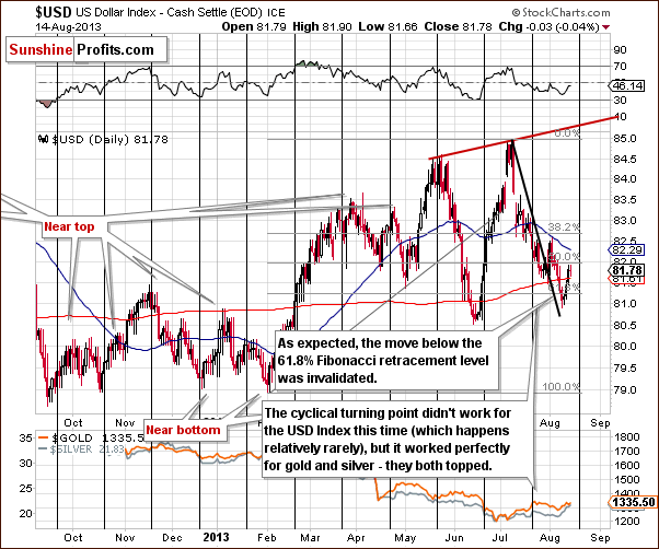
From the short-term perspective, we clearly see that the recent decline took the US dollar slightly below the 61.8% Fibonacci retracement level based on the entire February – July rally. Despite this downward movement, buyers managed to push the USD Index higher, and the short-term breakdown below the above-mentioned Fibonacci retracement level was invalidated as you can see on the chart.
Quoting our last week’s Update:
The short-term breakdown is small and unconfirmed, and unconfirmed by what we see on the medium-term chart, where a strong support line stopped the decline. Consequently, it seems that the short-term breakout will be invalidated shortly.
On the above chart, we also see that there was a short-term breakout above the black declining line, which was not invalidated. From this perspective, it’s quite possible that the bottom of the recent correction is already in.
Let’s now take a look at the Euro Index.
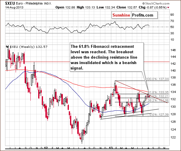
On the above chart, we see that the Euro Index declined in recent days. The combination of the 200-week moving average, and the strong resistance at the 134 level stopped the rally.
The European currency moved back below its declining resistance line based on the January top and the June peak, which is an invalidation of the small breakout that we saw last week.
The above is by itself a bearish sign for the European currency. A continuation of the declines in the euro would likely lead to further strength in the dollar and to declines in precious metals.
Summing up, the long- and medium-term outlooks for the dollar remain bullish. From the short-time perspective, the situation is a bit unclear with a bullish bias based on the invalidation of the previous breakdown. The recent change in the euro index price levels provides us with bearish implications, and from this point of view, we expect to see a move to the upside in the USD Index in the coming weeks.
General Stock Market
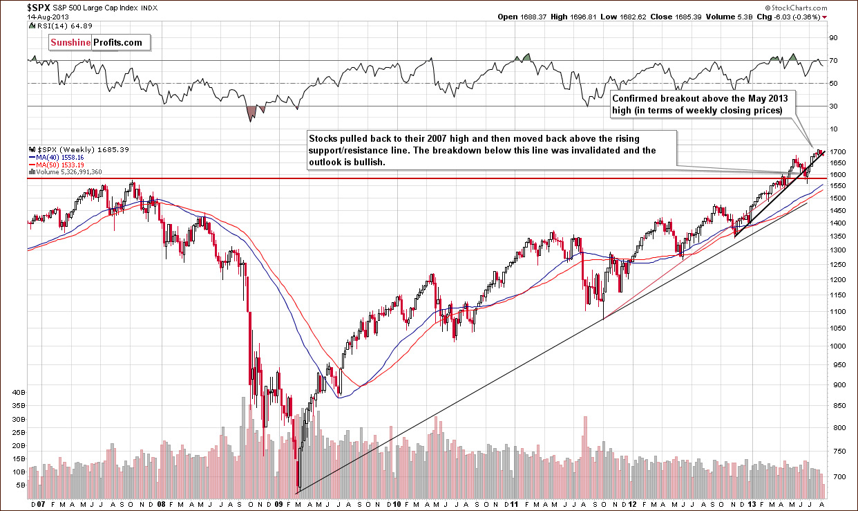
On this week‘s long-term S&P 500 chart, we see that the situation hasn’t changed much.
The correction is very shallow, and the S&P 500 Index is still above the previously broken rising trend line based on the November 2012 January 2013 lows.
Please note that the RSI is no longer above the 70 level, and from this point of view, the stock market is not so overbought anymore.
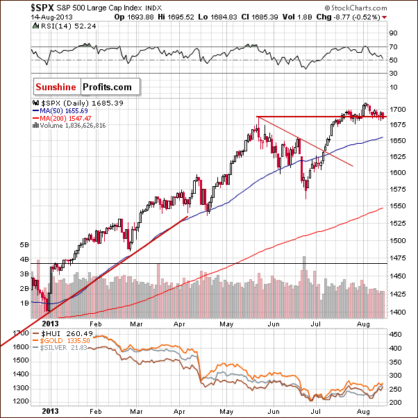
On the above daily chart we see that prices declined in the recent days. Even though stocks temporarily moved back below the May top once again, they didn’t close below this important level for 3 consecutive trading days and the move below the high was quite insignificant. Most importantly, the SP 500 didn’t close below the top measured in terms of daily closing prices.
It’s worth mentioning that a large part of the recent move up in the precious metal sector, especially in silver, materialized when stocks seemed to be breaking below the May high.
It looks like investors were quickly buying precious metals as a hedge against big declines in the stock market.
Please note that no breakdown was confirmed. Instead, stocks closed visibly above the May high. From the short-term point of view, the outlook is also bullish.
The situation is not overbought on a short-term basis – the RSI is relatively close to the 50 level, so a bigger rally could be seen. It is likely to be seen, because this move will be very much in tune with the bigger trend. Therefore, those who bought precious metals and mining stocks based on an expected move lower in stocks are likely to sell them once again.
Actually, we can see a similar mechanism in the dollar-gold relationship. Many investors who were focused only on the short term charts and support levels probably opened short positions / closed long ones in the USD Index after the breakdown below the 61.8% Fibonacci retracement level. (The opposite could have been the case with the gold market, which is what might have helped push precious metals higher in recent days.) However, they didn’t take into account the great importance of the medium-term support line in the USD Index. It stopped the decline in June and did it once again in the recent days. Therefore, they are likely to close the positions with a loss, which may result in further growth in the US currency.
We turn now to the financial sector, which in the past used to lead the rest of the general stock market.
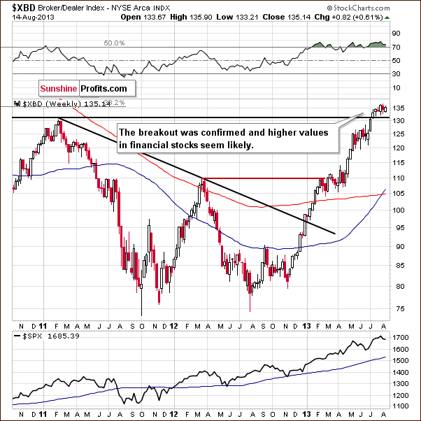
On the above Broker-Dealer Index chart, we see that the financials remain above the previously broken resistance level of 130. Despite last week’s decline, the outlook hasn’t changed here.
The breakout above the level of 130 has not been invalidated. Taking this into account, there’s a greater probability that the breakout in stocks will not be invalidated.
Summing up, although we saw a small corrective move in stocks, the previously confirmed long- and short-term breakouts were not invalidated. This fact, along with a bullish outlook for the financials makes the overall outlook bullish for the general stock market.
Copper
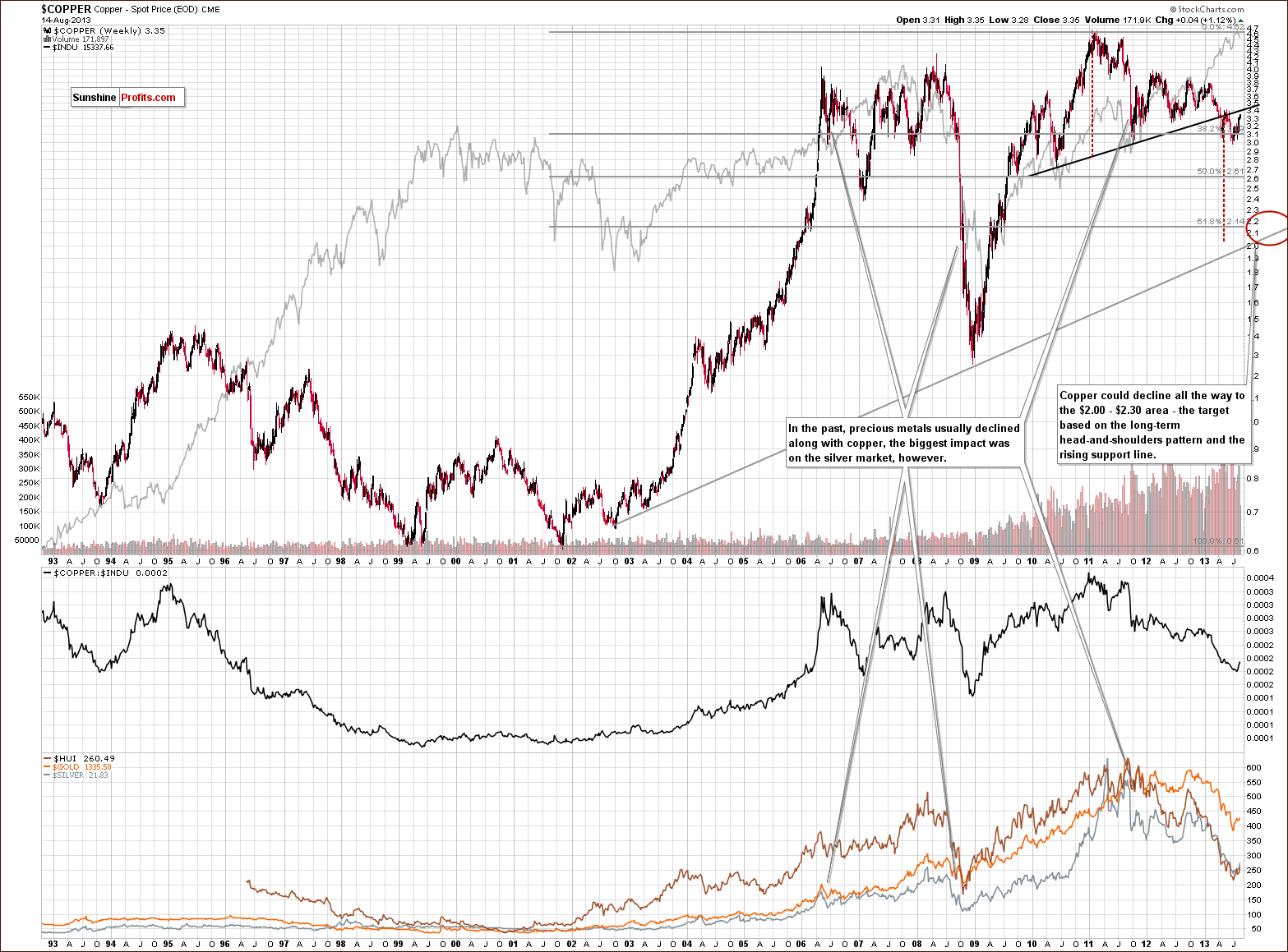
This week we’re moving back to the copper market to see if the recent move up in the commodity sector, including precious metals, changes anything from the long-term perspective.
What we see is that the recent move up on short-term basis is just a pullback that didn’t invalidate the previous large head and shoulders pattern.
Consequently, the medium-term outlook for copper remains bearish.
Gold & Silver Correlations
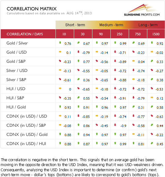
The Correlation Matrix is a tool which we have developed to analyze the impact of the currency markets and the general stock market upon the precious metals sector (namely: gold and silver correlations).
The recent strength in gold relative to the dollar seems to be a very short-term phenomenon only. The coefficients based on the previous 30 trading days are still strongly negative. The medium-term coefficients are also negative; however, the 90-day column has a very small, negative value.
Generally, the above provides us with a bearish outlook for the precious metals sector because of the medium-term outlook for the USD Index, which is bullish. Since the USD Index just bounced off a strong support line, the downside seems very limited.
The reason for the 90-day column value being so insignificant is that gold underperformed the USD Index for quite a long time. The implications therefore are bearish anyway.
Summing up, the indications of the current bullish situation in the USD Index in the medium-term are bearish for gold and the rest of the precious metal sector.
As always this may change in the coming days, but what we’ve seen so far is not enough to invalidate this tendency.
Gold
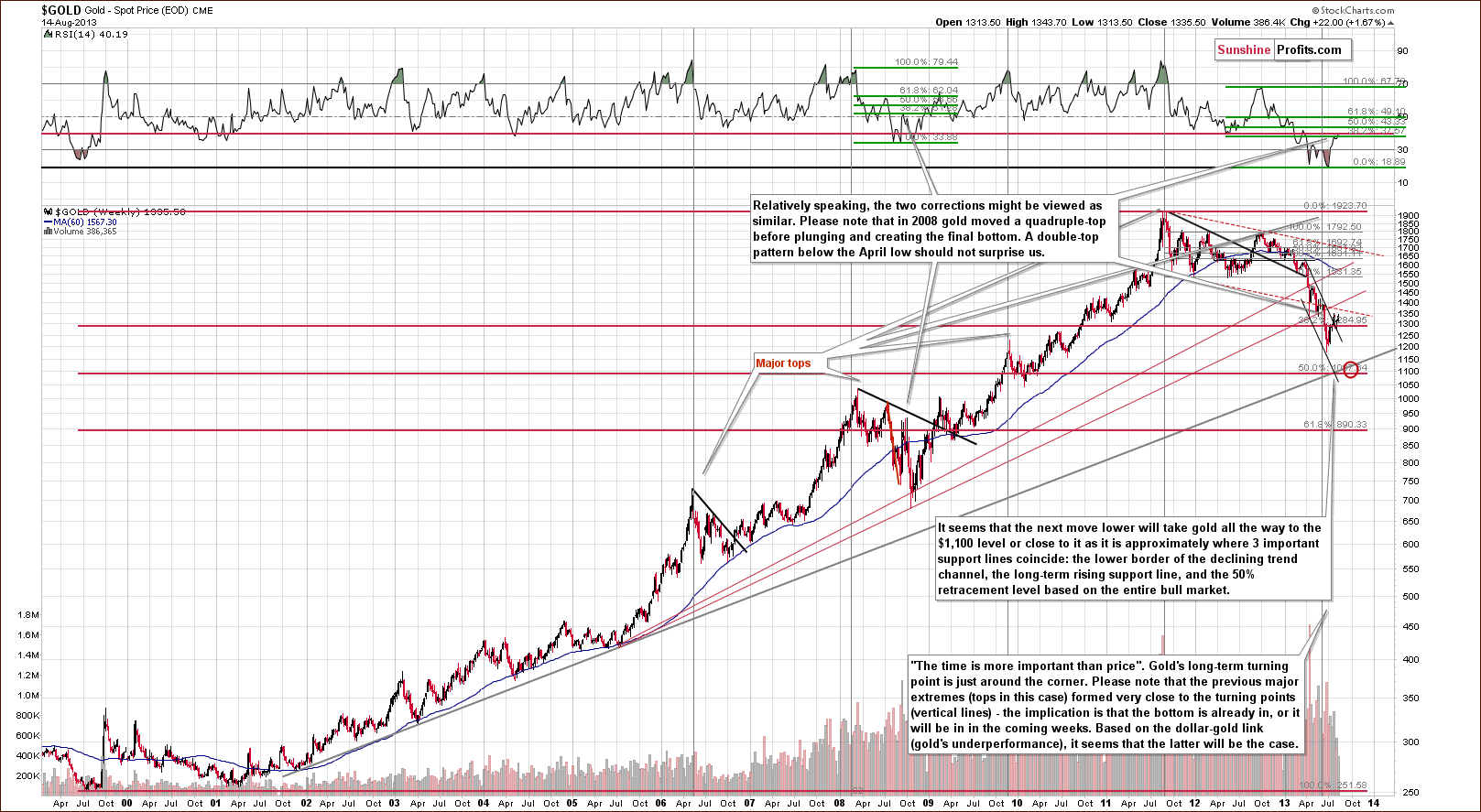
On the above chart we see a number of things, but we’ll start with the most significant one. The current move up is quite similar to the relatively big rally that we saw in September 2008. Back then, gold rallied more significantly on a relative and absolute basis (in dollar terms) but back then the preceding decline was faster as well, so a more volatile pullback might have been necessary to cool down the emotions of market participants.
One of the ways to compare situations on a relative basis is through the indicators. The RSI Indicator is one which is useful for the gold market, and that’s why we chose to take a look at it in order to determine if there are any similarities between the current and the 2008 pullback.
It turned out that in both cases, the RSI Indicator corrected about 38.2% (Fibonacci retracement) of the decline from its last major top close to the 70 level. Consequently, the move that we’re seeing right now could be the correction that precedes the final part of the decline.
There’s more. In 2008, gold tried to move above an important resistance level but failed a few times in a row. Back then the level was created by the April 2008 bottom. It never held above this level for more than one week. Now, 5 years later, we also have the April low as an important resistance level, and gold is trying to move back above it. It’s making a second attempt right now.
Finally, if you were interested in the precious metals market 5 years ago, please recall if you thought that gold was about to take off when it simply corrected. Many investors and analysts thought so. Based on the breakout above the declining resistance line and strength in the silver market, many investors are expecting higher gold prices at this time. At first glance, the chart looks bullish. However, taking a closer look and examining the similarities further makes us think twice before betting on higher gold prices.
Let’s now take a look at the medium-term picture.
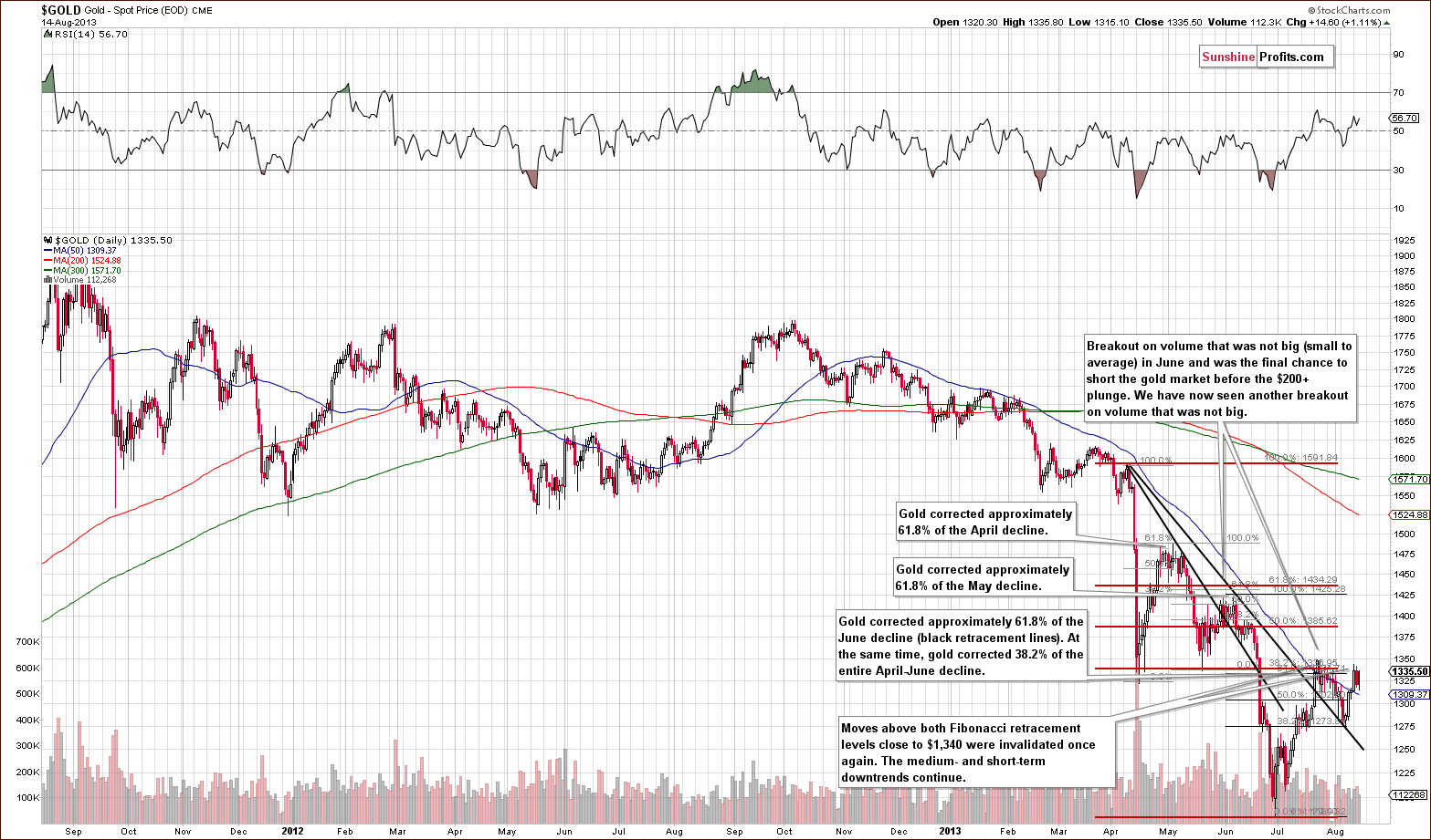
Gold once again tried to move back above the April low but failed to hold these levels. In the past few days, the yellow metal closed below the April low and the breakout was invalidated once again.
Consequently, this chart is not as bullish as it might seem despite the breakout above the declining resistance line.
The most important thing, however, is that gold didn’t manage to break above the April low even though the USD Index moved to its medium-term support.
With the outlook being bullish for the USD Index, it doesn’t seem that gold will have enough strength to hold the breakout above the April bottom. If it does, we have stop loss orders in place to protect us against such price action.
Now let’s take a look at the chart featuring gold’s price from the non-USD perspective.
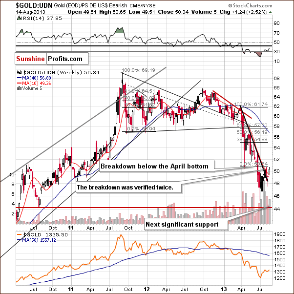
In our last Update, we wrote:
(...) gold showed weakness in the past week as well as this one, and the breakdown below the April’s bottom was verified.
On the above chart, we clearly see that the non-USD gold price moved once again to its April low and declined further after reaching it. In this way, the breakout was verified twice.
From this perspective the situation remains bearish.
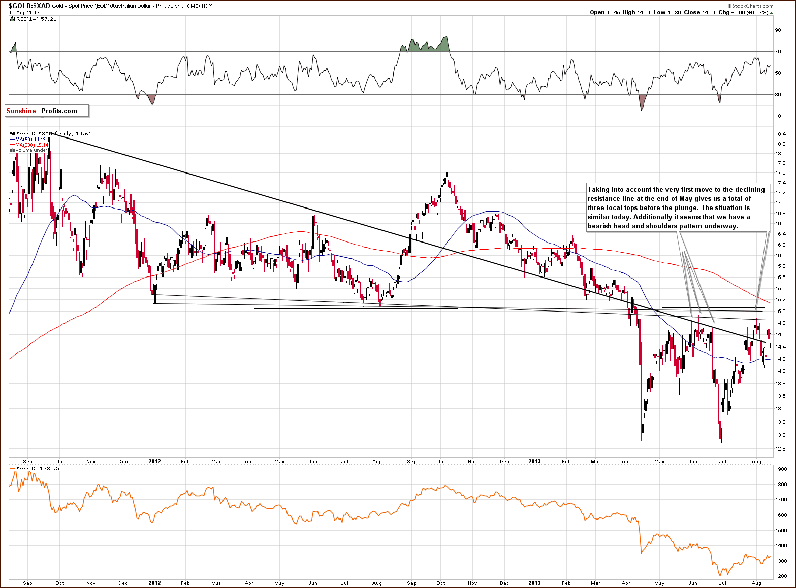
On the gold priced in Australian dollars chart, we see that there were three local tops before the plunge (we previously mentioned two tops as we didn’t include the final pullback to the declining resistance line). The first top was formed at the end of May, the second one in the first week of June, and the last one on June 20.
The situation is similar today. The recent local tops were formed respectively on July 24, July 31 and August 14. When we take a closer look at the above chart, it seems that we have a bearish head and shoulders pattern underway based on the last 3 local tops.
Keep in mind that we saw a similar price action in June. After the invalidation of the breakout above the previously broken resistance/support line, there was a pullback to this resistance line. The buyers, however, didn’t manage to push gold above it, resulting in strong declines. This time, the gold bulls were stronger and pushed the price a bit higher, but it doesn’t change the similarity of these two situations.
In June, the strong corrective move took gold’s price all the way back down to the April bottom area. If we see a similar price action here, gold priced in Australian dollars will likely decline heavily once again.
So, from this point of view, the recent price increase hasn’t changed the current outlook, and the implications remain bearish.
Let’s examine gold from another perspective – gold priced in British pounds.
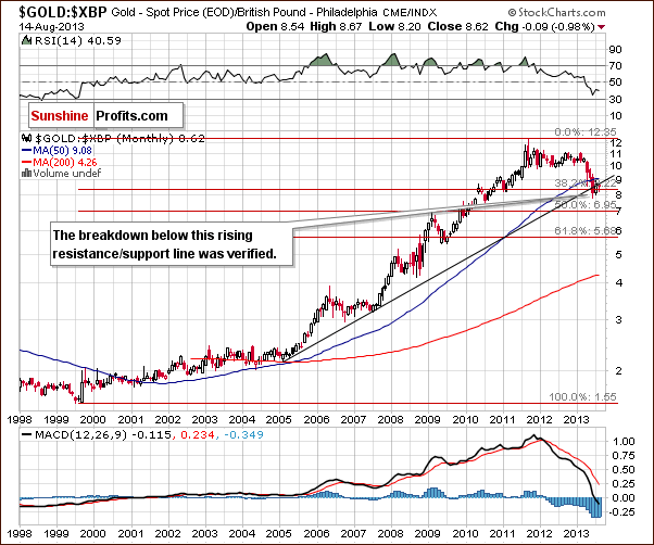
Quoting from last week’s Update:
(…) At the beginning of the month, gold reversed and moved back below not only previously broken rising resistance line, but also below the 38.2% Fibonacci retracement level.
Recently, gold priced in British pounds moved to the long-term rising resistance level again, but the situation hasn’t improved – there was no move back above this line.
From this point of view, it seems that we simply saw one more pullback before the invalidation of the breakout.
Consequently, we don’t really view this chart as bullish.
Before summarizing, let’s take a look at a relationship you don’t often read about.
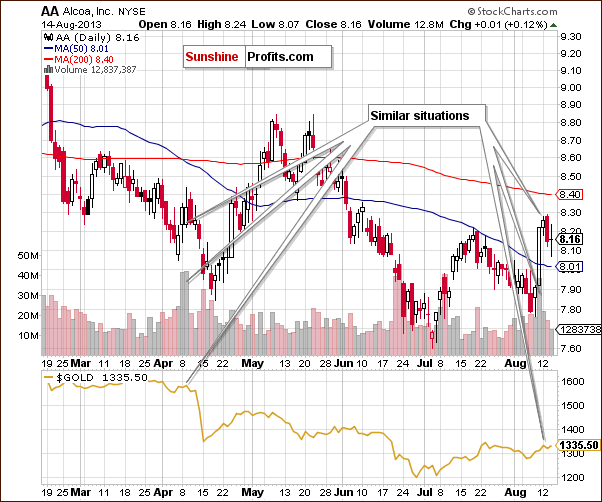
In our Monday’s Market Alert we wrote about the gold-Alcoa link:
We mentioned the gold-Alcoa link months ago and we see some similarity in trading patterns now as well (after all, they are both in the commodity sector). Local lows and local highs took place simultaneously in AA and in gold starting in April. AA shares rallied strongly on huge volume on Friday and the same was the case in early April - right before a decline in AA's share price, and before gold's plunge. Consequently, we have a bearish indication here.
Today, we would like to take this opportunity to provide you with a graphical presentation. As you can see on the above chart, rallies in AA on huge volume are not that common, so when they happen, they could signal something for gold. It’s not a very strong signal as we have only one similar case in the recent past, but still, it’s making the situation a bit more bearish than if we do not see such signal.
Summing up, the medium-term outlook for gold remains bearish. The situation remains similar to what happened in 2008 and in some ways similar to what happened right before the big declines that materialized earlier this year. One of the most important things is that the yellow metal didn’t manage to break above the April low even though the USD Index declined to its medium-term support line.
Silver
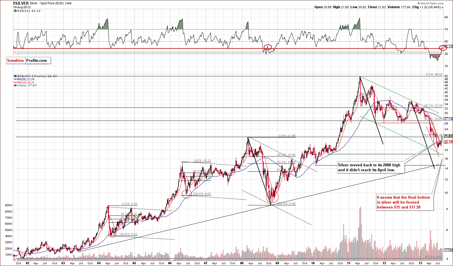
The first thing that we see on the above chart is that silver moved higher but not above its April low. On Wednesday, silver moved a bit above the 61.8% Fibonacci retracement level based on the prior several-years’ rally, which is at the same time the 2008 top and the April 2013 bottom. The move, however, is not confirmed so far.
Please take a few minutes to compare the current decline with the one we saw in 2008. The current decline is much slower, so it’s not surprising to see that a pullback also took more time.
The key thing here, however, is that the final decline materialized just after silver moved above the short-term declining resistance line in 2008 and when investors thought that the worst was behind them. The current pullback seems similar in that regard.
Moreover, please note that the RSI indicator moved higher in both corrections – now and in 2008. We marked these situations with red ellipses on the chart.
Even though the situation looked bullish in September 2008, it was actually the final chance to go speculatively short.
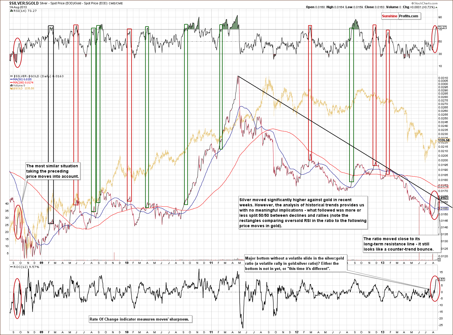
Silver’s outperformance might be something that you are – correctly - wondering about. On one hand, it seems that silver can lead gold higher. On the other hand, the last few times that silver outperformed gold was right before a sizable decline. When in doubt, it’s usually best to get back to the basics, and simply check what usually happened in situations similar to the one that we have right now.
The rally in the silver to gold ratio was significant enough to cause the RSI indicator based on it to rally substantially, moving above the 70 level. This meaningful sign could have some implications... but it doesn’t. We checked each case in the past 5 years when the RSI moved close to or above 70, and gold rallied in about half of cases and it declined in the other half. Consequently, there’s not much that we can infer based on silver’s recent outperformance.
We usually don’t bother you with things that are not meaningful, but this time we are making an exception. This is because it seems that there will be a lot of comments on silver’s current outperformance, and we want you to be able to compare them with the above.
There is one thing about the above chart that is indeed meaningful, and that’s the comparison of the situation that we have now with what we saw in September 2008 right before the final plunge. Back then, the silver to gold ratio moved higher during the corrective upswing (before the decline continued) and the size of the rally was quite similar to what we saw recently. Consequently, the very recent strength in the white metal does not invalidate the similarity between now and 2008, but rather confirms it.
This means that we shouldn’t say that silver’s strength is really a sign of a bottom. In fact, the long-term resistance line was not broken, and the trend remains down.
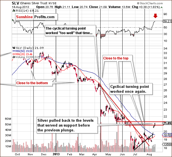
On the short-term SLV ETF chart, we clearly see that silver climbed up and reached the levels that served as support before the previous plunge. When we take a closer look at the daily chart, we notice that the recent price action looks like a zigzag pattern, and from this perspective, it looks like a correction.
Please note, that the RSI indicator is close to the 70 level, which means (according to the classical definition) that the top is about to be seen or is already in.
Summing up, the medium-term outlook remains bearish for the white metal even despite the strength shown in recent days.
Gold and Silver Mining Stocks
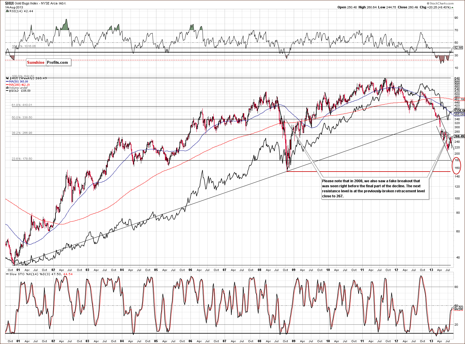
Similar to the situation in the gold market, we see mining stocks moving back to the April bottom, but failing to move back above it.
It doesn’t seem that we can trust the breakout above the declining trend channel line just yet, because during a declines similar to this one (the one we saw in 2008), such a fake breakout was the final pullback before a major decline.
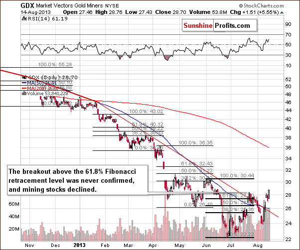
On the short-term GDX ETF chart we have a confirmation of the breakout above the medium-term declining resistance line which is a bullish fact by itself; however, at the same time, we don’t have a confirmed breakout above the 61.8 % Fibonacci retracement level.
Consequently, the situation in this chart is unclear with a bullish bias.
However, taking into the account the long-term trends and similarities, which are more important than the short-term ones, it seems that the medium-term outlook remains bearish anyway.
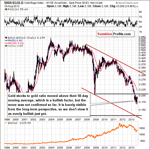
On the above chart featuring the gold stocks to gold ratio, we see that the consolidation simply continued without a major move up visible from the long-term perspective.
From this point of view, the trend remains down.
Summing up, the outlook for the mining stocks remains bearish, and the trend is still down despite the recent strength. The breakdown below the April low was not invalidated, and the short-term breakout above the 61.8% Fibonacci retracement was not confirmed yet. The move above the declining resistance line seems bullish, but that’s exactly what happened in 2008 right before the final plunge, so we don’t view it as a bullish sign just yet.
Letters from Subscribers
In previous Market Alerts we replied to most questions we have received since the last Premium Update and this leaves us with comments on the following link. It includes two charts, which we feature below for clarity:
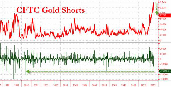
The author argues that the current pace of short covering is very similar to what we saw in the 1999-2000 period, which included a significant rally in Sep-Oct 1999. The author emphasizes that "the last time we saw shorts cover this size, prices surged".
While we appreciate bringing up the concept of the pace of decline, we respectfully disagree with the analysis of the chart and its implications.
First of all, there were multiple "signals" (the pace of short covering similar to what we see now) and only one sharp rally. Consequently, it's not that obvious that the two were connected. Secondly, in most cases when the shorts were covered so quickly, the price didn't rally sharply. Finally, what's clearly visible on the chart, is that the most recent case when the pace of short covering was similar to what we have right now is not what happened in 1999 and 2000 but what took place in 2008.
In 2008 shorts were covered at a similar pace when gold rallied in September - meaning when it pulled back after the initial decline. However, gold topped afterwards and declined once again, to create the final lows. This is exactly what we expect to happen and it's another factor that makes the very recent move up similar to what happened during the pullback 2008.
In other words, even though the article presents the chart as bullish, the chart itself doesn't have bullish implications for the short term (it may have bullish implications for the medium term - and it likely will, as we are expecting to see gold rally after just one more downleg). In fact, taking a closer look at it reveals that it has bearish implications for the short run.
The second chart is a one featuring gold ETF holdings with the emphasis on capital inflows.
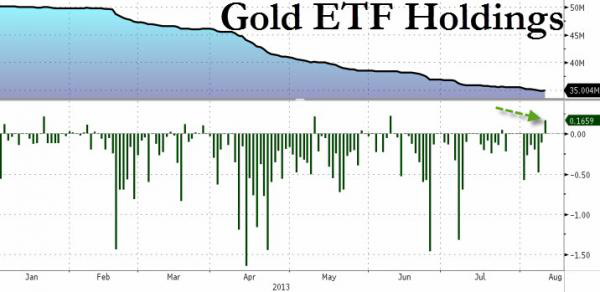
The emphasized fact is that "gold ETFs saw their first inflows in 2 months". The author doesn't directly state that it’s a bullish sign, but it's presented to give this impression in our opinion. Anyway, let's take a closer look.
The surprising thing about the above chart is that practically each case when the inflows were positive in 2013 marked a local top. Early June, Early May, late March, early February, very early January and mid-January. All (!) cases were followed by significant declines. That's a very strong, medium-term relationship given that all cases ended in the same way. Consequently, that's not a bullish sign, it's a sell signal. Of course, the tendency is based on the current medium-term decline and it will likely change eventually when inflows become positive in general, however, at this time, it's still a bearish signal.
Summary
The USD Index declined significantly in previous weeks but seems to have formed a bottom at the medium-term support line. For those who are short-term oriented, the trend might seem to be down, but the more important one – the medium-term trend – is up and it seems that we have already seen an important bottom.
The general stock market took its time to verify the breakout above its previous highs, but investors seem to fear an invalidation of this move. When stocks declined recently, precious metals and miners rallied. However, the breakout held and is confirmed by a breakout in the financial sector as well, and the outlook simply remains bullish for the stock market. In fact, it seems that stocks gathered strength for another significant move up. Those who bought gold fearing stocks’ plunge are quite likely to sell their holdings when stocks rally and fear subsides.
The recent moves in gold, silver and mining stocks look promising; however, that is what we saw in the only decline that is similar to the current one – right before the final, huge plunge. Silver is acting particularly strong, but it turns out that its performance relative to gold is also in tune with what happened in September 2008.
In general, gold, silver, and mining stocks moved to their April lows without breaking them – it seems to be another verification of the breakdown below this important level. This is also in tune with what we saw in September 2008, when we saw several attempts to hold the move above the April 2008 low – they failed and were followed by a significant decline.
In other news, platinum continues to outperform gold, as we have been expecting to see for months.
The summer season is slowly coming to an end and the True Seasonal factors may soon become particularly important for the precious metals market. We will discuss the important issue of seasonality thoroughly next week.
Trading – PR: Short positions in gold and mining stocks.
Trading – SP Indicators: No positions: SP Indicators suggest long positions, but the new self-similarity-based tool suggests short ones for the precious metals sector, and we think that overall they cancel each other out.
Long-term investments: Half position in gold, silver, platinum and mining stocks. As far as long-term mining stock selection is concerned, we suggest using our tools before making purchases: the Golden StockPicker and the Silver StockPicker
| Portfolio's Part | Position | Stop-loss / Expiry Date |
|---|---|---|
| Trading: Mining stocks | Short | 273 (HUI), $29.4 (GDX) / - |
| Trading: Gold | Short | $1,356 / - |
| Trading: Silver | No positions | - |
| Long-term investments: Gold | Long - half | - |
| Long-term investments: Silver | Long - half | - |
| Long-term investments: Platinum | Long - half | - |
| Long-term investments: Mining Stocks | Long - half | - |
This completes this week’s Premium Update. Our next Premium Update is scheduled for Friday, August 23, 2013. We will continue to send out Market Alerts on a daily basis (except when Premium Updates are posted) at least until the end of August 2013, and we will send additional Market Alerts whenever appropriate.
Thank you for using the Premium Service. Have a great weekend and a profitable week.
Sincerely,
Przemyslaw Radomski, CFA


