-
S&P 500 Slips at Close, Sector Strength Tells Defensive Story
August 4, 2021, 5:46 PMAs the S&P 500 chugs higher and higher, have you been monitoring the sector strength over the last month? Taking a deeper look into leading sectors paints a different picture.
Broader markets have been quiet over the last few days and trading in narrow ranges. While the overall trend in the short term has been higher, albeit, with a sideways tone, one cannot help feeling that this market is a bit on the defensive side.
Today, we saw the S&P 500 slip at the close, finishing the day lower by 0.46%, featuring some selling at the close.
As we noted on Monday, the $VIX had been rising, even with the S&P 500 up fractionally. Although the $VIX settled down in yesterday’s session, we can certainly take away that protection was being bought during an otherwise quiet session on Monday.
Sector Strength
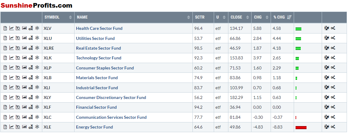
Looking Back at the past 30 days, here is where the sector strength has been:

Figure 1 - Leading Sectors July 6, 2021 - August 4, 2021, Source stockcharts.com
Health Care certainly makes sense with the vaccine administration and the overall macro news theme that has been featured over the last month surrounding the delta variant.
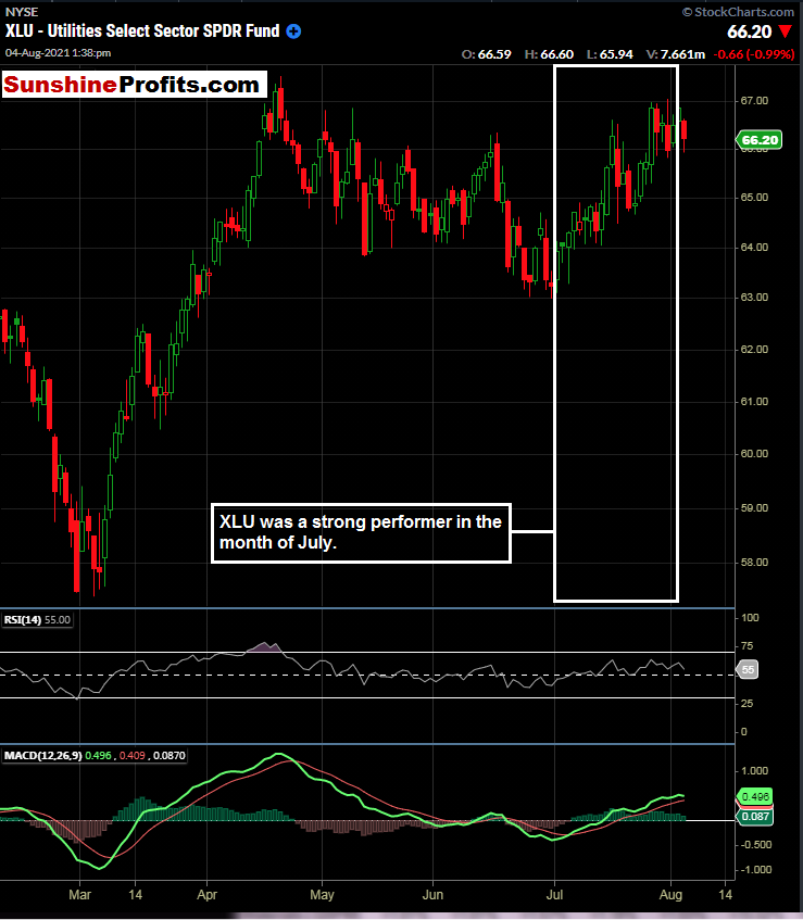
However, coming in at number two, we see Utilities taking the spotlight, almost up as much as Health Care. Utilities tend to connote highly to a defensive or even overall bearish market stance. Let’s take a look at the XLU (Utilities Sector Fund):

Figure 2 - XLU Utilities Select Sector Fund ETF February 15, 2021 - August 4, 2021, Daily Candles Source stockcharts.com
As you most likely know, utility stocks are high dividend-paying (for the most part), defensive plays when more aggressive growth plays become out of favor. It is concerning for the broader markets when utilities catch such a bid that is in place right now.
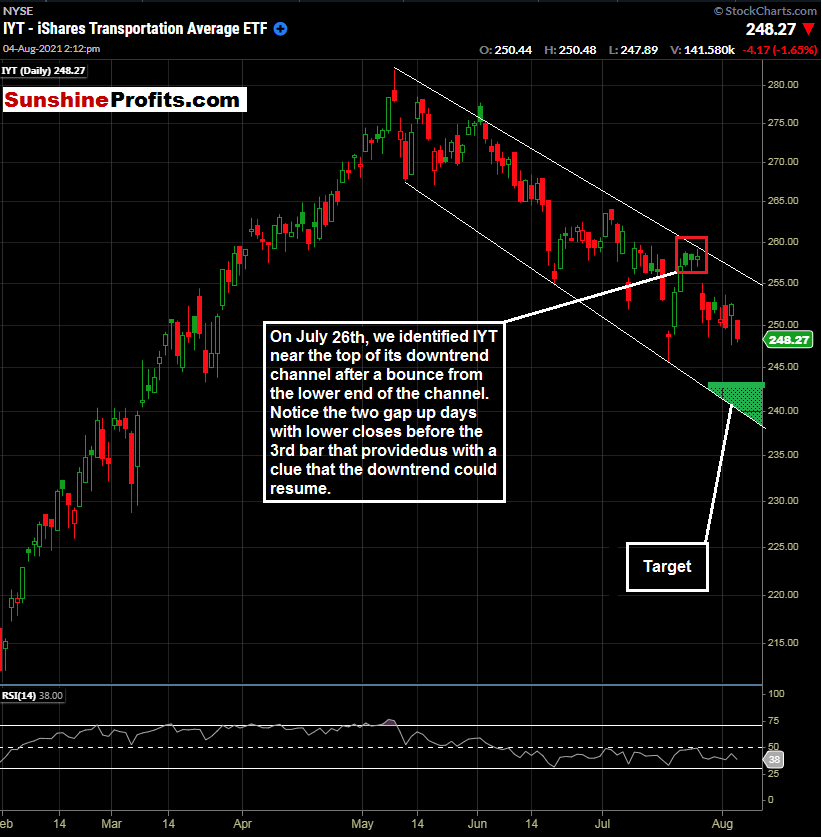
In our July 23rd publication, we covered the price divergence in the Dow Jones Transports. The Transports put in a high on May 10th, and they have been falling ever since. This price action is in sharp contrast to the broader market averages making fresh highs.
We were ready when the IYT bounced and traded near the top of its recent downward channel.

Figure 3 - IYT iShares Transportation Average ETF February 1, 2021 - August 4, 2021, Daily Candles Source stockcharts.com
The setup in IYT was a nice one and the day after identification rewarded traders with a gap lower. Our initial short entry zone that was identified was between $257.00 and $259.99. Prices traded in this area on the same day and the next day IYT gapped down. Our current price target is $243.01. This level can change over time, so stay tuned for updates.
Now, let’s examine the other markets that we are covering for Premium Subscribers.
Not a Premium subscriber yet? Go Premium and receive my Stock Trading Alerts that include the full analysis and key price levels.
Thank you for reading today’s free analysis. If you would like to receive daily premium follow-ups, I encourage you to sign up for my Stock Trading Alerts to also benefit from the trading action described - the moment it happens. The full analysis includes more details about current positions and levels to watch before deciding to open any new ones or where to close existing ones.
Thank you.
Rafael Zorabedian
Stock Trading Strategist -
Slope Dope? S&P 500 Monthly Candles Aim for Asteroids
August 3, 2021, 3:31 PMIt’s no secret that the S&P 500 has been leaving all bears in the dust. How does the recent rate of change measure up to previous bull runs?
After seeing many bull and bear markets over the years, I have never quite seen a slope of this magnitude. Of course, a picture is worth a thousand words, so:

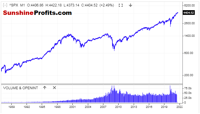
Figure 1 - S&P 500 Index June 1988 - August 2021, Monthly Candles Linear Chart Source stooq.com
The angle of the ascent has dwarfed previous bull markets by far. Of course, there is more than one way to skin a cat. The above chart is a linear chart (most traders, especially short-term traders use linear charts).
However, looking at the recent rally in a logarithmic chart, the ascent does not seem quite as steep.

Figure 2 - S&P 500 Index June 1988 - August 2021 Monthly Candles Logarithmic Chart Source stooq.com
On a regular (or linear) price chart, each value change is expressed in the same way. This means that a change of $2 to $4 looks identical to a change of $28 to $30.
On a logarithmic chart, the amount of percentage change is what is treated identically.
Knowing the difference between the two chart types can be beneficial for traders, and keep price moves in perspective. As we can see in the first chart, the upward move in the S&P 500 looks extreme, while shown in the logarithmic price chart, its angle doesn’t look as sharp.
Expressing the runup as a percentage of the S&P 500 since the pandemic lows, we are higher by approximately 103% in eighteen months.
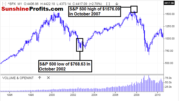
In comparison, I would like to take a look at the runup from the tech bubble selloff in 2002 to the highs that were made in 2007.

Figure 3 - S&P 500 Index January 1995 - April 2010 Monthly Candles Linear Chart Source stooq.com
From trough to peak (October 2002 - October 2007), it took the S&P 500 five years to move 105%. Let’s keep in mind that the sell-off from the March 2000 peak to the October 2002 lows was over a 2 year and 7-month period.
This is more reminiscent of how bear markets used to be in US equities; there were lower prices over longer time periods.
In comparison, the coronavirus meltdown in 2020 was a two-month affair, and we have now been moving higher for 17 months since the lows. Was the coronavirus meltdown a flash crash or indeed a bear market?
The meltdown was so short-lived and was obviously nothing that we have ever experienced before.
What Do I Emphasize Long Term Charts?
Markets do have memories. In fact, I find that longer-term charts are more valuable than short-term charts in almost all timeframe comparisons. Since we are in uncharted territory in the US stock indices, we could gain some kind of insight into the previous trough to peak bull runs.
In Summary:
From pandemic low to current highs in the S&P 500: 103% in eighteen months
From dotcom low to highs before US Financial Crisis: 105% in five years
It can be challenging to get a read on where the US equity markets are trading as a whole these days, given that there is no more chart resistance. In addition, market participants are now accustomed to higher highs, and every dip seems like it is bought more quickly than the last. Although using comparisons like this will not provide insight into exact entry and exit levels, such analysis can provide some long-term comparisons in an otherwise incomparable market. I do hope you find value in this perspective.
Now, for our premium subscribers, let's review the markets that we are covering (IYT, UDN, ERTH, & TAN). Not a Premium subscriber yet? Go Premium and receive my Stock Trading Alerts that include the full analysis and key price levels.
Thank you for reading today’s free analysis. If you would like to receive daily premium follow-ups, I encourage you to sign up for my Stock Trading Alerts to also benefit from the trading action described - the moment it happens. The full analysis includes more details about current positions and levels to watch before deciding to open any new ones or where to close existing ones.
Thank you.
Rafael Zorabedian
Stock Trading Strategist -
Afternoon Stock Trading Alert: SPX, VIX, GRID
August 2, 2021, 2:13 PMAvailable to premium subscribers only.
-
Afternoon Stock Trading Alert: UDN, GRID, TAN, ERTH, IYT
July 29, 2021, 2:39 PMAvailable to premium subscribers only.
-
Fed Nothingburger, Dollar Lower, Focus on GDP, PCE
July 28, 2021, 9:55 PMIt was a rather pedestrian FOMC Statement day on Wednesday. There is GDP data incoming, and the widely Fed-followed Core PCE Price Index data comes out on Friday. What can we take away from the FOMC Statement and press conference?
Rates unchanged. No rush to raise interest rates. Inflation should persist.
No surprises here.
However, there was some notable price action in the US Dollar Index during Wednesday’s session. The US Dollar Index initially rose on the FOMC statement at 2:00 PM. During the press conference, the USD fell as Fed Chair Jerome Powell mentioned that inflation should persist for several months. It is noteworthy price action and can be a forward-looking indicator for the direction of other asset prices.
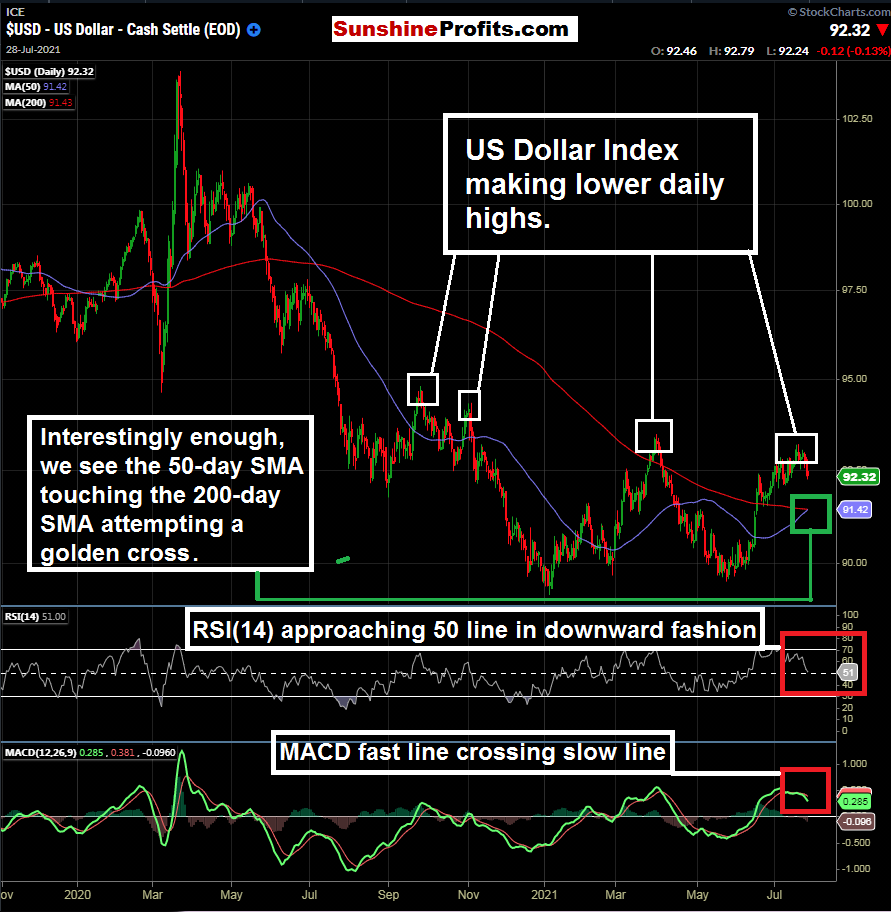
First, let’s take a look at the daily chart of the $DXY:

Figure 1 - US Dollar Index November 1, 2020 - July 28, 2021, Daily Candles Source stockcharts.com
As we know, the US Dollar has been in a longer-term downtrend. The repeating pattern has been lower daily highs. Short the dollar was a heavily crowded trade recently that we examined and discussed. After reaching oversold conditions, a quick bounce occurred. However, with no rush to raise interest rates and Fed open market operations continuing, the $DXY could try the downside once again. This downward move could impact the prices of commodities even further to the upside. There is a key Fibonacci level that was not quite reached in the index on its last downside attempt (near $88.41).

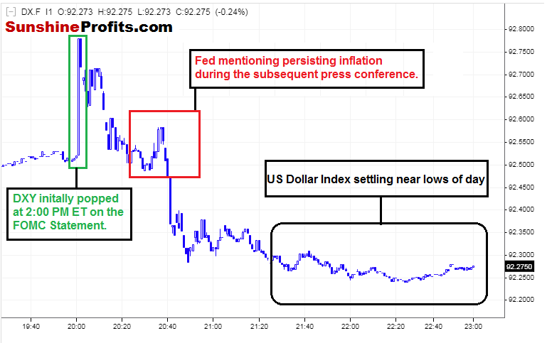
Figure 2 - US Dollar Index July 28, 2021 - July 28, 2021, 1-minute Candles Source stooq.com
I find value in this type of analysis; when you can take a daily/longer-term trend/outlook and then take an intraday peek on a day such as a Fed day. I would have guessed that the market would be factoring in further inflation already. However, based on the $DXY behavior intraday, it appears that the US Dollar may want to get set to go and retest the recent low near $89.50.
GDP Data, Core PCE
On Thursday morning, we are getting GDP (q/q), and on Friday morning we will get the Core PCE data. GDP can be a market mover, and the Fed does like to monitor the PCE data for inflation signals.
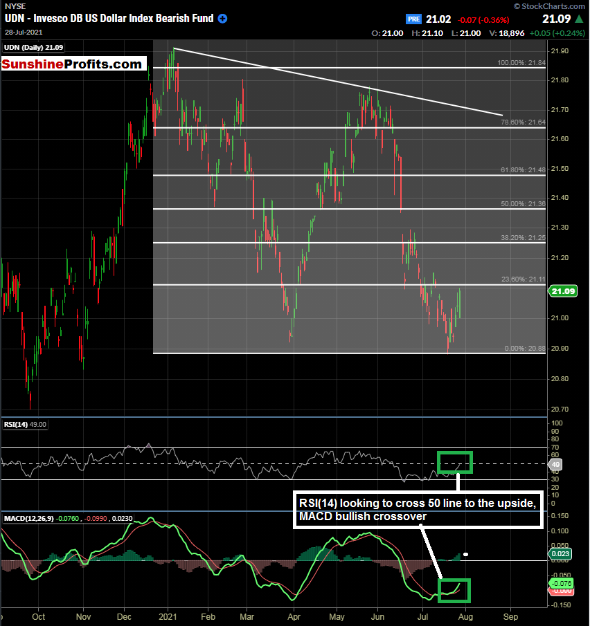
As the US Dollar may weaken some, a place to park some cash could be in the UDN - Invesco DB US Index Bearish ETF. I wouldn’t expect any home runs here; the ETF is unleveraged, but a 2 - 3% pop could be in the cards here if the $DXY wants to test its recent lows.

Figure 3 - Invesco DB US Dollar Index Bearish Fund - September 4, 2020 - July 28, 2021, Daily Candles Source stockcharts.com
UDN is doing its job rather well and is inversely tracking the US Dollar Index at an efficient rate. Other traders could use the $DXY product on ICE if their accounts are enabled for it. ICE passes through the monthly fee for its products to retail traders (somewhere in the neighborhood of $110 per month) to trade these products and receive quotes.
So, using UDN can give traders some pure exposure to a dollar decline. We will be eyeballing the $21.48 - $21.64 levels as potential TP targets for now. Levels and sentiment can change quickly, so stay tuned!
Now, for our premium subscribers, let's review the other markets that we are covering. Not a Premium subscriber yet? Go Premium and receive my Stock Trading Alerts that include the full analysis and key price levels.
Thank you for reading today’s free analysis. If you would like to receive daily premium follow-ups, I encourage you to sign up for my Stock Trading Alerts to also benefit from the trading action described - the moment it happens. The full analysis includes more details about current positions and levels to watch before deciding to open any new ones or where to close existing ones.
Thank you.
Rafael Zorabedian
Stock Trading Strategist
Free Gold &
Stock Market Newsletter
with details not available
to 99% investors
+ 7 days of Gold Alerts
Gold Alerts
More-
Status
New 2024 Lows in Miners, New Highs in The USD Index
January 17, 2024, 12:19 PM -
Status
Soaring USD is SO Unsurprising – And SO Full of Implications
January 16, 2024, 8:40 AM -
Status
Rare Opportunity in Rare Earth Minerals?
January 15, 2024, 2:06 PM