-
US Economic Data Prints Softly, US Dollar Mostly Flat
May 26, 2021, 9:51 AMUS economic data disappointed yesterday. The SPX remained largely unaffected as the dollar remained quiet. Does this remind you of anything?
When a market is in Goldilocks mode, the “data doesn’t matter”. However, is the current landscape very Goldilocks-like? There seems to be lingering uncertainty behind the curtain that would not lend itself well to such a scenario.
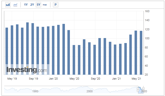
Yesterday’s US CB Consumer Confidence data showed some weakness, missing market expectations of a 119.2 print, and coming out at 117.2. It is not the worst miss in the world, and I don’t think it surprised many US-based market participants. This data release is a medium impact announcement historically and does not pack the punch of a Non-Farm Payroll number. But, it is still a weak print keeping in mind that the previous month’s release was revised downward, from 121.7 to 117.5. It seems that the shine from the US reopening trade may be fading.

Figure 1 - CB Consumer Confidence Monthly Releases March 2019 - May 2021. Source investing.com
No doubt rising inflation has US consumers a bit more cautious with their dollars these days.
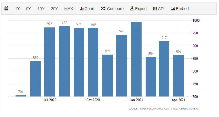
On the same day, market participants heard from the Census Bureau with the latest new home sales data. Another bearish print here, with a print of 863K vs. market expectations of 950K. If you are in the US and live in a hot market, this data may come as a surprise. New Home Sales is also not the heaviest market impact release out there, but I have always paid attention to it. When New Home Sales slow, the trickle effects are real in several industries, including furniture, mortgages, and appliances. Some local real estate markets are so overheated, that one would think that reality has to set in at some point soon. Is this just a temporary blip?

Figure 2 - United States New Home Sales May 2020 - May 2021. Source tradingeconomics.com
Interestingly enough, these soft prints had little impact on the US Dollar. Usually (and I use the word usually in a liberal sense here), bearish US economic data will send the US dollar lower. The dollar actually bounced intraday off these data releases, which could be a clue that traders may be covering some hefty short dollar positions. The data releases create liquidity, and traders with large positions need liquidity to get out of the other side of such a trade. Just a theory, folks.
I suggest reviewing our publication from May 19th here, which outlines some key technical levels in the US Dollar Index that we are currently monitoring. The DXY is trading very close to a key level.

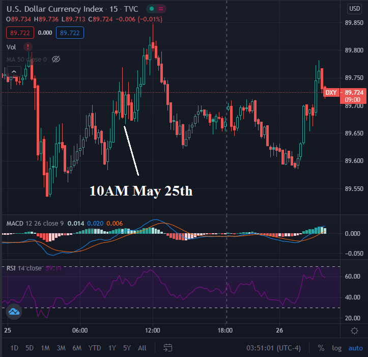
Figure 3 - US Dollar Index 15 Minute Candles May 25, 2021 - May 26, 2021. Source tradingview.com
As we can see above, the DXY did not get sold on the bearish data releases. The data came out at 10 AM ET yesterday. In fact, it popped intraday and then slid off its highs, rebounding as the European session approached on May 26th. Interesting, right?
When data releases are bearish, and the impacted markets do not necessarily trade in the consensus direction, it takes me back to a time in 2007 - 2008. Data seemed to pour in on the bearish side, yet the equity markets just went up, up, up. More on that soon.
Now, for our premium subscribers, let’s review the markets that we are following. Not a Premium subscriber yet? Go Premium and receive my Stock Trading Alerts that include the full analysis and key price levels.
Thank you for reading today’s free analysis. If you would like to receive daily premium follow-ups, I encourage you to sign up for my Stock Trading Alerts to also benefit from the trading action described - the moment it happens. The full analysis includes more details about current positions and levels to watch before deciding to open any new ones or where to close existing ones.
Thank you.
Rafael Zorabedian
Stock Trading Strategist -
The Shifting US Economy: AI and Automation Lead the Way
May 25, 2021, 9:33 AMThe Biden administration is 125 days old, and things certainly feel different. What strategies are you employing to take advantage of the shift?
Things often change temporarily before reverting to a mean. Just like market instruments, changing political ideals can, do, and will change, before ultimately reverting back to a mean, or an average state.
Labor force configurations have changed drastically, partially due to the pandemic. What was once everyone’s dream “to work from home”, went from a wish to a potentially harsh reality and has stayed there for many people.
On top of the new remote workforce norm, there has been a shift for many wageworkers, as they are becoming increasingly reliant on government-funded subsidies such as unemployment benefits, food assistance, and others to survive. Many workers needed these benefits to survive during the peak of the pandemic. Many red states have already begun the process of limiting or restructuring unemployment benefits and requirements. However, many blue states have not done so, and perhaps do not intend on doing so.
These collective actions and inactions create a lack of desire for many wageworkers to return to work. And, why would they? If a worker can receive an equal-to, or in many cases, a higher amount of compensation without having to work, there is no financial incentive, albeit some may have a moral incentive. This dynamic creates challenges for small business owners in the US.
Let’s assume that you are a restaurateur. You require a labor force that has a certain skill set and commands a certain compensation. Since the labor market for this type of work does not command a very high rate of pay, the work pool shrinks, and labor is hard to find. So, raise the minimum wage, you say? Then, the small business restaurateur may not be able to survive and continue operations, doling out delicious delicacies to the neighborhood. Who wins in that situation?
Inflation does not help. Is it highly coincidental that inflation metrics have suddenly spiked while a large percentage of certain workforces are not working? What about housing? If you are in the US (depending on your local market), you may be all too familiar with sky-high single-family home prices, and rents are out of control in many markets. Housing seems to be a luxury in many markets and for many people at this time.
How do we try to profit from it? Automation.

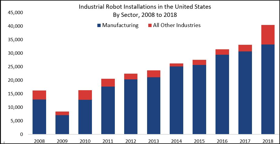
Figure 1 - Industrial Robot Installations in the United States 2008 - 2018. Source International Federation of Robots ifr.org
While the above graphic is a bit dated, it shows an exponential increase in industries other than manufacturing in 2018.
Robots don't need paychecks or lunch breaks. They never call in sick. Bringing a robot into service is a one-time cost and a maintenance cost. If there is no human work pool to fill a demand, robots and automation will likely continue to be the answer, and potentially at a higher rate of increase.
There is no shortage of ETFs for an investor to gain exposure to this trend in automation. After sifting through many of them, I wanted to discuss one that really stood out to me today.
Now, for our premium subscribers, let’s take a look at an instrument that could benefit from increased automation adoption. Not a Premium subscriber yet? Go Premium and receive my Stock Trading Alerts that include the full analysis and key price levels.
Thank you for reading today’s free analysis. If you would like to receive daily premium follow-ups, I encourage you to sign up for my Stock Trading Alerts to also benefit from the trading action described - the moment it happens. The full analysis includes more details about current positions and levels to watch before deciding to open any new ones or where to close existing ones.
Thank you.
Rafael Zorabedian
Stock Trading Strategist -
Your Week Ahead: S&P 500 to Commodities Ratio May Tell a Story
May 24, 2021, 9:58 AMAs commodities rise, are there any clues about the direction of broader US markets? Measuring correlations can help to spot trends across asset classes.
As we head into the new week, we want to be aware of the impending data releases that can affect timing and sentiment. This week is a mild to moderate week on the US economic data side of things, with the largest market impact event happening on Thursday, May 27th, in the form of Preliminary GDP q/q (quarter over quarter). This number is reported in an annualized fashion (so it is the quarterly change x4). Market participants are forecasting a print of 6.4%. Also, bear in mind that this is the Preliminary GDP number. There are three different GDP data releases, the Advance GDP (earliest indication and usually most impactful on markets), Preliminary GDP (this one), and then Final. A bullish print usually strengthens the US Dollar (not always, but usually).
Other than the GDP print, FOMC members Brainard, and Bostic speak on Monday morning, FOMC member Evans speaks on Tuesday morning, and we have Consumer Confidence data on Tuesday, as well. More Fedspeak is in store for Wednesday, with FOMC member Quarles speaking, leading up to the GDP print on Thursday. Thursday also features US Unemployment Claims and Pending Home Sales. Finally, on Friday, we get the Core PCE Price Index which measures the price of services and goods (ex-food and energy) purchased by consumers (not businesses). This data release could warrant some attention due to the inflationary pressure that has been present in the markets as of late.
Overall, it will be a moderate economic data release in the US. I always like to know what data will be coming out, and when, as a trading week begins.
Correlations. Traders love them. They tell a story that really cannot be quantified unless studying the raw data. As we have had so much attention going to inflation lately, it is a good time to review the broader market S&P 500 vs. commodities to get an idea of the relationship between them.

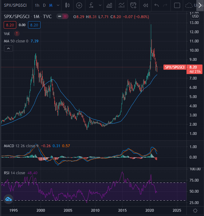
Figure 1 - SPX/SPGSCI TVC Monthly Candles November 1992 - May 2021. Source tradingview.com
Here we have a long-term chart of the SPX (S&P500) divided by the SPGSCI (S&P Goldman Sachs Commodity Index). So, we have the ratio between the two instruments to inspect. We can see the large blowoff top price action that occurred in this ratio in Q1 2020 as a result of the pandemic (Crude trading negative, anyone?). There is a nice pullback from the blowoff top levels of the pandemic. The question becomes, is that the top or is it time to be long equities and short commodities? Friday’s PCE data could give us another clue. If buying pullbacks tickles one’s fancy in a contrarian fashion, this could be some food for thought.

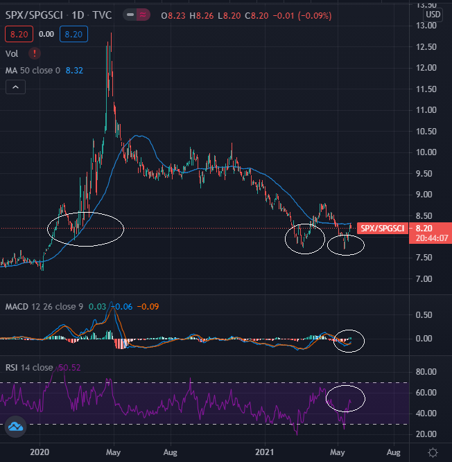
Figure 2 - SPX/SPGSCI TVC Daily Candles October 28, 2019 - May 21, 2021. Source tradingview.com
Drilling down to the daily candles, we do see an interesting formation that could potentially indicate support of this trade between the 7.70-8.00 levels. The level has been key on the last three tries. Notice the horizontal price support and the MACD (12,26,9) starting to look bullish here. In addition, we have the RSI(14) crossing the 50 line.
So, what does all of this mean? Trading ratios does require some knowledge and arithmetic. A trader would need to be long an identical X dollars worth of one instrument and short X dollars of the other to make it work. Do you have experience with this type of pairs trading?
For now, let’s just explore the potential that the S&P 500 could be inexpensive compared to the commodity basket that the SPGSCI measures. Is one of them “cheap” or is the other “expensive”? Or both? Given the S&P 500 earnings multiple, money printing, and other policy directives from the new US administration, it may be simple to conclude that stocks are overpriced, and commodities will go up in a straight line. However, is trading really that easy? Bull markets, such as the one in the S&P 500, do not tend to go out in a whimper. Instead, they tend to go out with a bang.
In the May 10th publication, we were examining the Invesco MSCI Sustainable Future ETF (ERTH) given the US infrastructure bill, new administration, and other factors.
Now, for our premium subscribers, let’s revisit ERTH, and see what the price action may be telling us, given recent market developments. Not a Premium subscriber yet? Go Premium and receive my Stock Trading Alerts that include the full analysis and key price levels.
Thank you for reading today’s free analysis. If you would like to receive daily premium follow-ups, I encourage you to sign up for my Stock Trading Alerts to also benefit from the trading action described - the moment it happens. The full analysis includes more details about current positions and levels to watch before deciding to open any new ones or where to close existing ones.
Thank you.
Rafael Zorabedian
Stock Trading Strategist -
10-Year Note Yields: Opportunity to Benefit?
May 20, 2021, 6:23 AMGiven yesterday’s headlines with Bitcoin plunging, did you take a peek at interest rates? Could a stronger dollar lie ahead with higher rates?
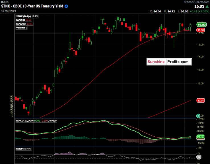
While everybody’s eyes are peeled on cryptocurrencies and a crowded short DXY trade, let’s revisit the potentially polar opposite of a crypto instrument: 10-year notes. Yields rose on Wednesday, settling at 1.683%, just off the intraday high of 1.692%. I like to take a look when few others are looking. As yields closed near the highs of the day, with other risk assets seeming out of favor, at least temporarily, let’s revisit the 10-year notes.

Figure 1 -CBOE 10-year US Treasury Yield Daily Candles January 19, 2021 - May 19, 2021. Source stockcharts.com
Bonds and equities have an interesting relationship. The trade that has worked in recent years has been long the bonds or 10-year notes (short yield) and long the $SPX. That trade has worked for a long, long time, overall. However, trends eventually change and given the current environment of the US Dollar Index approaching a key long-term Fibonacci retracement level, and yields looking like they want to climb, things could turn out differently in the short run.
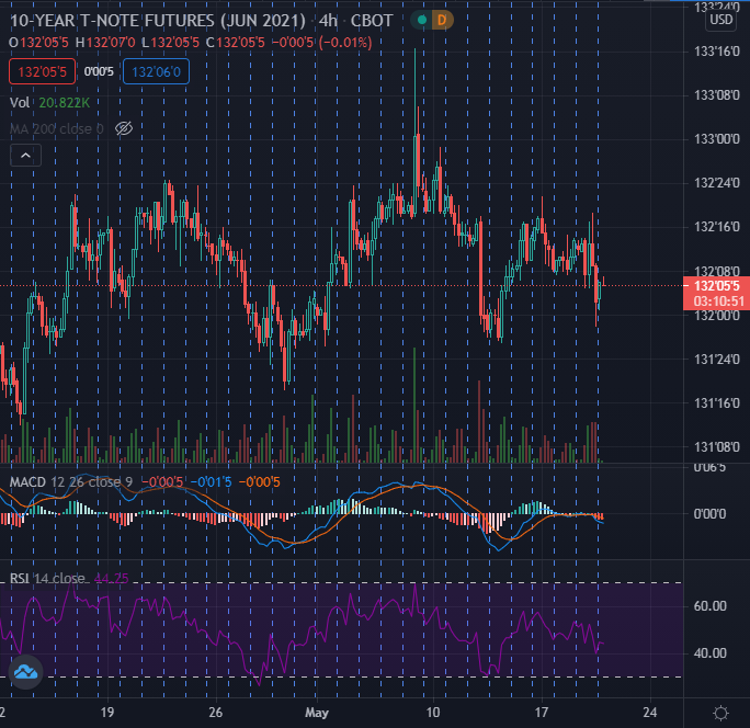
In my May 11th publication, we were eyeing potential precision entry levels for a short trade in the June 10-year notes (higher yields). Remember, bond prices and yields move inversely to one another. We discussed some key technical indicators, and the idea was sound. Reviewing this analysis, the 50-day moving average was a key level that was analyzed and discussed. That idea was put on pause due to the bounceback that occurred in the $SPX, and a trader would usually not want to be caught short bonds with a snapback rally and $VIX crush in the cards. Since that is so “last week”, we can now take a look and see what has transpired since then. The 50-day moving average has held like a rock in $TNX over 4 trading sessions. We can see what appears to be a “cup and handle(y) type of bullish continuation pattern that is forming here. It just feels like rates want to rise, and therefore the 10-year note futures could fall.

Figure 2 -June 10-year T-Note Futures CBOT (ZNM2021) 4 Hour Candles April 12, 2021 - May 19, 2021. Source tradingview.com
It really doesn’t get more textbook than this, as we can see a clear head and shoulders formation occurring here in the June 10-year notes. Rallies to the neckline have stalled, and yields have been finding support at the 50-day MA. Notice the potentially bearish MACD (12,26,9) action on the 4-hour candle chart, trading just south of the zero line. RSI(14) appears to be anything but bullish.
But, what do you think? The Fed says rates will remain “lower for longer”. That theme still exists. However, please remember that the Fed only sets the overnight lending rate and not the longer-term duration rates. Thankfully, free markets determine such rates. What is the market telling us? And what about the DXY? As we approach some longer-term important technical levels, how could this affect the price of 10-year notes? There is a flux of data pulling markets in bipolar directions at this time, in my opinion, and this could create opportunity.
Based on the recent price action, there could be a potential opportunity to benefit from a market curve pricing discrepancy between the actual short-term rate levels set by the Fed, and what the charts are showing us with the recent action in the 10-year note.
Now, for our premium subscribers, let’s dig into the ZNM2021 short-term technicals and the potential key levels for today. In addition, we have been stalking the Amplify Transformational Data Sharing ETF (BLOK), which is especially interesting, given yesterday's action in Bitcoin. Not a Premium subscriber yet? Go Premium and receive my Stock Trading Alerts that include the full analysis and key price levels.
Thank you for reading today’s free analysis. If you would like to receive daily premium follow-ups, I encourage you to sign up for my Stock Trading Alerts to also benefit from the trading action described - the moment it happens. The full analysis includes more details about current positions and levels to watch before deciding to open any new ones or where to close existing ones.
Thank you.
Rafael Zorabedian
Stock Trading Strategist -
DXY Weakness: Are You in A Crowded Commodities Trade?
May 19, 2021, 6:44 AMHave you been long commodities like agriculture or oil? The US Dollar has continued to weaken, but is this trade getting a little long in the tooth?
Happy Hump Day, folks. Here are some quick facts: The US dollar has been in a steep downtrend since late March. The most recent CPI print in the US was a monster. The Fed has continued with the “lower for longer” theme. The Biden administration is looking to spend trillions upon trillions with no clear path for repayment, and it doesn’t seem to matter. Has the short dollar/long commodities trade gotten “too easy"?
The answer is yes, or at least most likely. Some steam will have to come out at some point. I’m not setting off any immediate alarm bells here and don't care to theorize on whether inflation is indeed transitory, as the Fed states. However, when a trade theme has that much going for it, for so long, in leveraged markets, it usually ends suddenly or at least experiences a snapback. Just some food for thought.
The US Dollar Index (DXY) can give us some clues.

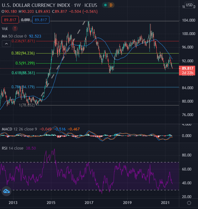
Figure 1 - US Dollar Currency Index Weekly Candles April 2012 - May 18, 2021. Source tradingview.com
In the above long-term US Dollar Index chart (DXY, weekly candles), we can see the long-term picture beginning back in April of 2012. We can see the long-term Fibonacci levels by starting near the lows in 2014 near the 78 - 79 handles, and using the high levels in December 2016 when it traded north of 103.50. We can see that some major support was found in Q1 2018 right at the 61.8% retracement level near 88.36. This area is a long-term level, folks, and it held up very well on its last attempt. The DXY did trade in a range near this level for several months before bouncing and turning upward. Could we be in for a similar setup shortly? Since we are so close to this key level, I believe this is worth a mention and some thought.
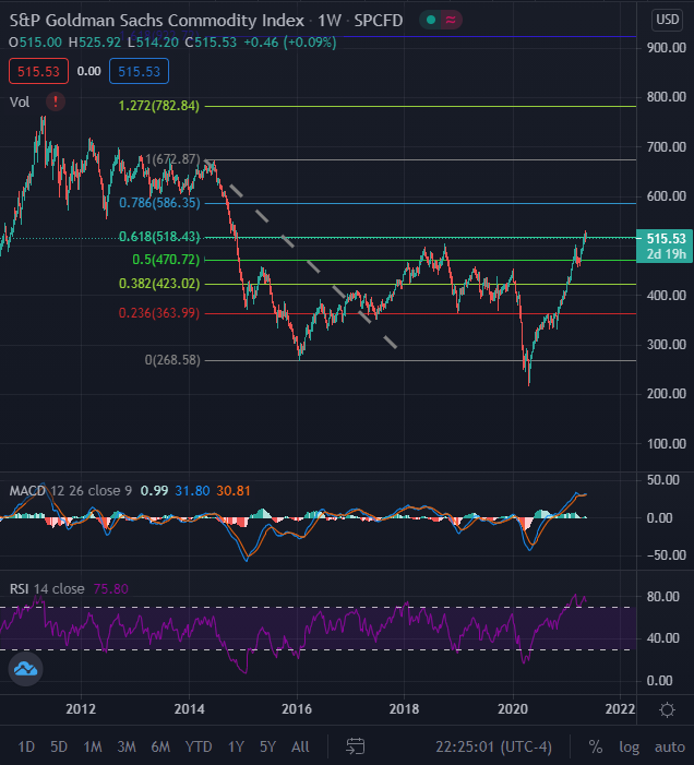
Digging deeper, to get a broader look at commodities, we turn to the S&P Goldman Sachs Commodity Index (SPGSCI). You could also look at the Invesco DB Commodity Index Tracking Fund (DBC), which is very liquid, but let's look at the SPGGSCI.
 Figure 2 -S&P Goldman Sachs Commodity Index Weekly Candles (SPGSCI) July 2010 - May 18, 2021. Source tradingview.com
If you are a fan of Fibonacci retracements/extensions/time zones, you may wonder why I would draw the retracements in this way. Well, I am omitting the outlier that was Q1 of 2020 and seeing how it looks. Remember having sub-zero crude oil in March of 2020? That would certainly impact the pricing of this index. So, I omitted it. We can see weekly overbought technicals via the RSI(14) and the MACD(12,26,9), showing what may be a bearish crossover in the making in the MACD. The 61.8% retracement level here shows a 518.43 level (the way I have drawn it), and this is something to consider. Seems a bit technically overbought, yes?
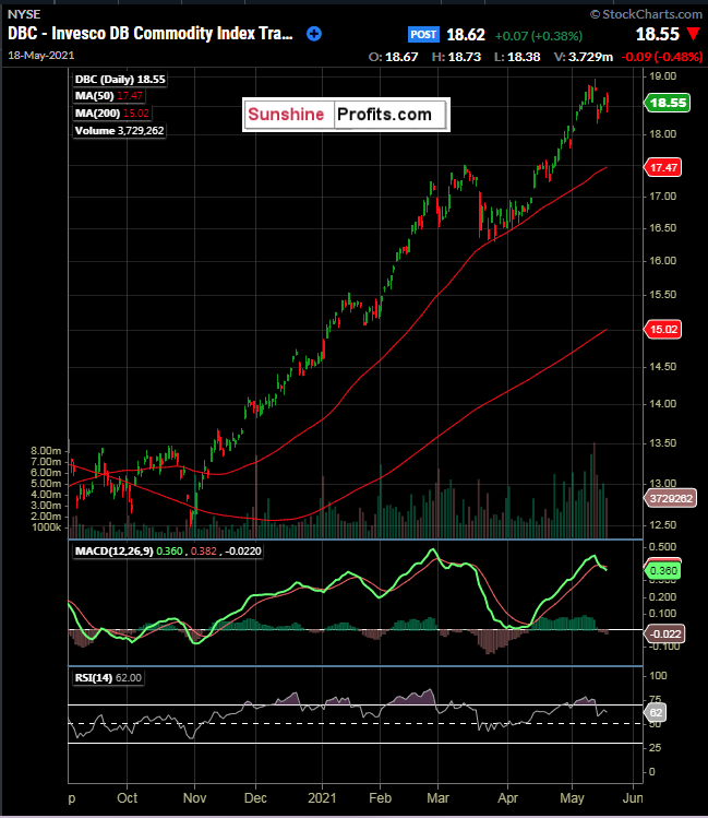
Since I have opened this rabbit hole in search of a tradable opportunity, let’s look at the Invesco DB Commodity Index Tracking Fund (DBC), but on a shorter-term basis.

Figure 3 - Invesco DB Commodity Index Tracking Fund (DBC) Daily Candles September 3, 2020 - May 18, 2021. Source stockcharts.com
It has been a great trade from the long side. There is no doubt about it - from the bottom left of the chart to the top right, with a steep slope. I am always a “trend is your friend trader” first, as getting on the wrong side of a trend can be damaging, and very quickly. However, in this instance, I believe we need a closer look at what may be in the cards for the US Dollar and commodities.
Now, for our premium subscribers, let’s dig into the DBC short-term technicals. Not a Premium subscriber yet? Go Premium and receive my Stock Trading Alerts that include the full analysis and key price levels.
Thank you for reading today’s free analysis. If you would like to receive daily premium follow-ups, I encourage you to sign up for my Stock Trading Alerts to also benefit from the trading action described - the moment it happens. The full analysis includes more details about current positions and levels to watch before deciding to open any new ones or where to close existing ones.
Thank you.
Rafael Zorabedian
Stock Trading Strategist
Free Gold &
Stock Market Newsletter
with details not available
to 99% investors
+ 7 days of Gold Alerts
Gold Alerts
More-
Status
New 2024 Lows in Miners, New Highs in The USD Index
January 17, 2024, 12:19 PM -
Status
Soaring USD is SO Unsurprising – And SO Full of Implications
January 16, 2024, 8:40 AM -
Status
Rare Opportunity in Rare Earth Minerals?
January 15, 2024, 2:06 PM